Category: Uncategorized

  • Substance Over Shock

    In the art world, provocation often gets more attention than creativity and dynamic quality. Artists like Jeff Koons gain overwhelming attention for the principle and controversy of its avant garde qualities. Koons’ fans have an easier time justifying his work when they look at it in a vacuum, not acknowledging other artists’ work. This attention really could be distributed to many other artists or works that are more dynamic like Nick Ervinck for example.

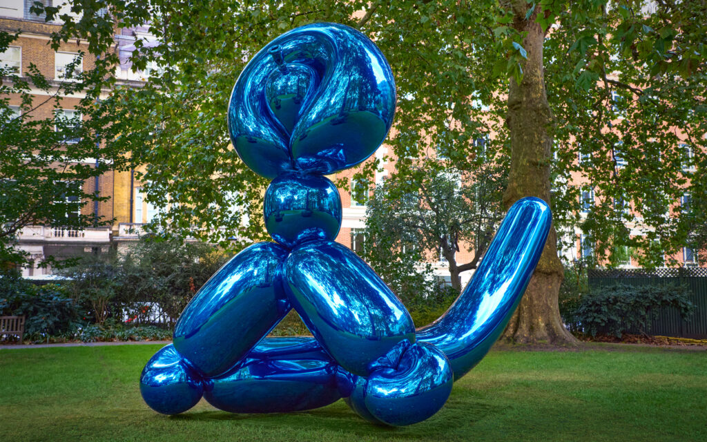
    Koons’ work is admired for its technical flawlessness. When discussing his strive for perfection in an interview with NOWNESS, he said, “When I would work with an object, I would want every detail, every perfection or imperfection of the object. So when somebody would view it, that they could maintain this kind of suspension of disbelief and go along with this abstraction for as long as possible.” When this mindset is applied to generally symmetrical subjects like his balloons in Celebration, the works look too even, making it visually boring. For instance, in Balloon Monkey (Blue), he could make various sized versions of the piece, rotate them, and stick them together at different points of his original piece. This could still be naturalistic and would help create interest in the form. He could also create interest in the surface by having contrasting textures. Like most of his other sculptures, the Balloon Monkey (Blue) is covered in one solid metallic color. Having an area or two that go against this “perfection” would strengthen the pieces visually. Koons’ pursuit of perfection limits his works and can make them stagnant.
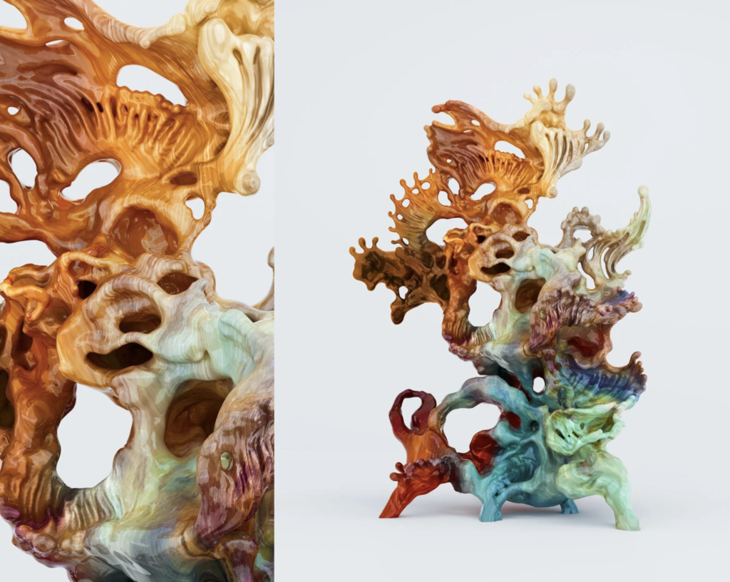
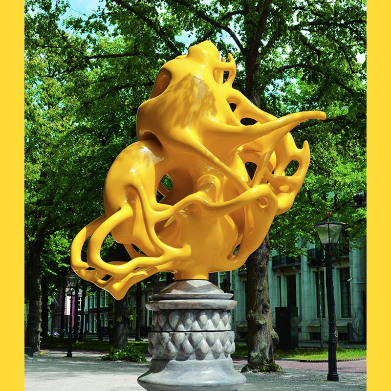
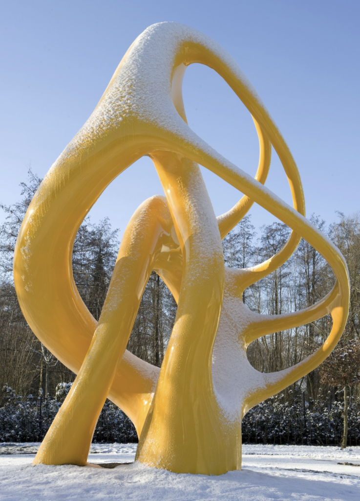
    Works like Nick Ervinck NOITERIS are inarguably visually dynamic. NOITERIS has repetition in form and color. It has an interesting glossy woodgrain-like texture that adds depth to the piece. It also contrasts in its use of negative and positive space while staying balanced. The viewer’s eyes travel across the entire sculpture and are not fixed at one point. This may not be “perfection” but the technical work is still strong enough for the immersion to be believable to the audience.

    Jeff Koons’ A Retrospective and Nick Ervinck’s LUIZAERC are two very similar pieces in terms of colors and gestural form. Looking at the two of these pieces side by side allows you to see how they compare with their dynamic aspects. The biggest difference that stands out is Koon’s rooted priority in naturalism and Ervinck’s priority in incorporating negative space into the sculpture.

    Ervinck commented on a similar sculpture of his, “After all, PRAHIARD looks like a sculpture which embraces the empty space in between. As a result of this embrace, that empty space has become a sculptural instrument.” Since Koons is focusing on making this piece believable to the audience, he doesn’t give himself the opportunity to use negative space in the piece like Ervinck can. A Retrospective, also lacks contrast in proportion making the sculpture look highly busy. LUIZAERC is chaotic like A Retrospective but isn’t as hard to look at due to business, it has contrast in proportion between the abstract blobs and doesn’t rely on naturalistic details to make it dynamic. 
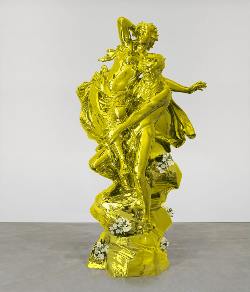
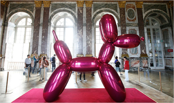
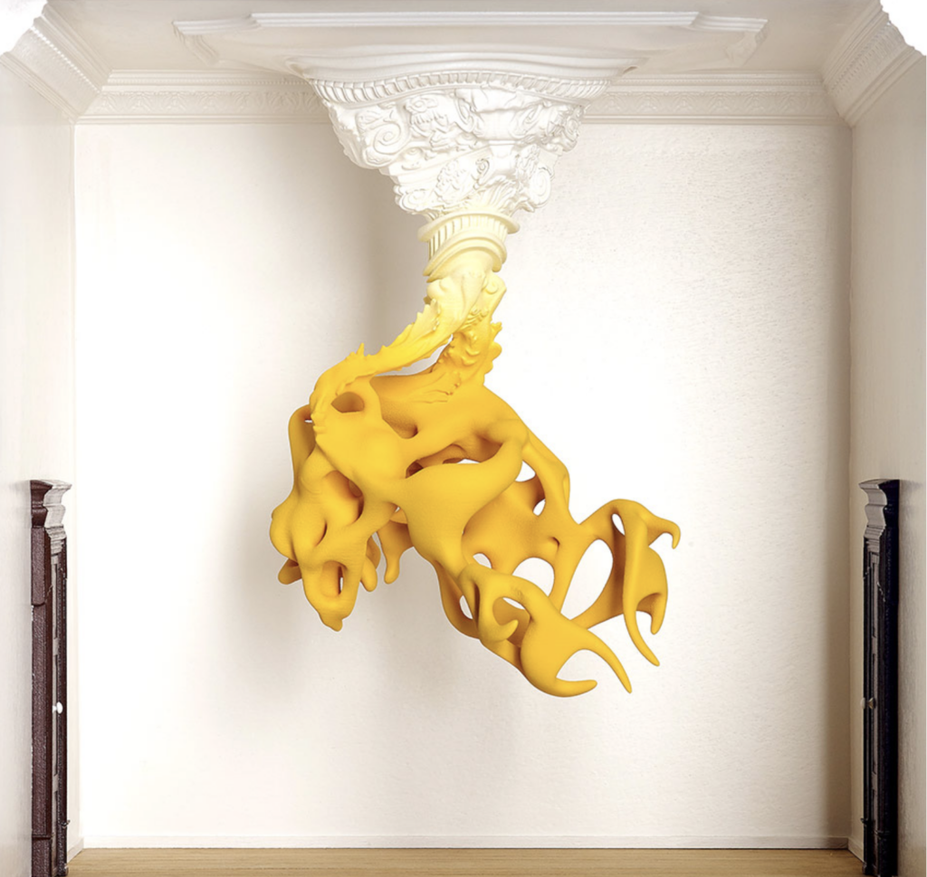
    When the sculptures are placed in older buildings that are more classical or french baroque they can be controversial for being nontraditional art in traditional places. However Ervinck has a skill to incorporate the environment into his piece like he did in the ceiling medallion of KOMANIL. Whereas Koons’ Balloon Dog in the Palace of Versailles stuck out like a sore thumb, asking to have debate on its right to be there. Whether the art actually belongs there is subjective. However, having the skill to analyze a space and adapt your work accordingly to fit the aesthetics of its surroundings, immerse viewers, or otherwise, is one I’ve yet to see from Koons’.
    Popularity of art solely based on controversy and shock value instead of their artistic skill should be avoided at all costs. Let the debate take place and then let it spark conversation to praise other artists who you think are deserving. As viewers we do not need to continue to over praise the successful who don’t align with our artistic values. We can give attention to those who do it all.

    Work Cited

    “8 Questions with Nick Ervinck – ORIGINAL Issue.” Al-Tiba9, Al-Tiba9 Contemporary Art, 1 June 2020, www.altiba9.com/artist-interviews/nick-ervinck-3d-sculpture. 

    The Editors of Art Market. “Nick Ervinck | An Exclusive Interview.” Art Market, 8 Oct. 2020, artmarketmag.com/nick-ervinck-an-exclusive-interview/. 

    Lancelin, Hervé. “Jeff Koons: The Triumph of Shimmering Emptiness.” ArtCritic, 17 Dec. 2024, www.artcritic.com/en/jeff-koons-the-triumph-of-shimmering-emptiness/. 

    McGivern, Hannah. “Jeff Koons Goes Head-to-Head with Michelangelo in Florence.” The Art Newspaper – International Art News and Events, The Art Newspaper – International art news and events, 1 Sept. 2015, www.theartnewspaper.com/2015/09/01/jeff-koons-goes-head-to-head-with-michelangelo-in-florence. 

    “Prahiard.” Nick Ervinck, nickervinck.com/en/work/advanced-search/detail-2/prahiard. Accessed 7 May 2026. 

    “Reflections: Jeff Koons’ Philosophy of Perfection.” NOWNESS, 16 June 2014, www.nowness.com/series/reflections/jeff-koons-philosophy-of-perfection. 
  • Hybridized Food Item

    Assignment

    Formaltexture, balance, color, repetition, contrast
    Technicalcreate a substructure using foilwork at hand sized scale (5-10″)additive and subtractive surface methodswork with a soft material that it made permanent through low temperature heating 
    Conceptualcreate a hybridized form that has not been seen before using know textures and color 

    Guidelines:

    • Using white Sculpy polymer clay your will combine together 2 food items into a hybridized food item. The  material will be heated to 275 degrees farenheit per 1/4 inch of thickness for 1/2 hour. 
    • This closed form should have volume and shape.
    • The interior will be created with foil and then the Sculpy will be formed over that structure.   
    • You should have a visual reference for the forms being used.
    •  The final hardened work will be painted for final effect.
    • Images will be posted to your website with explanation.

    Process

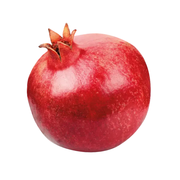
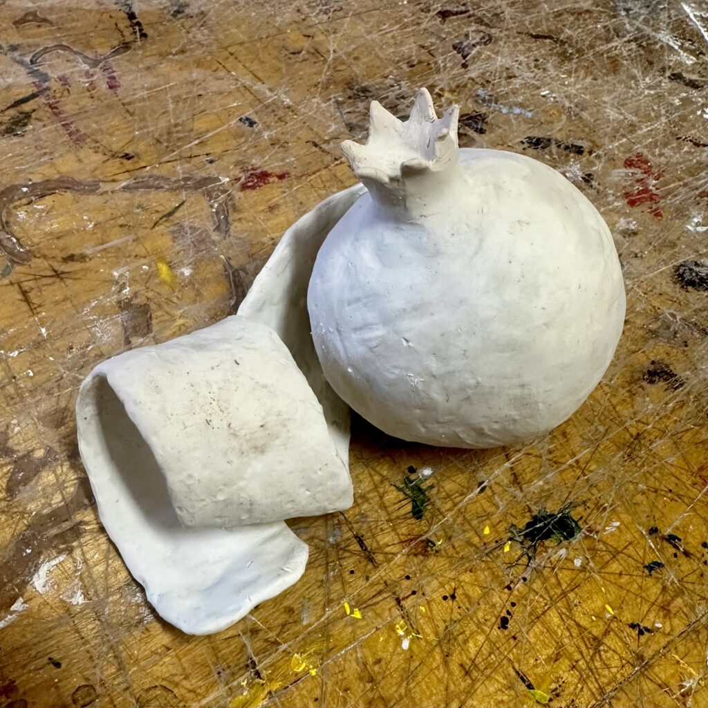
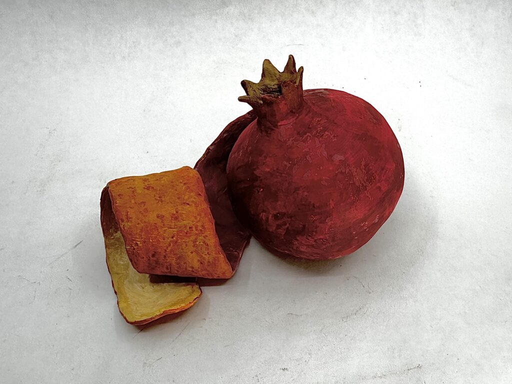
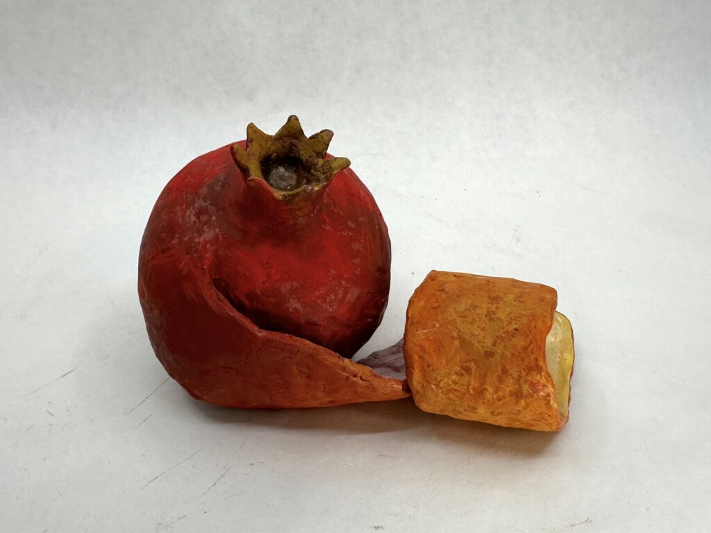
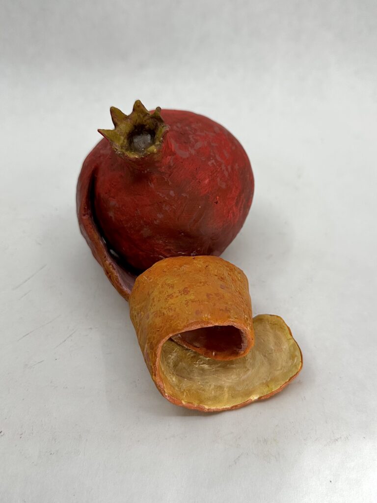
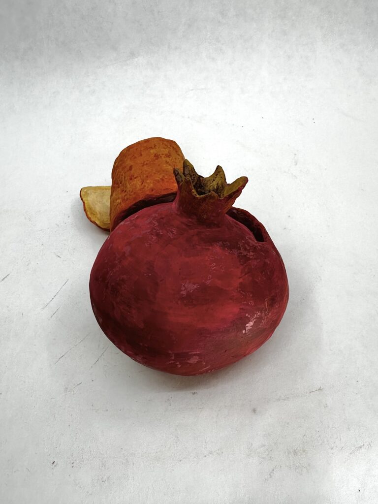
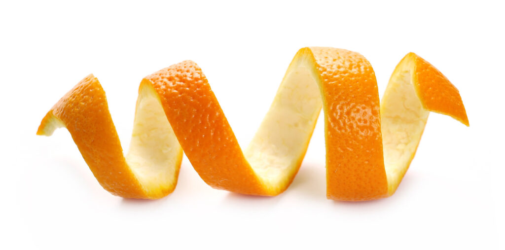
    I didn’t know how to pick my hybridized food. So I just thought of colors I’d like to paint instead, seeing as I neglect the painting process until after I build the forms. I landed on a pomegranate and orange because I thought the analogous colors would blend nice together. I decided to have an orange peel off from the pomegranate and use it as a ribbon to create interest. Then I could create a nice ombre effect as I transition from a magenta into orange color.

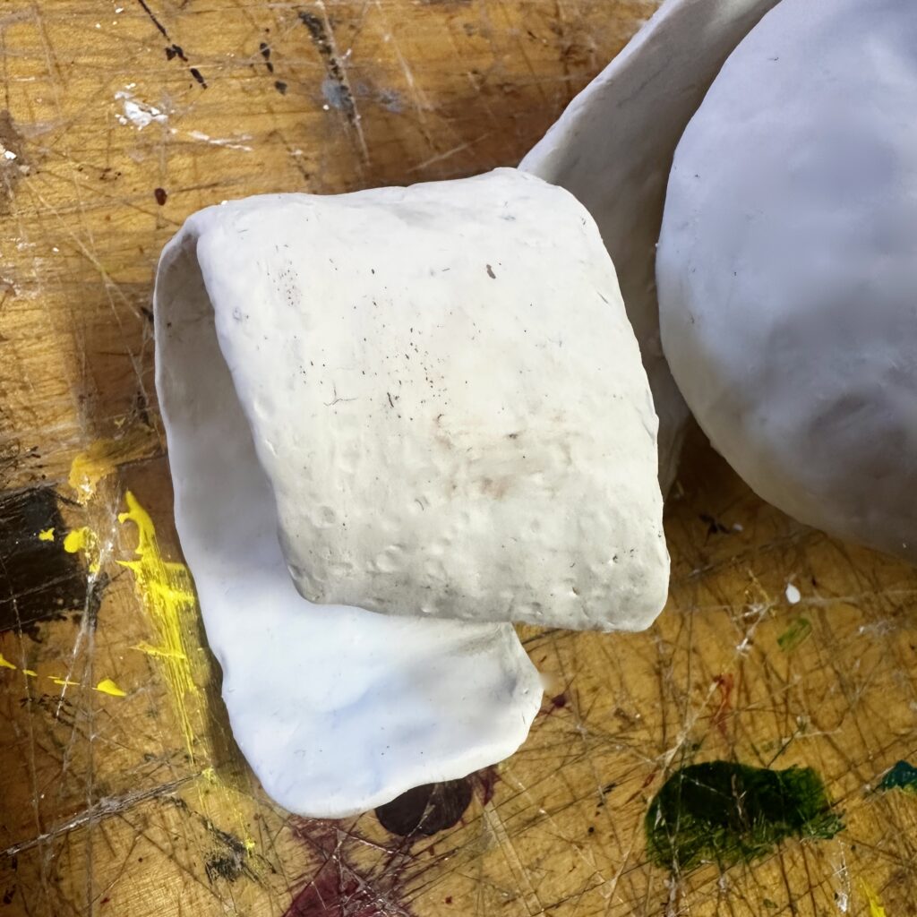
    I started by rolling tin foil into a ball. Luckily, I didn’t need to make it perfectly sphere since I would be going over it with the oven-bake clay later. Then I folded some more tin foil into a strip and weaved one end of it into the ball then curled it. After, I put a layer of clay onto the form, removed any excess clay that made lumps, and used a small dowel-like tool to help smooth out the surface. To make the stem, I repeated 7 relatively flat triangles on top of the pomegranate creating a fanned out ring. Pomegranates come in different sizes, but I noted most have 6-7 triangles and have the width of the stem roughly a third of the width of the whole fruit. Observing references helped make the fruit look a lot more naturalistic. Before firing the piece, I made sure to add little circular indents to the orange peel to give it the pore-like texture they have. This would also help me dry brush later on to make the pores darker than the rest of the peel.

    Final Product

    This piece turned out to be the most dynamic piece I’ve made in this course. Brainstorming the painting process first proved effective, I’m much better at planning the actual shape of the form so prioritizing the aspect I’m worse at made it seem like it was less of an after thought and more well balanced. I enjoyed using the warm colors especially because of the curling peel. The shadows of the form and the colors chosen, make the peel have high color contrast. Form wise, I think the asymmetrical, chaotic gestural movement of the peel contrasts well against the very stagnate symmetrical pomegranate. The concept of a more chaotic form merging with a more stagnate form is interesting to me.

  • Abstract Form

    Assignment

    Project #3: Abstract Form

    Formalabstract, closed and hollow form, texture, pattern, proximity, color 
    TechnicalMaquette/sketch creation interior structure creation additive method   
    ConceptualCreate a form that can be placed in any position (don’t think of the object having a top or bottom) and incorporates contrast in surface/concept      

    Description:

    • You will create a hollow form that can be placed in any position using plaster, wire mesh, and plaster gauze to create a surface skin over the mesh structure  
    • Create a maquette of this form using oil clay, sketches, digital representations, etc.
    • 14-18″ in size for a final form
    • can incorporate color, decoupage, screenprint, or other surface treatments in addition to texture

    Process

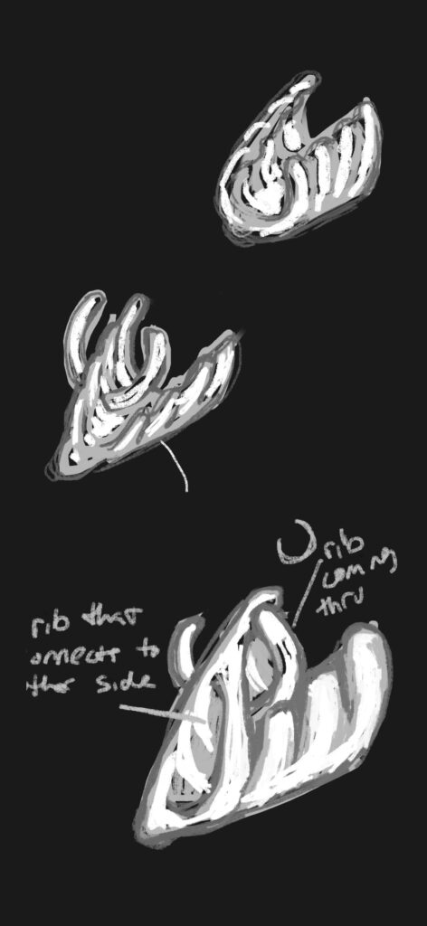
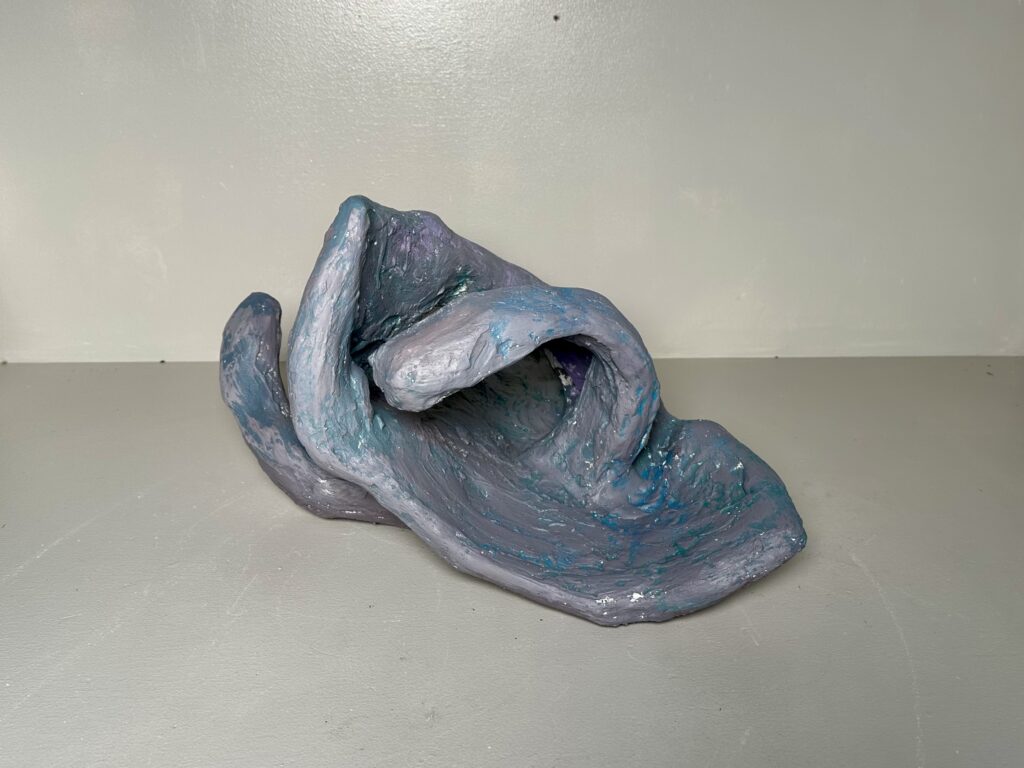
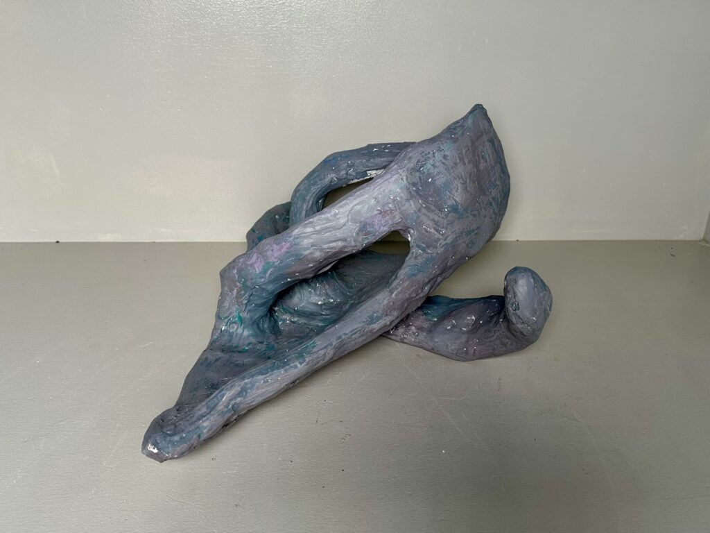
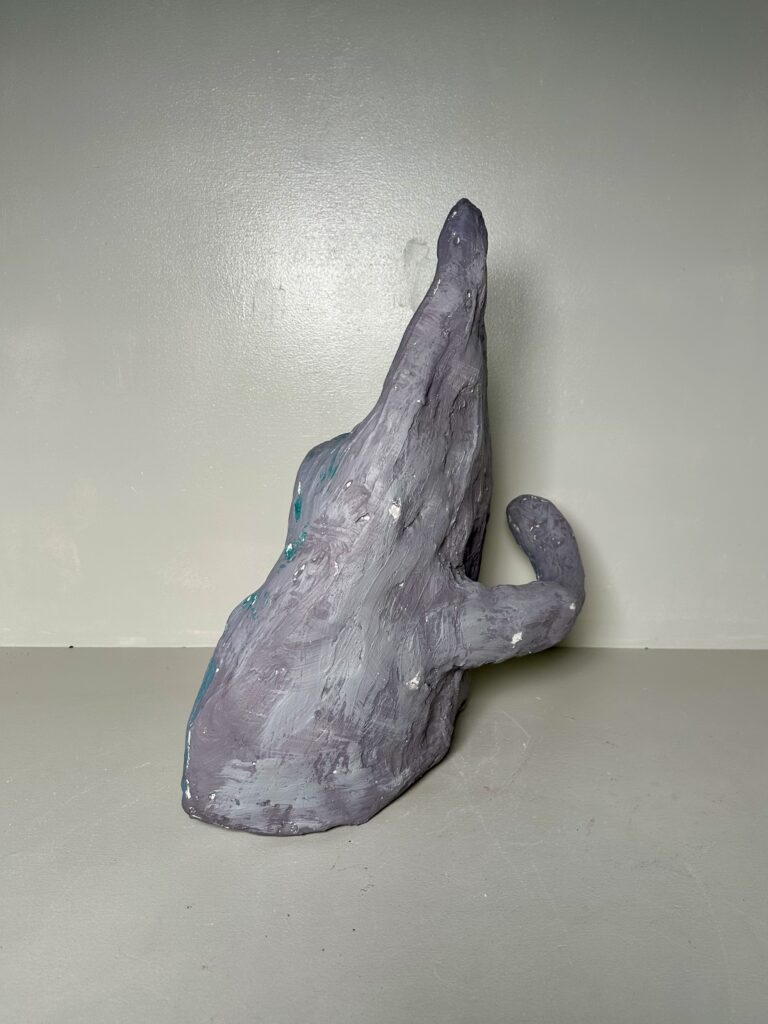
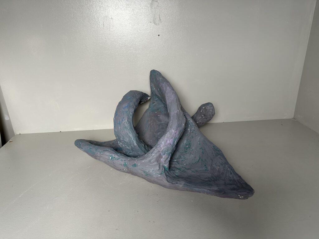
    The only inspiration I took into this piece was the idea of ribs. I originally wanted to paint the ribs on its general abstracted form. Which would include a pair of rips jutting out of place. As I started forming the object with chicken wire, I slowly forgot about my sketch and just started cutting, removing, adding and bending wire into whatever looked more interesting. I think this worked out well since the objective was not to make it look naturalist but something abstract.

    When adding the plaster, I tried to smooth it out as much as possible when wet to save my self from extra work later. As I was sanding it, I tried not to focus on getting a perfectly smooth texture, but to just focus on removing big bumps. After all, this was based on the idea of ribs sitting out decaying. I didn’t think it needed to be “perfect”.

    When it came to painting it, I simply didn’t feel the urge to paint individual ribs anymore. I wanted to paint it all one solid bone-white/cream color. However, there was no yellow paint available for me to mix into a cream. So I threw all plans out the window and just used whatever paint came out of the bottle too fast. I used dry-brushing in hopes of giving it an interesting texture/color as a last-ditch effort to make it look more dynamic.

    digital sketches

    Final Product

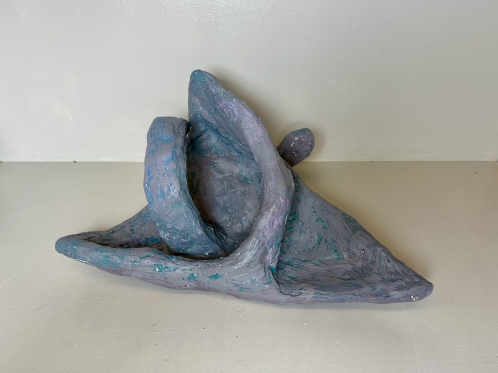
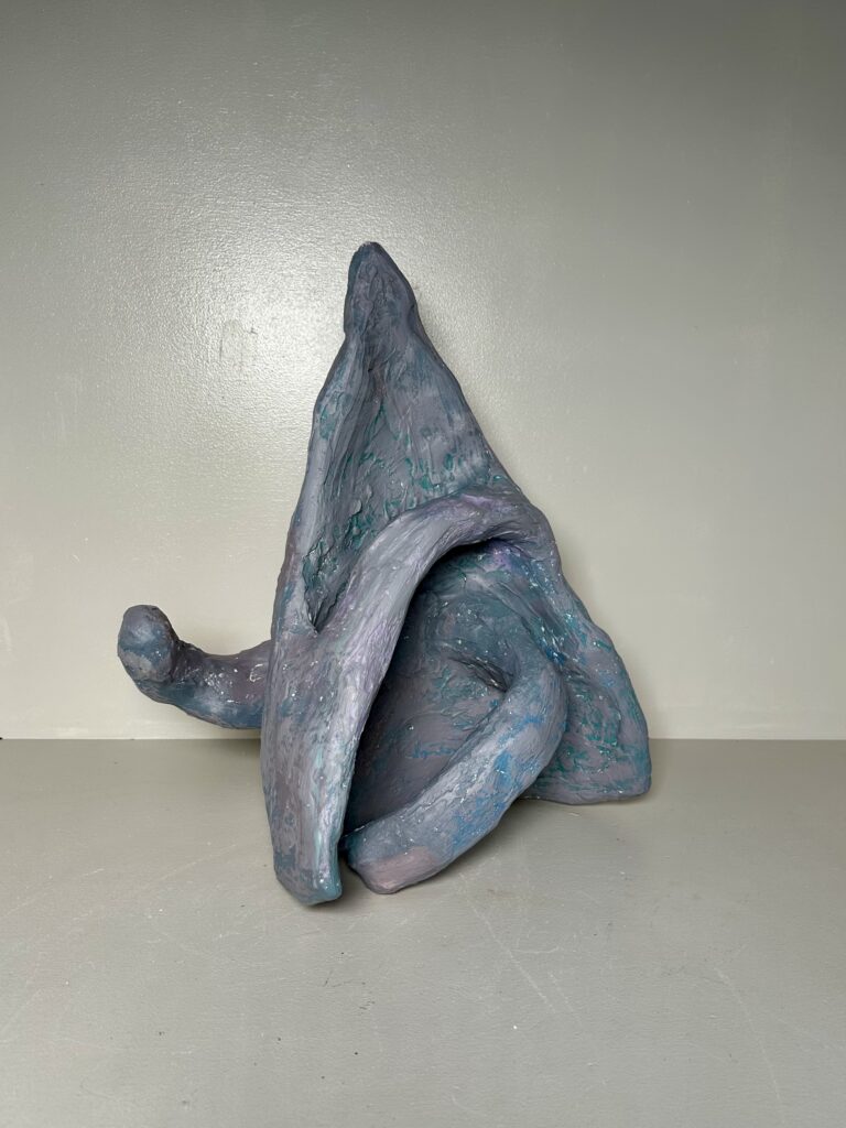
    At the end, I actually really enjoyed the color of the piece. Someone had said the color almost looked metallic which I really liked. It was also compared to a cornucopia, Dorito, shark, and more. Hearing what everyone’s interpretation of it was, was the best part of the project for me. In my eyes it’s still ribs though, and I think the metallic color contrasts interestingly with that. What I pictured as decaying and broken down is now armored and strong.

    The most dynamic aspect of the form is the shape. There are a lot of gestural lines that give the piece movement. Not only that, but it truly can be placed and rotated any way and still have things going that makes it dynamic from every perspective.

  • Historical Vessel Adaptation

    Historical Vessel Adaptation

    FormalElements of design: color, texture, material, scale, 
    TechnicalCorrect use of underglaze and clear glaze
    Use mixed methods of hand building to create a hollow form
    Additive and subtractive methods 
    ConceptualCreate a contemporary object using forms and iconography from the tradition of historic vessels

    For this project you are to choose 3 different vessel forms dated pre 1500. Choose these vessels in regards to shape, composition, and surface design. Have representations (tracings, photocopies, printouts, etc…) of these vessels that you can reference and know:

    • the period of history in which they were created/ date
    • what country they are from
    • a cultural reference of tribe or geographic area

    If you cannot find this information then you can’t use the vessel. You will be explaining your results at the final critique and in written form.

    Sketches

    In a sketch take the three images you have chosen and combine them together into one vessel. Example: use the form of a Korean vessel, the handles from a Minoan vessel, and the surface design from a Mayan vessel. Mix cultures to create the final.

    Final Vessel Guidelines

    1. 12 inches in height.
    2. Use of colored underglazes
    3. Additive and subtractive methods of surface design.
    4. Should be an “enclosed” form that involves an S curve. The volume should be curvilinear and not a vertical tube.
    5. Incorporate handles on the form

    Process

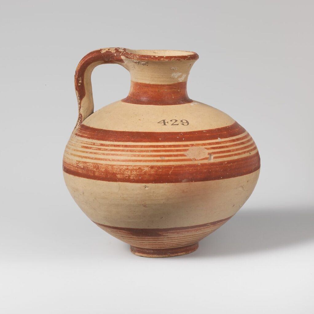
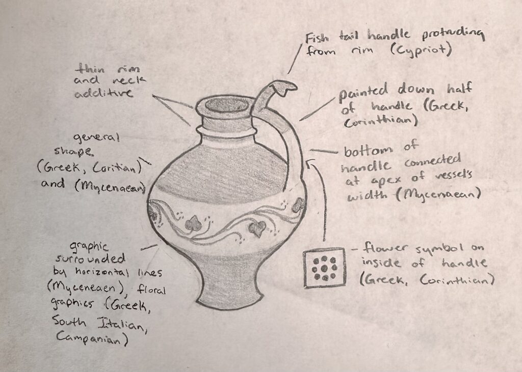
    Vessel A – Terracotta jug, ca. 1600-1050 BCE, Mycenaean culture, H. 4 in.

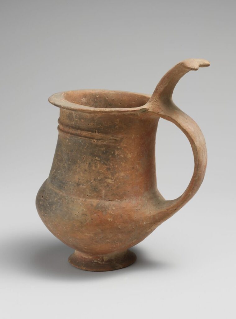
    Vessel B – Terracotta tankard – ca. 1600-1200 BCE, Cypriot culture, H. 4 9/16 in.

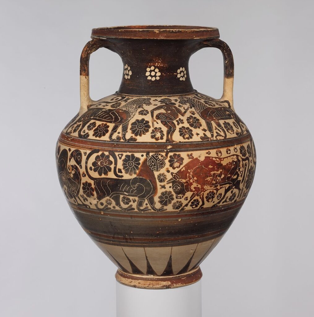
    Vessel C – Terracotta neck-amphora, ca. 620-590 BCE, Greek, Corinthian culture, H. 11 1/2 in.

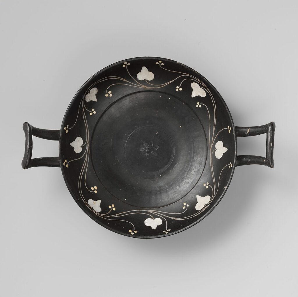
    Additional Ceramic Piece – Terracotta kylix, ca. 400-350 BCE, Greek, South Italian, Campanian culture

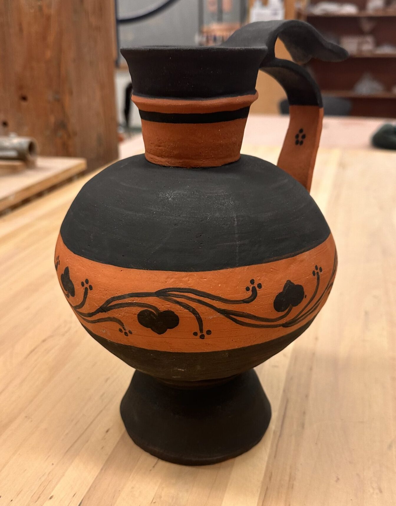
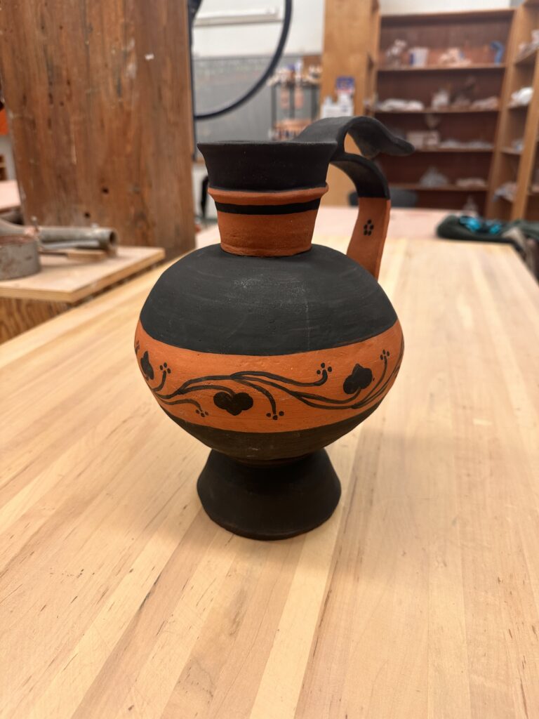
    Vessel A & C is where I got most my inspiration of the general design of my Frankenstein vessel. I took another element of Vessel A from the handle. I wanted a handle to come from the rim of the vessel down into the greatest circumference measurement of the vessel like it does in Vessel A. I wanted another handle to come from the top of that handle and bow out like it does in Vessel B. The top handle also share the same shape at the tip of the handle as the reference. Vessel C was the only reference I felt unsure about recreating. I wanted to incorporate a graphic design that wrapped around the entire vessel and was enclosed by horizontal lines, but didn’t wasn’t to create an elaborate illustration of people, animals, and florals. That’s why I added another reference to add to my vessel that’s illustration was much more simple and my style. To make sure I had enough elements of Vessel C in my adaptation, I included the handle being painted halfway and added one of the geometric floral symbols on the inside of the bottom handle.

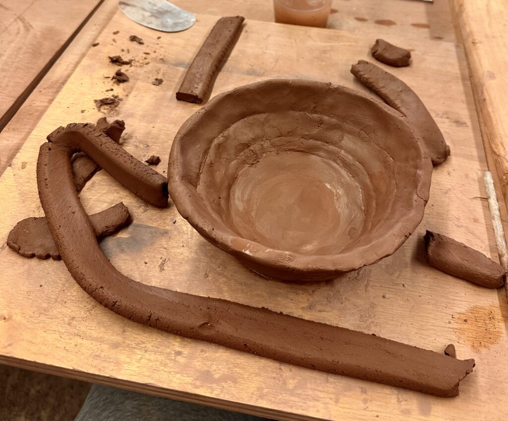
    My first step was to make two large bowls to later attach later to create the circular part of the vessel. This was my second experience ever trying to create a vase-like sculpture out of clay. So this step was an experimental process of figuring out what working for me.

    My first strategy was to make flattened coils that I would tediously attach in layers. However, this seem to become futile as I would thin out the walls too much in the areas I had attached the coils. So during my second go around of making the bowl I used much larger coils I didn’t bother flattening. After I would attach the coils to each other I would flatten them out myself in a pinch pit fashion. This proved to be a dramatically quicker process that gave me similar enough results.

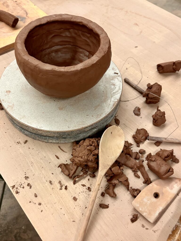
    Although, I tried to get a round shape that was closer to my sketch, it ended up being my circular than I anticipated. I tried to recover the original shape as much as possible by patting the walls in with a wooden spoon.

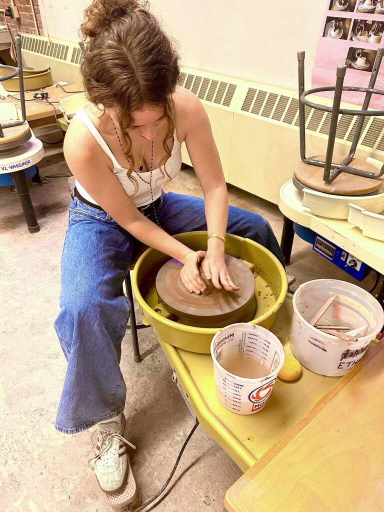
    I had never used the wheel before so I decided to only do the smaller parts of the vessel, like the base and neck, on the wheel.

    Using the wheel for the first time was an interesting experience. I surprised at how difficult it was to control the clay. Luckily, I found it to not be too frustrating because when I failed, it just felt like I was making mud pie. It reminded me of using a sewing machine where you use a pedal to control the speed, at the higher speeds you could more easily loose control and risk the precision of your work, which in this case would result in a mud pie.

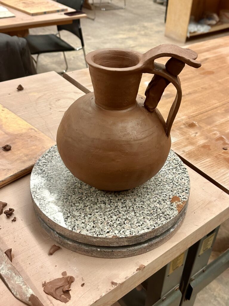
    I started with the neck of the vessel which I hard a hard time forming because I can’t breaking the neck when I tried to extend the length of the rim. I settled for a less dramatic rim and then attached the neck to the hollow sphere I’d already made. I took a break from the wheel to craft the handles of the vessel. I used a flat strip of clay to make the handles, one

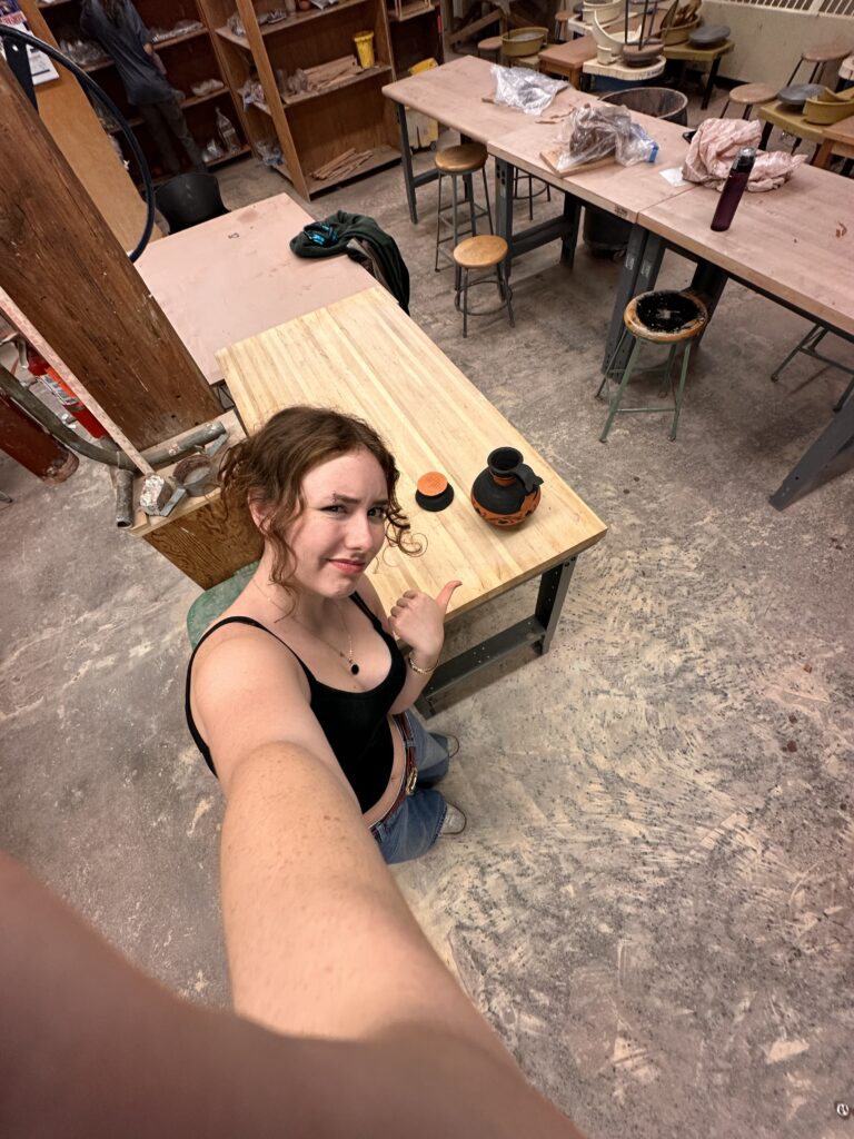
    for the big bottom strip, and one for the smaller top piece. The most difficult part of making the handle was trying to get the clay to stand up right. The clay had to be wet enough to attach and bend, but dry enough to stand up right. I had difficulty with the latter and relied on other clay to keep the form up right. As you can see in the picture above, the clay acted as a pillar to keep the handles from drooping. It might seem that there is one handle with a decorative flourish on top, but I would argue that there are two since you could carry the vessel from either part.

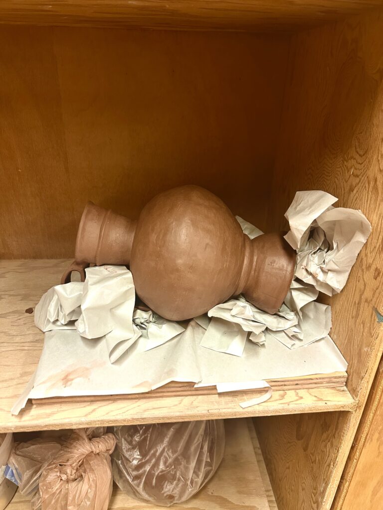
    Now that the handle was attached I would be able to accurately measure the height of what I had for the vessel so far, so I could calculate how tall to make the base. Although a tall base wasn’t in any historical vessel references, it was my way of adding height to the vessel to meet the assignment requirements. Once I attached the base I realized it was too short by a 1/2 inch, so I made another base to attach to the bottom which made the whole base over 13 inches. I created essentially a kiln bomb so I carved out the bottom of it. Something I didn’t foresee was that because I took away the support the solid base was providing, it began to collapse. I tried to rectify this but no matter what I did, it just kept sinking into itself. I decided to take pressure off the bottom by laying it down, the only problem with that is the handles or the walls of the vessel would warp from the pressure on them. To prevent contorting it, I crumpled up newspaper to try to support the sides and handles. This worked surprising very well. If course I couldn’t prevent all the caving but I tried to fix the damages when it was less wet.

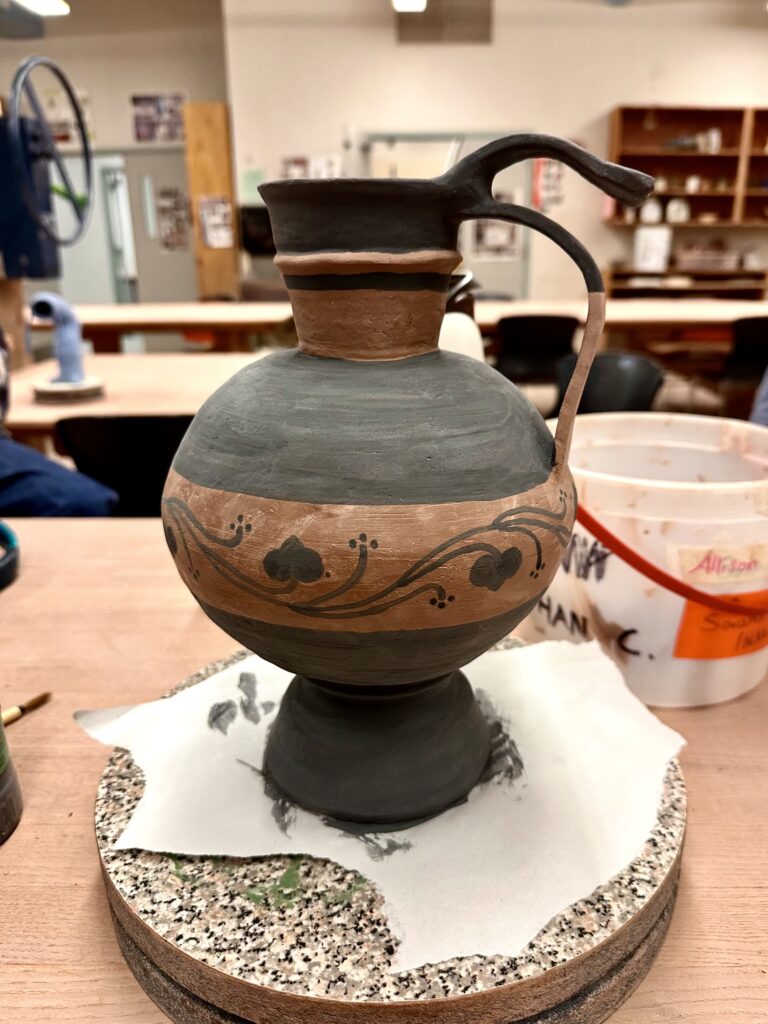
    After it was bone dry I was able to begin painting with black underglaze similar to Vessel C and the additional ceramic piece, leaving the rest of the vessel a natural warm terracotta color similar to the warm tones in the rest of the references. To line up the horizontal lines smoothly, I put the vessel on the wheel and held the paintbrush to it, so all I had to do was push a pedal. After creating my lines I blocked in the glaze and drew on my design.

    Then my vase got bisque fired! I checked to see if y handle was secured to the vessel as that was what I was most worried about since they were so thin. Luckily, they were fine. As I was taking pictures of the vessel it popped off the base! At least you can see my score marks on the vessel for proof I did my best.

    At this stage all I have to is reattached the base. I was originally thinking to put a clear coat of glaze on top of the entire vessel but now I’m reconsidering this after seeing how clumping it can look. If I had the tools available, I would use an airbrush to apply the glaze to get a thin even coat to avoid getting a goopy texture on it.

    Final glazing aside, I think the this form works really well. The contrast of the circular middle part of the vessel next to the planar slabs creates an interesting visual especially with how it’s painted. The geometric black stripes also contrast well with the organic pattern that enevlops the vessel. The whole piece has pleasing contrasts as I choose black against the bright orange of the bare low fire clay. I also think the handle that hovers above the lower longer one adds an interesting flair that brings the piece personality.