Category: Ceramics

  • Expressive Hand

    Assignment

    Project #1: Expressive Hand

    Formal Scale, proportion, size, gesture, color
    Technical·      Maquette creation·      Direct observational rendering using sighting tools·      Balance a larger than life scale object·      Subtractive method   
    ConceptualCreate a hand that gesturally conveys a message to the viewer  

    Description:

    After defining what expressive means you will construct:

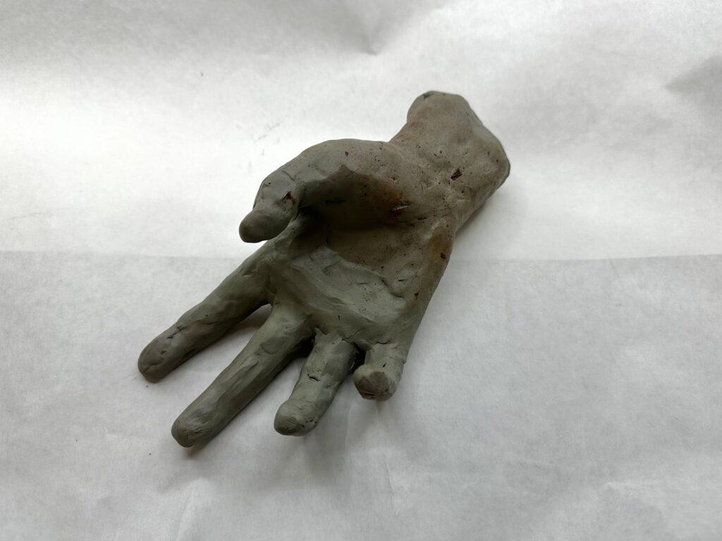
    • a 3-5” wire and plasticene hand using sighting tools
      • this will be a type of quick maquette that should be flexible and bendable for practice
      • due start of class Tuesday January 26
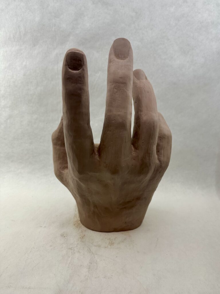
    • a 12-16” clay hand to be fired and completed
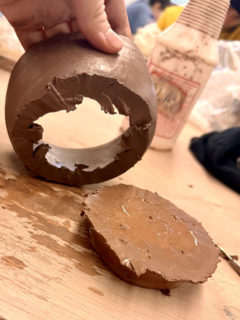
      • this hand will start out as a solid form and then need to be CAREFULLY hollowed out to avoid exploding in the kiln firing.
      • There will be an option for using 2-3 colors of acrylic paint including the orange brick color of the fired clay surface.
      • greenware hand due Thursday February 5
        • final painted hand due TBA pending firing in kiln

    This hand should be expressive in gesture instead of expressive in an object it is holding.

    Process

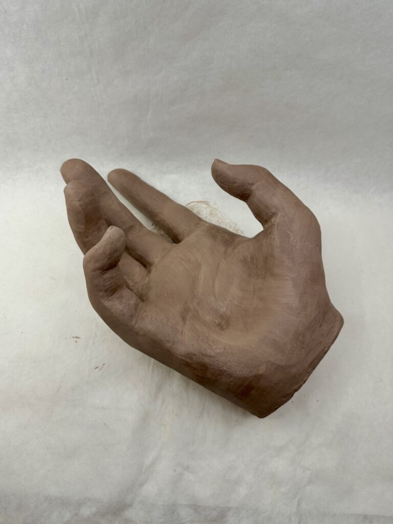
    To create my maquette, I bent wire in a shape of a skeleton hand using my actual hand as reference. The maquette would serve me as a tool later on, so getting the proportions of everything now would be helpful later. By layering the wire on top of my hand I was able to ensure that the proportions would be relatively close. When I added the modeling clay, I made sure to add the more clay in between my wire finger to have accurate line of where I would need to “start” and “end” the finger from the palm. The only big thing I noticed that I would have to change in my real sculpture was the thinness of the hand. Like scientists with dinosaurs, I shrink wrapped the clay to the wire more notably in the palm where I was less worried about messing up proportions.
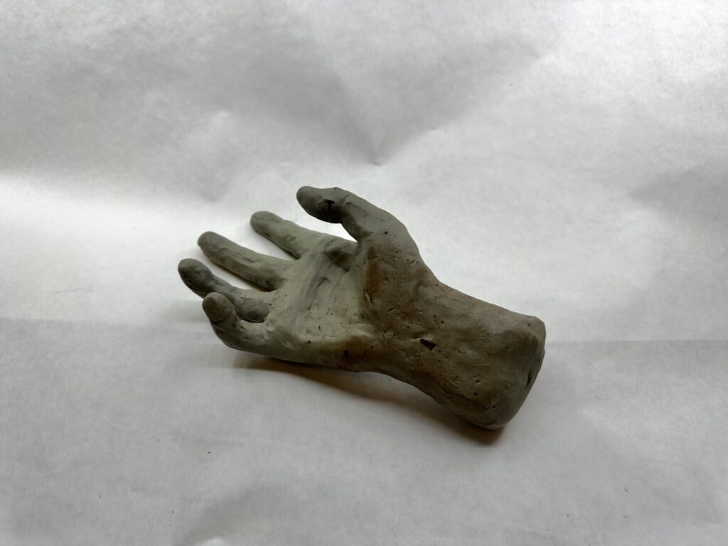
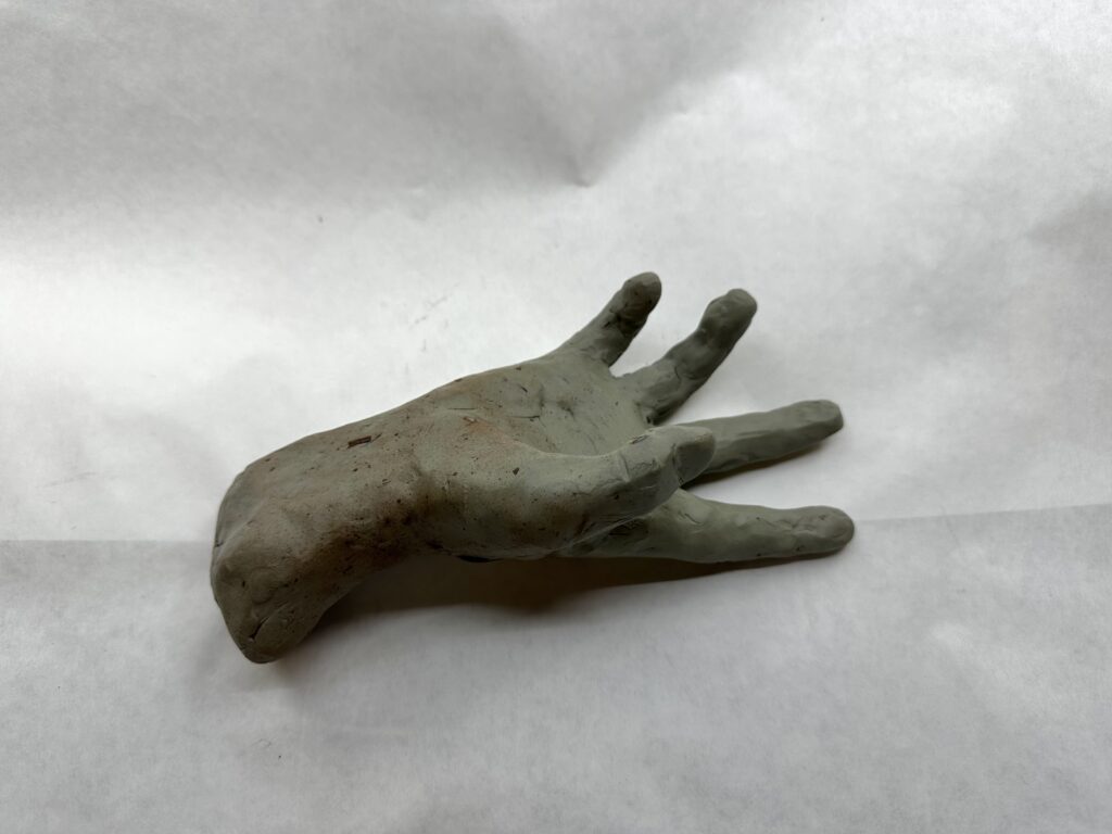
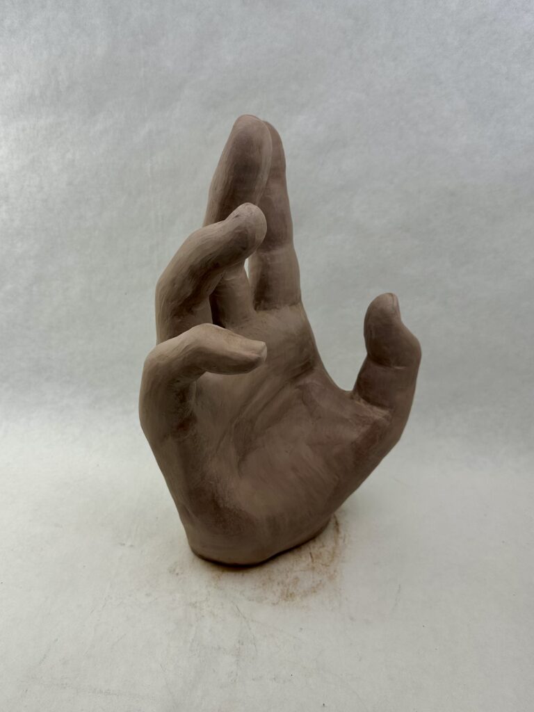
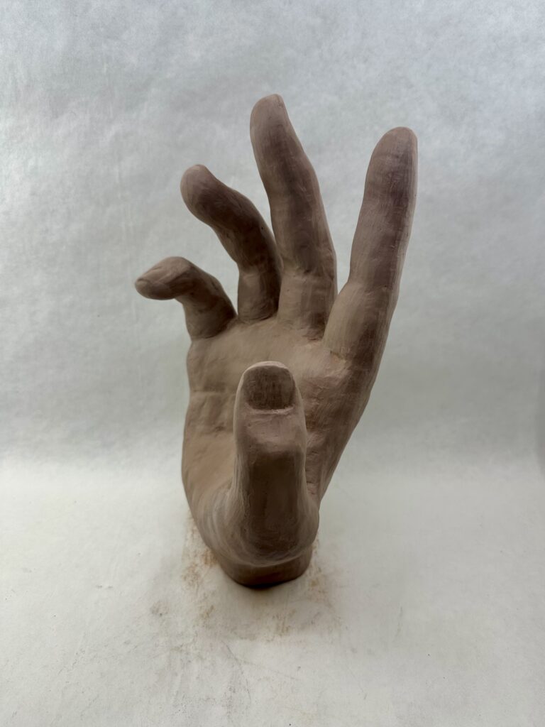
    At first, when I started working on the larger hand, I couldn’t even allow myself to think of details like the nails or creases. I had to tackle trying to get the sausage like forms to bend in the same spots as my real fingers, cutting them into relatively equal thirds on the “front” side. I would have to constantly alternate using subtractive and additive methods as I realized things like that the middle of the palm has less padding than the bottom that has a lot more because the thumb sticking out, or that the skin between the fingers is raised much higher on the “front” side than where the knuckles start on the “back” side.

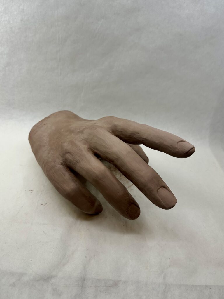
    Once I finished getting basic proportions and shapes down, I was able to focus on the more detailed areas. The nails were especially difficult for me. I had to redo them because at first I made them flat but realized they bend around the finger giving them more surface area. On multiple occasions, I would have to rewet the ends of the fingers since they were the spots that dried quickest, to add the nails that would jut out past the finger tip. I only wished I filed my nails before using them as a reference.
    Final Product

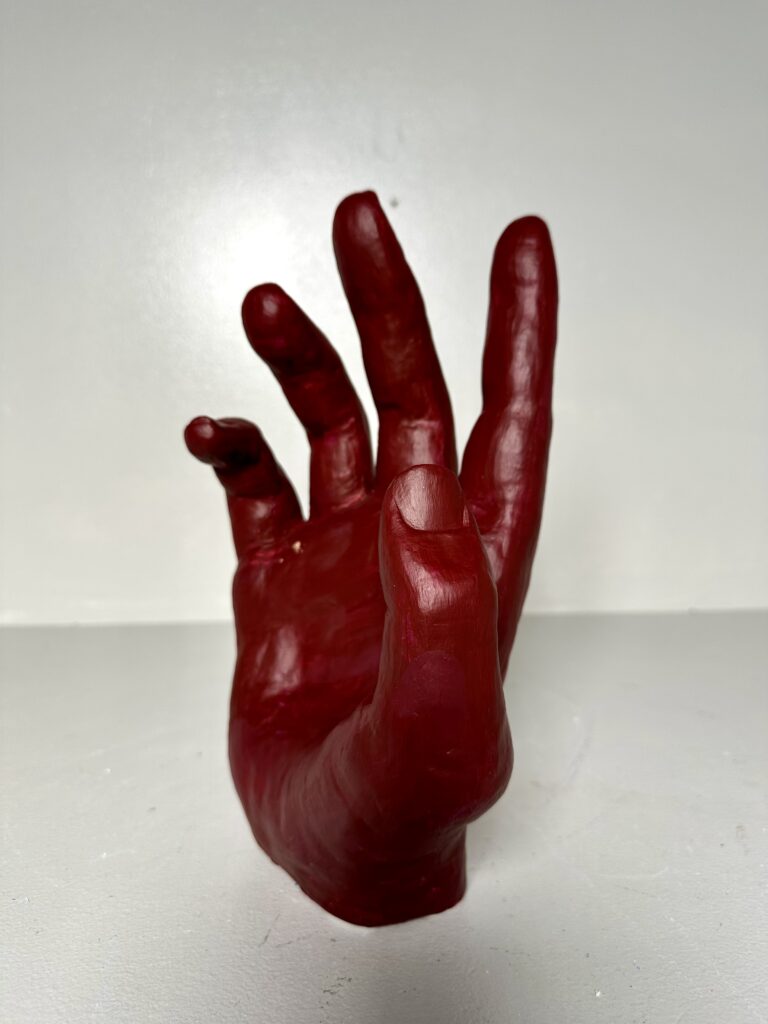
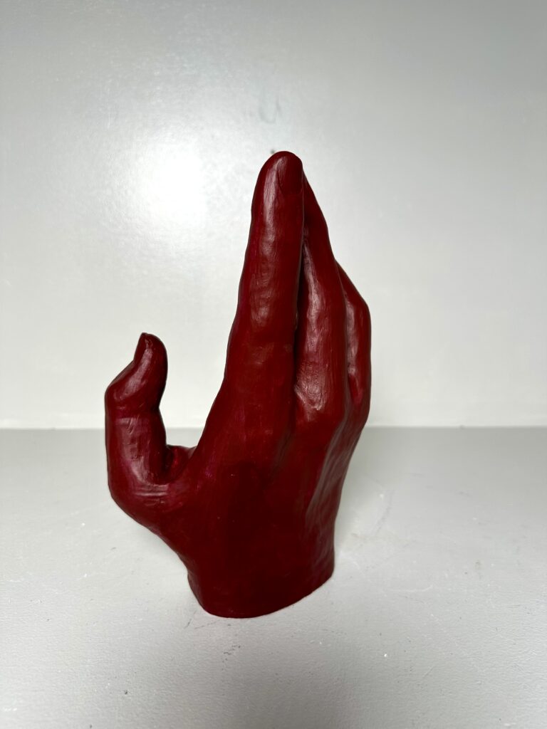
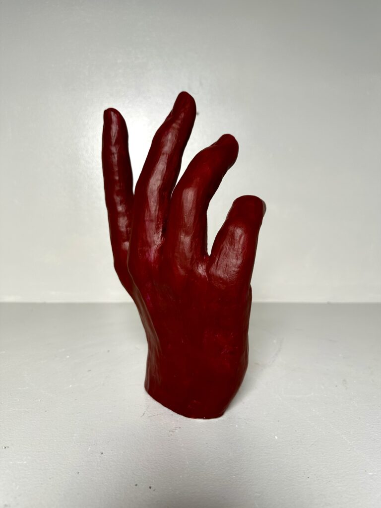
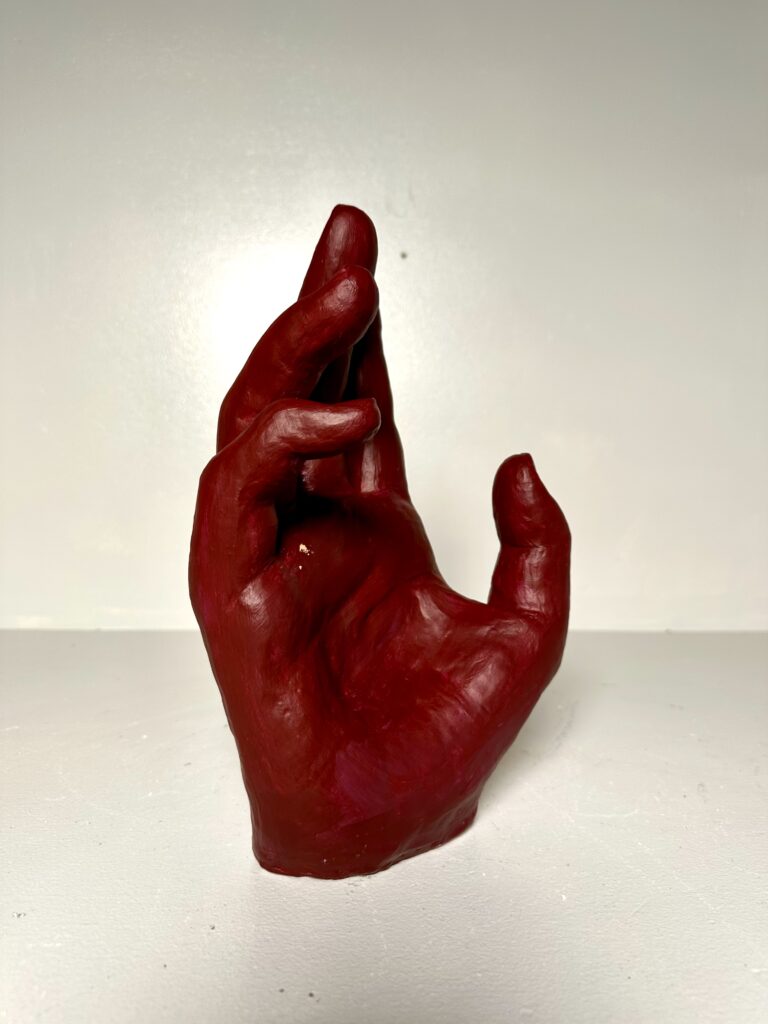
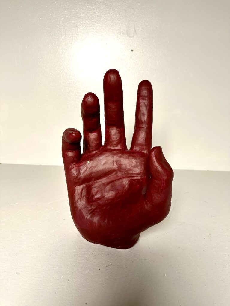
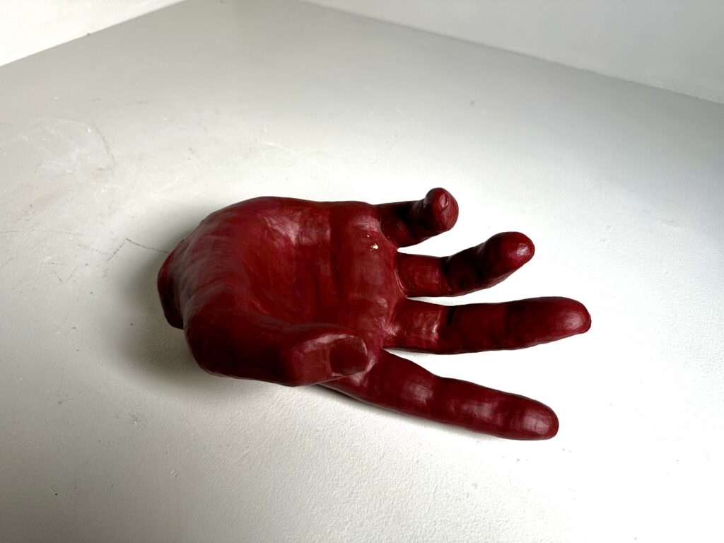
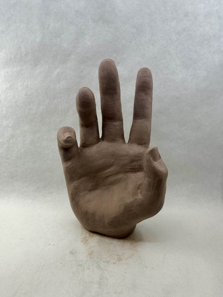
    After carving out the center of the hand to make it dry faster and putting it in the kiln, I had to paint it. I painted this multiple times because the first time it was periwinkle which looked more like a doctor’s latex glove. I went into a different direction making it a deep red. The color contrasts to the gesture making the viewer think about the meaning more. While the color is an intense red that makes people think of anger and rage, the gesture is soft, hesitant, or desperate. This could represent someone presenting well-tempered but is really furious inside. Personally I think that gives the piece more meaning than the original periwinkle idea.

    Overall, this piece is dynamic with not one side being the “front”. If it stands up, you can walk fully around the piece and see the fingers bending in interesting ways from every angle. Unlike the fingers that mimic each other’s positions, the thumb is pulling away from them creating a focal point that stick out from the visually dominant area.
  • Adornments

    Adornments

    Assignment

    CategoryDescription
    FormalCreate a 3D customer based product
    TechnicalWork at a smaller scale on an iterative product series·       use high fire clay and glaze·      
    Consider efficient methods for creating forms 
    ConceptualUnderstand what material, time, and customer driven work needs to consider to be profitable

    Working with high fire cone 10 clay you will research products of adornment for the body. The goal is not to appropriate/reproduce an existing product but to create something of your own design. 

    Guidelines: 

    • products should be between 1-5″ in size
    • be a decorative function of adornment to be worn on the body
    • involve color, design, and iteration

    Process

    I firstly needed to think about my audience and what type of product I was going to sell. I thought about how events like Earth Jam, Autumn Fest, and Winter Market, all had very similar items: crocheted items, prints, clothes, and jewelry. I wanted to avoid going into an oversaturated market, so I didn’t want to make jewelry if possible. I thought about the current fashion trend of wearing a carabiners and thought that those people must need something more than just keys to put on them. That’s how I arrived at the keychain idea.

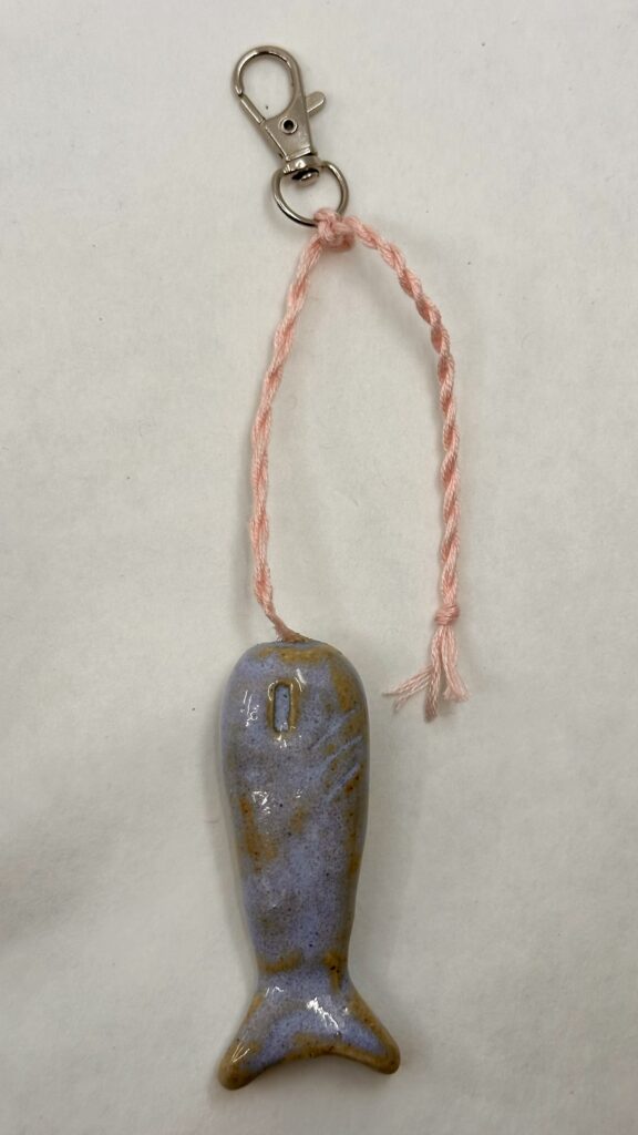
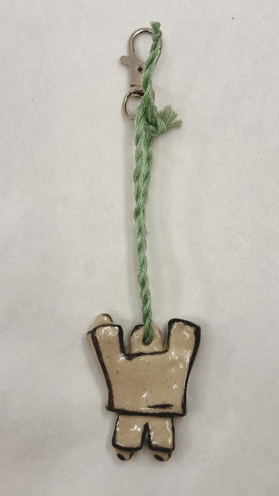
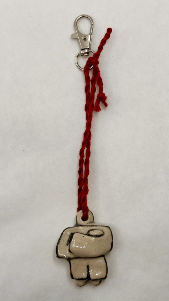
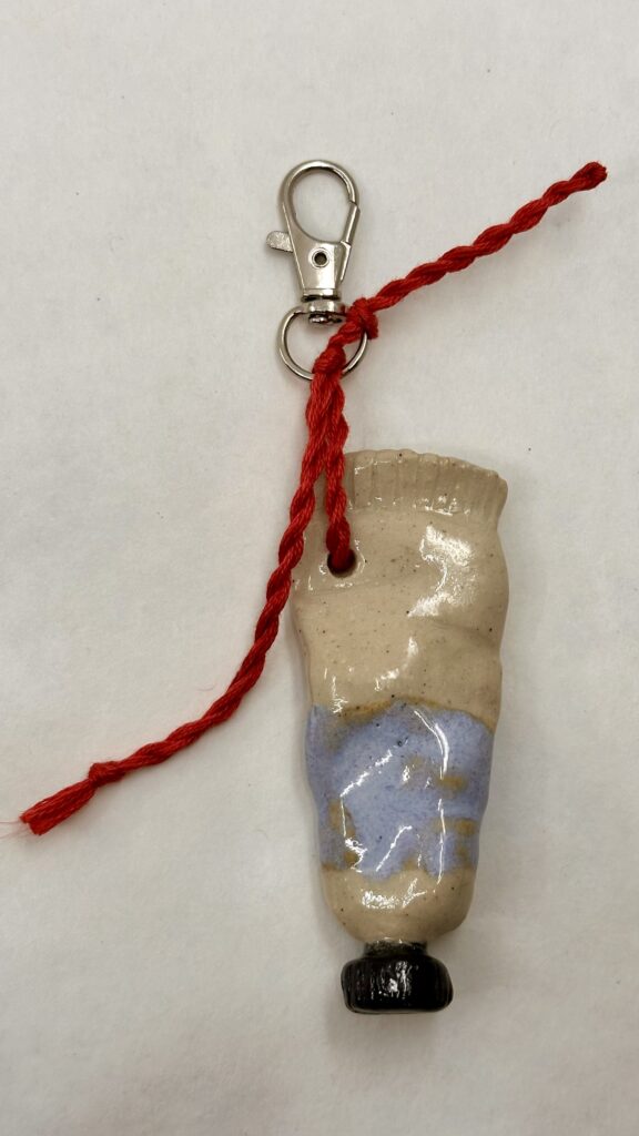
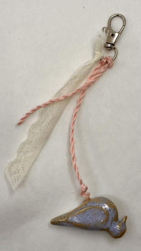
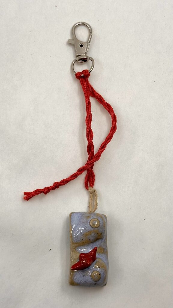
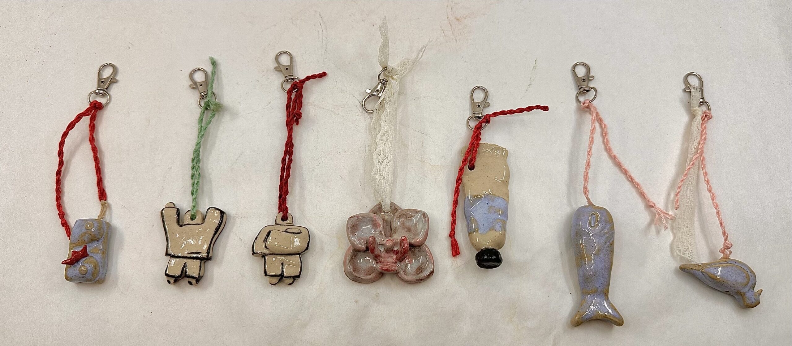
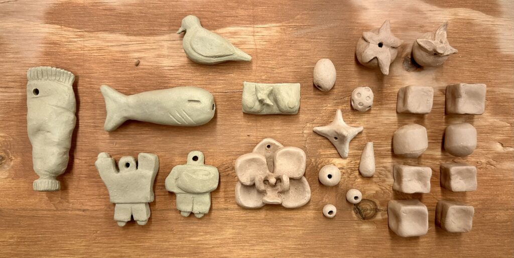
    When I considered what charms to add to the keychains, I thought to myself well I’m a college student, what would I want to buy?, and that’s basically how I went about this. I made a paint tube for art kids, tomatoes and a fish for the nature type folk, and matching people charms that could be used as BFF keychains. Most of the adornments are unique to one another so the customer will feel more special and feel as they are getting something more personalized. I also threw in a couple quick-to-make abstract charm adornments for time constraints I might face. These keychains would also be occasionally paired with other strings of fabric to make the piece less simple and more dynamic.

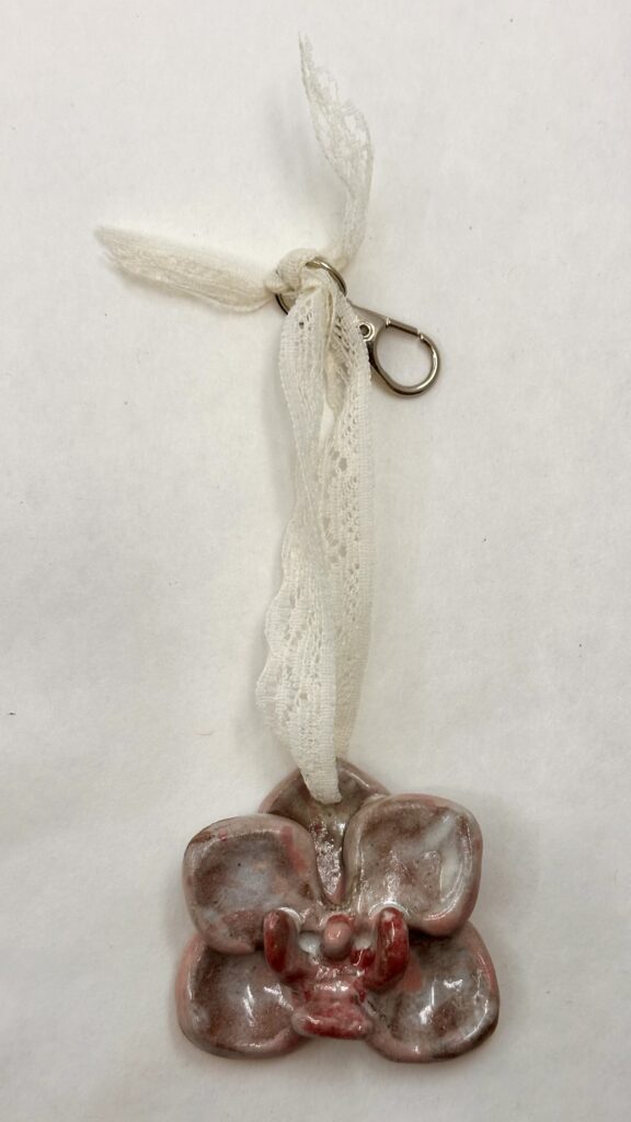
    I first started off by using the low-fire clay just because I missed the announcement where we were told we could use high-fire. I soon discovered that the low-fire clay was extremely hard to sculpt on a small scale. That’s why you see all of the basic bead looking charms done with low-fire. The most complicated thing I made with the low-fire clay was the orchid, which might have even been easier to create than the sharp leaves of the tomatoes. The high-fire clay was much more cooperatable and forgiving, I was able to smooth edges much better too. After a leaf broke off one of the tomatoes, I gave myself some room to be able to ditch a charm or two by making a couple more than needed.

    For glazes, I kept my color pallet simple, Taking advantage of the already made opal blue high-fire glaze to expedite the process. Unfortunately, I could not come up with up with a good enough pink in time which was truly devastating. I used blues, greens, and black and white instead which I guess work just as good.

    Most of the low-fire charms weren’t loaded into the kiln despite having put them on a shelf so I didn’t end up having

    ten pieces in the end. This was disappointing since I couldn’t possibly make up for that since it was the last fire of the semester. However, I worked with what I got. I think I could have been more carful checking if there was glaze in the holes before I had loaded them into the kiln because a few of the pieces’ holes were glazed shut so I had to super glue the string instead of simply threading it through and tying it. I thought I had checked the pieces pretty well beforehand but I suppose I might have forgotten to do a double check which could have saved me a lot of time (and money since I had to buy the super glue). Making the strings/chains of the keychains was actually pretty fun too. I used some old lace I had lying around and some embroidery thread that I thrifted for a different project in the past. I just took the thread, folded it in half, twirled them together, and they naturally twist themselves in the middle to create that sturdy string. This added to the piece a lot because it gave me a chance to introduce or repeat colors into the charms.

    Cost

    If I were to continue making these pieces and sell them for profit, I would need to price these adornments at $37.60 each to make livable wage. This doesn’t include one time purchases like superglue for a quick fix or things like studio equipment/studio subscription. If I would to do this over a long period of time, presumably my speed at which I could make these products would increase, so I could use less time to make them, sell more for a cheaper price, and therefore sell more, and make more. This would be ideal anyway since my target audience at the moment are college students.

    Products in bulk:Per adornment:
    Estimated average cost of high-fire clay:$2.60 (1 lb)$0.26 (given estimated weight is 1.6 ounces)
    Keychain hooks:$5.00 (70 pc) $0.07
    Thread:$2.00$0.01
    Labor time:—$37.17 (1.5 hrs, livable wage in NH)
    Total costs:$9.60 + livable wage $37.60

    Final Products

    What I think makes these pieces dynamic is the contrast in color I used. I used the grey scale against bright colors in pieces like the people and paint tube. The people are completely black and white which look nice against the bright string used as the chain. The chest also is a good example of this. Although it doesn’t have black and white, the good contrast comes from the soft pale blue against the harsh bright red in the thread and spikes. Another reason this charm contrast well is because of the geometric spikes jutting out from the organic dominant shape of the chest. This also creates a good focal point for the viewer. The orchid also creates an interesting focal point using the same technique of something smaller like the saturated petals coming out from the dominate area. I believe an interesting form in itself can make an adornment dynamic; the chest, flower, and dove, are good examples of that.
  • Kathy Butterly Presentation

    Kathy Butterly Presentation

    Audio

    Transcript

    SLIDE 1-2

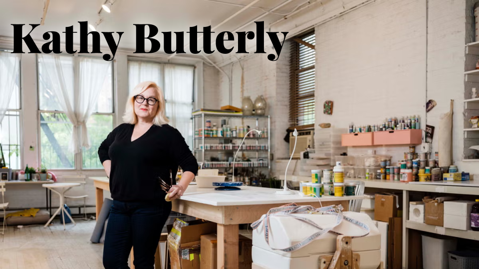
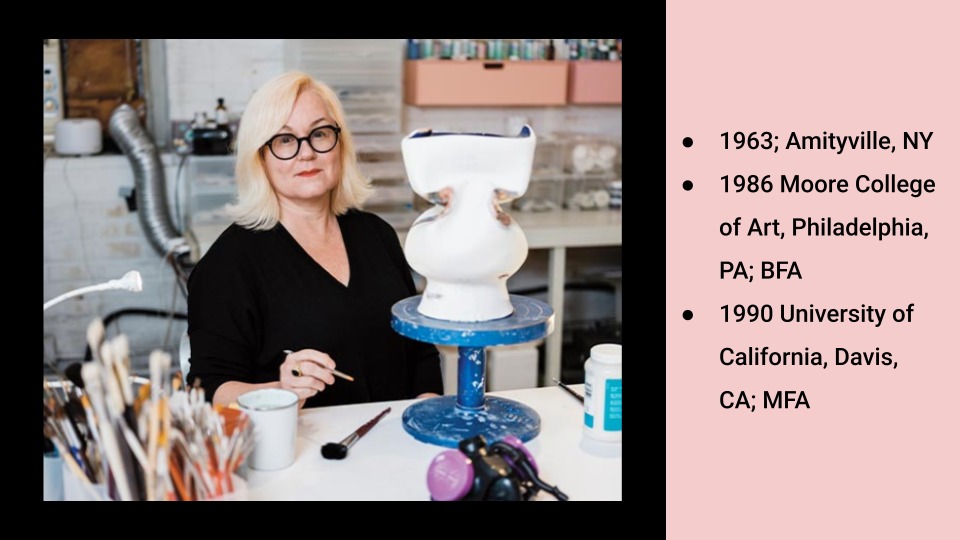
    Kathy Butterly was born in 1963 in Amityville NY. She graduated from Moore College of Art – located in PA in 1986 with her Bachelor of Fine Arts. She then received her Master of Fine Arts at University of California in 1990. 

    SLIDE 3

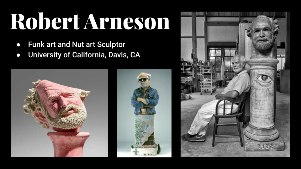
    Butterly studied with Robert Arneson who was a funk art and nut art sculptor. Arneson, like Butterly, had also studied at University of California. He later became a ceramics professor there for nearly three decades.

    SLIDE 4

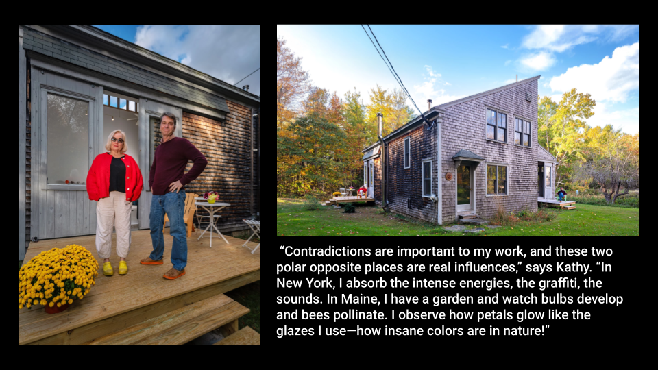
    Another artist Kathy Butterly is associated with, is her husband Tom Burckhardt, who does abstraction and figuration paintings. They both have a studio in Maine where they split their time between NYC and the rural environment.

    “‘The light in Maine is just so beautiful,’ says artist Kathy Butterly…‘You see more of the sky here than in New York. You’re very acutely aware of the elements.’” adds Tom Burckhardt.

    SLIDE 5

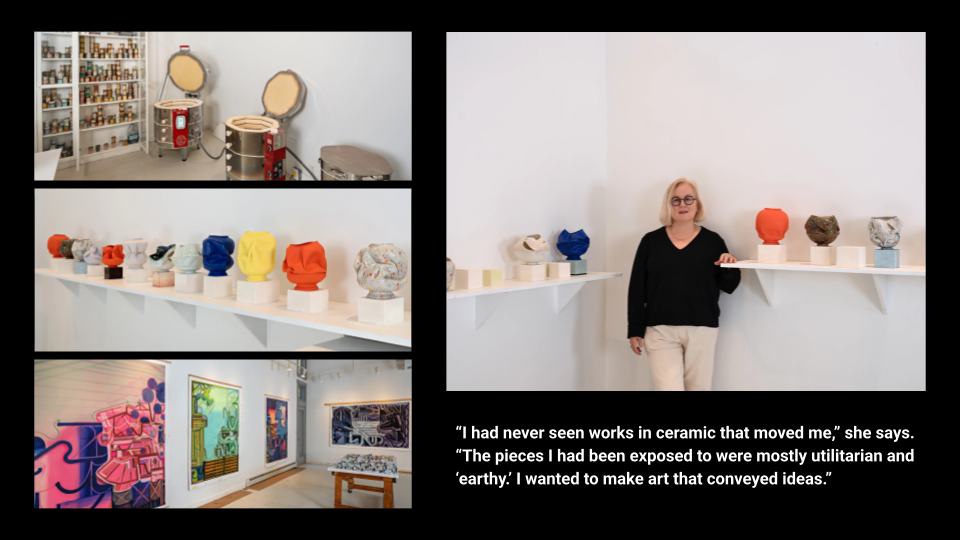
    Here are just some more photos of their studio in Maine, on the bottom left you will see some paintings by Tom Burckhardt.

     “Contradictions are important to my work, and these two polar opposite places are real influences,” says Kathy. “In New York, I absorb the intense energies, the graffiti, the sounds. In Maine, I have a garden and watch bulbs develop and bees pollinate. I observe how petals glow like the glazes I use—how insane colors are in nature!”

    SLIDE 6

    As an undergrad at Moore College Art and Design, Butterly thought that she would be an oil painter. 

    “The pieces I had been exposed to were mostly utilitarian and ‘earthy.’ I wanted to make art that conveyed ideas”

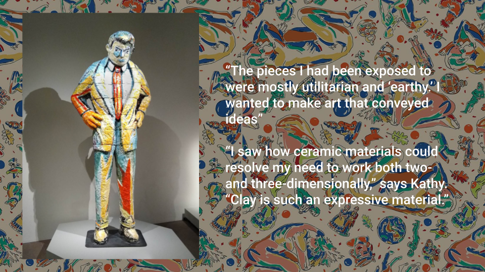
    That was until she saw a sculpture exhibition in 1984 by Viola Frey. Who was a painter and drawing in addition to sculptor. Renowned for her large and colorful glazed clay sculptures of people. This nontraditional, boundary pushing style is what sparked Butterly’s work.

    “I saw how ceramic materials could resolve my need to work both two- and three-dimensionally,” says Kathy. “Clay is such an expressive material.”

    SLIDE 7-10

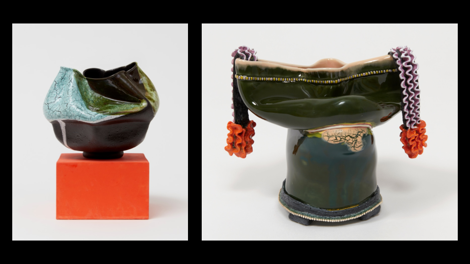
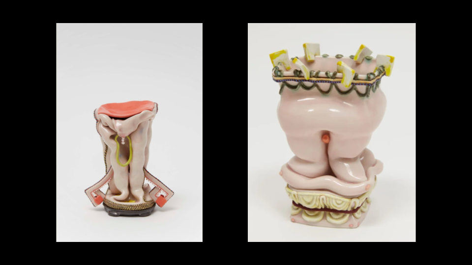
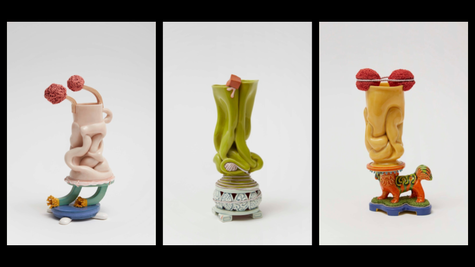
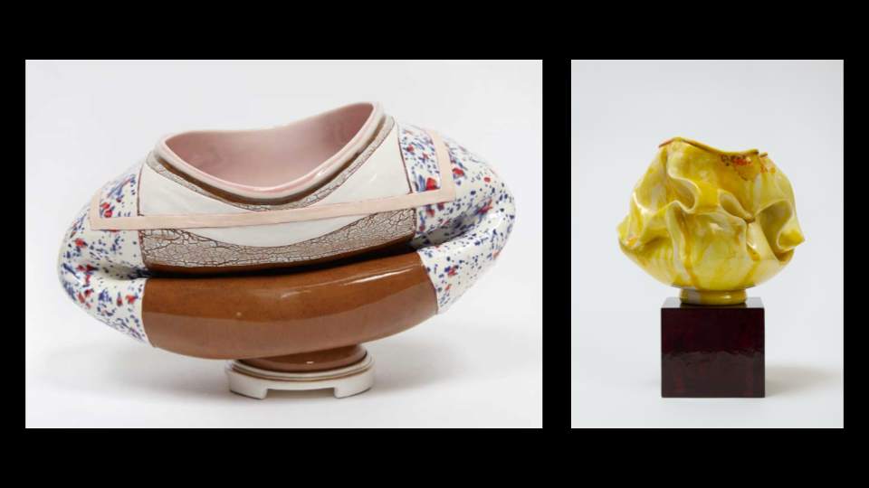
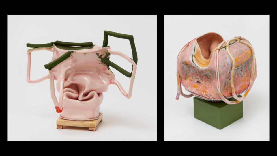
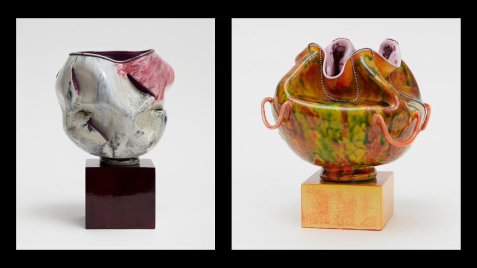
    Butterly uses a variety of muses today including but not limited to children’s toys, pop culture, dolls, asian culture, and the body. Butterly’s work often explores the female figure and the stereotypes and expectations that come with it. The vessel’s contortions, bulges, and lumpy midrifts make it impossible to use as a functional mug or cup. They resist the expected purpose of the vessel. Demonstrating Butterly’s strength in conceptual and abstract ideas. 

    Kathy Butterly creates vases and vessels that stand no taller than 12 inches. She tends to create sculptures closer to 6 inches though to be able to create intimate, complex pieces. She starts with a simple porcelain slip cast form, then pokes holes and folds in the walls of the form. She then will often decorate the exterior with ropes of porcelain or carefully crafted beads.

    These sculptures are presented on colorful pedestals or plinths to support the even more vibrant forms. Butterly’s color usage is something she is known for. Using vibrant colors resembling those from mid-century modern. A style which highlights clean lines, and organic shapes. The reason for her remarked use of color becomes clear when you realize the tedious work she puts into the layers. To achieve the iconic painterly effect on the surface of the piece, Butterly will fire and layer glazes on her works up to 40 times.  

    As Butterly works on each piece, she allows the materials and her creative flow drive her the process so each vessel is unique. 

    SLIDE 11-12

    I admire how Butterly leans into the concept of imperfection. She uses the flaws of her art like errant firing to her advantage. Going with the flow and being flexible with “happy accidents” in art is something I try to improve on. Of course not just in craft but conceptually too; she extinguishes any expectations a viewer might have of her ceramics.

    Her work being as conflicting and complex as it is, truly inspires me to do the same in my art work. It made me realize that my ideas don’t need to be fully flushed out to express myself. They merely need to create a spark or opportunity for the audience to feel conflicted or seen through the contradictory.

    I’m inspired by Butterly’s artwork mostly from her use of pallet. She uses a wide range of colors that are bright and playful. Lately I’ve really liked the concept of embracing femininity in my artwork; Butterfly does a beautiful job at this, with the usage of pink alongside the lace-like elements that resemble small strings of pearls. 

    SLIDE 13

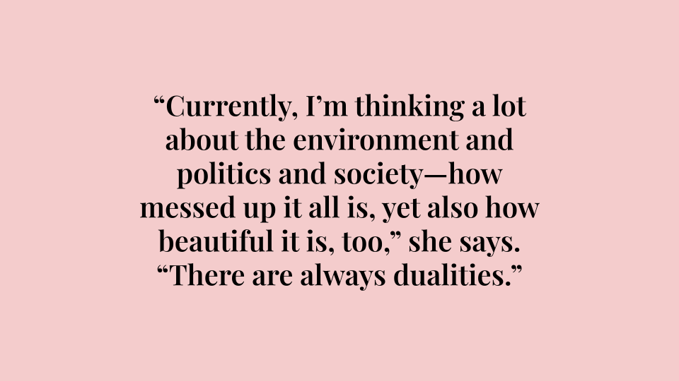
    I’ll leave you with a quote from Kathy Butterly that might resonate, “Currently, I’m thinking a lot about the environment and politics and society—how messed up it all is, yet also how beautiful it is, too,” she says. “There are always dualities.”

    SLIDE 14

    Thank you.


    Works Cited

    Frankel, David. “Kathy Butterly.” Artforum, May 2014, www.artforum.com/events/kathy-butterly-205136/. Accessed 17 Sept. 2025.

    “KATHY BUTTERLY.” Kathybutterly.com, 2019, kathybutterly.com. Accessed 16 Sept. 2025.

    “KATHY BUTTERLY.” KATHY BUTTERLY, 2020, www.kathybutterly.com/cv. Accessed 16 Sept. 2025.

    “Kathy Butterly: Out of One, Many / Headscapes.” Portland Museum of Art, www.portlandmuseum.org/kathybutterly. Accessed 16 Sept. 2025.

    Mcavoy, Suzette. “Studio Visit with Kathy Butterly and Tom Burckhardt.” Decor Maine, 2025, www.google.com/url?q=www.decormaine.com/art/studio-visit-with-kathy-butterly-and-tom-burckhardt/&sa=D&source=docs&ust=1765066373656961&usg=AOvVaw0pyHY4IY-GfVpymo6DRJwh. Accessed 16 Sept. 2025.

    Stern, Melissa. “KATHY BUTTERLY at JAMES COHAN GALLERY – COLOR in FORMING – Art Spiel.” Artspiel.org, 9 Mar. 2022, artspiel.org/kathy-butterly-at-james-cohan-gallery-color-in-forming/. Accessed 16 Sept. 2025.

  • Wheel Thrown Elements

    Wheel Thrown Elements

    Assignment

    FormalCreate a visually dynamic object using color, open forms, texture and rhythm.
    TechnicalLearn to use the pottery wheel. 
    Create a functional object.
    Use mixed building methods to create a form.
    ConceptualLearn to use bowls/open form to create a closed form.

    This is a multiple part project that should have results on specific dates.  Wheel thrown elements you make will act as components for a pair of larger objects and functional objects in themselves. You should incorporate mixed methods of building objects in Part C and try not to think of the forms as bowls but elements for Part C of the project.

    Part A:

    Throw 10 high walled open form bowls. Guidelines:

    • use 1.5 to 2lbs of clay
    • have an opening diameter of 5-7 inches.
    • Be wheel trimmed before removal from the wheel head

    Part B: Four of these bowls need to:

    • relate in surface design and volume.
    • be wheel trimmed.

    Part C:  Using the remaining forms you are to create two closed vessel forms with handles. The final pieces should inform the viewer of your intent in defining “vessel”. You will be asked at the final critique to explain your intention. 

    Process

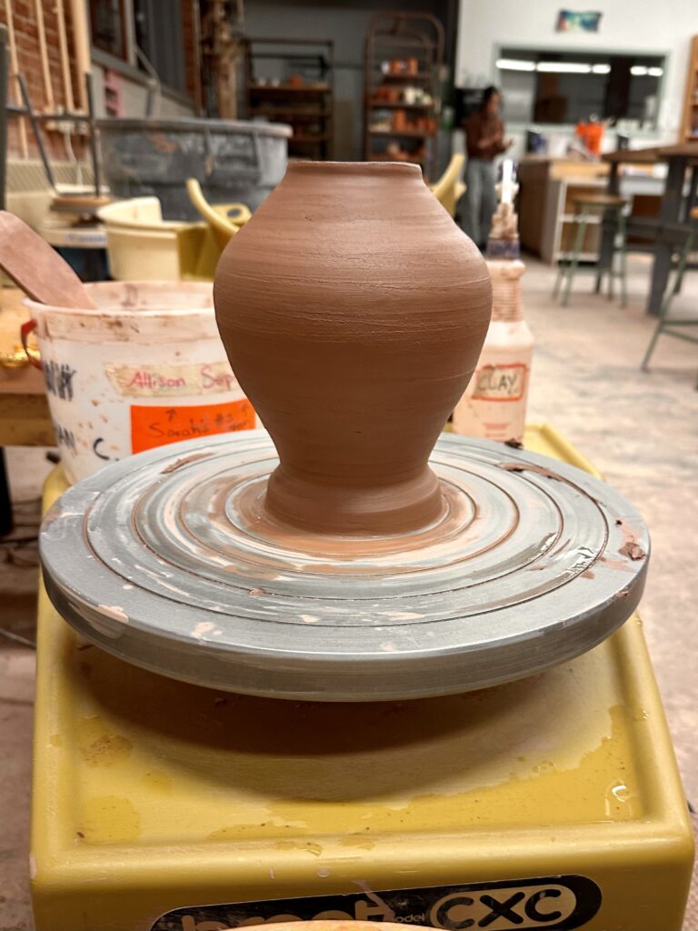
    Of course I started off the project by throwing ten bowls. It was my second or third time using the wheel and I had noticed some pain in my right wrist. I had broken a part of my wrist when I was a kid and realized that may be the cause of my pain. I had to spend some time figuring out a way to cone and shape the clay in a way that didn’t strain my wrist which was definitely a challenge during the whole process.

    I noticed some people’s approach to the project was to make six of the bowls with the intention of making the vessels out of them. I thought that may be helpful except I have never thrown bowls before and I had half expected a lot of fails during the process, so I decided to make all ten bowls first so I could use the worse ones as parts of my vessels.

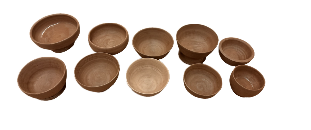
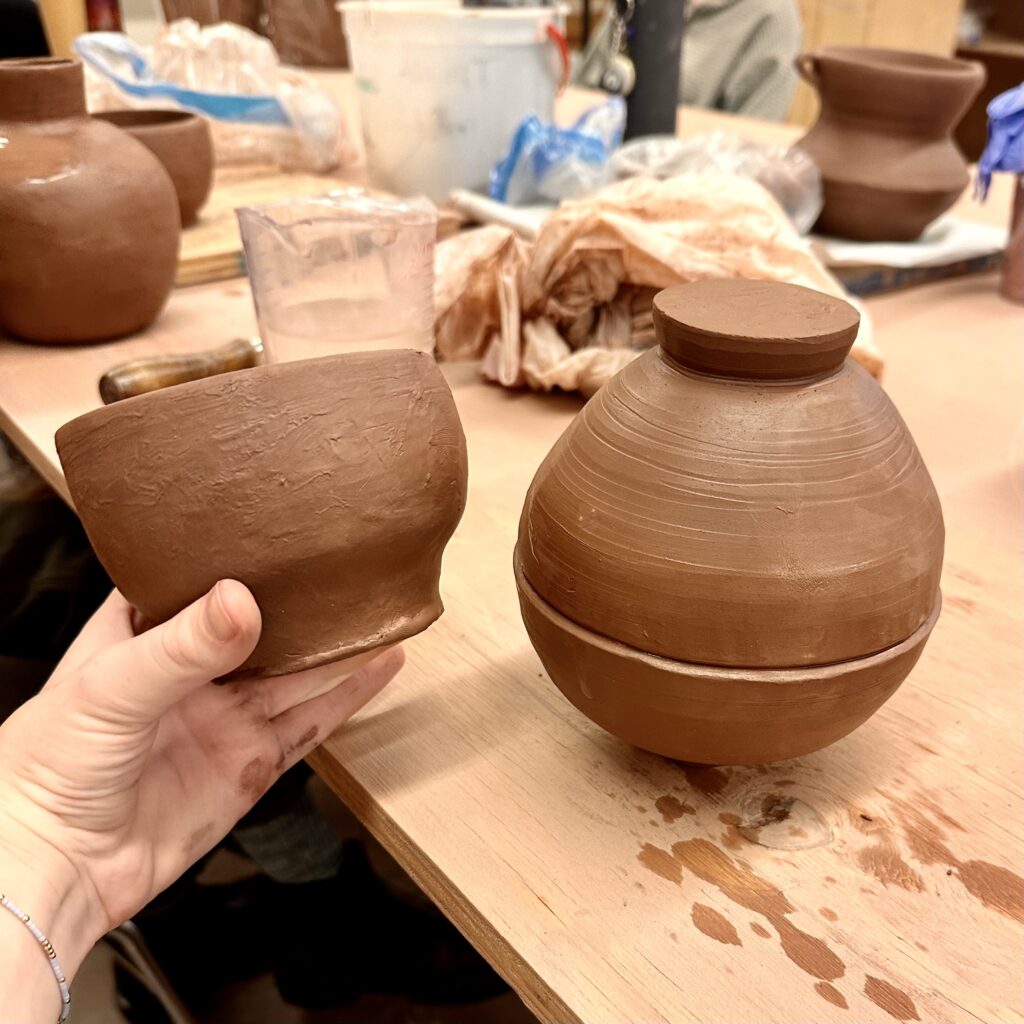
    To the right are the ten best bowls I

    produced. In the picture only one of them is trimmed, but I made sure to trim all of them even if I was using them for the vessels as I thought that would help me align the centers better.

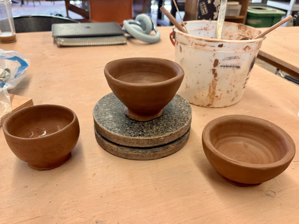
    To get started on the next step, I picked four bowls that related most to each other in size and form to be my four final bowls. Once I had those picked out I used the rest to make the vessels. I took the three smallest bowls and decided to make a vessel with those first. Out of the three, I picked two bowls with about the same circumference and stuck them together by the rims to make a closed form. There was some wrestling I had to do with the clay to get the rims to stick together just right as they weren’t perfectly the same size as each other. They fit relatively well however, and I was able to polish it up well by trimming it again on the wheel.

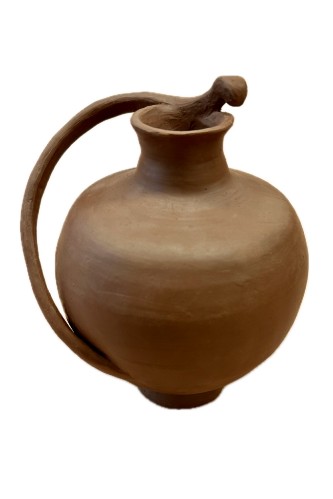
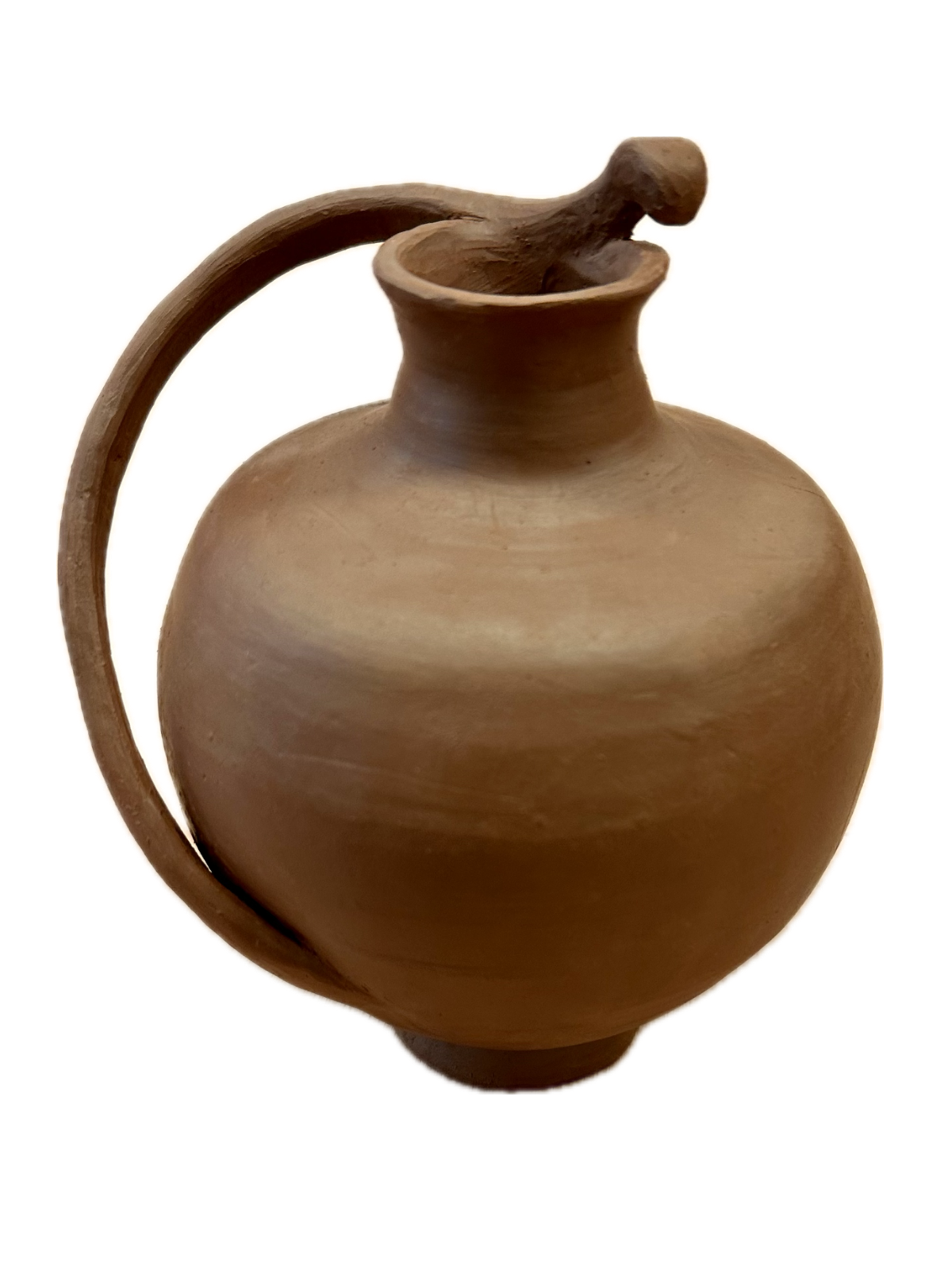
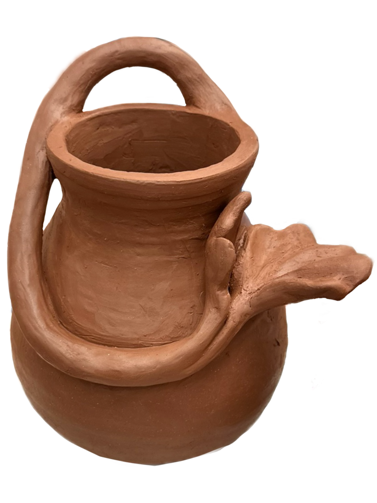
    Then I got started on the handle of the vessel. I deconstructed the remaining bowl and was inspired by the wheel-like shape it created. I thought it would be a shame to not take advantage of the already circular slab I accidentally created. So, I trimmed this slab into a thin curved coil, then I diagonally wrapped it around the vessel. While I did this I used newspaper in between the handle and walls of the form to keep the handle suspended in the air while I shaved away and shaped it. Then I just added a flare on top to decorate it.

    The last thing I did was create the whole into the neck of the vessel. I wanted to do this last so that the

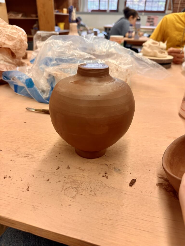
    form wouldn’t dent or fold into itself while I worked on it. I basically was working with a balloon that allowed the air inside to keep equal pressure to the walls of the form. I learned this trick on my first ceramic piece and it’s definitely come in handy in handy since. I used the wheel again for subtractive methods to carve out the neck so that the rim was equal in volume all around.

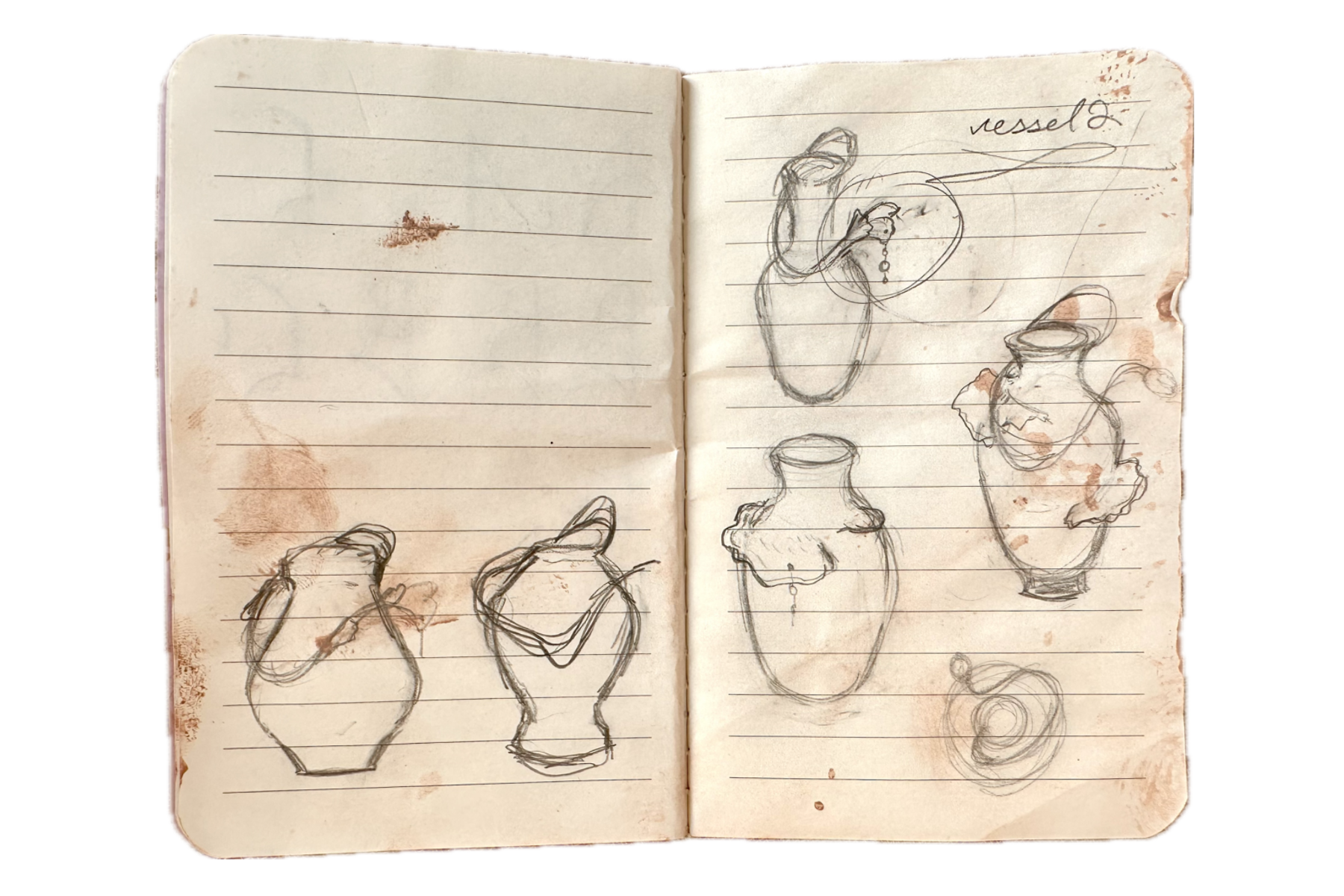
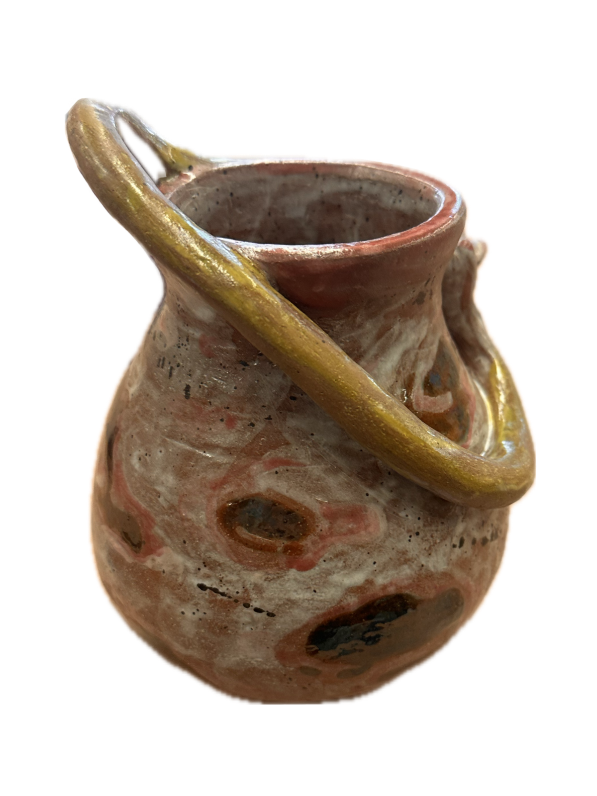
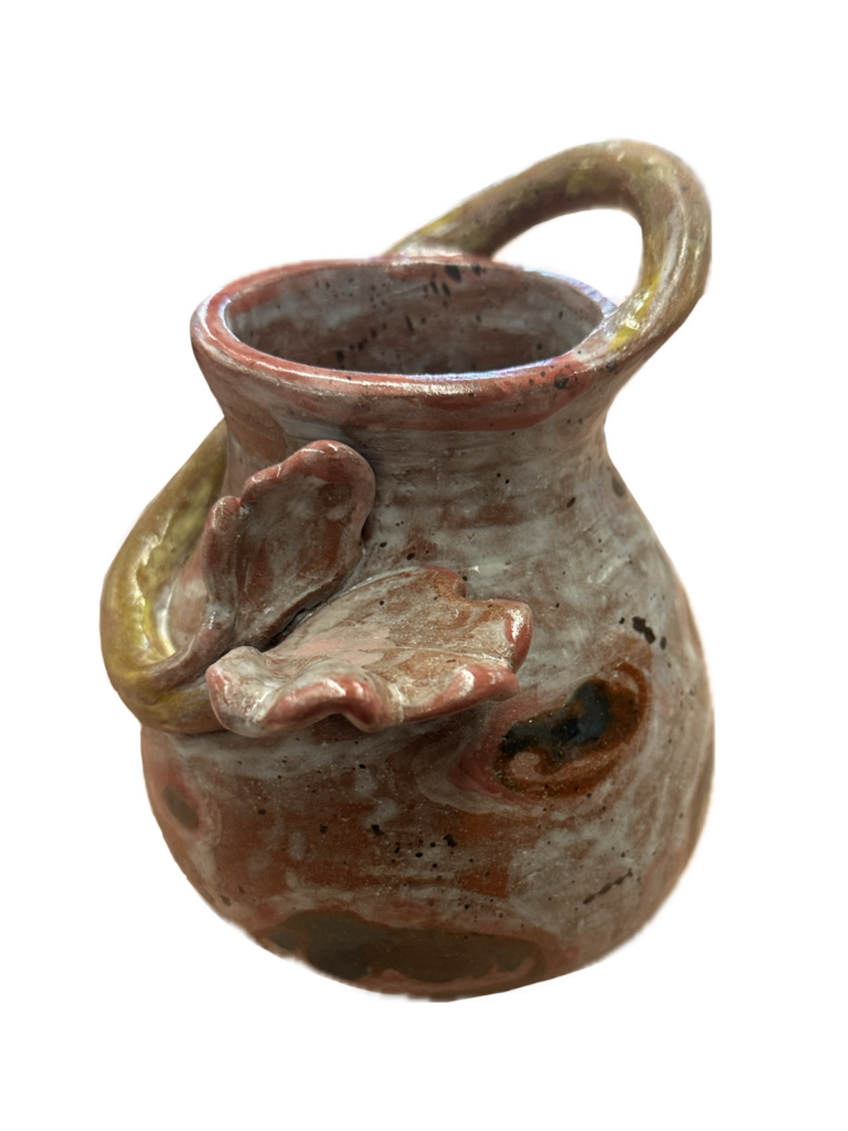
    Once I finished sculpting the first vessel I started on the second. The remaining three bowls I had to work with didn’t cooperate well together, they were too different in size to make anything out of them. So I decided to scrap using those bowls and make new ones. Now that I was going to create bowls with the specific intention of making a vessel out of them, I put a lot more thought into the shapes of them. I create a few sketches of what type of vessel I wanted that guided my throwing process (see right page of notebook). I knew I wanted something botanical and have a place to attach string of non ceramics charms to it that mimicked water or dew dripping.

    After I had made the two bowls I had to then conjoin them together. I was working on a time crunch and the air vent wasn’t working at this time, so the most I could do was wait for the clay to partly dry and work on the flower part of the handle in the meantime. However, I still had to add the bowls together while they were still very wet. Luckily, the form didn’t cave in on itself too much. I also decided to trim the closed form on the wheel while it was still wet. I think this expedited process worked well in this case but if the form was any bigger or thinner, there could have been backlash in my attempt to speed up the process.

    Since the vessel wasn’t as tall as my sketches, I redrew it, this time accurate to width and height as the vessel I made (see left page of notebook). I made an option if I were to flip it either way to see which I liked better. Once I decided on which way I wanted it to go, I added a coil for the handle that wrapped all the way around the vessel. I used the newspaper technique once again to hold it in place. Adding in the floral decorative piece I worked on while the bowls were drying, was one of the more difficult parts of the process. The flower was crumbling and falling apart as I was trying to adhere it to the slip and scored area. I had to use a column
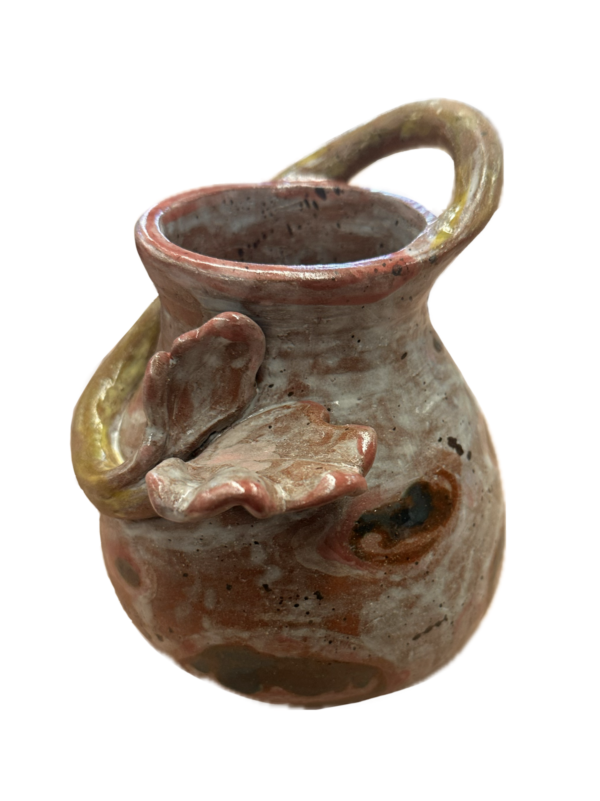
    of wet clay to hold up the flower while it dried. Then once it was leather hard, I realized I forgot to add a hole in the flower for the string of beads to hang from, so in the process of adding that, it broke again. I must have reconstructed it about four times before it stayed. I was sure it was going to break in the kiln.

    I think what contributes to what makes these pieces dynamic are the handles that can be seen from all angles of the piece. They both create interesting focal points at the end of the handles. The first vessel’s hovers

    above the visually dominated element of the round bottom. This gives it great contrast since the focal point is much smaller in scale to the rest of it. However, the base of the vessel is also quite small, so it creates a high contested, yet balanced visual for the viewer. The second vessel, although the focal point is close to the visually dominated area of the piece, has gestural lines created by the handle that act as an arrow that lead your eye out from the rim of the vessel down and up away from the established element of dominance.

    Overall, I think these pieces work really well as a series. They both are closed forms that have organic handles that wrap around the vessel. If I were to continue this series I would definitely keep trying to add height and more elaborate botanical handles.

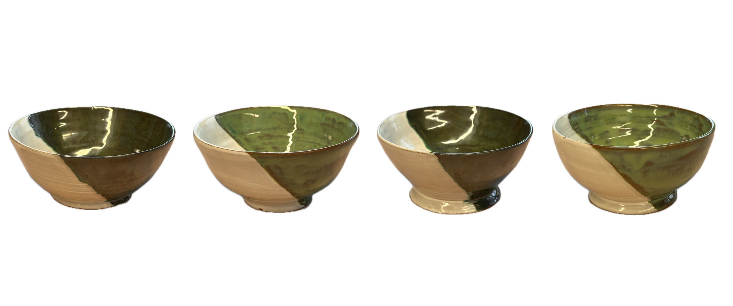
    Glazing them was what I was most nervous about. Not being able to exactly predict how glazes will turn out once they’re fired is intimidating. Honestly, I think I was intimidated for good reason because the second vessel turned out muddy. I realized I should have put more layers on the next day, but when I went back to glaze again, it had already gone in the kiln. A part of me wishes I dipped both pieces fully in white to save me from ruining the pieces but I’m glad I experimented. I’m happy with how the dark colors contrast against the light though. I think once I reglaze and fire it, that aspect will potentially be a strength.

    Final Glazed Products (pics coming soon)

    Bowls
    – 2 foliage green
    – 2 bottle green

    2 Vessels
    – 1 final with glaze
    – one pre second glaze

  • Historical Vessel Adaptation

    Historical Vessel Adaptation

    FormalElements of design: color, texture, material, scale, 
    TechnicalCorrect use of underglaze and clear glaze
    Use mixed methods of hand building to create a hollow form
    Additive and subtractive methods 
    ConceptualCreate a contemporary object using forms and iconography from the tradition of historic vessels

    For this project you are to choose 3 different vessel forms dated pre 1500. Choose these vessels in regards to shape, composition, and surface design. Have representations (tracings, photocopies, printouts, etc…) of these vessels that you can reference and know:

    • the period of history in which they were created/ date
    • what country they are from
    • a cultural reference of tribe or geographic area

    If you cannot find this information then you can’t use the vessel. You will be explaining your results at the final critique and in written form.

    Sketches

    In a sketch take the three images you have chosen and combine them together into one vessel. Example: use the form of a Korean vessel, the handles from a Minoan vessel, and the surface design from a Mayan vessel. Mix cultures to create the final.

    Final Vessel Guidelines

    1. 12 inches in height.
    2. Use of colored underglazes
    3. Additive and subtractive methods of surface design.
    4. Should be an “enclosed” form that involves an S curve. The volume should be curvilinear and not a vertical tube.
    5. Incorporate handles on the form

    Process

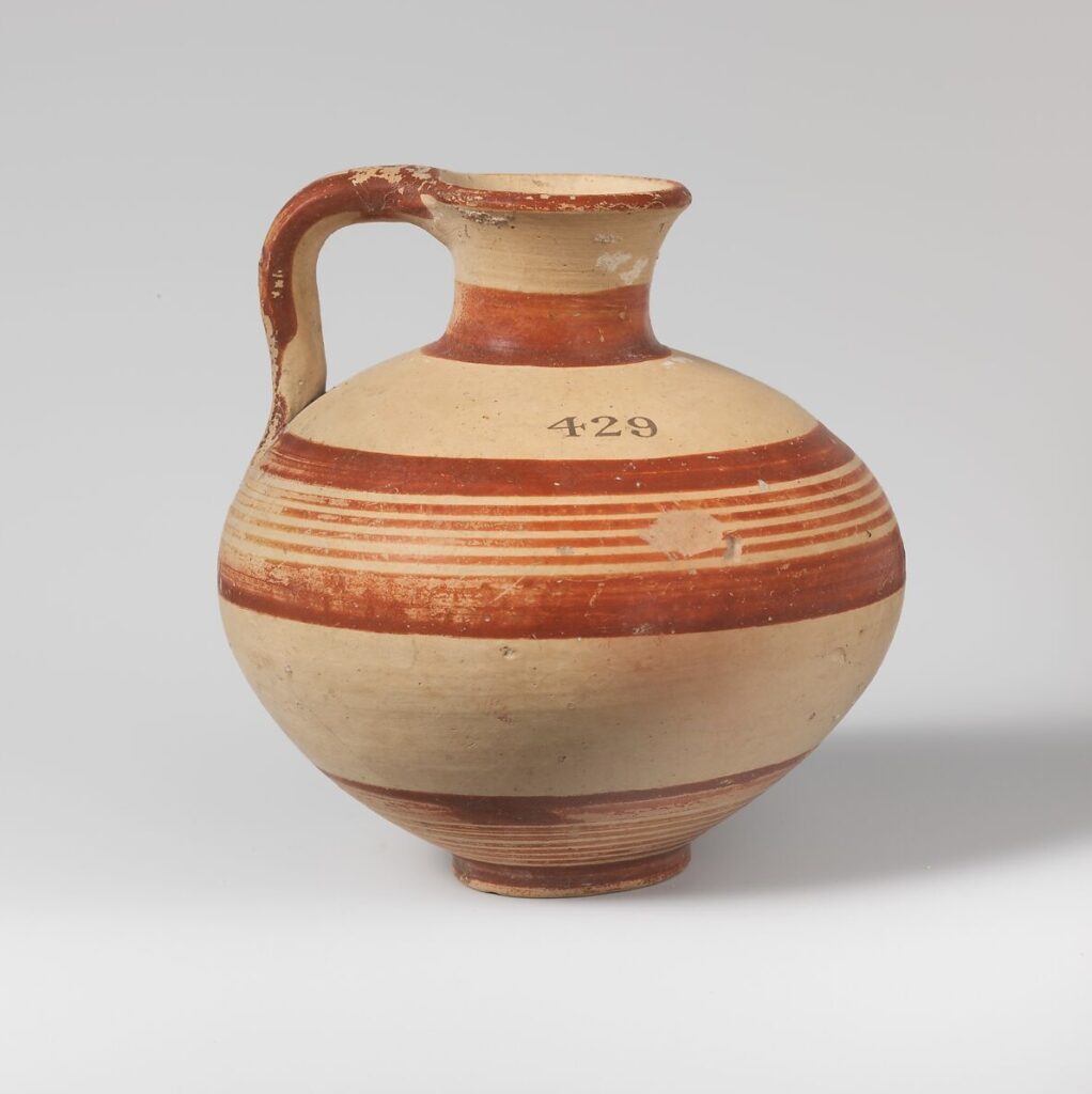
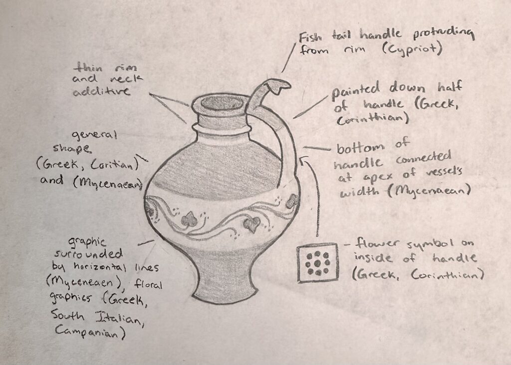
    Vessel A – Terracotta jug, ca. 1600-1050 BCE, Mycenaean culture, H. 4 in.
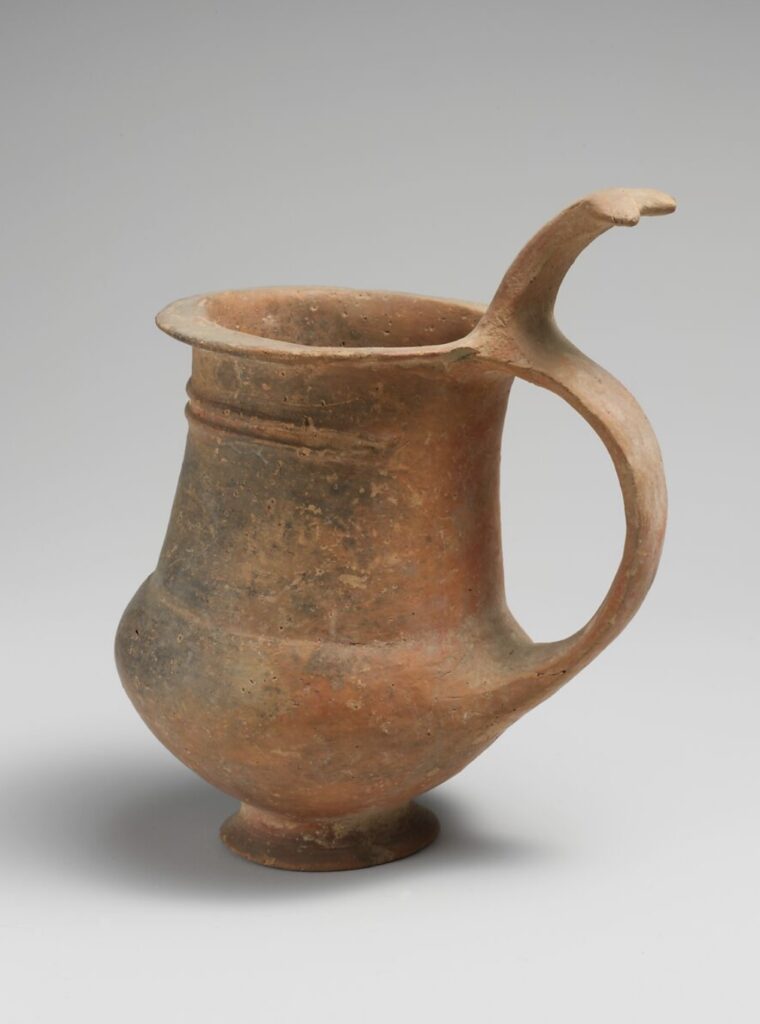
    Vessel B – Terracotta tankard – ca. 1600-1200 BCE, Cypriot culture, H. 4 9/16 in.

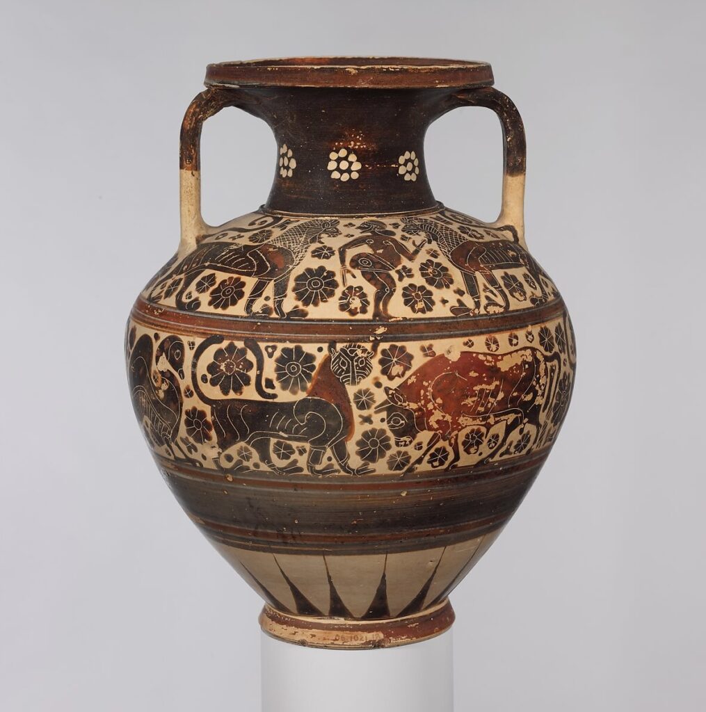
    Vessel C – Terracotta neck-amphora, ca. 620-590 BCE, Greek, Corinthian culture, H. 11 1/2 in.

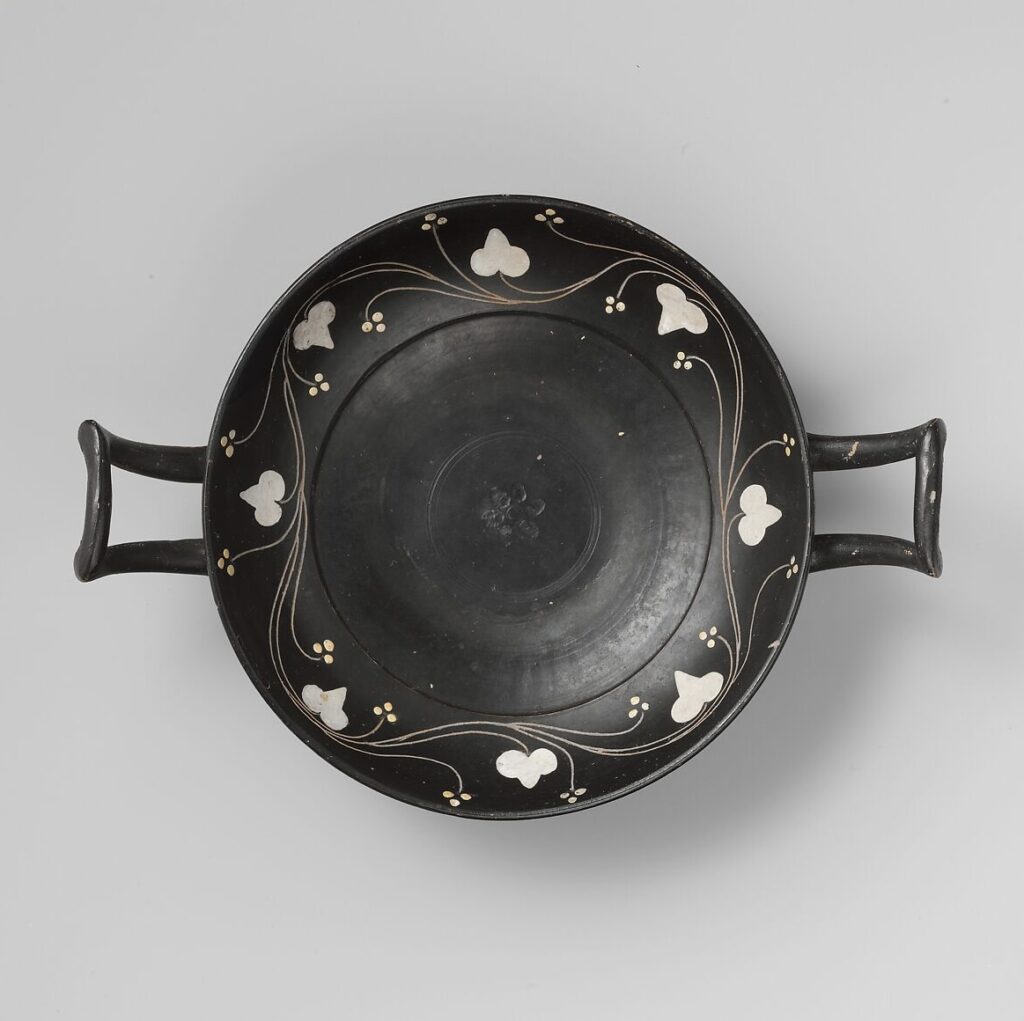
    Additional Ceramic Piece – Terracotta kylix, ca. 400-350 BCE, Greek, South Italian, Campanian culture

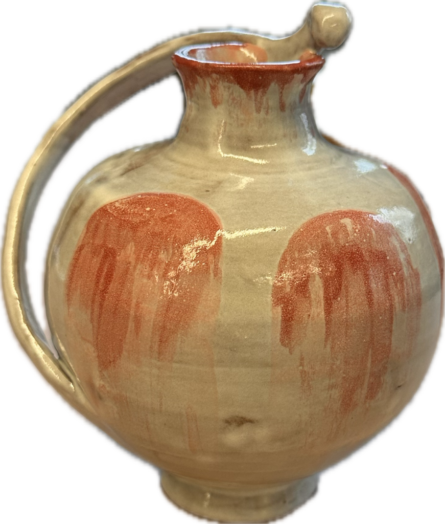
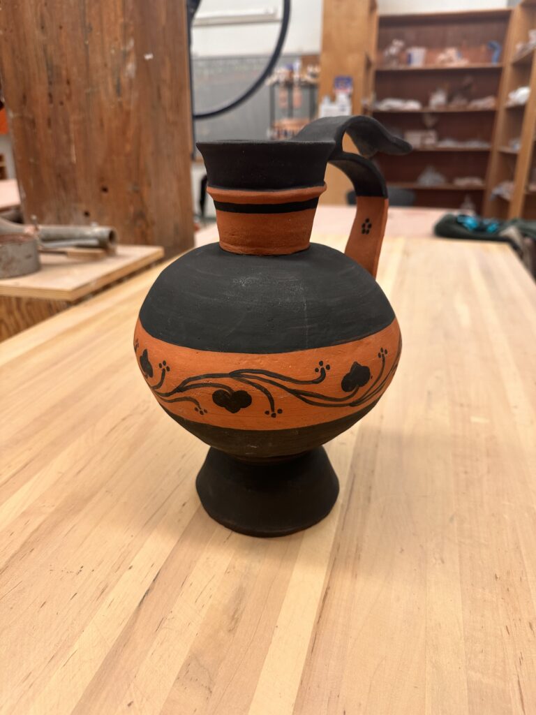
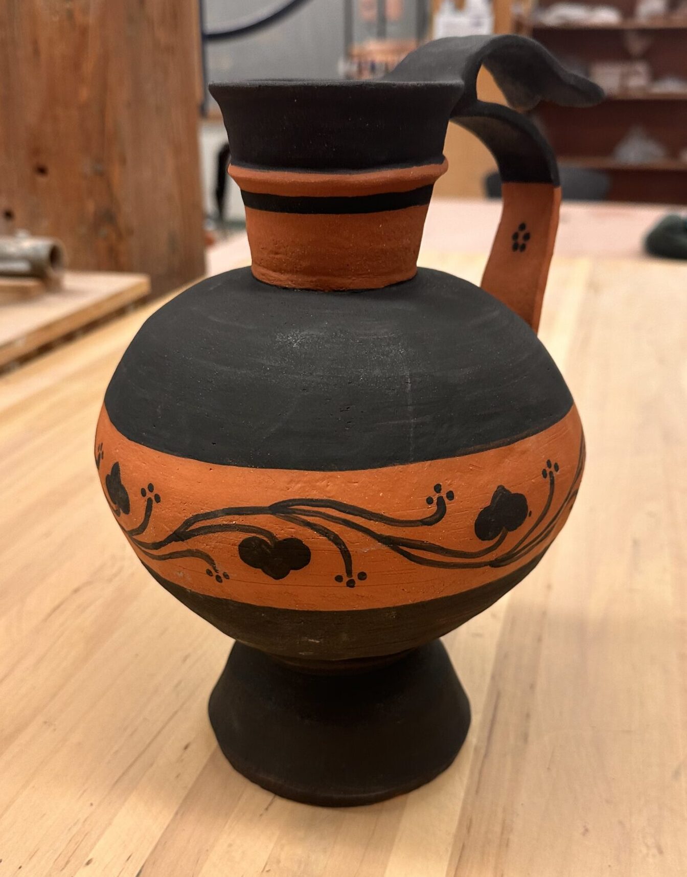
    Vessel A & C is where I got most my inspiration of the general design of my Frankenstein vessel. I took another element of Vessel A from the handle. I wanted a handle to come from the rim of the vessel down into the greatest circumference measurement of the vessel like it does in Vessel A. I wanted another handle to come from the top of that handle and bow out like it does in Vessel B. The top handle also share the same shape at the tip of the handle as the reference. Vessel C was the only reference I felt unsure about recreating. I wanted to incorporate a graphic design that wrapped around the entire vessel and was enclosed by horizontal lines, but didn’t wasn’t to create an elaborate illustration of people, animals, and florals. That’s why I added another reference to add to my vessel that’s illustration was much more simple and my style. To make sure I had enough elements of Vessel C in my adaptation, I included the handle being painted halfway and added one of the geometric floral symbols on the inside of the bottom handle.

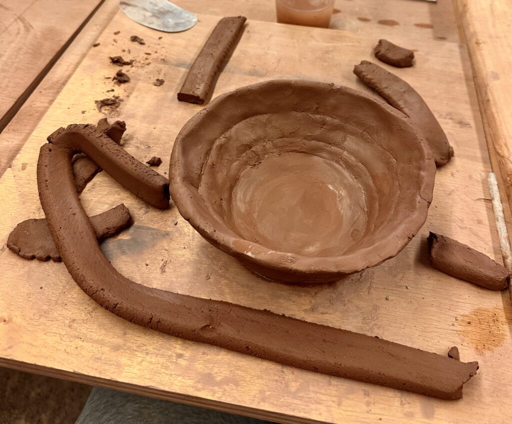
    My first step was to make two large bowls to later attach later to create the circular part of the vessel. This was my second experience ever trying to create a vase-like sculpture out of clay. So this step was an experimental process of figuring out what working for me.

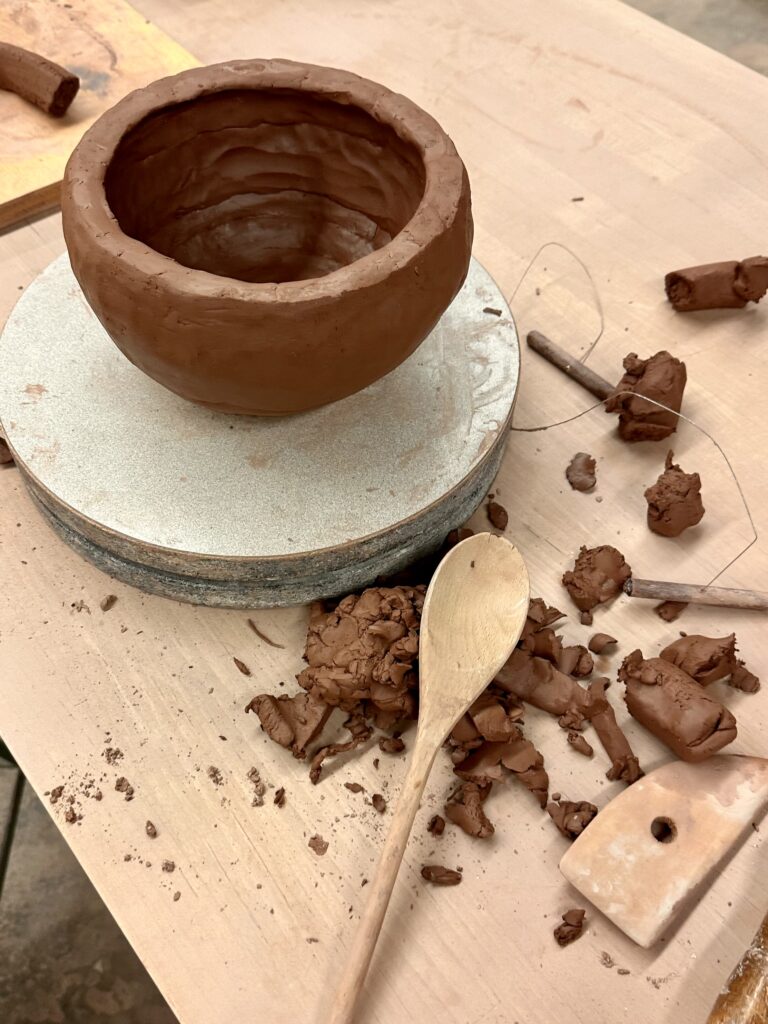
    My first strategy was to make flattened coils that I would tediously attach in layers. However, this seem to become futile as I would thin out the walls too much in the areas I had attached the coils. So during my second go around of making the bowl I used much larger coils I didn’t bother flattening. After I would attach the coils to each other I would flatten them out myself in a pinch pit fashion. This proved to be a dramatically quicker process that gave me similar enough results.

    Although, I tried to get a round shape that was closer to my sketch, it ended up being my circular than I anticipated. I tried to recover the original shape as much as possible by patting the walls in with a wooden spoon.

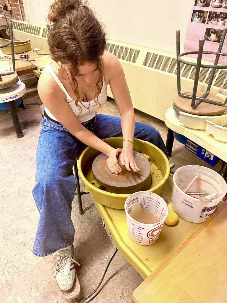
    I had never used the wheel before so I decided to only do the smaller parts of the vessel, like the base and neck, on the wheel.

    Using the wheel for the first time was an interesting experience. I surprised at how difficult it was to control the clay. Luckily, I found it to not be too frustrating because when I failed, it just felt like I was making mud pie. It reminded me of using a sewing machine where you use a pedal to control the speed, at the higher speeds you could more easily loose control and risk the precision of your work, which in this case would result in a mud pie.

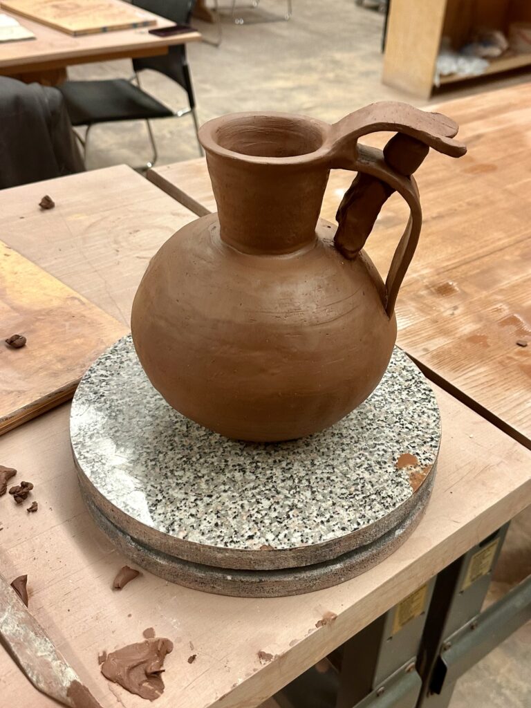
    I started with the neck of the vessel which I hard a hard time forming because I can’t breaking the neck when I tried to extend the length of the rim. I settled for a less dramatic rim and then attached the neck to the hollow sphere I’d already made. I took a break from the wheel to craft the handles of the vessel. I used a flat strip of clay to make the handles, one

    for the big bottom strip, and one for the smaller top piece. The most difficult part of making the handle was trying to get the clay to stand up right. The clay had to be wet enough to attach and bend, but dry enough to stand up right. I had difficulty with the latter and relied on other clay to keep the form up right. As you can see in the picture above, the clay acted as a pillar to keep the handles from drooping. It might seem that there is one handle with a decorative flourish on top, but I would argue that there are two since you could carry the vessel from either part.

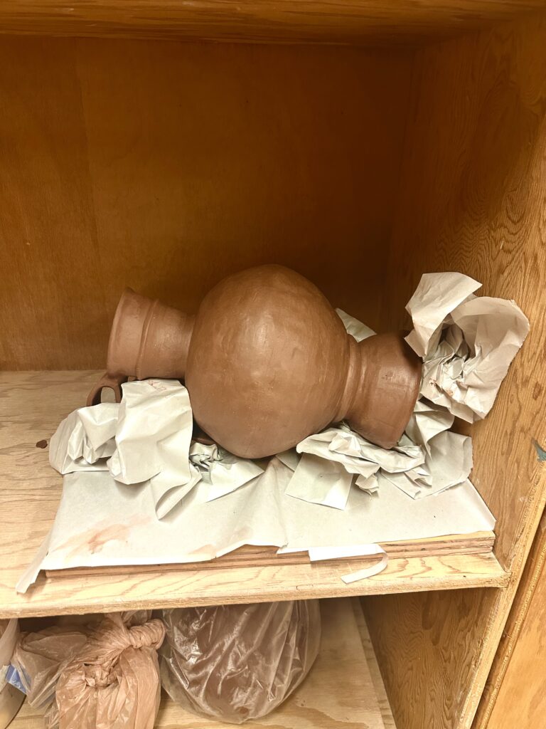
    Now that the handle was attached I would be able to accurately measure the height of what I had for the vessel so far, so I could calculate how tall to make the base. Although a tall base wasn’t in any historical vessel references, it was my way of adding height to the vessel to meet the assignment requirements. Once I attached the base I realized it was too short by a 1/2 inch, so I made another base to attach to the bottom which made the whole base over 13 inches. I created essentially a kiln bomb so I carved out the bottom of it. Something I didn’t foresee was that because I took away the support the solid base was providing, it began to collapse. I tried to rectify this but no matter what I did, it just kept sinking into itself. I decided to take pressure off the bottom by laying it down, the only problem with that is the handles or the walls of the vessel would warp from the pressure on them. To prevent contorting it, I crumpled up newspaper to try to support the sides and handles. This worked surprising very well. If course I couldn’t prevent all the caving but I tried to fix the damages when it was less wet.

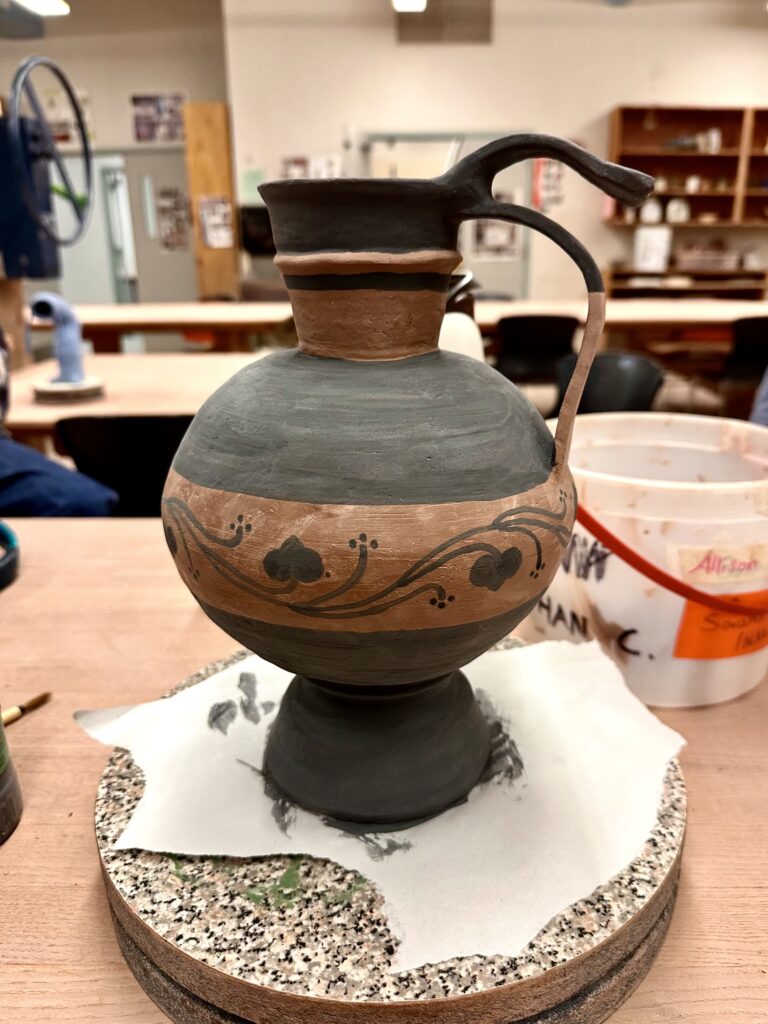
    After it was bone dry I was able to begin painting with black underglaze similar to Vessel C and the additional ceramic piece, leaving the rest of the vessel a natural warm terracotta color similar to the warm tones in the rest of the references. To line up the horizontal lines smoothly, I put the vessel on the wheel and held the paintbrush to it, so all I had to do was push a pedal. After creating my lines I blocked in the glaze and drew on my design.

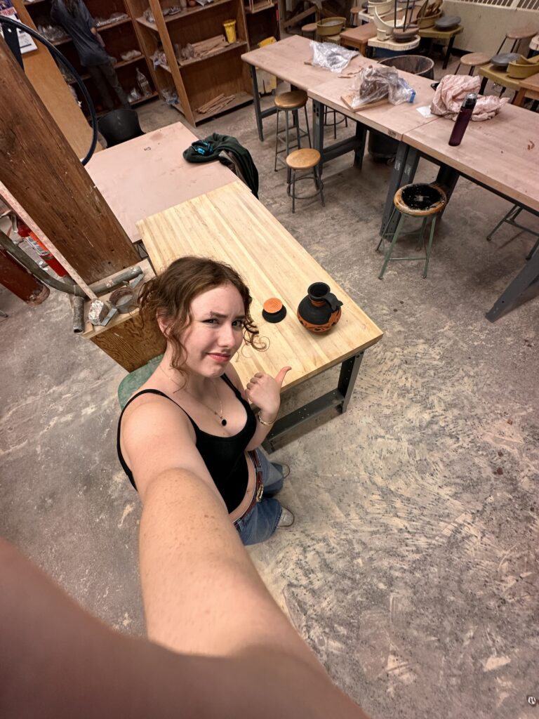
    Then my vase got bisque fired! I checked to see if y handle was secured to the vessel as that was what I was most worried about since they were so thin. Luckily, they were fine. As I was taking pictures of the vessel it popped off the base! At least you can see my score marks on the vessel for proof I did my best.

    At this stage all I have to is reattached the base. I was originally thinking to put a clear coat of glaze on top of the entire vessel but now I’m reconsidering this after seeing how clumping it can look. If I had the tools available, I would use an airbrush to apply the glaze to get a thin even coat to avoid getting a goopy texture on it.

    Final glazing aside, I think the this form works really well. The contrast of the circular middle part of the vessel next to the planar slabs creates an interesting visual especially with how it’s painted. The geometric black stripes also contrast well with the organic pattern that enevlops the vessel. The whole piece has pleasing contrasts as I choose black against the bright orange of the bare low fire clay. I also think the handle that hovers above the lower longer one adds an interesting flair that brings the piece personality.