Tag: Best Works

  • Defining Women Should Not Be to Define Modernism

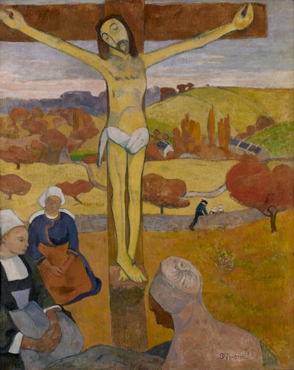
    To be modern is to challenge the present. Post-Impressionist artists did just that; they rejected tradition, embraced emotion, and redefined what art could express. As you can see to the right, this movement’s style exhibited imperfect lines and unnaturalistic colors. They were reacting to the Impressionists, who were beginning to embrace brushstrokes and color. They focused on their individual experience, opinions, and feelings about the fleeting moments in front of them, rather than focusing on the precision of what lay before them and capturing photo-identical pictures.
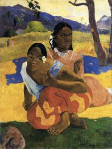
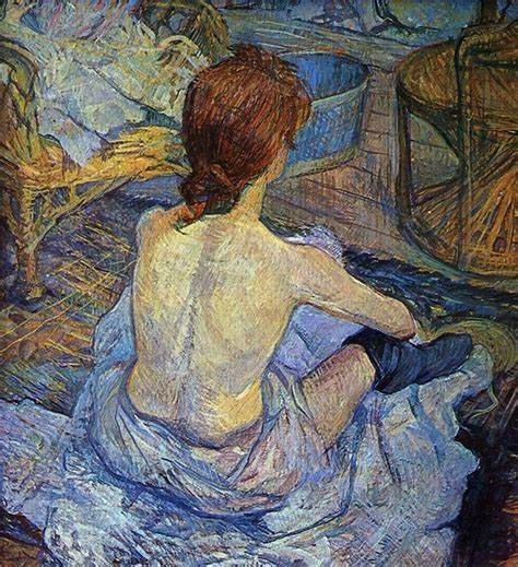
    What made them modern is similar to what made the Impressionists modern: “The [Impressionist] group was unified only by its independence from the official annual Salon.” These artists represented a rejected, bohemian, alternative lifestyle that the official Paris Salon could not condone. Post-Impressionists weren’t just modern for their use of brushstrokes, perspective, and color; they were also modern for their contrasting subjects or muses.
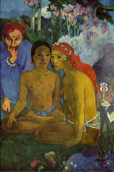
    Paul Gauguin, Contes Barbares (Primitive Tales)

    They would often paint naked women in the presence of men without a chaperone. Having a different subject from past movements set them apart—it’s what made them bohemian. It was supposed to reflect an alternative lifestyle, one that rejected societal norms. This can be seen as strides in the feminist movement because women were finally represented outside the constraints of modesty. However, having men be the dictators of how women are depicted isn’t anything new. They’re just using women to display their skill and talent, much like painting a vase. They did not care to reflect the women’s perspectives at all; instead, they depicted their own interpretation of them through their art.

    The content of Post-Impressionism bohemian art was also extremely shocking to viewers. Revolting against the Salon’s ideals consequently gained a lot of traction (good or bad) due to the shock value it had. This was an attractive reason for artists to (ironically) jump on the bandwagon and partake in the Impressionist art style. It ended up enabling the objectification of women. It reminds us of the importance to keep an eye out for artists who are simply looking for attention from that shock value—if not, they could be harming a marginalized community, as Carol Duncan said, “His freedom is her unfreedom.”

    We can relate this to one of the most popular movie production companies, Disney. Disney is currently straying away from the traditional cliché of the (white) damsel in distress, replacing her with diverse, capable women who are fearless and decisive, often with no focus on romantic entanglements with anyone. Many would agree this is a nice switch-up. Disney would be reacting to their own times by doing so. However, they are continuing a new trend of rewriting classics that don’t align with their present values, like Snow White. This begs the question: Are they doing this to correct their history of normalizing harmful stereotypes, or as a strategic move to profit off the shock value of surface-level change?

    We saw Gisela McDaniel rewrite Paul Gauguin’s Primitive Tales in her piece Chelon Tiha, doing a similar empowering revision of a misogynistic piece. So, is it not the same thing? Well, no, it’s not, for a couple of reasons. Disney could be creating new movies that excite and inspire youth; instead, they’re lazily taking older movies they have copyrights to and putting a different set of expectations on women. This implies once again that there is only one way to be a woman. Young women are getting the impression that they can’t be quiet, soft-spoken, and take on traditional feminine roles; now they can only be leaders, heroes, and take on more masculine roles. We haven’t really allowed room for women to be respected as somewhere in between. The other reason is that Gisela McDaniel is a woman who is taking back the narrative herself.

    We need to let women take the reins of their own representation. We need to create a space to allow them to show modernism through their art, instead of letting women’s expectations define modernism for that time period. That way, we don’t get a repeat of a whole movement objectifying naked women like we see in Post-Impressionism.
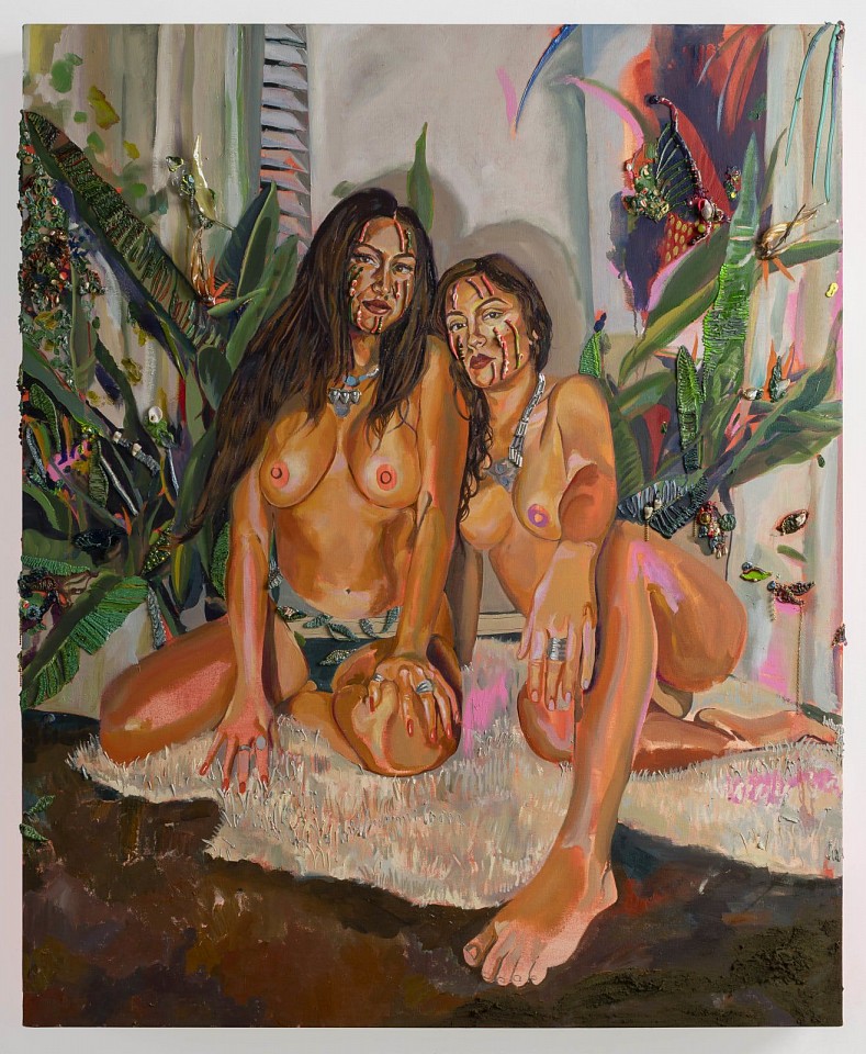
    Gisela McDaniel, Chelon Tiha

    Citations

    “La Toilette (Toulouse-Lautrec).” Wikipedia, Wikimedia Foundation, 17 Nov. 2024,
         en.wikipedia.org/wiki/La_Toilette_(Toulouse-Lautrec). Accessed 15 Apr.
         2025.

    “Paul Gauguin.” Buffalo AKG Art Museum, buffaloakg.org/artworks/
         19464-le-christ-jaune-yellow-christ. Accessed 15 Apr. 2025.

    “Paul Gauguin – Contes Barbares Also Known as Primitive Tales.” Paul Gauguin
         Art, www.paulgauguinart.org/
         paul-gauguin-paintings-contes-barbares-also-known-as-primitive-tales.
         Accessed 15 Apr. 2025.

    Pilar Corrias. www.pilarcorrias.com/artists/53-gisela-mcdaniel/. Accessed 15
         Apr. 2025.

    Samu, Margaret. “Impressionism: Art and Modernity.” The Met, 1 Oct. 2004,
         www.metmuseum.org/essays/impressionism-art-and-modernity. Accessed 15 Apr. 2025.
  • From Rebirth to Revenue

    The Renaissance literally translates to “rebirth,” a rebirth from a period marked by famine, war, and the Black Death. The medieval period was not a habitable era for the pursuit of art, and the art that was made had a slightly different focus in content. However, during the Renaissance, there was an upsurge in quantity and a shift in content and technique. 

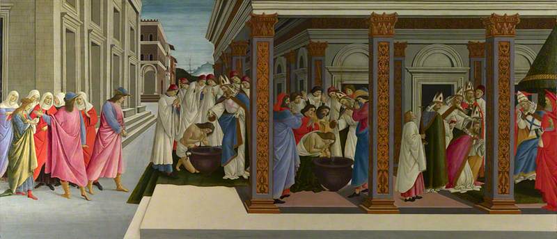
    In a time when people are less concerned with their survival, they are allowed to pursue the quality of life in leisure and entertainment. They look back to the last time when civilization was consistently thriving. This meant they were looking at the philosophers and scholars of the classical period for guidance through writing and other art. This inspired the Renaissance’s focus on religious figures, such as deities, along with historical figures. Since these are historical or spiritual figures, they didn’t just make portraits of them as we see with current rich hierarchical figures’ commissions. Instead, these artists commonly used these figures as symbols for their (or their buyer’s) political commentary, a retelling of their story, or both. With this lens, as you may predict, the paintings produce more dynamic action to give the audience more to digest than just a still face that holds no meaning. These artists also exuded a strong emphasis on antiquity-inspired values such as humanism and individual agency. This focus greatly influenced their artistic expression, often resulting in storytelling through continuous narratives. Similar to modern comics, these artworks depicted multiple moments of a story within a single composition, with characters appearing in various stages of the narrative.

    The National Gallery, London
    Sandro Botticelli, Four Scenes from the Early Life of Saint Zenobius (1444/1445-1510)

    The Four Scenes from the Early Life of Saint Zenobius uses grouping of people as gestural splits in scenes along with architecture that creates more of a literal line of separation more akin to comics.

    Renaissance and classical art is highly regarded today in architecture, philosophy, our values of harmony and balance, and the need for storytelling. Our form of storytelling is different now only due to advancements in technology where we can simply record and alter video. Our normalization and reliance on video have forced continuous narratives to die out; because why would you need continuous narrative paintings when you have a museum for moving pictures in your pocket? However, we still see ghosts of continuous narratives within our capitalist society today.

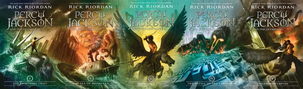
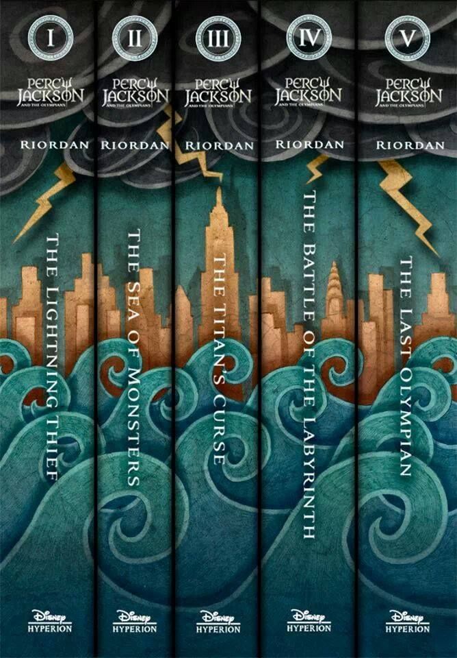
    Rick Riordan, Percy Jackson series (side by side)

    Consider your favorite novel series, do they have matching covers and/or spines? Most do, and some even go as far as to create a depiction of the story on the cover in the continuous narrative format like how Percy Jackson does. If you have one or two of the books, there’s more of an incentive to collect the rest to complete the piece of artwork. The artist could have innocently been inspired by the classical period seeing as the story is about Greek gods and demigods, or the artist realized the appeal and variable of fear of missing out (FOMO), that matching sets have. Especially when you’re considering the audience for these books: children, specifically children with learning disabilities like ADHD or Dyslexia in mind. This audience’s first impression of the product is the picture on the cover, not the blurb on the inside of the sleeve or the title of the book, it’s the scene unfolding visually in front of them.

    We’ve known that we look back to Ancient Greece and Rome and the Renaissance to improve our society today, but it seems we also use it for consumerism culture. Especially when you consider short video clips like Instagram reels or tiktoks – which could be argued is an extension or distant relative of continuous narrative – that are being exploited to sell us products. How far will we take the privilege of being able to look to our past to feed into our corrupt capitalist culture and how long have we been doing it?

    Citations

    Continuous narrative. (n.d.). Italian Renaissance Resources. Retrieved March 1,

         2025, from https://www.italianrenaissanceresources.com/units/unit-6/

         sub-page-05/continuous-narrative/

    Wattam, A. (2023, August 15). Double take: Continuous narrative in Renaissance

         art. Art UK. Retrieved March 1, 2025, from https://artuk.org/discover/

  • Dynamic Double Diorama

    Dynamic Double Diorama

    Assignment

    In this assignment you will complete a two sided diorama incorporating contrasting concepts on each side. The composition can be arranged vertically or horizontally, and should be at least 8” x 6” when complete.  

    Requirements:

    • a minimum of five layers. The middle layer/center counts and should be involved in the composition. A “frame” layer does not count as a layer.
    • Patterns in a material should compliment the work and contribute to the composition.
    • Images can be taken from any scale to represent depth and distance.
    • Think of 3 contrasting concepts for each side of the diorama. Simple solutions (you will create better ones!)
      • Day & night
      • Arctic & desert
      • Curvilinear & angular

    Part One: From your contrasting ideas select objects that relate and think of them in layers.

    • What do you want to represent in this contrast for the viewer?   
    • Take the images and break them into five or more layers, by distance (foreground, midground, background). The composition should be visually dynamic. How light interacts through the final piece should be considered. Layers in the foreground will cast shadows on those toward the mid/background. Can the backgrounds of each side have the same imagery? 
    • The materials used for your piece should compliment the role they play in the composition. Be mindful that the materials will need to survive the laser cutting process and being on display for the viewer.

    Part Two: Production and assembly.

    • Create 2D files from your sketches, working in black and white. One file per layer, saved as PNG files. We will take PNG files, import them in to Lightburn,Links to an external site. and trace the bitmaps to produce the work.

    Process

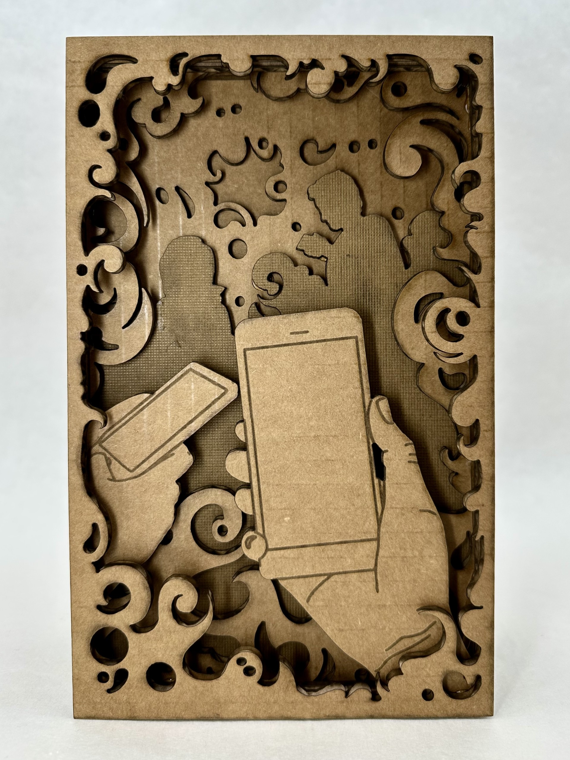
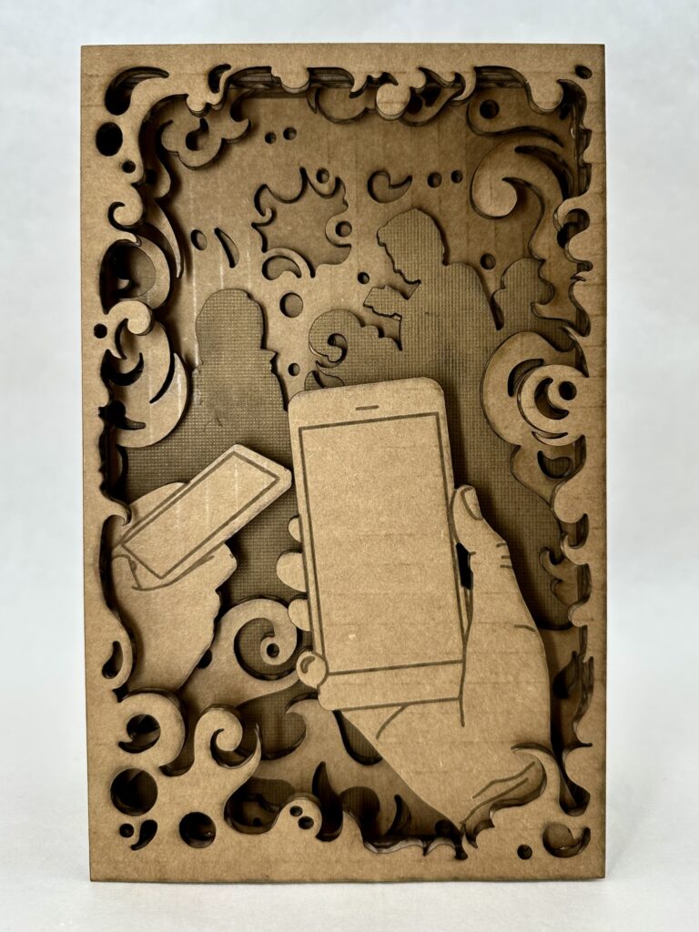
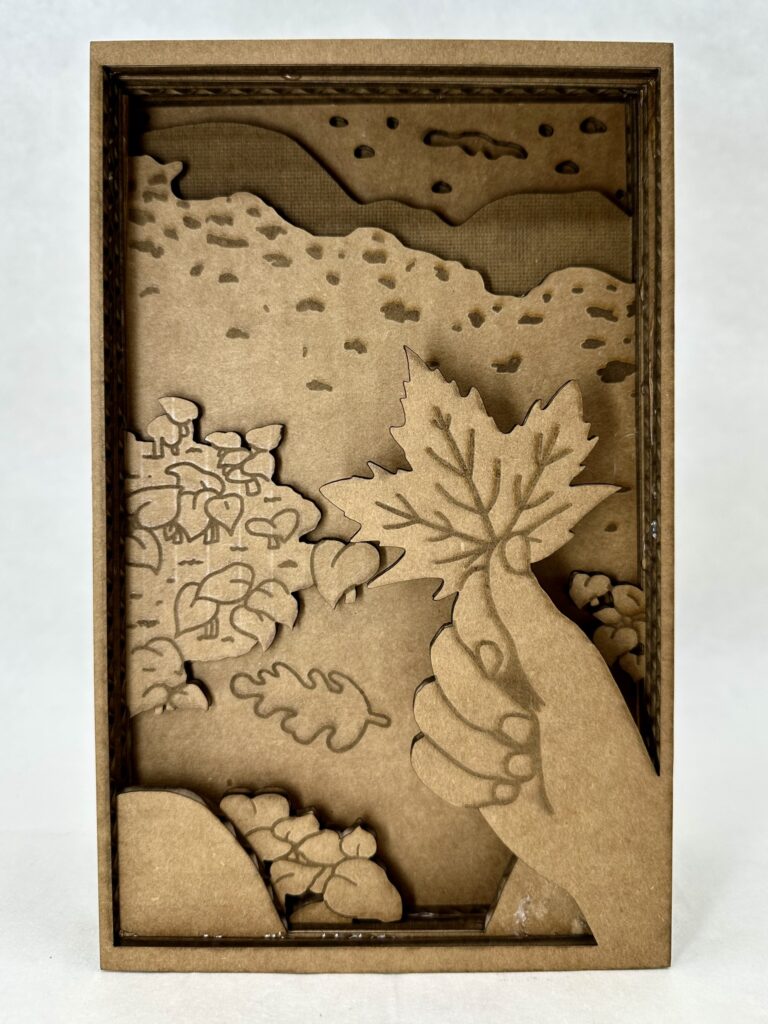
    When brainstorming concepts for the design, the first thing I thought of was good and evil. I knew the concept was too broad for me to depict without more guidance, so I thought about sub-categories within good and evil. I settled on technology vs. nature, specifically through the lens of a person on a day to day level. A person has a choice (much like with morally good and bad choices) to choose to be either sucked into doom scrolling or go outside and take a moment to be mindful.

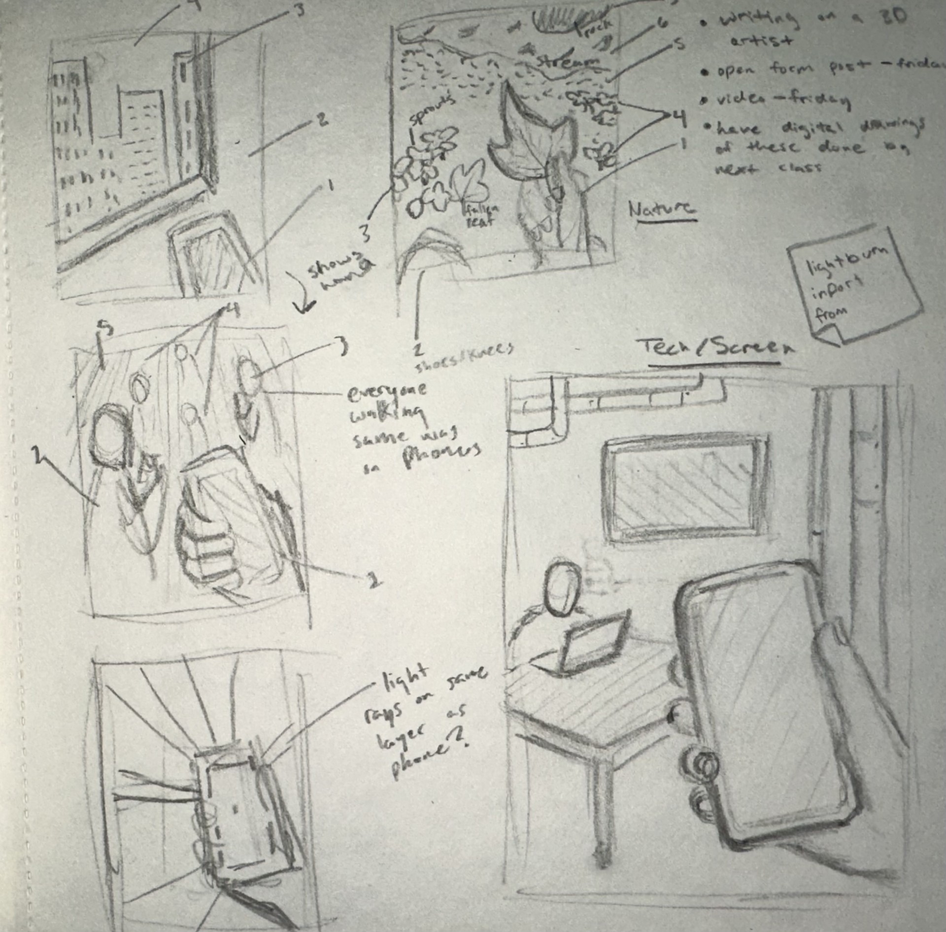
    At this stage I wasn’t entirely sure what I wanted to do for the tech side. As you can see in my sketchbook I have many different ideas of what the background could look like, but I didn’t end up coming up with the final idea until the very end of the process.

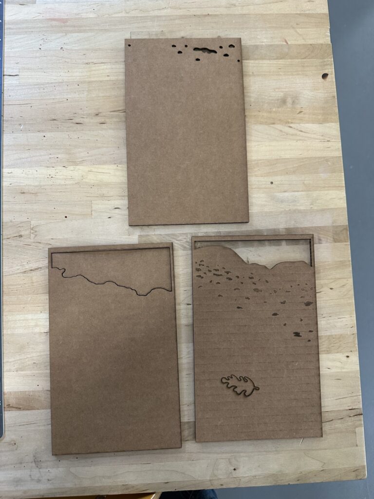
    As for the nature side, I was pretty sure on what I wanted to do from the very beginning, something tranquil and interactive. I was picturing the thing I would most likely do on a hike which is pick up the biggest, most red leaf I could find. You might note that the leaf isn’t red and that the whole project is in greyscale. I chose to do this one because I wanted to try shading with the laser cutter, otherwise I would have definitely had made the leaf red.

    Sketches of concept

    I’ve worked with a laser cutter briefly once before in high school so I was somewhat familiar with how my designs were going to translate into the program. I knew I had to make very clean looking lines so it would be less work later in Lightburn. This meant I couldn’t use any brushes that had any blending end properties. My strategy ended up working well and I was able to swiftly get perfect lines in the program.

    Something I hadn’t thought of in the beginning was adding inner frames around all the layers. I had to go back and do that at the end which was a little confusing at first because I’m used to drawing with something like that in mind. I didn’t add butter layers because that would mean shrinking each layer individually and I wasn’t willing to risk not getting each layer disproportional to each other. But this proved not to be a castle in the program and was honestly one of the more easier things to do.

    Overall, I enjoyed my experience working in Lightburn because it was interesting to see how my knowledge of Adobe programs translated. It ended up being more similar than I anticipated. It was also fun to learn how to do new things on the program and then to see the product come to life, it was very rewarding.

    Unfortunately, I had to use cardboard instead of wood like I had hoped because, with the many layers I had, it would have been too time-consuming otherwise. For. those who don’t know, cardboard takes less energy to cut and shade, therefore less time. An additional thing that needed to be adapted to save time was the layers that were complexity filled in. These layers are the silhouetted people on the tech side, and on one of the nature background layers.  

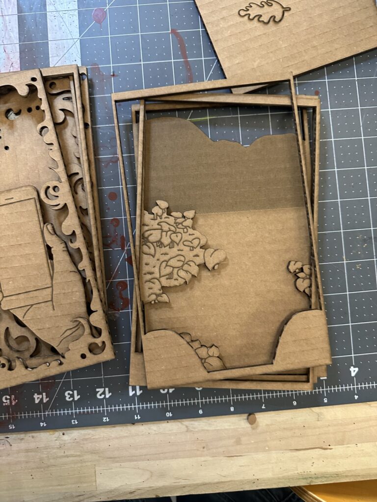
    There were a couple hiccups during the cutting process. The picture on the right shows a couple of layers where I put shading layers on the wrong cut layer. I had to go back and redo. correctly. Besides that, there were not any major problems I had with the laser cut.

    Final Product

    I’m pleased with the results of diorama, the only thing I would change is the foreground. The two sets of plant clusters is broken up by the background. This breaks the illusion of depth. I didn’t realize this was a problem until was all put together, I thought the front plants would be enough to create the illusion. Another thing I would add just for an extra layer of interest is a boarder at the very front that has clean rounded edges and slightly over hangs over the rest of the layers’ boarders. I think part of what worked so well with the tech side of the diorama is the foggy boarder (especially with the extra ons as you go further into) that brings the viewer into the space.

    I also believe I did a good job depicting the busy, noisy, constant buzz of social media that tech brings by the smoke layers. The business is what clouds your vision from the present moment which I think translate well in the design; this is highlighted in the layer of silhouetted people. I was originally going to add line work on top, but instead I chose to shade the whole layer. I found that this gave it more meaning because the people blend in with the environment and don’t stand out as people. Another aspect of the smoke I find successful is how it has areas of sharp edges that represent how scrolling on social media can be so harmful.

    It’s Its ironic how the side I was most successful in is the side I should admittedly not engage with as much.

  • Objects in Space

    Objects in Space

    Assignment Description

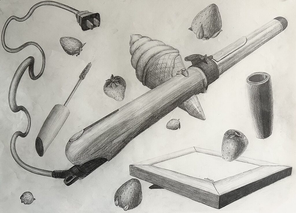
    The assignment was to create five lists of five dynamic closed shaped objects. So not i.e. rainbows, rivers, fields, etc. From that we were to pick five objects from each list that might look interesting together, so not too many skinny objects, or too many spherical objects. Then we needed to create four sketches of the objects we picked floating around in space. The sketch needed to be dynamic, which meant playing around with perspective, overlapping, and repetition. Once we had done sketches, we were to use what we liked from them and implement it in our final drawing.

    My Process

    I created five lists of five objects (with categories to help me come up with ideas for objects) as shown. I tried to pick things physically around me so I could use them as reference.

    Things That Remind Me Of Vermont

    1. Cabot Cheese
    2. Maple Helicopter Seeds
    3. Apple Cider Donuts
    4. Creemies
    5. Cows

    Objects In My Room

    1. Potted Plant
    2. Salt Lamp
    3. Purse
    4. Stuffed Animal
    5. Picture Frame

    Food I Like

    1. Ben & Jerry’s
    2. Strawberries
    3. Salmon
    4. Bananas
    5. Fruity Pebbles

    Bathroom Objects

    1. Toilet Paper
    2. Candle
    3. Hair Curler
    4. Soap
    5. Razor

    Things I Wear

    1. Shoes
    2. Necklace
    3. Sunglasses
    4. Mascara
    5. Belt

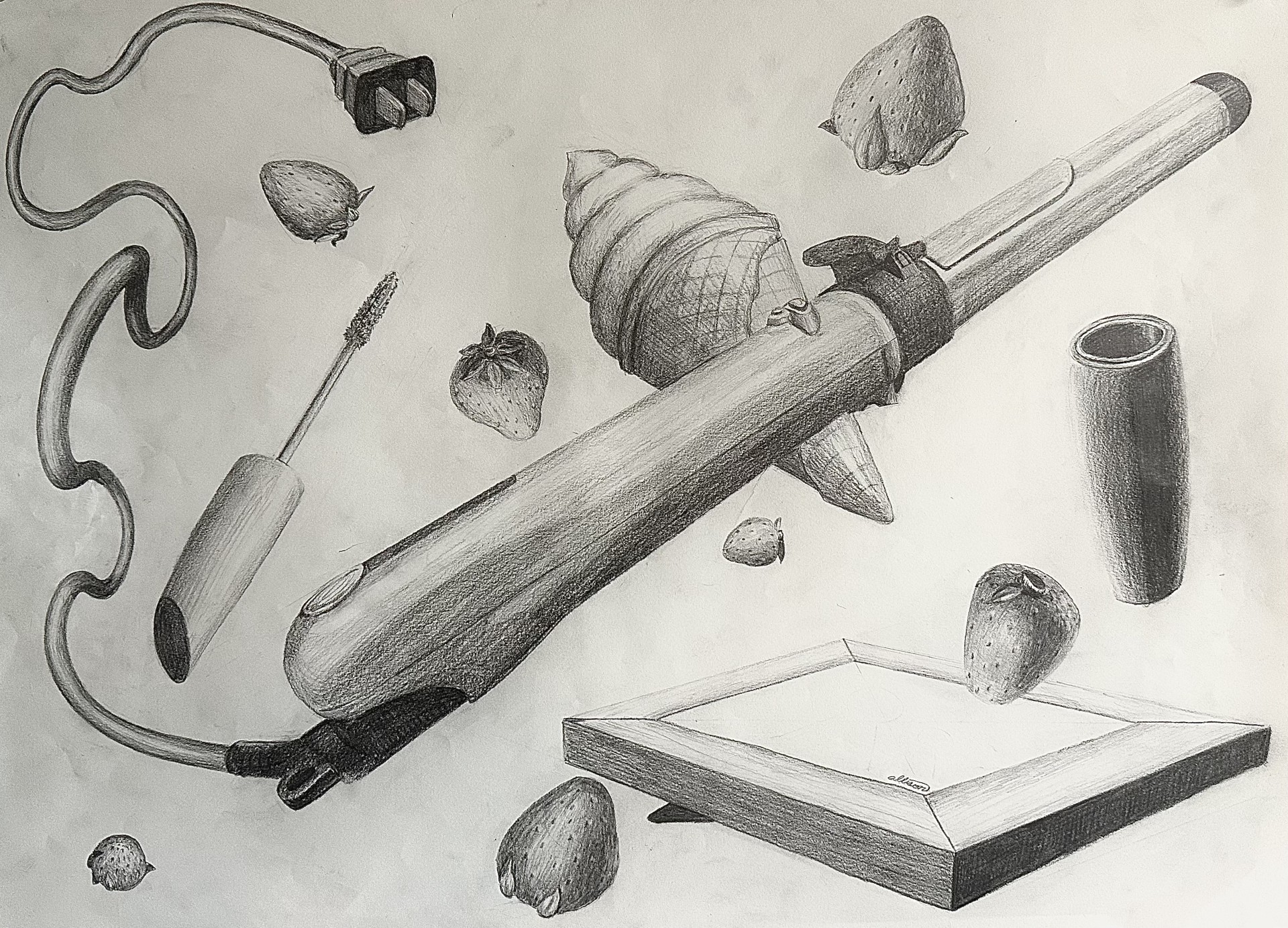
    After creating my lists of objects, I made five more lists playing around with combinations. I ended up choosing to draw a curling iron, tube of mascara, an ice cream cone, a picture frame, and strawberries. I thought these were objects that, out of all my combinations, were least connected with each other while also being very diverse shape-wise. These randomized combo lists are shown below:

    1. Potted Plant
    2. Razor
    3. Salmon
    4. Bananas
    5. Fruity Pebbles
    1. Stuffed Animal
    2. Candle
    3. Bananas
    4. Creeemies
    5. Shoes
    1. Salt Lamp
    2. Razor
    3. Strawberries
    4. Helicopter Seeds
    5. Belt
    1. Potted Plant
    2. Razor
    3. Strawberries
    4. Donuts
    5. Sunglasses
    1. Picture Frame
    2. Hair Curler
    3. Strawberries
    4. Creemie
    5. Mascara

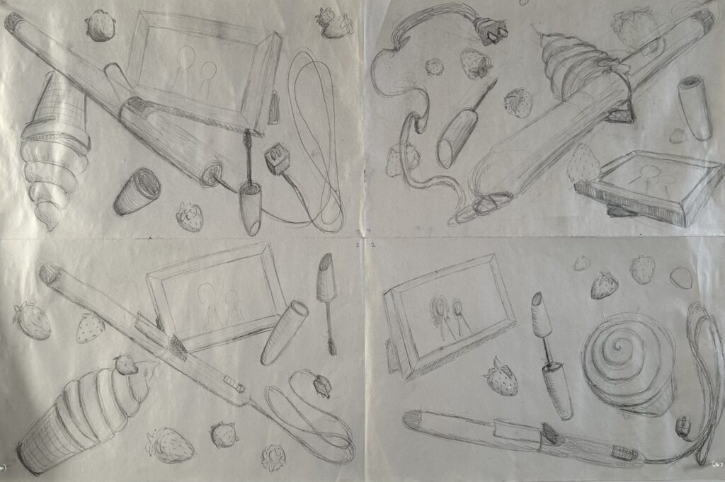
    These are the sketches I did to the left. You can probably tell which were my first ones and which was my last one. I worked from the top left, counterclockwise to the top right. As you can tell the top right one is much more dynamic than the other three. After getting feedback I gave the hair curler more of an interesting perspective and made its cord travel back through space by using size and value.

    I also gave the frame a less typically viewed at perspective, making sure to add in detail of the stand in the back. However the frame turned out a bit grounded so if I had to redo it I would tilt it more. If I had more time to redo it I would draw an actual photograph into the frame.

    The mascara use was one of the more easier things to draw but I wish I had added a label on it tome it more interesting.

    The strawberries were the most tedious part. The shape was the easiest part of it but creating the seed texture was difficult, especially having to repeat. it so many times.

    The ice cream cone was the part I struggled with the most. I didn’t have an actual ice cream cone to reference so it was a bit challenging to conceptualize it in my head. Eventually I stripped back the layers and thought of it as two cones attacked to one another floating in space. This helped my process out a lot and once I got those shapes down it was a matter of adding texture. There’s a lot of growth from the top right sketch to the final drawing which I’m really proud of.

    One thing I had to change from my critique (one shown above was pre critiques and the one to the right is post critique) was distributing the value across the composition. I had a couple areas in the bottom right corner that was not as dark as the darkest shade in the center or upper left corner were; it made it look incomplete. After making the bottom half of the mascara tube’s shadow darker, and making the darkest shade of the picture frame darker, the drawing looked more complete.

    All in all I think ai made a very dynamic piece. The action happening a slash across the composition created by the hair curler, things over lapping each other, multiple unique perspectives being used, repletion from the strawberries, and (besides arguably the frame) I didn’t ground any objects and all objects. I also didn’t crop any objects off the edge of the paper. So I followed the assignment guidelines and made a very dynamic composition.

  • The Popularity Of  Sexist Theories In Prehistory

    The Popularity Of  Sexist Theories In Prehistory


    Man The Hunter
    is a symposium published in 1968 by Richard B. Lee and Irven DeVore. It’s notorious for its sexist evolutionary views that essentially claims that men were the hunters and women were nearly supporting roles. This theory became popular and was promoted through editorial cartoons, tv shows, and other media, for the public to digest and accept as truth. However, this narrative of men being the hunters is simply false. Despite this, the lens of which Man The Hunter was created from, is commonly shared, and is used just to discredit women.

    There’s evidence proving that women had the physical capacity to hunt alongside men and did. If you look at the biological differences between the two sex’s, you can see there are advantages with both that could help with hunting. Men typically have larger hearts, lungs, and more muscle mass, whereas females have better endurance.

    Endurance is essential to persistent hunting which is hypothesized to be how humans hunted prey in the past. There is also evidence of equal roles between sexes by the skeletons of our ancestors.

    Meaning that since there are similar damages to between the skeletons, then they were doing the same activities. Despite the clear evidence of Man The Hunter being incorrect, it was still the catapult of a set of beliefs that men drove evaluation by their hunting.

    Venus of Willendorf is a prime example of how people can use bias lenses to generate theories on prehistoric ancestors and their values. It’s a common belief that Venus of Willendorf (whose modern name from the 20th century derives from the goddess of love and beauty), was created by men for aphrodisiacal purposes. Another popular explanation of the purpose of Venus of Willendorf, is that she was a fertility figure, whether it was a good-luck totem in hopes of women becoming fertile, or fertility being monumented because it was so valued at the time. This reasoning was supported by the exaggerated reproductive physical features of the woman, “The most conspicuous elements of her anatomy are those that deal with the process of reproduction and child rearing. The artist took particular care to emphasize her breasts, which some scholars suggest indicates that she is able to nurse a child.”, (Dr. Zygmont, para. 17). These reasons are as well as the next but why it’s the most commonly known explanation is something we have to evaluate.

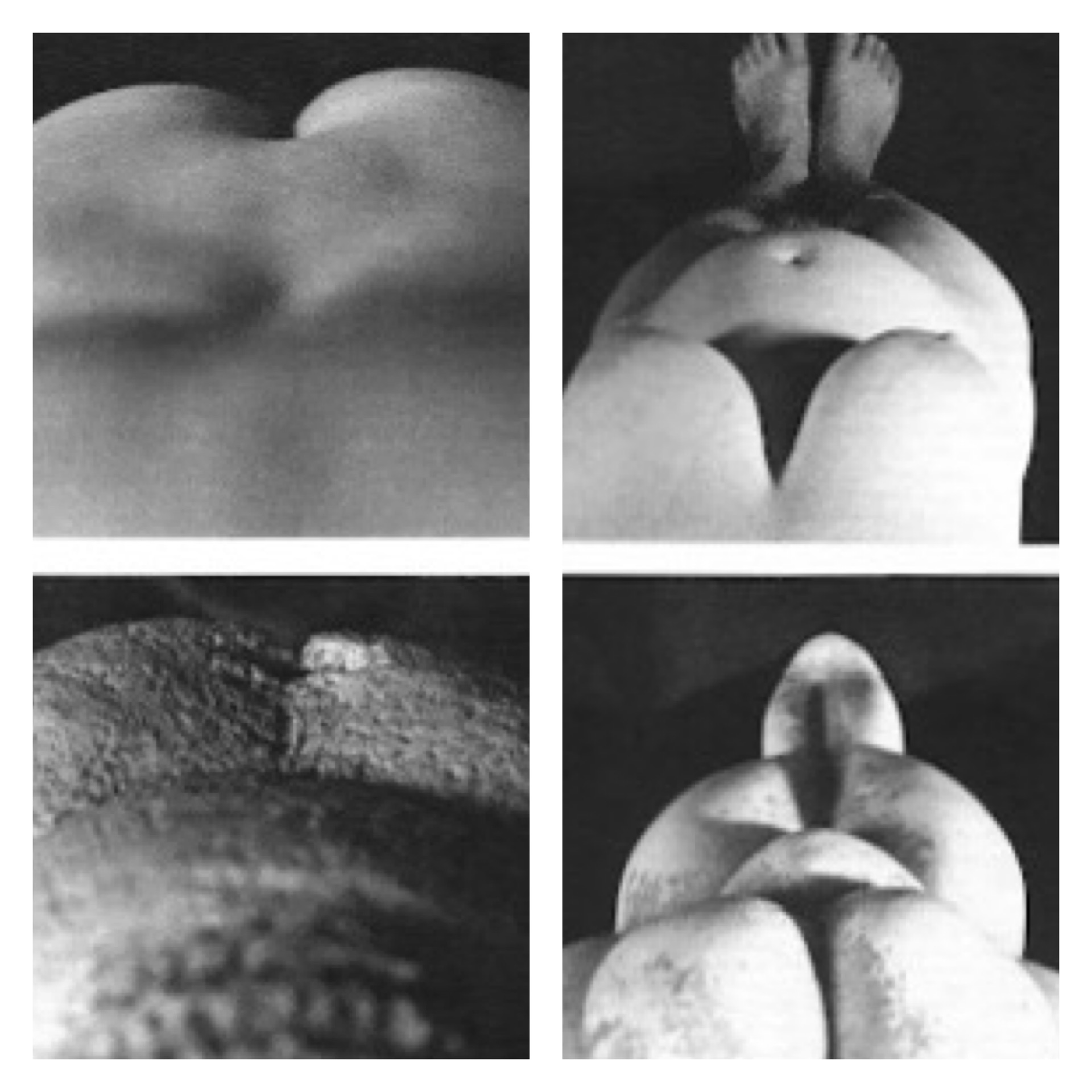
    A different explanation suggests a woman created the piece as a self portrait. You can see from the contrasting images that the sculpture looks very similar to how a six month pregnant woman would look down at herself (since mirrors weren’t invented yet). n contrast to what Dr. Zygmont stated,

    “If the face was purposefully obscured, the Paleolithic sculptor may have created, not a portrait of a particular person, but rather a representation of the reproductive and child rearing aspects of a woman.”, (para. 19). A woman looking down at herself would not be able to see her own face or hands while she was sculpting.

    There are multiple reasons why a woman would want to create a self portrait while pregnant. You can imagine that like any child who draws in the sand with their finger, art comes naturally to us and we simply have an urge to recreate what we see. This woman could have also created this sculpture in an educational lens to demonstrate to other young women what changes their bodies would go through. This is such a large aspect of womanhood, and to leave it out of the narrative because of one’s own sexist biases is fallacious.

    What these anti-feminist theories all have in common, is that they stem from a harsh set of beliefs of gender binary roles. They hardly consider women being valued for anything more than their bodies or their contribution to domestic chores. These sexist assumptions are not just harmless ideas, they have an effect on society. Look at the time at which Man the Hunter was published; it was right after a large rise in working wives during the 1950s. It’s hard to believe that “man the hunter”, “man the provider”, “man the breadwinner”, wasn’t a biased opinion based off of this event.

    One can imagine the movement would have taken off quicker if not for this claim that women’s domestic role comes natural to them because “that’s the way it’s always been”. 

    When presented with a feminist idea like Venus of Willendorf being a self portrait, it’s branded as “extreme liberalism” and “unlikely”, discrediting women and their ability. It’s important to ask what prehistoric art could have meant to our ancestors so we have a better understanding of where we came from, but it’s just as important to look at our ideas of what it meant to reflect on our generation’s biases.

    Citations

    • Oocbock, C., & Lacy, S. (2023, November 1). The theory that men evolved to hunt 

         and women evolved to gather is wrong. Scientific American. Retrieved 

         February 21, 2024, from https://www.scientificamerican.com/article/ 

         the-theory-that-men-evolved-to-hunt-and-women-evolved-to-gather-is-wrong1/

    • Zygmont, B., Dr. (n.d.). Nude woman (Venus of Willendorf). Khan Academy. 

         Retrieved February 21, 2024, from https://www.khanacademy.org/humanities/ 

         prehistoric-art/paleolithic/paleolithic-objects/a/venus-of-willendorf

  • Classical Influence of Intergenerational Cultural Transmission in Disney

    Classical Influence of Intergenerational Cultural Transmission in Disney

    Photo by My Favorite Planet.com

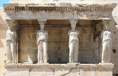
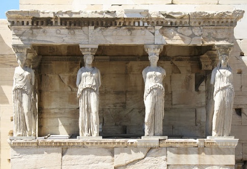
    The classical era has made its stamp on today’s modern world of art, but not just by the influence of fancy pillars on esteemed buildings. Its influence branches further than the physical appearance of architecture and sculptures, it reaches the virtues and values we uphold today. One example is their caryatids, these sculptures serve multiple purposes: beauty, support, and a symbol of harmony. If you look at the Erechtheion, you’ll see that they’re unified by appearance and stance that creates a sense of order and peace. The way the women have their weight shifted on their outer legs provides the assurance of support and therefore adds to the sense of united peace. “This is a sort of sensitivity to harmony, balance…” Zucker, S., & Harris, B express. This technique used to represent these ideals is so effective that we imitate it in our art today. We have more tools than ever to pass down groups’ cultural morals and values to new generations such as animation. The Disney movie Brave used it to tell a story of what happens when you don’t have that unity. 

    that they should be the pillars on which the peace of the land rested.

    In Brave, the mother Elinor is trying to teach her daughter Merida what happens if you don’t fulfill your duties as a political figure. She tells a story of an ancient kingdom, “… ruled by a wise and fair king who was much beloved. And when he grew old he divided the kingdom among his four sons. That they should be the pillars on which their piece of land rested.” Andrews, M & Chapman, B. (Directors). [13:10:00]. As Elinor tells the story she physically builds this kingdom with a chess board supported by four chess pieces under each corner. The chessmen she picks are white and are well detailed coincidentally alike how we view classical caryatids today. However one chessman is black and is clashing with the other three white pieces, it is this piece that represents the antagonist of the story at hand, “… But the oldest prince wanted to rule the land for himself, he followed his own path and the kingdom fell, from war and chaos and ruin.” As she recounts the kingdom’s demise, she snatches the black chessman from underneath the chess board and it tumbles to the ground along with all the other chess pieces who once relied on the foundationally chessmen to stay atop the board. Physically showing how imbalance, lack of order, or lack of symmetria, causes chaos. 

    He followed his own path and the kingdom fell

    These beliefs were once displayed on the architecture of buildings in Athens for all to see. All the youth of Athens had to do to see the virtues of their community was to walk outside. We don’t have as detailed architecture today to create rich storytelling for children, so we rely on other means. As a form of education and storytelling, animation has made a powerful impact on children’s lives. It’s no wonder they’ve looked back at the classical era for symbolism for intergenerational cultural transmission.

    Citations

    Andrews, M. & Chapman, B. (Directors). (2012). Brave [Film]. Walt Disney Pictures, Walt Disney Studios Motion Pictures.

    Zucker, S., & Harris, B. (n.d.). The Athenian Agora and the experiment in 
    democracy. Khan Academy. Retrieved April 30, 2024, from 
         https://www.khanacademy.org/humanities/ap-art-history/ancient-mediterranean-ap/ 
         greece-etruria-rome/v/athenian-agora 

    Zucker, S., & Harris, B. (n.d.). The Erechtheion. Khan Academy. Retrieved April 
         30, 2024, from https://www.khanacademy.org/humanities/ 
         ancient-art-civilizations/greek-art/classical/v/erechtheion?modal=1