Assignment
In this assignment you will complete a two sided diorama incorporating contrasting concepts on each side. The composition can be arranged vertically or horizontally, and should be at least 8” x 6” when complete.
Requirements:
- a minimum of five layers. The middle layer/center counts and should be involved in the composition. A “frame” layer does not count as a layer.
- Patterns in a material should compliment the work and contribute to the composition.
- Images can be taken from any scale to represent depth and distance.
- Think of 3 contrasting concepts for each side of the diorama. Simple solutions (you will create better ones!)
- Day & night
- Arctic & desert
- Curvilinear & angular
Part One: From your contrasting ideas select objects that relate and think of them in layers.
- What do you want to represent in this contrast for the viewer?
- Take the images and break them into five or more layers, by distance (foreground, midground, background). The composition should be visually dynamic. How light interacts through the final piece should be considered. Layers in the foreground will cast shadows on those toward the mid/background. Can the backgrounds of each side have the same imagery?
- The materials used for your piece should compliment the role they play in the composition. Be mindful that the materials will need to survive the laser cutting process and being on display for the viewer.
Part Two: Production and assembly.
- Create 2D files from your sketches, working in black and white. One file per layer, saved as PNG files. We will take PNG files, import them in to Lightburn,Links to an external site. and trace the bitmaps to produce the work.
Process
When brainstorming concepts for the design, the first thing I thought of was good and evil. I knew the concept was too broad for me to depict without more guidance, so I thought about sub-categories within good and evil. I settled on technology vs. nature, specifically through the lens of a person on a day to day level. A person has a choice (much like with morally good and bad choices) to choose to be either sucked into doom scrolling or go outside and take a moment to be mindful.
At this stage I wasn’t entirely sure what I wanted to do for the tech side. As you can see in my sketchbook I have many different ideas of what the background could look like, but I didn’t end up coming up with the final idea until the very end of the process.
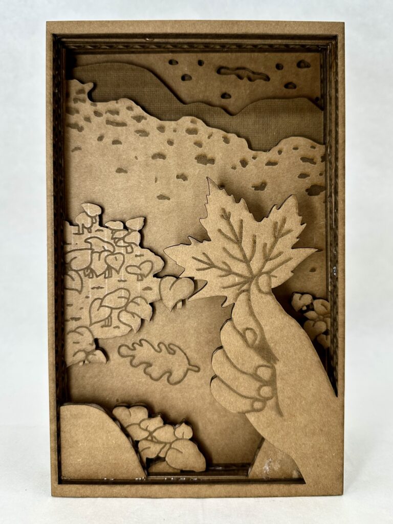
As for the nature side, I was pretty sure on what I wanted to do from the very beginning, something tranquil and interactive. I was picturing the thing I would most likely do on a hike which is pick up the biggest, most red leaf I could find. You might note that the leaf isn’t red and that the whole project is in greyscale. I chose to do this one because I wanted to try shading with the laser cutter, otherwise I would have definitely had made the leaf red.
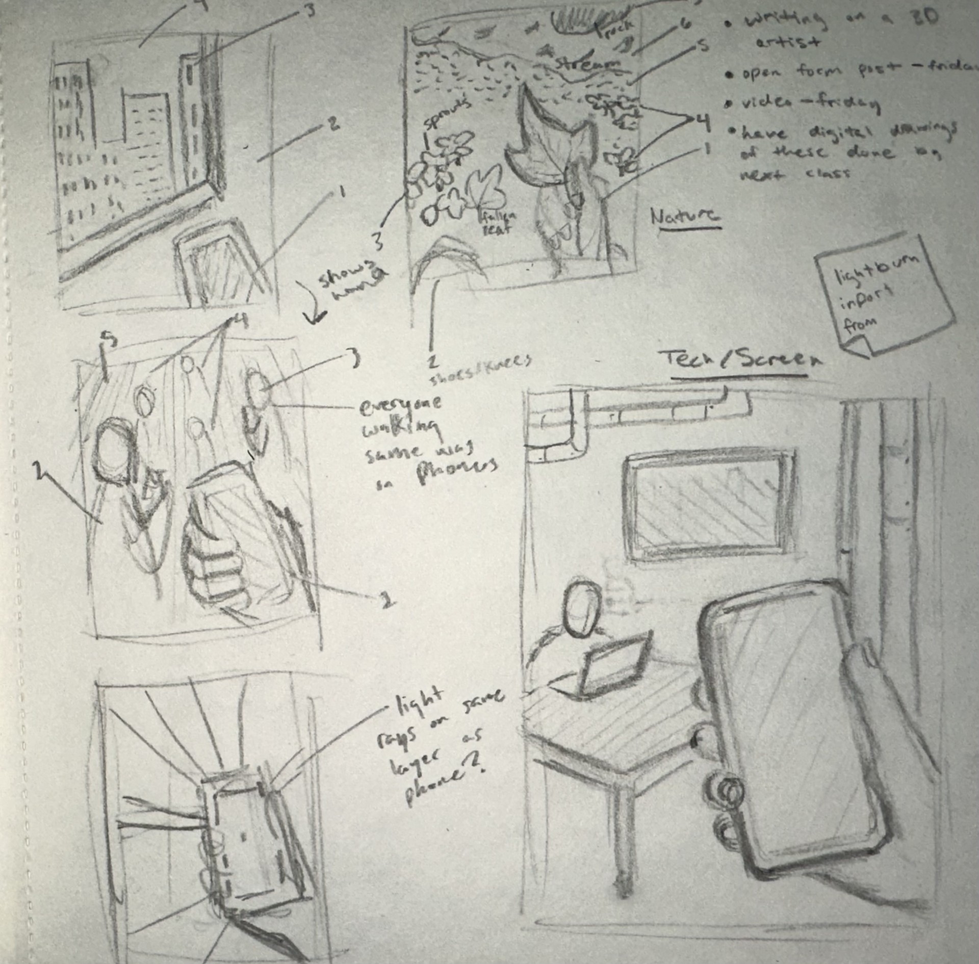
I’ve worked with a laser cutter briefly once before in high school so I was somewhat familiar with how my designs were going to translate into the program. I knew I had to make very clean looking lines so it would be less work later in Lightburn. This meant I couldn’t use any brushes that had any blending end properties. My strategy ended up working well and I was able to swiftly get perfect lines in the program.
Something I hadn’t thought of in the beginning was adding inner frames around all the layers. I had to go back and do that at the end which was a little confusing at first because I’m used to drawing with something like that in mind. I didn’t add butter layers because that would mean shrinking each layer individually and I wasn’t willing to risk not getting each layer disproportional to each other. But this proved not to be a castle in the program and was honestly one of the more easier things to do.
Overall, I enjoyed my experience working in Lightburn because it was interesting to see how my knowledge of Adobe programs translated. It ended up being more similar than I anticipated. It was also fun to learn how to do new things on the program and then to see the product come to life, it was very rewarding.
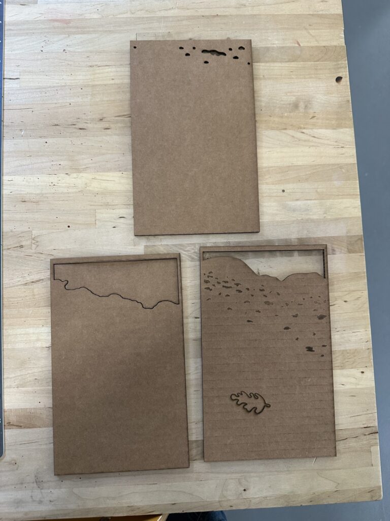
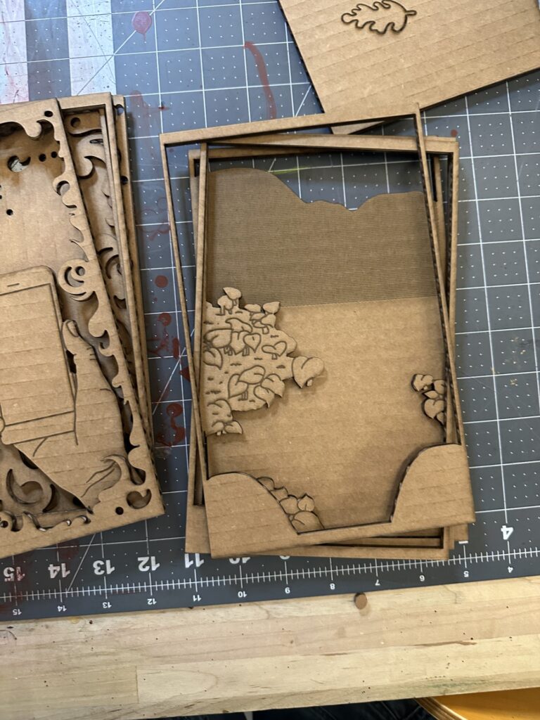
Unfortunately, I had to use cardboard instead of wood like I had hoped because, with the many layers I had, it would have been too time-consuming otherwise. For. those who don’t know, cardboard takes less energy to cut and shade, therefore less time. An additional thing that needed to be adapted to save time was the layers that were complexity filled in. These layers are the silhouetted people on the tech side, and on one of the nature background layers.
There were a couple hiccups during the cutting process. The picture on the right shows a couple of layers where I put shading layers on the wrong cut layer. I had to go back and redo. correctly. Besides that, there were not any major problems I had with the laser cut.
Final Product
I’m pleased with the results of diorama, the only thing I would change is the foreground. The two sets of plant clusters is broken up by the background. This breaks the illusion of depth. I didn’t realize this was a problem until was all put together, I thought the front plants would be enough to create the illusion. Another thing I would add just for an extra layer of interest is a boarder at the very front that has clean rounded edges and slightly over hangs over the rest of the layers’ boarders. I think part of what worked so well with the tech side of the diorama is the foggy boarder (especially with the extra ons as you go further into) that brings the viewer into the space.
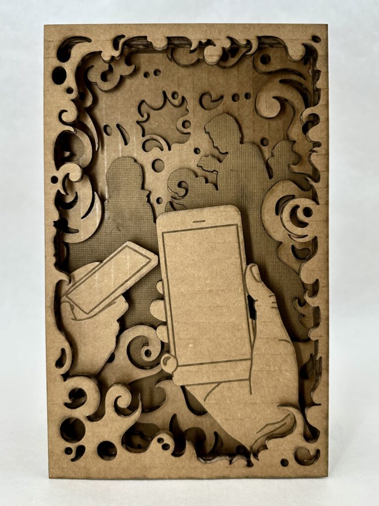
I also believe I did a good job depicting the busy, noisy, constant buzz of social media that tech brings by the smoke layers. The business is what clouds your vision from the present moment which I think translate well in the design; this is highlighted in the layer of silhouetted people. I was originally going to add line work on top, but instead I chose to shade the whole layer. I found that this gave it more meaning because the people blend in with the environment and don’t stand out as people. Another aspect of the smoke I find successful is how it has areas of sharp edges that represent how scrolling on social media can be so harmful.
It’s Its ironic how the side I was most successful in is the side I should admittedly not engage with as much.
Leave a Reply