Tag: Top 3 Posts

  • Historical Vessel Adaptation

    Historical Vessel Adaptation

    FormalElements of design: color, texture, material, scale, 
    TechnicalCorrect use of underglaze and clear glaze
    Use mixed methods of hand building to create a hollow form
    Additive and subtractive methods 
    ConceptualCreate a contemporary object using forms and iconography from the tradition of historic vessels

    For this project you are to choose 3 different vessel forms dated pre 1500. Choose these vessels in regards to shape, composition, and surface design. Have representations (tracings, photocopies, printouts, etc…) of these vessels that you can reference and know:

    • the period of history in which they were created/ date
    • what country they are from
    • a cultural reference of tribe or geographic area

    If you cannot find this information then you can’t use the vessel. You will be explaining your results at the final critique and in written form.

    Sketches

    In a sketch take the three images you have chosen and combine them together into one vessel. Example: use the form of a Korean vessel, the handles from a Minoan vessel, and the surface design from a Mayan vessel. Mix cultures to create the final.

    Final Vessel Guidelines

    1. 12 inches in height.
    2. Use of colored underglazes
    3. Additive and subtractive methods of surface design.
    4. Should be an “enclosed” form that involves an S curve. The volume should be curvilinear and not a vertical tube.
    5. Incorporate handles on the form

    Process

    Vessel A – Terracotta jug, ca. 1600-1050 BCE, Mycenaean culture, H. 4 in.

    Vessel B – Terracotta tankard – ca. 1600-1200 BCE, Cypriot culture, H. 4 9/16 in.

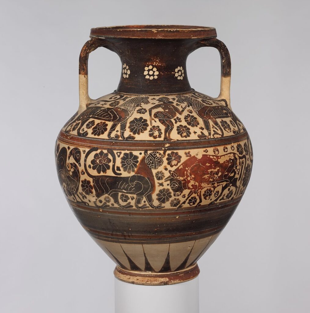
    Vessel C – Terracotta neck-amphora, ca. 620-590 BCE, Greek, Corinthian culture, H. 11 1/2 in.

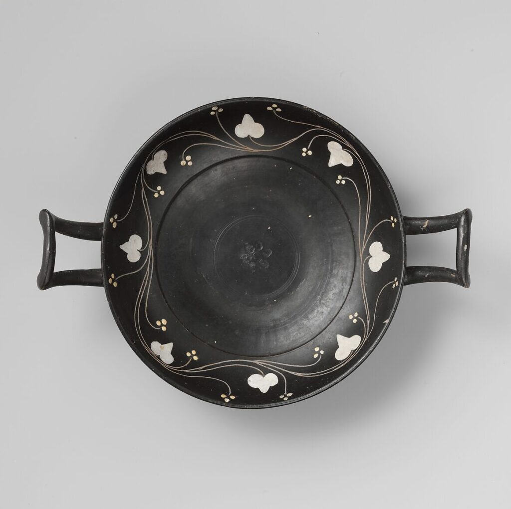
    Additional Ceramic Piece – Terracotta kylix, ca. 400-350 BCE, Greek, South Italian, Campanian culture
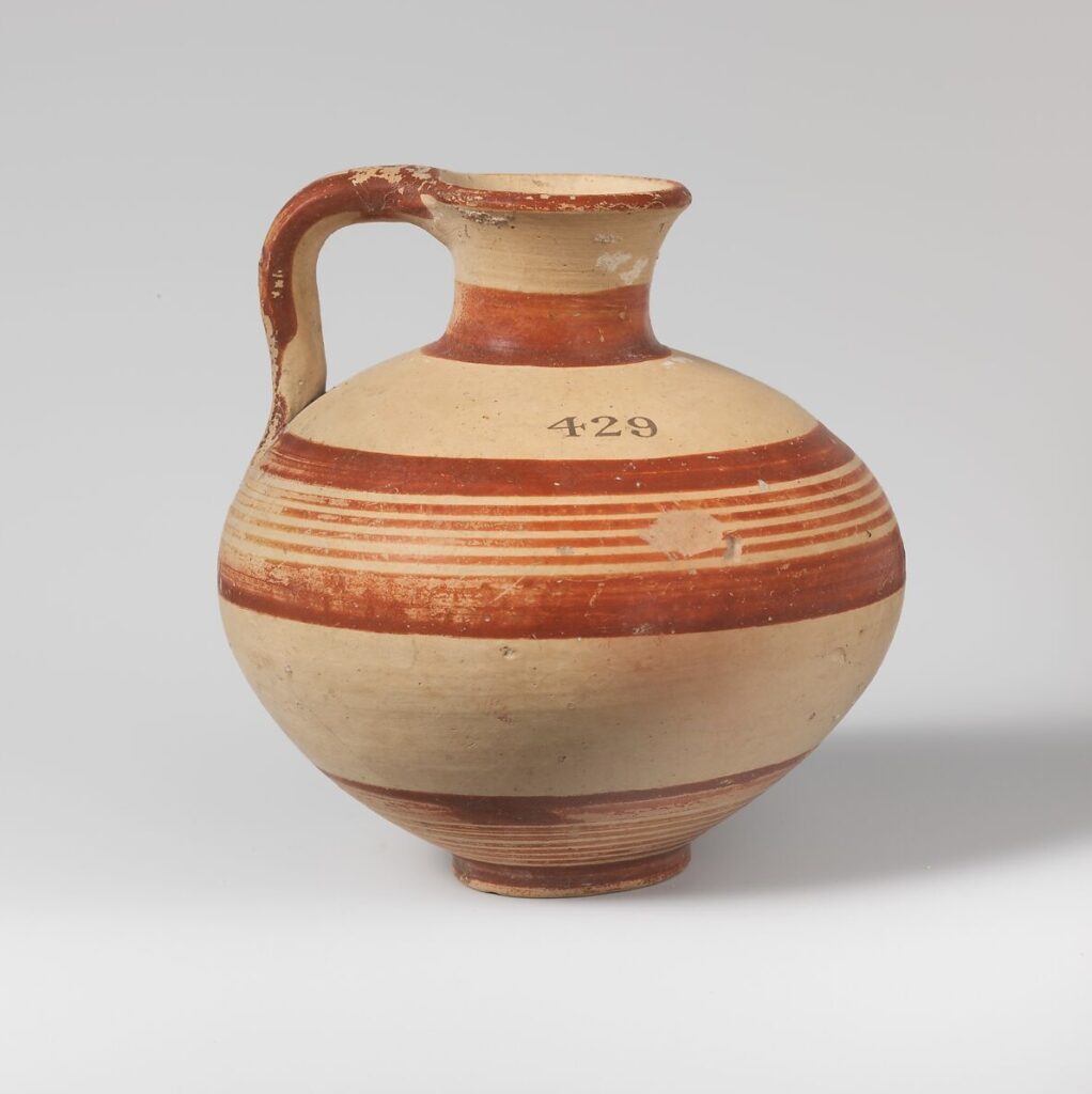
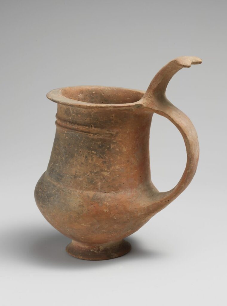
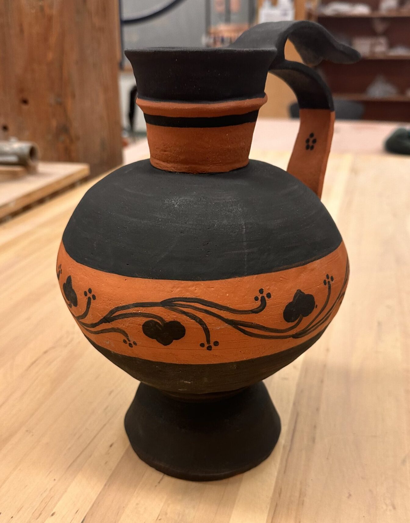
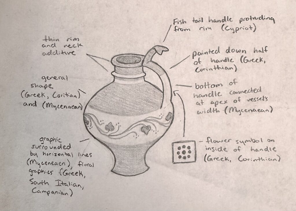
    Vessel A & C is where I got most my inspiration of the general design of my Frankenstein vessel. I took another element of Vessel A from the handle. I wanted a handle to come from the rim of the vessel down into the greatest circumference measurement of the vessel like it does in Vessel A. I wanted another handle to come from the top of that handle and bow out like it does in Vessel B. The top handle also share the same shape at the tip of the handle as the reference. Vessel C was the only reference I felt unsure about recreating. I wanted to incorporate a graphic design that wrapped around the entire vessel and was enclosed by horizontal lines, but didn’t wasn’t to create an elaborate illustration of people, animals, and florals. That’s why I added another reference to add to my vessel that’s illustration was much more simple and my style. To make sure I had enough elements of Vessel C in my adaptation, I included the handle being painted halfway and added one of the geometric floral symbols on the inside of the bottom handle.
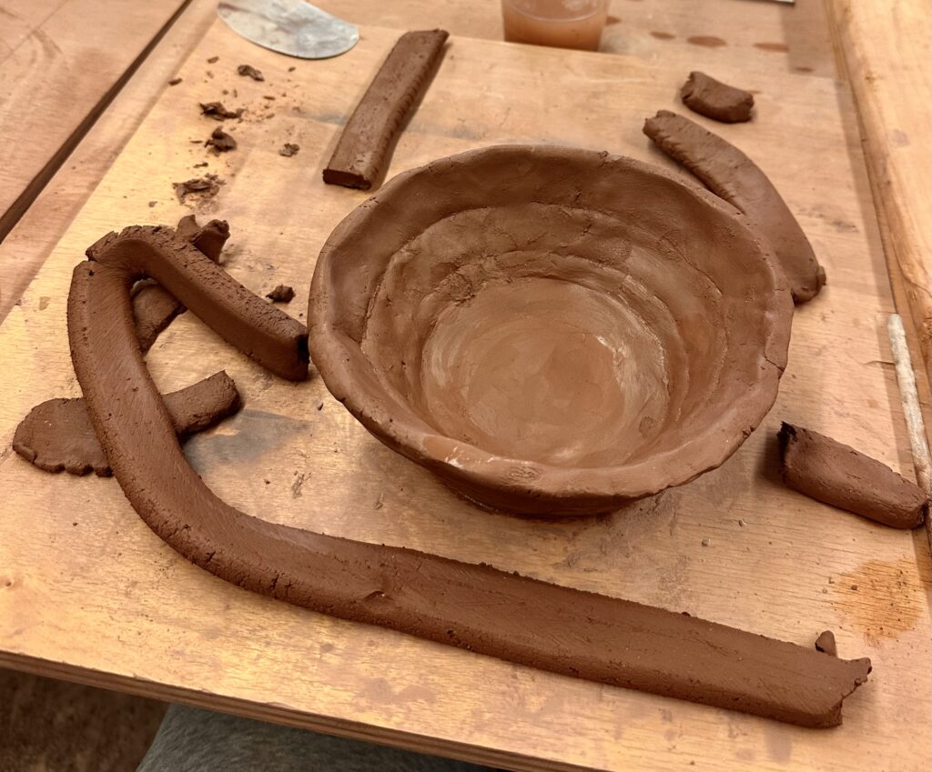
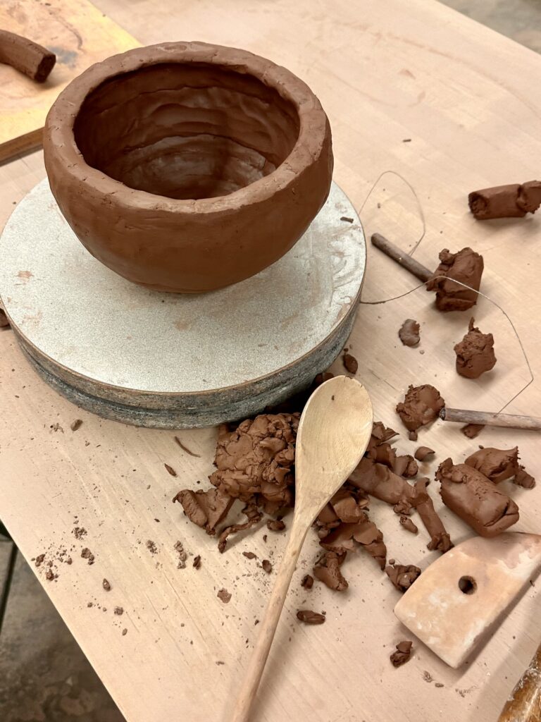
    My first step was to make two large bowls to later attach later to create the circular part of the vessel. This was my second experience ever trying to create a vase-like sculpture out of clay. So this step was an experimental process of figuring out what working for me.

    My first strategy was to make flattened coils that I would tediously attach in layers. However, this seem to become futile as I would thin out the walls too much in the areas I had attached the coils. So during my second go around of making the bowl I used much larger coils I didn’t bother flattening. After I would attach the coils to each other I would flatten them out myself in a pinch pit fashion. This proved to be a dramatically quicker process that gave me similar enough results.

    Although, I tried to get a round shape that was closer to my sketch, it ended up being my circular than I anticipated. I tried to recover the original shape as much as possible by patting the walls in with a wooden spoon.

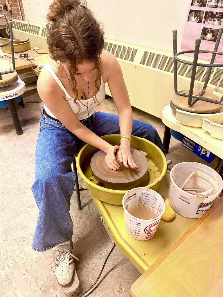
    I had never used the wheel before so I decided to only do the smaller parts of the vessel, like the base and neck, on the wheel.

    Using the wheel for the first time was an interesting experience. I surprised at how difficult it was to control the clay. Luckily, I found it to not be too frustrating because when I failed, it just felt like I was making mud pie. It reminded me of using a sewing machine where you use a pedal to control the speed, at the higher speeds you could more easily loose control and risk the precision of your work, which in this case would result in a mud pie.

    I started with the neck of the vessel which I hard a hard time forming because I can’t breaking the neck when I tried to extend the length of the rim. I settled for a less dramatic rim and then attached the neck to the hollow sphere I’d already made. I took a break from the wheel to craft the handles of the vessel. I used a flat strip of clay to make the handles, one
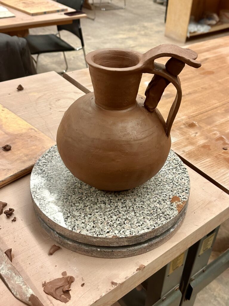
    for the big bottom strip, and one for the smaller top piece. The most difficult part of making the handle was trying to get the clay to stand up right. The clay had to be wet enough to attach and bend, but dry enough to stand up right. I had difficulty with the latter and relied on other clay to keep the form up right. As you can see in the picture above, the clay acted as a pillar to keep the handles from drooping. It might seem that there is one handle with a decorative flourish on top, but I would argue that there are two since you could carry the vessel from either part.

    Now that the handle was attached I would be able to accurately measure the height of what I had for the vessel so far, so I could calculate how tall to make the base. Although a tall base wasn’t in any historical vessel references, it was my way of adding height to the vessel to meet the assignment requirements. Once I attached the base I realized it was too short by a 1/2 inch, so I made another base to attach to the bottom which made the whole base over 13 inches. I created essentially a kiln bomb so I carved out the bottom of it. Something I didn’t foresee was that because I took away the support the solid base was providing, it began to collapse. I tried to rectify this but no matter what I did, it just kept sinking into itself. I decided to take pressure off the bottom by laying it down, the only problem with that is the handles or the walls of the vessel would warp from the pressure on them. To prevent contorting it, I crumpled up newspaper to try to support the sides and handles. This worked surprising very well. If course I couldn’t prevent all the caving but I tried to fix the damages when it was less wet.

    After it was bone dry I was able to begin painting with black underglaze similar to Vessel C and the additional ceramic piece, leaving the rest of the vessel a natural warm terracotta color similar to the warm tones in the rest of the references. To line up the horizontal lines smoothly, I put the vessel on the wheel and held the paintbrush to it, so all I had to do was push a pedal. After creating my lines I blocked in the glaze and drew on my design.
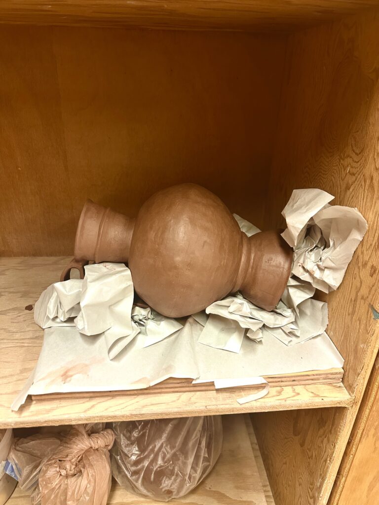
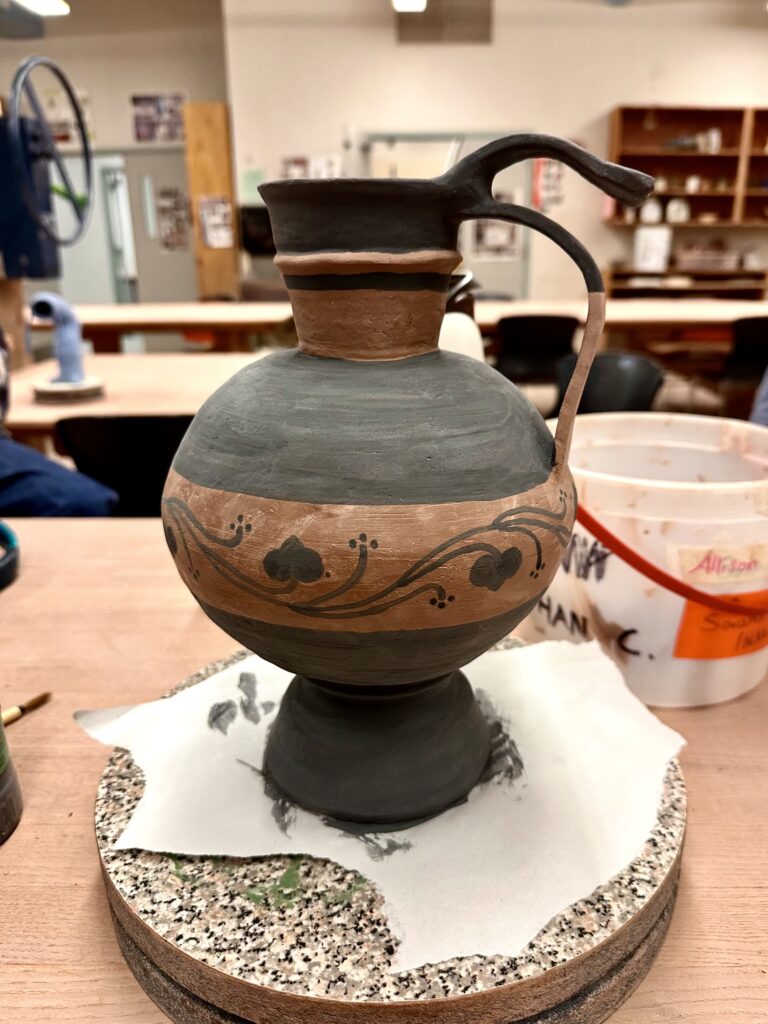
    Then my vase got bisque fired! I checked to see if y handle was secured to the vessel as that was what I was most worried about since they were so thin. Luckily, they were fine. As I was taking pictures of the vessel it popped off the base! At least you can see my score marks on the vessel for proof I did my best.
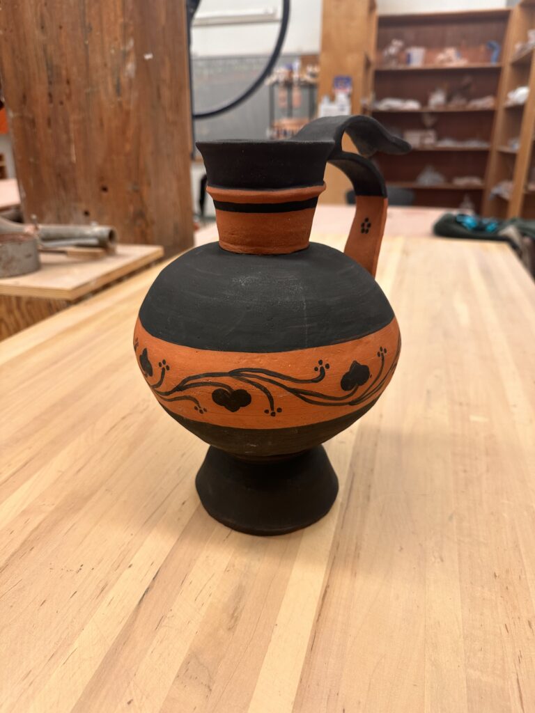
    At this stage all I have to is reattached the base. I was originally thinking to put a clear coat of glaze on top of the entire vessel but now I’m reconsidering this after seeing how clumping it can look. If I had the tools available, I would use an airbrush to apply the glaze to get a thin even coat to avoid getting a goopy texture on it.

    Final glazing aside, I think the this form works really well. The contrast of the circular middle part of the vessel next to the planar slabs creates an interesting visual especially with how it’s painted. The geometric black stripes also contrast well with the organic pattern that enevlops the vessel. The whole piece has pleasing contrasts as I choose black against the bright orange of the bare low fire clay. I also think the handle that hovers above the lower longer one adds an interesting flair that brings the piece personality.
  • Dynamic Double Diorama

    Dynamic Double Diorama

    Assignment

    In this assignment you will complete a two sided diorama incorporating contrasting concepts on each side. The composition can be arranged vertically or horizontally, and should be at least 8” x 6” when complete.  

    Requirements:

    • a minimum of five layers. The middle layer/center counts and should be involved in the composition. A “frame” layer does not count as a layer.
    • Patterns in a material should compliment the work and contribute to the composition.
    • Images can be taken from any scale to represent depth and distance.
    • Think of 3 contrasting concepts for each side of the diorama. Simple solutions (you will create better ones!)
      • Day & night
      • Arctic & desert
      • Curvilinear & angular

    Part One: From your contrasting ideas select objects that relate and think of them in layers.

    • What do you want to represent in this contrast for the viewer?   
    • Take the images and break them into five or more layers, by distance (foreground, midground, background). The composition should be visually dynamic. How light interacts through the final piece should be considered. Layers in the foreground will cast shadows on those toward the mid/background. Can the backgrounds of each side have the same imagery? 
    • The materials used for your piece should compliment the role they play in the composition. Be mindful that the materials will need to survive the laser cutting process and being on display for the viewer.

    Part Two: Production and assembly.

    • Create 2D files from your sketches, working in black and white. One file per layer, saved as PNG files. We will take PNG files, import them in to Lightburn,Links to an external site. and trace the bitmaps to produce the work.

    Process

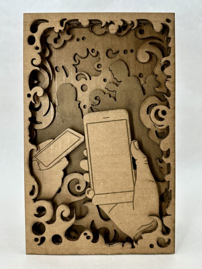
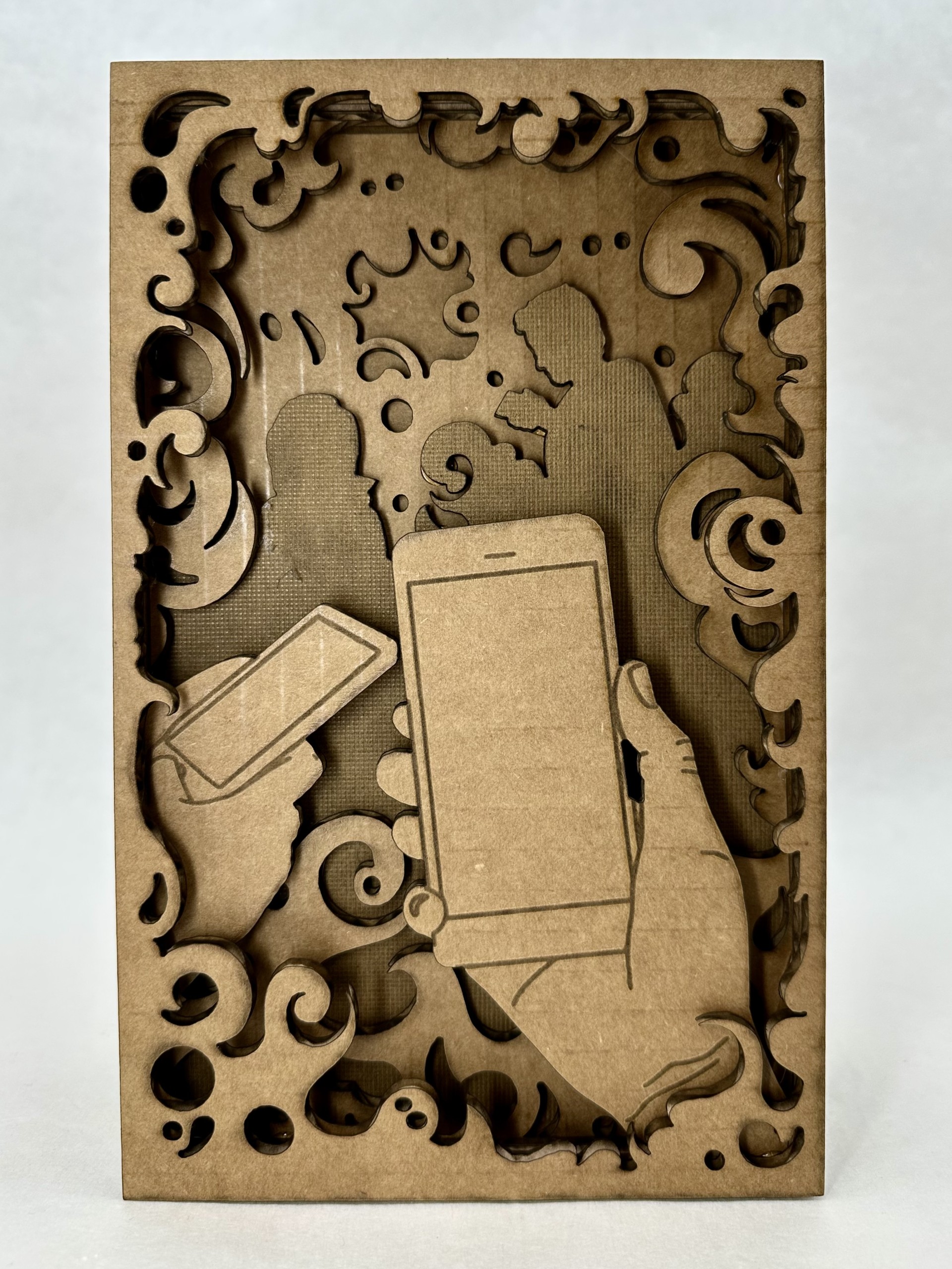
    When brainstorming concepts for the design, the first thing I thought of was good and evil. I knew the concept was too broad for me to depict without more guidance, so I thought about sub-categories within good and evil. I settled on technology vs. nature, specifically through the lens of a person on a day to day level. A person has a choice (much like with morally good and bad choices) to choose to be either sucked into doom scrolling or go outside and take a moment to be mindful.

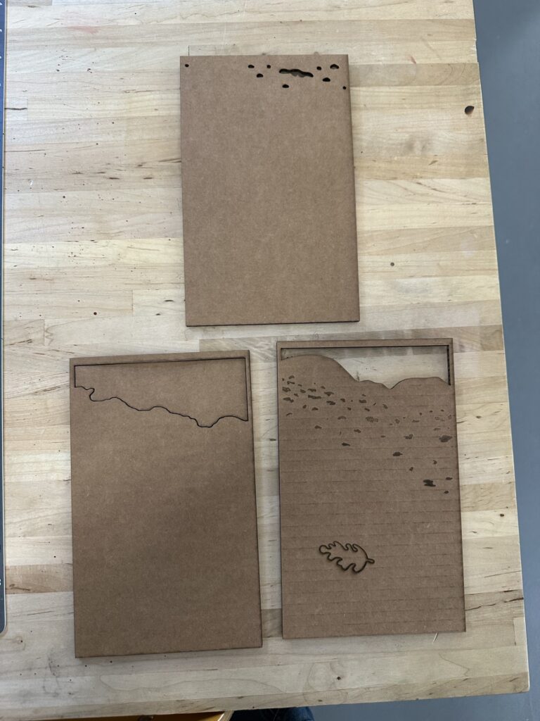
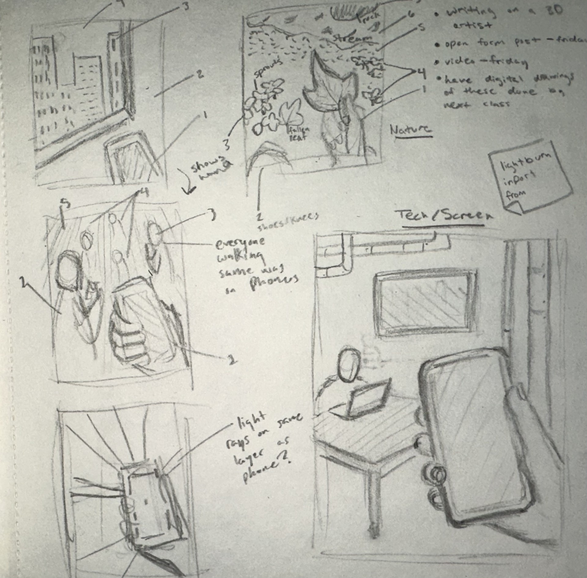
    At this stage I wasn’t entirely sure what I wanted to do for the tech side. As you can see in my sketchbook I have many different ideas of what the background could look like, but I didn’t end up coming up with the final idea until the very end of the process.

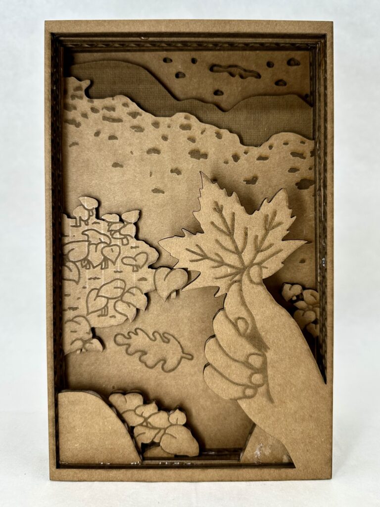
    As for the nature side, I was pretty sure on what I wanted to do from the very beginning, something tranquil and interactive. I was picturing the thing I would most likely do on a hike which is pick up the biggest, most red leaf I could find. You might note that the leaf isn’t red and that the whole project is in greyscale. I chose to do this one because I wanted to try shading with the laser cutter, otherwise I would have definitely had made the leaf red.

    Sketches of concept

    I’ve worked with a laser cutter briefly once before in high school so I was somewhat familiar with how my designs were going to translate into the program. I knew I had to make very clean looking lines so it would be less work later in Lightburn. This meant I couldn’t use any brushes that had any blending end properties. My strategy ended up working well and I was able to swiftly get perfect lines in the program.

    Something I hadn’t thought of in the beginning was adding inner frames around all the layers. I had to go back and do that at the end which was a little confusing at first because I’m used to drawing with something like that in mind. I didn’t add butter layers because that would mean shrinking each layer individually and I wasn’t willing to risk not getting each layer disproportional to each other. But this proved not to be a castle in the program and was honestly one of the more easier things to do.

    Overall, I enjoyed my experience working in Lightburn because it was interesting to see how my knowledge of Adobe programs translated. It ended up being more similar than I anticipated. It was also fun to learn how to do new things on the program and then to see the product come to life, it was very rewarding.

    Unfortunately, I had to use cardboard instead of wood like I had hoped because, with the many layers I had, it would have been too time-consuming otherwise. For. those who don’t know, cardboard takes less energy to cut and shade, therefore less time. An additional thing that needed to be adapted to save time was the layers that were complexity filled in. These layers are the silhouetted people on the tech side, and on one of the nature background layers.  

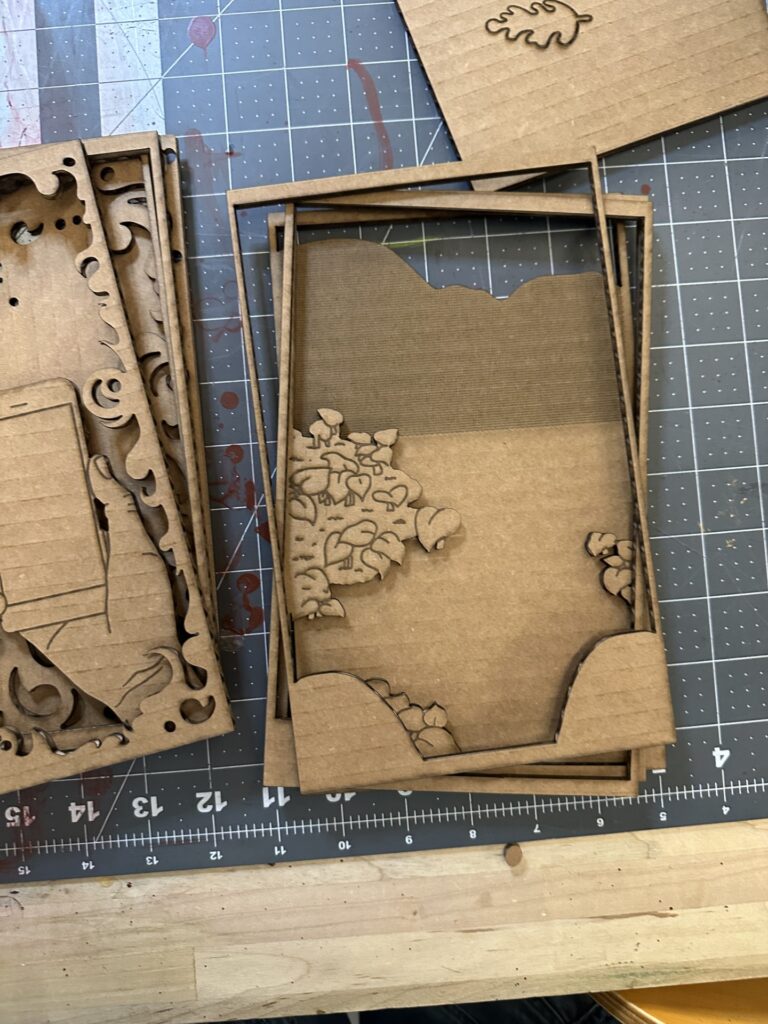
    There were a couple hiccups during the cutting process. The picture on the right shows a couple of layers where I put shading layers on the wrong cut layer. I had to go back and redo. correctly. Besides that, there were not any major problems I had with the laser cut.

    Final Product

    I’m pleased with the results of diorama, the only thing I would change is the foreground. The two sets of plant clusters is broken up by the background. This breaks the illusion of depth. I didn’t realize this was a problem until was all put together, I thought the front plants would be enough to create the illusion. Another thing I would add just for an extra layer of interest is a boarder at the very front that has clean rounded edges and slightly over hangs over the rest of the layers’ boarders. I think part of what worked so well with the tech side of the diorama is the foggy boarder (especially with the extra ons as you go further into) that brings the viewer into the space.

    I also believe I did a good job depicting the busy, noisy, constant buzz of social media that tech brings by the smoke layers. The business is what clouds your vision from the present moment which I think translate well in the design; this is highlighted in the layer of silhouetted people. I was originally going to add line work on top, but instead I chose to shade the whole layer. I found that this gave it more meaning because the people blend in with the environment and don’t stand out as people. Another aspect of the smoke I find successful is how it has areas of sharp edges that represent how scrolling on social media can be so harmful.

    It’s Its ironic how the side I was most successful in is the side I should admittedly not engage with as much.

  • Classical Influence of Intergenerational Cultural Transmission in Disney

    Classical Influence of Intergenerational Cultural Transmission in Disney

    Photo by My Favorite Planet.com

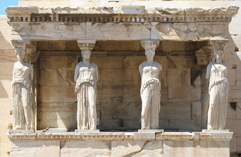
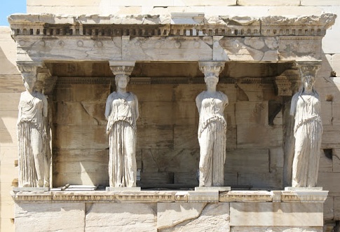
    The classical era has made its stamp on today’s modern world of art, but not just by the influence of fancy pillars on esteemed buildings. Its influence branches further than the physical appearance of architecture and sculptures, it reaches the virtues and values we uphold today. One example is their caryatids, these sculptures serve multiple purposes: beauty, support, and a symbol of harmony. If you look at the Erechtheion, you’ll see that they’re unified by appearance and stance that creates a sense of order and peace. The way the women have their weight shifted on their outer legs provides the assurance of support and therefore adds to the sense of united peace. “This is a sort of sensitivity to harmony, balance…” Zucker, S., & Harris, B express. This technique used to represent these ideals is so effective that we imitate it in our art today. We have more tools than ever to pass down groups’ cultural morals and values to new generations such as animation. The Disney movie Brave used it to tell a story of what happens when you don’t have that unity. 

    that they should be the pillars on which the peace of the land rested.

    In Brave, the mother Elinor is trying to teach her daughter Merida what happens if you don’t fulfill your duties as a political figure. She tells a story of an ancient kingdom, “… ruled by a wise and fair king who was much beloved. And when he grew old he divided the kingdom among his four sons. That they should be the pillars on which their piece of land rested.” Andrews, M & Chapman, B. (Directors). [13:10:00]. As Elinor tells the story she physically builds this kingdom with a chess board supported by four chess pieces under each corner. The chessmen she picks are white and are well detailed coincidentally alike how we view classical caryatids today. However one chessman is black and is clashing with the other three white pieces, it is this piece that represents the antagonist of the story at hand, “… But the oldest prince wanted to rule the land for himself, he followed his own path and the kingdom fell, from war and chaos and ruin.” As she recounts the kingdom’s demise, she snatches the black chessman from underneath the chess board and it tumbles to the ground along with all the other chess pieces who once relied on the foundationally chessmen to stay atop the board. Physically showing how imbalance, lack of order, or lack of symmetria, causes chaos. 

    He followed his own path and the kingdom fell

    These beliefs were once displayed on the architecture of buildings in Athens for all to see. All the youth of Athens had to do to see the virtues of their community was to walk outside. We don’t have as detailed architecture today to create rich storytelling for children, so we rely on other means. As a form of education and storytelling, animation has made a powerful impact on children’s lives. It’s no wonder they’ve looked back at the classical era for symbolism for intergenerational cultural transmission.

    Citations

    Andrews, M. & Chapman, B. (Directors). (2012). Brave [Film]. Walt Disney Pictures, Walt Disney Studios Motion Pictures.

    Zucker, S., & Harris, B. (n.d.). The Athenian Agora and the experiment in 
    democracy. Khan Academy. Retrieved April 30, 2024, from 
         https://www.khanacademy.org/humanities/ap-art-history/ancient-mediterranean-ap/ 
         greece-etruria-rome/v/athenian-agora 

    Zucker, S., & Harris, B. (n.d.). The Erechtheion. Khan Academy. Retrieved April 
         30, 2024, from https://www.khanacademy.org/humanities/ 
         ancient-art-civilizations/greek-art/classical/v/erechtheion?modal=1