Blog

  • Tyvek Suit

    Tyvek Suit

    Assignment

    Using what you know about the 3D elements of design, a Tyvek suit, Sharpie markers and a Theme of your choice, design a suit that will draw the viewers eye around from one side of the suit to the other.  Remember this suit will be worn and is Three-dimensional (even though when you work on it, it is flat).

    LATERAL THINKING: Brainstorm lists of the elements in a theme. For example if your theme was “Sea Life” you could make a list of the different things that live in the sea. Fish, whales, sharks, Plant life etc. Then…you could make a list of all the kinds of Fish (web search might help with this), list of different kinds of sharks…you get the idea. Now you have lots of visually material for the next step!

    • You must cover the whole suit (Draw big!)
    • Use repetition and contrast
    • Use pattern

    SKETCH: use your sketch book to explore different possibilities,

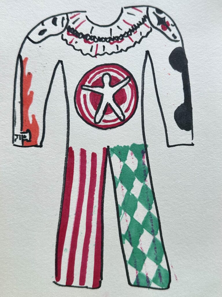
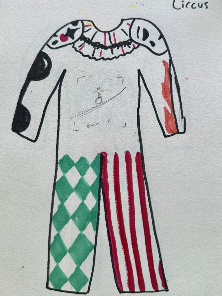
    Maquettes: then using a large sheet of paper cut out 3 paper doll type shapes that will be maquettes of your suit See below image). Draw on these to play with composition that is not only 2D but wraps around to the other side.  They should be different from each other, with the goal being to explore different possible paths for you to take with this assignment.

    WRITE: Free write a list of what is most interesting about each of the 3 cut outs, and what might be rewarding or compelling about making each one.

    Process

    Lists

    Eve

    • Golden Halo
    • Snake
    • Apple
    • Wings
      • Feather
    • Branches
      • Leaves
    • Ribs
    • Good & Evil/Black & White

    Circus

    • Spinning Dart Board
    • Flaming Swords
    • Dumbells
    • Horses
    • Elephants
    • Red & White vertical stripes
    • Clown makeup/masks
    • Type-rope

    Bugs

    • Beatle
    • Dragonfly
    • Ladybug
    • Ant
    • Caterpillar
    • Worm
    • Spider
      • Spiderweb
    • Dew drops
    • Leaves/other outdoor elements

    Sketches & Maquettes

    Shown to the right are my first two maquettes. I liked how the snake wrapped around the entire suit and how it had repetition/something sitting on the shoulders. However I didn’t like the first Eve theme because I didn’t think I could bring in commentary I wanted to do successfully with the timeframe and canvas I had.

    Again, I really enjoyed how I had something sitting on the shoulders with the Circus design, I also really liked the patterns on the leg. On the other hand, I didn’t feel like I was bringing the right vibe to the piece like I wanted. So, I decided against going any further with the idea.

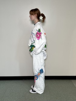
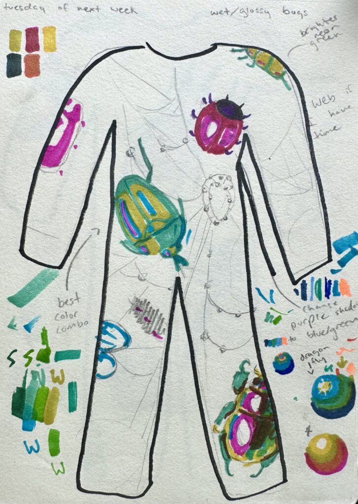
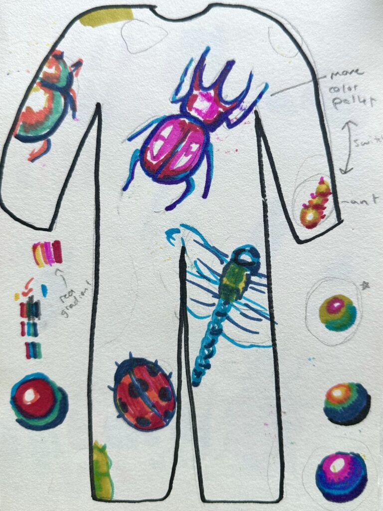
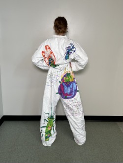
    The last design was interesting to me and I thought it brought verity and repetition in a unique way. Each bug had its own color, shape, It also allowed me to do something on the shoulder (like how I did with the ladybug). It also allowed me to do something on the shoulder (like how I did with the ladybug).
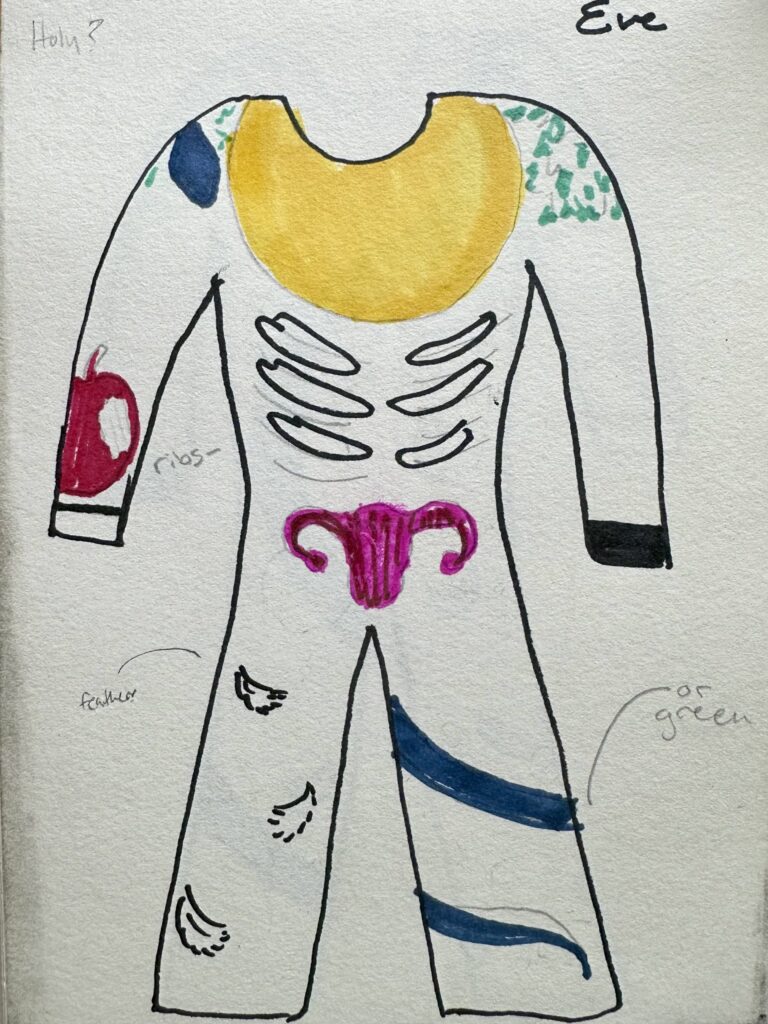
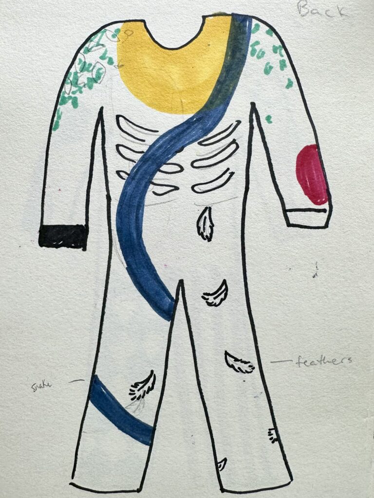
    Something I kept in mind while drawing the maquettes was that I’m a very meticulous slow drawers, so seeing this big of a canvas to work with made this assignment pretty daunting. I knew I would have to work more abstractly than I usually do. I tend to create things that are more realistic but it’s really time consuming as I get wrapped up in trying to make everything “perfect”. With such a large canvas to work on, I didn’t have the option to spend that much time on every small detail. So I chose to block out colors and create hard contrasting lines instead of mixing colors to create soft transitions within the shadows to get that realism effect.
    Drawing On the Suit
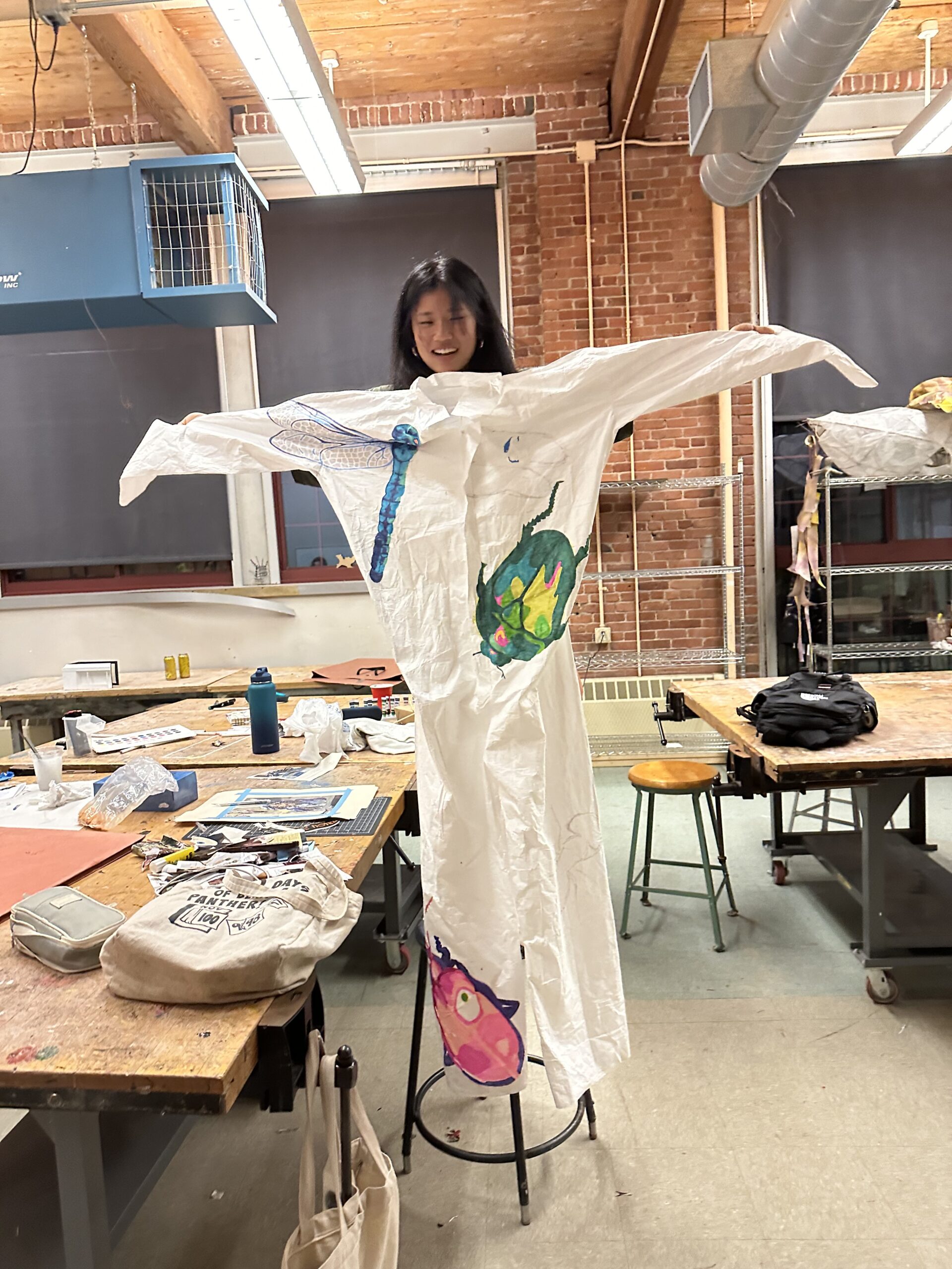
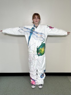
    First Progress Check (front)

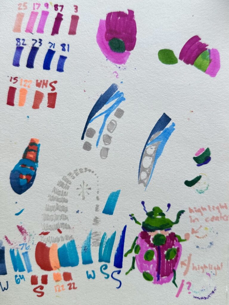
    As I mapped out my piece, I used the lightest color out of that bugs pallet to create the outline. Once the gestural drawings were done, that when I would go in blocking out colors following the color pallet values I tested before (as seen on the “Sketch: Bug (color swatches+)” picture).

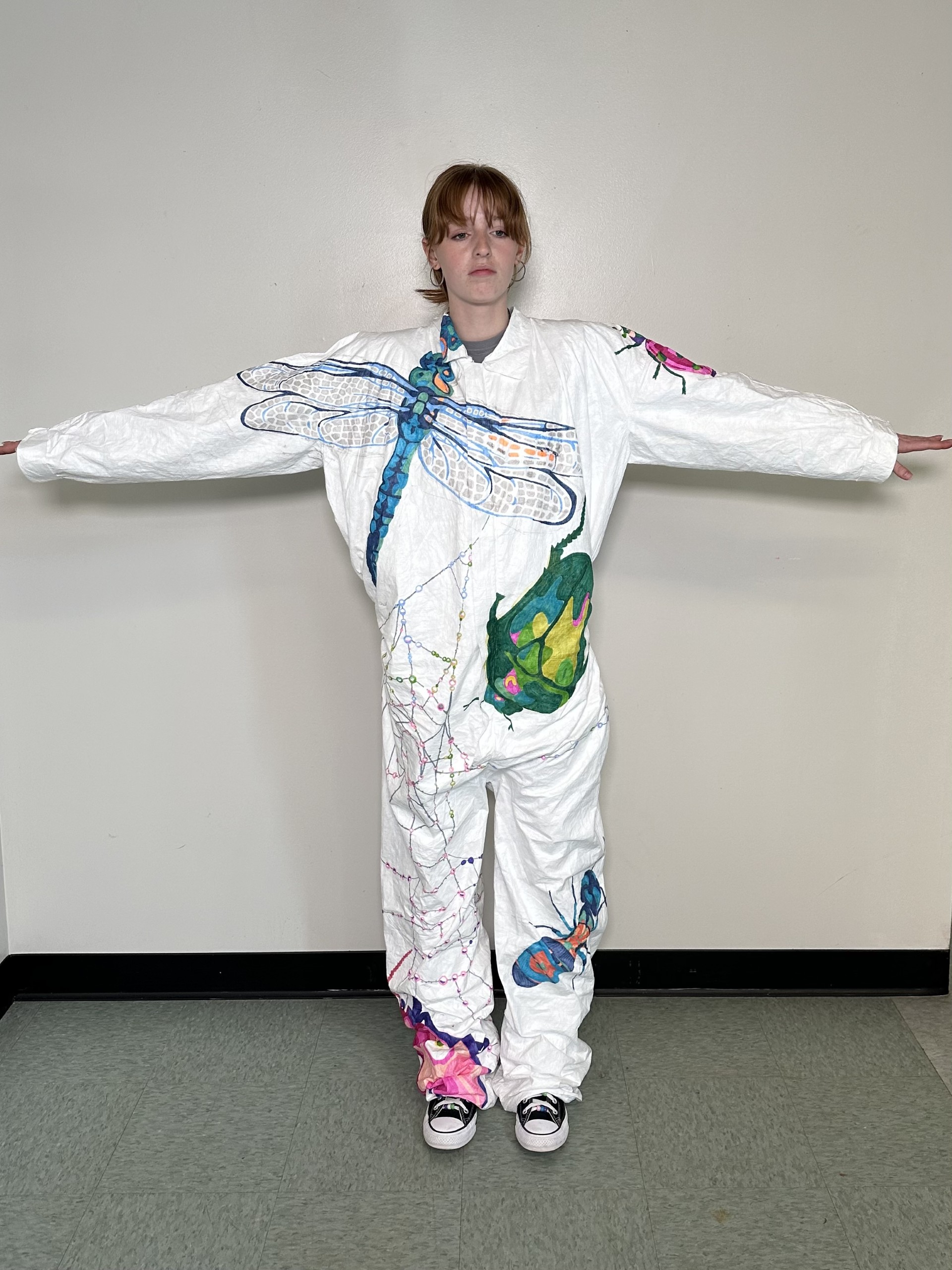
    For each bug I used contrasting colors for the highlight to give more interest to each bug. So for the blue bugs I used a light neon color, for the pink I used green, for the green I used pink, and so on. Another thing I think was successful was changing the facing directions of each bug, you don’t see a single bug facing the same direction as its neighbors.

    One thing I struggled with was trying to make each bug enlarged and different sizes, but as I sized up each bug that would normally be much smaller than it’s neighboring bug, I ended up making all the bug generally the same size on accident. I think was successful with the dragonfly and lady bug though as they were two contrasting sizes right next to each other, I wish I could have implemented that technique consistently throughout the piece. I also wish I had made minuscule bugs and placed them around the piece. Something simply and fast as to not take up much time but to add more interest to the piece in that way.

    A challenge I faced was defiantly the dragonfly. I think over all it turned out well and but I had a lot of bumps in the road and obstacles I had to get past for it to be successful, one of them being my canvas. I was working on fabric that moved around, pinched in some areas, and was distressed in others. So as I. was working on it the fabric would move, this made it challenging to map out the dragonfly, I had to constantly keep going back and correcting my mistakes so I could make the wings symmetrical. If you look closely at the wings they aren’t symmetrical, some lines in the right wing are badly messed up or completely missing. However I think I did a good job going with my mistakes and improvising to make them not noticeable.

    Another thing that was hard to work around was a patch two the right of the wing where there was a tag or label of some sort that had been ripped off leaving the fabric tearing and fuzzy. This texture made the ink bleed so I tried to avoid that spot as much as possible. I eventually had to draw a couple lines in that area so I worked with a light hand as to not have so much bleeding.

    One challenge that I didn’t expect was having the markers die on me so quick. You might notice with the dragonfly for example, the right wing has a patch of different color geometric shapes than the rest of it because my marker had completely run out of ink. I went to use a similar colored marker, but it looked a bit funky, so I chose to change route and try using the light neon orange that I had been using for the form’s highlighter instead. This turned out well and I was able to play it off as a patch where the sun hits the wing just right.

    Overall I think the dragon fly was a success. it created a linear element. to the front to make the piece eye catching. I wish I implanted something similar towards the bottom on the back.
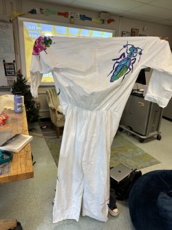
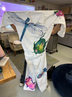
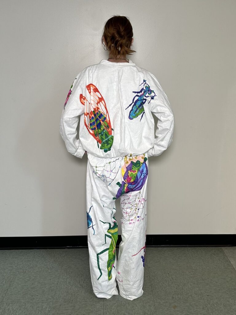
    Final Product

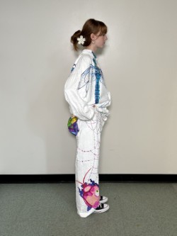
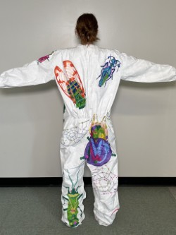
    At the critique I was told to add more stuff to fill up any empty space I had left. I was of course going to add more bugs to back, which I did. My only regret there was that wish I hadn’t done such complex color pallets, I wish I had stuck to something more like the front. Other things people suggested I add instead of bugs (since they’re so time consuming) were natural elements like sticks. I ended up doing colorful spiderwebs that reflected any nearby colors. I wish I had been able to keep the web in neutral grey tones to keep the attention on the bugs and not have the suit be so busy, but I doubt I would have had enough ink to do that anyway as I found myself running low on the few saturated colors I was using.

    If I had all the time I wanted to work on the project, then of course I would try to fill up more space on the suit. I would want to add much more bugs on the sleeve, smaller repeated bugs everywhere, and less dense attention-grabbing webs dispersed evenly around the suit.

    At the end of the day, I’m satisfied with my work. I covered the majority of the suite and made it dynamic. I got to play with bright colors in an abstract way which I’ve never done before. I definitely learned about color schemes and composition along the way, so I’d say it was a success.
  • Objects in Space

    Objects in Space

    Assignment Description

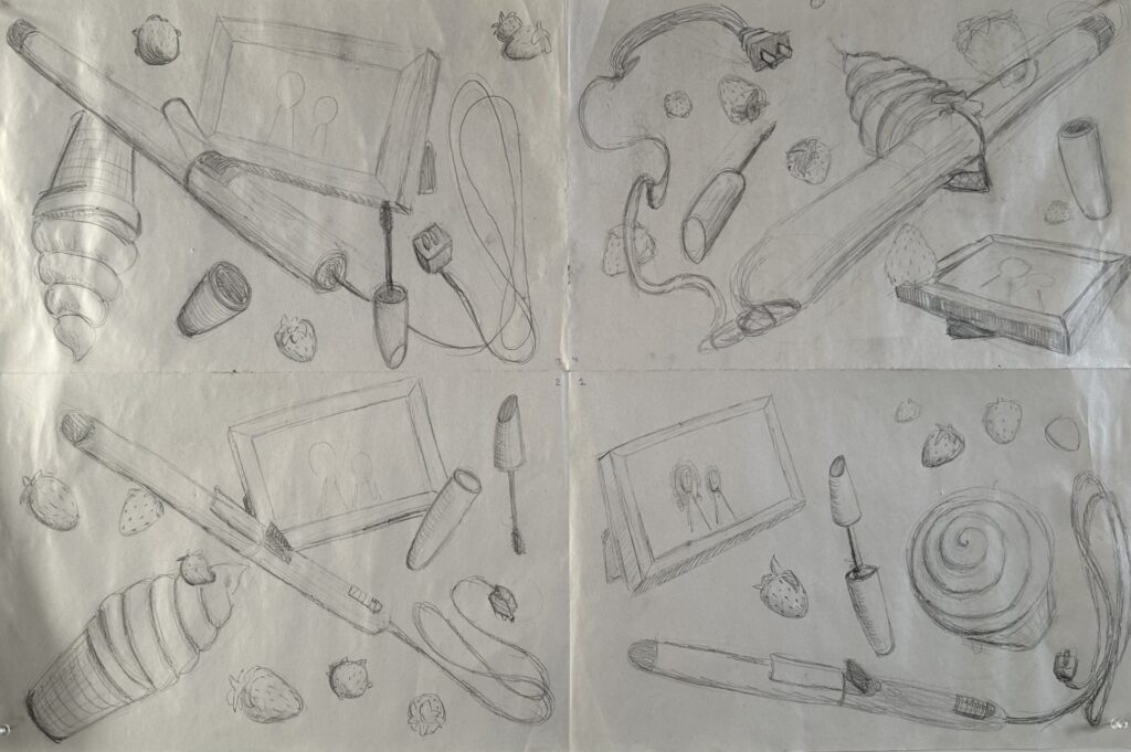
    The assignment was to create five lists of five dynamic closed shaped objects. So not i.e. rainbows, rivers, fields, etc. From that we were to pick five objects from each list that might look interesting together, so not too many skinny objects, or too many spherical objects. Then we needed to create four sketches of the objects we picked floating around in space. The sketch needed to be dynamic, which meant playing around with perspective, overlapping, and repetition. Once we had done sketches, we were to use what we liked from them and implement it in our final drawing.

    My Process

    I created five lists of five objects (with categories to help me come up with ideas for objects) as shown. I tried to pick things physically around me so I could use them as reference.

    Things That Remind Me Of Vermont

    1. Cabot Cheese
    2. Maple Helicopter Seeds
    3. Apple Cider Donuts
    4. Creemies
    5. Cows

    Objects In My Room

    1. Potted Plant
    2. Salt Lamp
    3. Purse
    4. Stuffed Animal
    5. Picture Frame

    Food I Like

    1. Ben & Jerry’s
    2. Strawberries
    3. Salmon
    4. Bananas
    5. Fruity Pebbles

    Bathroom Objects

    1. Toilet Paper
    2. Candle
    3. Hair Curler
    4. Soap
    5. Razor

    Things I Wear

    1. Shoes
    2. Necklace
    3. Sunglasses
    4. Mascara
    5. Belt

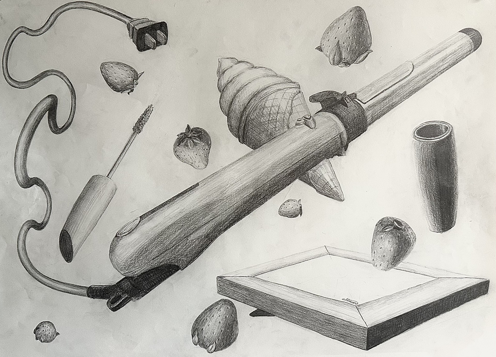
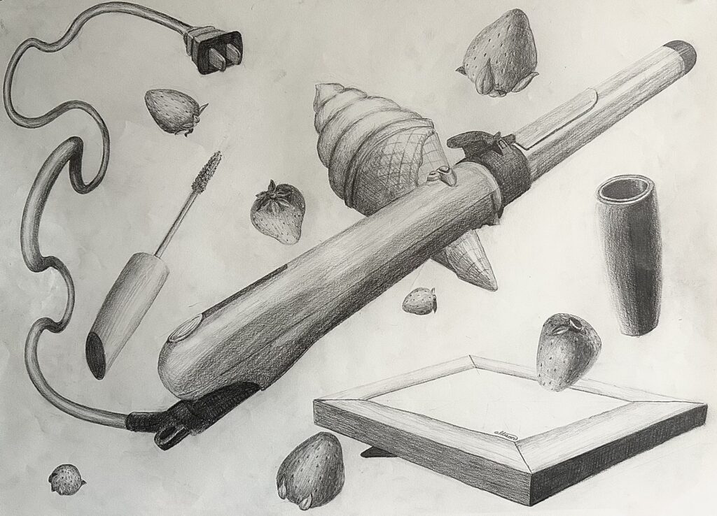
    After creating my lists of objects, I made five more lists playing around with combinations. I ended up choosing to draw a curling iron, tube of mascara, an ice cream cone, a picture frame, and strawberries. I thought these were objects that, out of all my combinations, were least connected with each other while also being very diverse shape-wise. These randomized combo lists are shown below:

    1. Potted Plant
    2. Razor
    3. Salmon
    4. Bananas
    5. Fruity Pebbles
    1. Stuffed Animal
    2. Candle
    3. Bananas
    4. Creeemies
    5. Shoes
    1. Salt Lamp
    2. Razor
    3. Strawberries
    4. Helicopter Seeds
    5. Belt
    1. Potted Plant
    2. Razor
    3. Strawberries
    4. Donuts
    5. Sunglasses
    1. Picture Frame
    2. Hair Curler
    3. Strawberries
    4. Creemie
    5. Mascara

    These are the sketches I did to the left. You can probably tell which were my first ones and which was my last one. I worked from the top left, counterclockwise to the top right. As you can tell the top right one is much more dynamic than the other three. After getting feedback I gave the hair curler more of an interesting perspective and made its cord travel back through space by using size and value.

    I also gave the frame a less typically viewed at perspective, making sure to add in detail of the stand in the back. However the frame turned out a bit grounded so if I had to redo it I would tilt it more. If I had more time to redo it I would draw an actual photograph into the frame.

    The mascara use was one of the more easier things to draw but I wish I had added a label on it tome it more interesting.

    The strawberries were the most tedious part. The shape was the easiest part of it but creating the seed texture was difficult, especially having to repeat. it so many times.

    The ice cream cone was the part I struggled with the most. I didn’t have an actual ice cream cone to reference so it was a bit challenging to conceptualize it in my head. Eventually I stripped back the layers and thought of it as two cones attacked to one another floating in space. This helped my process out a lot and once I got those shapes down it was a matter of adding texture. There’s a lot of growth from the top right sketch to the final drawing which I’m really proud of.

    One thing I had to change from my critique (one shown above was pre critiques and the one to the right is post critique) was distributing the value across the composition. I had a couple areas in the bottom right corner that was not as dark as the darkest shade in the center or upper left corner were; it made it look incomplete. After making the bottom half of the mascara tube’s shadow darker, and making the darkest shade of the picture frame darker, the drawing looked more complete.

    All in all I think ai made a very dynamic piece. The action happening a slash across the composition created by the hair curler, things over lapping each other, multiple unique perspectives being used, repletion from the strawberries, and (besides arguably the frame) I didn’t ground any objects and all objects. I also didn’t crop any objects off the edge of the paper. So I followed the assignment guidelines and made a very dynamic composition.

  • Another Piece of Artwork, The Bangwa Queen, Waiting to Go Home

    Another Piece of Artwork, The Bangwa Queen, Waiting to Go Home

    This sculpture, known as the Bangwa Queen, is housed in the Dapper Foundation in Paris. It was gifted or stolen from the Bangwa grasslands region of what is now Cameroon by German colonial agent Gustav Conrau, then donated to Berlin’s Museum für Völkerkunde, purchased by American collector Harry A. Franklin in 1966, and sold by his daughter to the current possessor. A lawyer representing Bangwa king Don Fontem Asabaton and chief Fuatabong Achaleke says he’s written three times asking for information and dialogue over the Bangwa Queen sculpture, “‘We have received no substantive response, only requests for verification,’ Sullivan says. ‘As the party with power, resources and access to information, they have not given us the impression that they respect how meaningful these artifacts are to the community, nor that they intend to take us seriously.’”

    Bangwa people fear most that the Bangwa sculpture will be auctioned off to a private collector and lost forever. The director of the Dapper Foundation, Christiane Falgayrettes-Leveau, says the organization has no intention of selling any items from its collection, “The Bangwa sculpture, like other works in the collection, will be part of international exhibitions,” she says. “The closure of the Paris building does not signal an end to the Dapper Foundation’s activities. In line with our mission for the past 30 years, we will mount exhibitions of ancient and contemporary art to give more visibility to the cultures of Africa and of its diasporas.” This justification that the art is for public appreciation is common. James Cuno believes it as he states in Culture War, “In an era of globalization that is nonetheless marked by resurgent nationalism and sectarianism, antiquities and their history should not be used to stoke such narrow identities. Instead, they should express the guiding principles of the world’s great museums: pluralism, diversity, and the idea that culture shouldn’t stop at borders” The popular discussion with the Parthenon Sculptures contains the same case with the British Museum saying that they “wholeheartedly committed to respectful collaboration worldwide, to sharing and lending the collection, and working in partnership for the benefit of the widest possible audience.”, according to the British Museum’s website

    Is this argument enough to keep artwork from their original homelands? Is it enough to keep the Bangwa Queen in the Dapper Foundation’s hands? Or are organizations like the Dapper Foundation and the British Museum keeping the artwork from their homelands for their profit. Now of course some museums will say that they don’t profit off of these specific pieces, but are they not profiting by the popularity and attention it brings them? I would say they do. By keeping meaningful and famous pieces for themselves, they are recognizing the value the pieces have to the culture, while simultaneously rejecting the moral ties to that culture they claim to appreciate so much. It’s not for any museum to decide what is best for the public if that means disrespecting the culture where their art is from. The Bangwa Queen, along with all the other once stolen artifacts should be returned to their origin upon request. By keeping meaningful and famous pieces for themselves, they are recognizing the value the pieces have to the culture, while simultaneously rejecting the moral ties to that culture they claim to appreciate so much.

    It’s not for any museum to decide what is best for the public if that means disrespecting the culture where their art is from. The Bangwa Queen, along with all the other once stolen artifacts should be returned to their origin upon request.

    Citations:

    Catherine Hickley, C. (2018, January 12). Paris’s Dapper Foundation stalls talks 

         over Cameroonian sculpture. The Art Newspaper. Retrieved March 23, 2024, 

         from https://www.theartnewspaper.com/2018/01/12/ 

         pariss-dapper-foundation-stalls-talks-over-cameroonian-sculpture

    Cuno, J. (2014, December). Culture war. Foreign Affairs. Retrieved March 23, 

         2024, from https://www.foreignaffairs.com/articles/africa/ 

         culture-war?utm_medium… 1 of 14 10/7/21, 8:28 AM

    The British Museum. (n.d.). The parthenon sculptures. The British Museum. 

         Retrieved March 23, 2024, from https://www.britishmuseum.org/about-us/ 

         british-museum-story/contested-objects-collection/parthenon-sculptures

    Greenberger, A. (2024, February 20). Looting, plundering, and more: 20 cultural 

         treasures that have faced claims of theft. Art News. Retrieved March 23, 

         2024, from https://www.artnews.com/list/art-news/artists/ 

         most-important-looted-plundered-works-1234584727/ 

         senegal-sword-france-return-museum-of-black-civilizations/

  • The Popularity Of  Sexist Theories In Prehistory

    The Popularity Of  Sexist Theories In Prehistory


    Man The Hunter
    is a symposium published in 1968 by Richard B. Lee and Irven DeVore. It’s notorious for its sexist evolutionary views that essentially claims that men were the hunters and women were nearly supporting roles. This theory became popular and was promoted through editorial cartoons, tv shows, and other media, for the public to digest and accept as truth. However, this narrative of men being the hunters is simply false. Despite this, the lens of which Man The Hunter was created from, is commonly shared, and is used just to discredit women.

    There’s evidence proving that women had the physical capacity to hunt alongside men and did. If you look at the biological differences between the two sex’s, you can see there are advantages with both that could help with hunting. Men typically have larger hearts, lungs, and more muscle mass, whereas females have better endurance.

    Endurance is essential to persistent hunting which is hypothesized to be how humans hunted prey in the past. There is also evidence of equal roles between sexes by the skeletons of our ancestors.

    Meaning that since there are similar damages to between the skeletons, then they were doing the same activities. Despite the clear evidence of Man The Hunter being incorrect, it was still the catapult of a set of beliefs that men drove evaluation by their hunting.

    Venus of Willendorf is a prime example of how people can use bias lenses to generate theories on prehistoric ancestors and their values. It’s a common belief that Venus of Willendorf (whose modern name from the 20th century derives from the goddess of love and beauty), was created by men for aphrodisiacal purposes. Another popular explanation of the purpose of Venus of Willendorf, is that she was a fertility figure, whether it was a good-luck totem in hopes of women becoming fertile, or fertility being monumented because it was so valued at the time. This reasoning was supported by the exaggerated reproductive physical features of the woman, “The most conspicuous elements of her anatomy are those that deal with the process of reproduction and child rearing. The artist took particular care to emphasize her breasts, which some scholars suggest indicates that she is able to nurse a child.”, (Dr. Zygmont, para. 17). These reasons are as well as the next but why it’s the most commonly known explanation is something we have to evaluate.

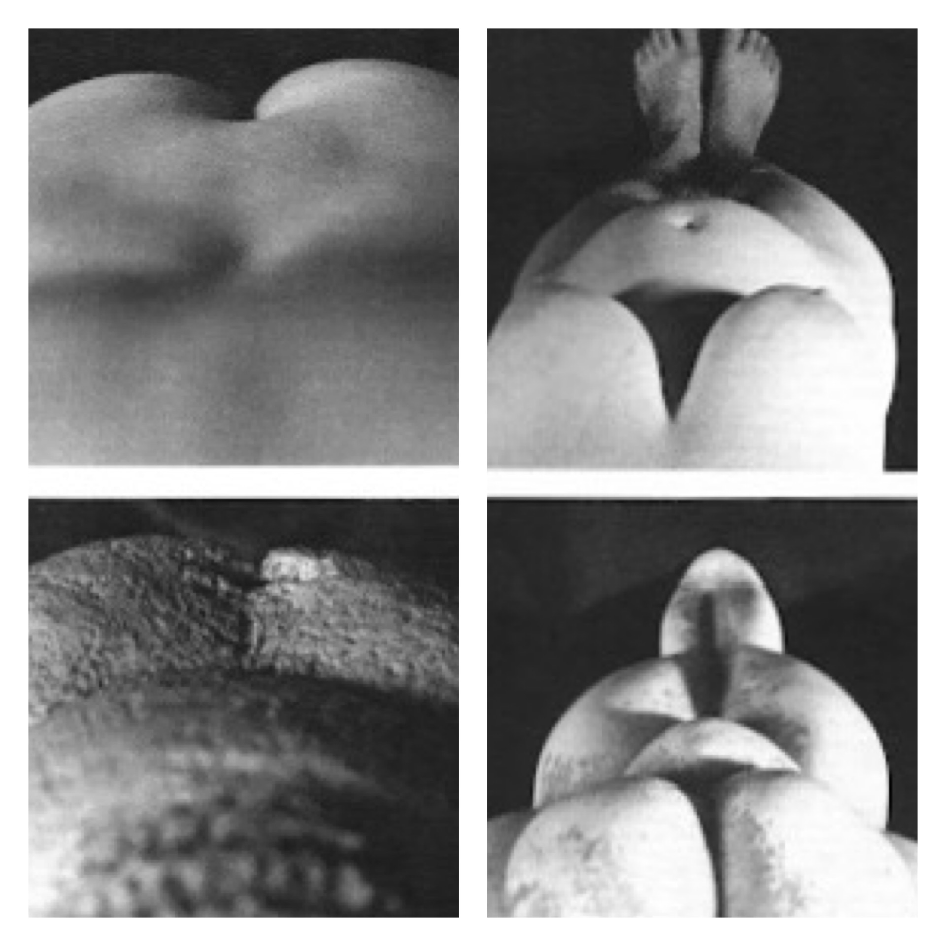
    A different explanation suggests a woman created the piece as a self portrait. You can see from the contrasting images that the sculpture looks very similar to how a six month pregnant woman would look down at herself (since mirrors weren’t invented yet). n contrast to what Dr. Zygmont stated,

    “If the face was purposefully obscured, the Paleolithic sculptor may have created, not a portrait of a particular person, but rather a representation of the reproductive and child rearing aspects of a woman.”, (para. 19). A woman looking down at herself would not be able to see her own face or hands while she was sculpting.

    There are multiple reasons why a woman would want to create a self portrait while pregnant. You can imagine that like any child who draws in the sand with their finger, art comes naturally to us and we simply have an urge to recreate what we see. This woman could have also created this sculpture in an educational lens to demonstrate to other young women what changes their bodies would go through. This is such a large aspect of womanhood, and to leave it out of the narrative because of one’s own sexist biases is fallacious.

    What these anti-feminist theories all have in common, is that they stem from a harsh set of beliefs of gender binary roles. They hardly consider women being valued for anything more than their bodies or their contribution to domestic chores. These sexist assumptions are not just harmless ideas, they have an effect on society. Look at the time at which Man the Hunter was published; it was right after a large rise in working wives during the 1950s. It’s hard to believe that “man the hunter”, “man the provider”, “man the breadwinner”, wasn’t a biased opinion based off of this event.

    One can imagine the movement would have taken off quicker if not for this claim that women’s domestic role comes natural to them because “that’s the way it’s always been”. 

    When presented with a feminist idea like Venus of Willendorf being a self portrait, it’s branded as “extreme liberalism” and “unlikely”, discrediting women and their ability. It’s important to ask what prehistoric art could have meant to our ancestors so we have a better understanding of where we came from, but it’s just as important to look at our ideas of what it meant to reflect on our generation’s biases.

    Citations

    • Oocbock, C., & Lacy, S. (2023, November 1). The theory that men evolved to hunt 

         and women evolved to gather is wrong. Scientific American. Retrieved 

         February 21, 2024, from https://www.scientificamerican.com/article/ 

         the-theory-that-men-evolved-to-hunt-and-women-evolved-to-gather-is-wrong1/

    • Zygmont, B., Dr. (n.d.). Nude woman (Venus of Willendorf). Khan Academy. 

         Retrieved February 21, 2024, from https://www.khanacademy.org/humanities/ 

         prehistoric-art/paleolithic/paleolithic-objects/a/venus-of-willendorf

  • Globalization Enabled by Simplistic Depictions of Deities

    Globalization Enabled by Simplistic Depictions of Deities

    Throughout history, religions have often used depictions of deities to visually represent their beliefs and values. Most of which have visuals containing realistic humanistic figures, others have symbols to represent their deities and/or their teachings. Take Buddhism in the third century BC; They decided to use symbols to represent Siddhartha Gautama because they thought he had transcended his physical body. These symbols include his footprints which represent Siddhartha Gautama leaving the palace and renouncing worldly goods, the wheel of law that represents him and his preachings, and a linden tree where he is said to find enlightenment. You can view such symbols on toranas and other ancient buddhist architecture. This culture among many others predominantly dedicated buildings to showcase art of their deities and the importance of these ideas to the community. 

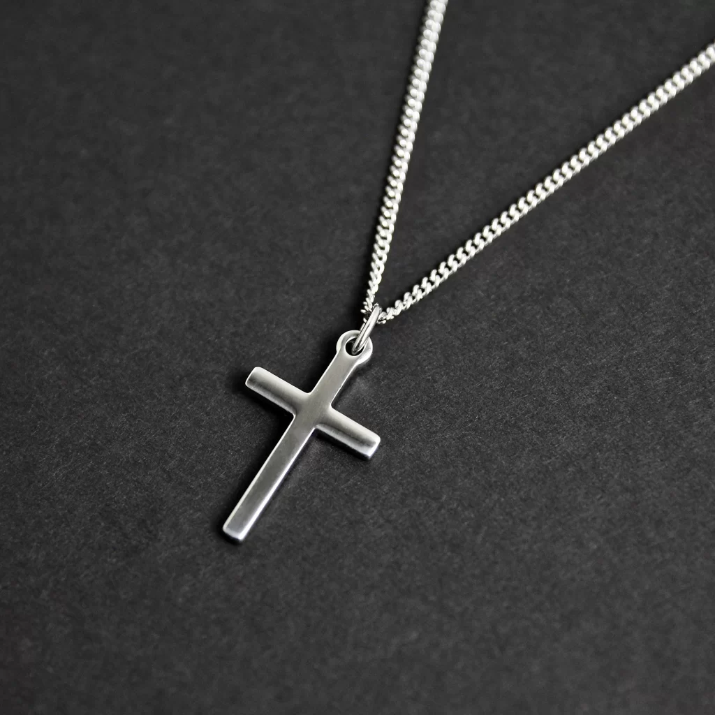
    As time progressed, attitudes towards one’s relationship with religion have changed in the United States. Take Christianity, instead of building large gothic cathedrals, we build more modern simpler buildings that can be changed to serve a new purpose if needed. We also use simple religious symbols, like the cross, to wear as jewelry. It’s also more common for this form of representation of deities because of mass production. Even if these religions didn’t have this reasoning behind their depictions of their deities, they still benefit from their easy marketing abilities. But despite society missing grand architecture and beautiful realistic depictions of one’s deities, having simplistic jewelry enables intimate and individualized connections to religious beliefs and values that are more easily able to spread around the world.

  • Contemporary Manuscript Illumination of P for Patroclus

    Contemporary Manuscript Illumination of P for Patroclus

    The manuscript is a P to stand for Pactrclous, an overlooked character in Achilles. His moment of truth lies when Achillies is too stubborn to fight. Pactrouclous puts on Achilles’ armor and pretends to be him so the men follow his lead into battle. Pactroclous then dies a hero. 

    Like many manuscripts this story is told through pictures. These illustrations lie on the outskirts of the border. The frames of the pictures are circular with a golden background. This is a memento to golden hellos you see in other artwork from this time period. This symbol was expressed on religious people, people who were often considered more significant. By keeping that same symbol in this manuscript, it gives Patroclus a sense of significance or glory that he rightly deserves.

    Gold isn’t the only color that adds to the manuscript theme. Blue and red were often used in manuscripts as well. Since titles weren’t distinguishable from their font size they used color to differentiate instead. Red was what jumped out of the page at you when reading, so making manuscripts in red was common. That’s why in this manuscript you’ll see red used in the very center. 

    The red section of the P also adds a new unique element of shape to the letter that normally wouldn’t be there today. The letter’s thickness is also displaying aspects of manuscripts in the Middle Ages. The thickness emphasized in the down strokes was the only option due to their writing utensils available. The letter is also embellished with random circular shapes along with foliage details. Drawings of flowers and other plants were often used in manuscripts and inspired me to implement them in mine. These particular plants slightly represent laurel wreaths which goes along with the ancient Greek theme.

  • Classical Influence of Intergenerational Cultural Transmission in Disney

    Classical Influence of Intergenerational Cultural Transmission in Disney

    Photo by My Favorite Planet.com

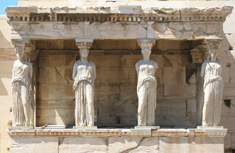
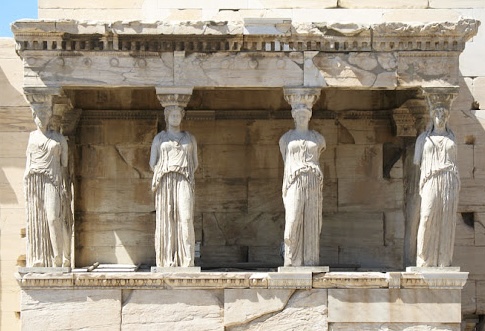
    The classical era has made its stamp on today’s modern world of art, but not just by the influence of fancy pillars on esteemed buildings. Its influence branches further than the physical appearance of architecture and sculptures, it reaches the virtues and values we uphold today. One example is their caryatids, these sculptures serve multiple purposes: beauty, support, and a symbol of harmony. If you look at the Erechtheion, you’ll see that they’re unified by appearance and stance that creates a sense of order and peace. The way the women have their weight shifted on their outer legs provides the assurance of support and therefore adds to the sense of united peace. “This is a sort of sensitivity to harmony, balance…” Zucker, S., & Harris, B express. This technique used to represent these ideals is so effective that we imitate it in our art today. We have more tools than ever to pass down groups’ cultural morals and values to new generations such as animation. The Disney movie Brave used it to tell a story of what happens when you don’t have that unity. 

    that they should be the pillars on which the peace of the land rested.

    In Brave, the mother Elinor is trying to teach her daughter Merida what happens if you don’t fulfill your duties as a political figure. She tells a story of an ancient kingdom, “… ruled by a wise and fair king who was much beloved. And when he grew old he divided the kingdom among his four sons. That they should be the pillars on which their piece of land rested.” Andrews, M & Chapman, B. (Directors). [13:10:00]. As Elinor tells the story she physically builds this kingdom with a chess board supported by four chess pieces under each corner. The chessmen she picks are white and are well detailed coincidentally alike how we view classical caryatids today. However one chessman is black and is clashing with the other three white pieces, it is this piece that represents the antagonist of the story at hand, “… But the oldest prince wanted to rule the land for himself, he followed his own path and the kingdom fell, from war and chaos and ruin.” As she recounts the kingdom’s demise, she snatches the black chessman from underneath the chess board and it tumbles to the ground along with all the other chess pieces who once relied on the foundationally chessmen to stay atop the board. Physically showing how imbalance, lack of order, or lack of symmetria, causes chaos. 

    He followed his own path and the kingdom fell

    These beliefs were once displayed on the architecture of buildings in Athens for all to see. All the youth of Athens had to do to see the virtues of their community was to walk outside. We don’t have as detailed architecture today to create rich storytelling for children, so we rely on other means. As a form of education and storytelling, animation has made a powerful impact on children’s lives. It’s no wonder they’ve looked back at the classical era for symbolism for intergenerational cultural transmission.

    Citations

    Andrews, M. & Chapman, B. (Directors). (2012). Brave [Film]. Walt Disney Pictures, Walt Disney Studios Motion Pictures.

    Zucker, S., & Harris, B. (n.d.). The Athenian Agora and the experiment in 
    democracy. Khan Academy. Retrieved April 30, 2024, from 
         https://www.khanacademy.org/humanities/ap-art-history/ancient-mediterranean-ap/ 
         greece-etruria-rome/v/athenian-agora 

    Zucker, S., & Harris, B. (n.d.). The Erechtheion. Khan Academy. Retrieved April 
         30, 2024, from https://www.khanacademy.org/humanities/ 
         ancient-art-civilizations/greek-art/classical/v/erechtheion?modal=1