Assignment
Using what you know about the 3D elements of design, a Tyvek suit, Sharpie markers and a Theme of your choice, design a suit that will draw the viewers eye around from one side of the suit to the other. Remember this suit will be worn and is Three-dimensional (even though when you work on it, it is flat).
LATERAL THINKING: Brainstorm lists of the elements in a theme. For example if your theme was “Sea Life” you could make a list of the different things that live in the sea. Fish, whales, sharks, Plant life etc. Then…you could make a list of all the kinds of Fish (web search might help with this), list of different kinds of sharks…you get the idea. Now you have lots of visually material for the next step!
- You must cover the whole suit (Draw big!)
- Use repetition and contrast
- Use pattern
SKETCH: use your sketch book to explore different possibilities,
Maquettes: then using a large sheet of paper cut out 3 paper doll type shapes that will be maquettes of your suit See below image). Draw on these to play with composition that is not only 2D but wraps around to the other side. They should be different from each other, with the goal being to explore different possible paths for you to take with this assignment.
WRITE: Free write a list of what is most interesting about each of the 3 cut outs, and what might be rewarding or compelling about making each one.
Process
Lists
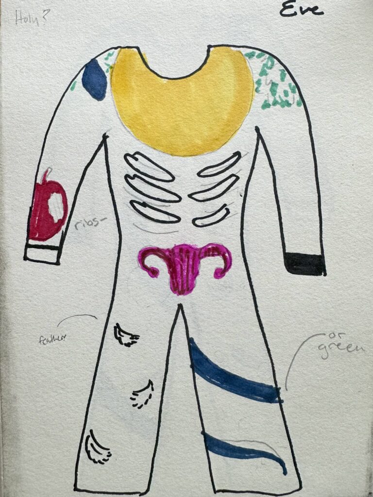
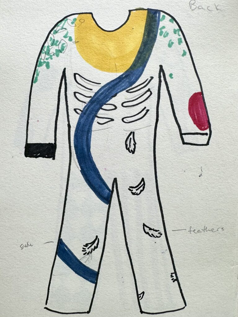
Eve
- Golden Halo
- Snake
- Apple
- Wings
- Feather
- Branches
- Leaves
- Ribs
- Good & Evil/Black & White
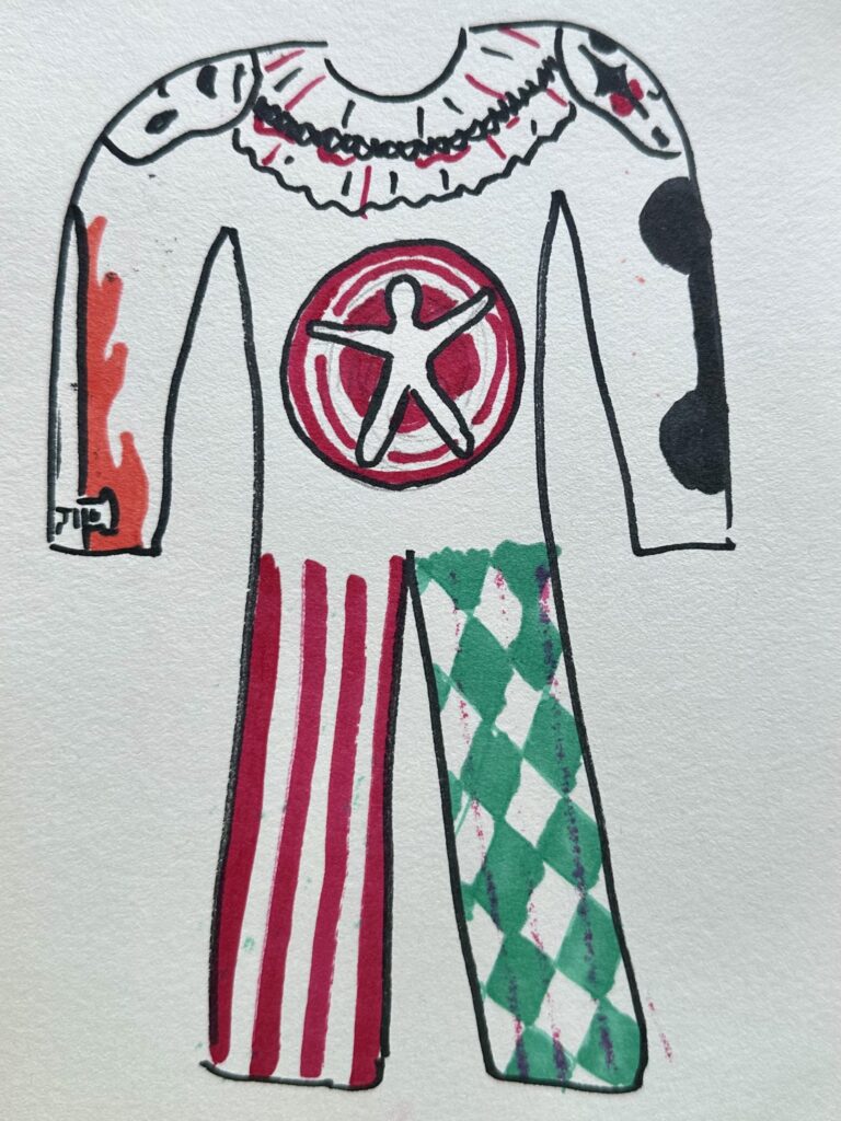
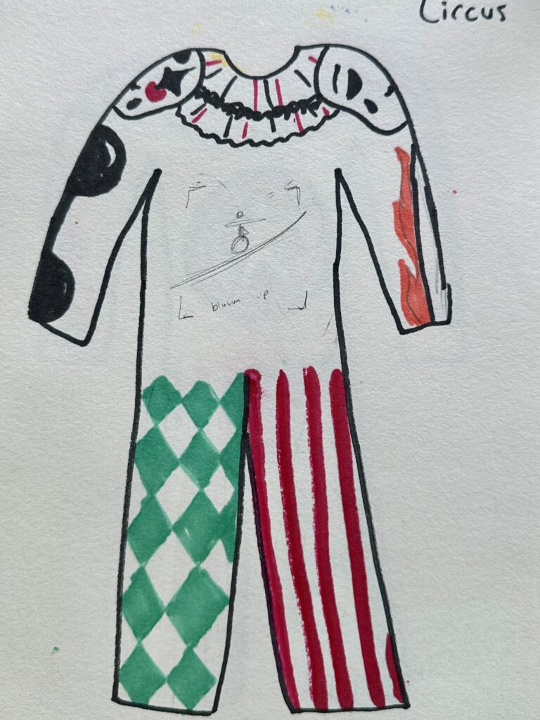
Circus
- Spinning Dart Board
- Flaming Swords
- Dumbells
- Horses
- Elephants
- Red & White vertical stripes
- Clown makeup/masks
- Type-rope
Bugs
- Beatle
- Dragonfly
- Ladybug
- Ant
- Caterpillar
- Worm
- Spider
- Spiderweb
- Dew drops
- Leaves/other outdoor elements
Sketches & Maquettes
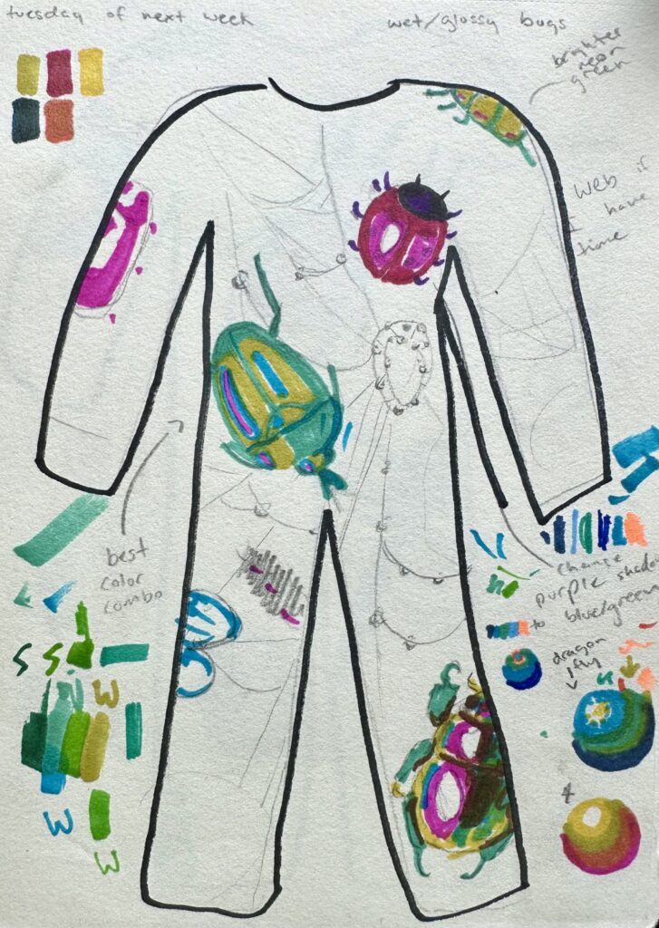
Shown to the right are my first two maquettes. I liked how the snake wrapped around the entire suit and how it had repetition/something sitting on the shoulders. However I didn’t like the first Eve theme because I didn’t think I could bring in commentary I wanted to do successfully with the timeframe and canvas I had.
Again, I really enjoyed how I had something sitting on the shoulders with the Circus design, I also really liked the patterns on the leg. On the other hand, I didn’t feel like I was bringing the right vibe to the piece like I wanted. So, I decided against going any further with the idea.
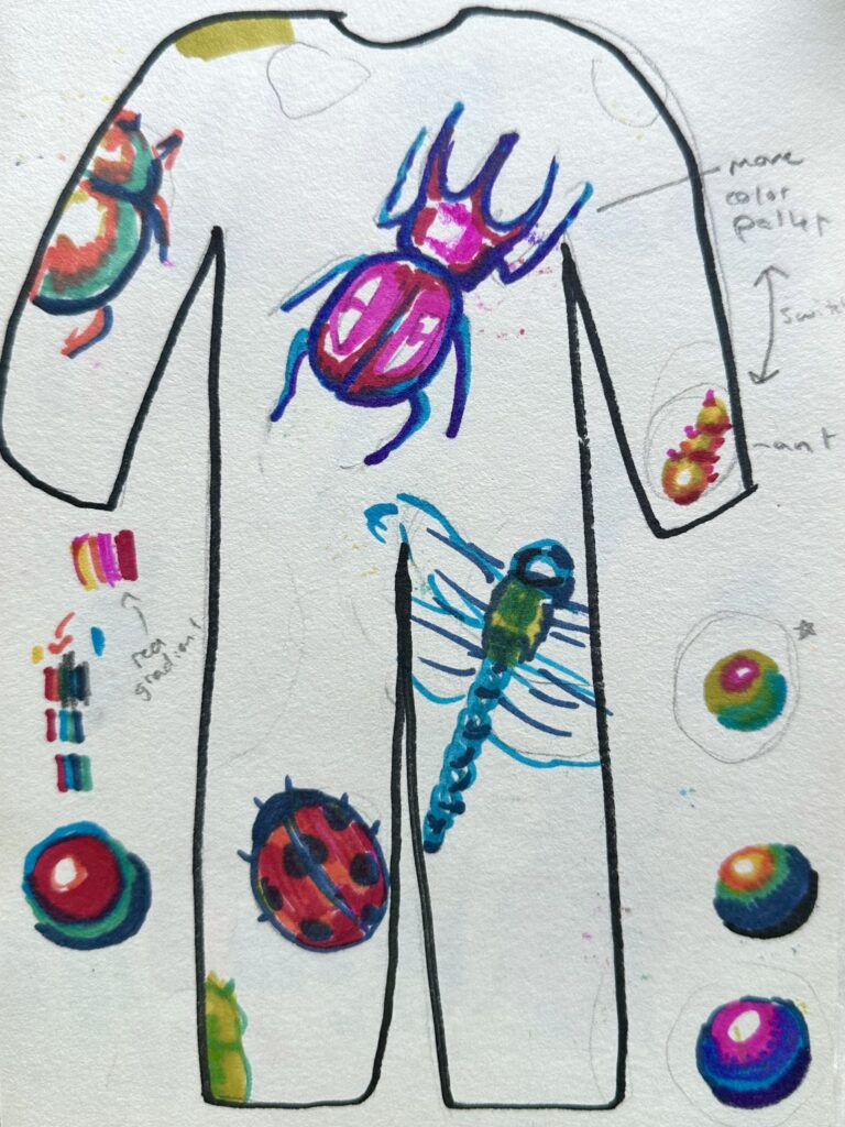
The last design was interesting to me and I thought it brought verity and repetition in a unique way. Each bug had its own color, shape, It also allowed me to do something on the shoulder (like how I did with the ladybug). It also allowed me to do something on the shoulder (like how I did with the ladybug).
Something I kept in mind while drawing the maquettes was that I’m a very meticulous slow drawers, so seeing this big of a canvas to work with made this assignment pretty daunting. I knew I would have to work more abstractly than I usually do. I tend to create things that are more realistic but it’s really time consuming as I get wrapped up in trying to make everything “perfect”. With such a large canvas to work on, I didn’t have the option to spend that much time on every small detail. So I chose to block out colors and create hard contrasting lines instead of mixing colors to create soft transitions within the shadows to get that realism effect.
Drawing On the Suit
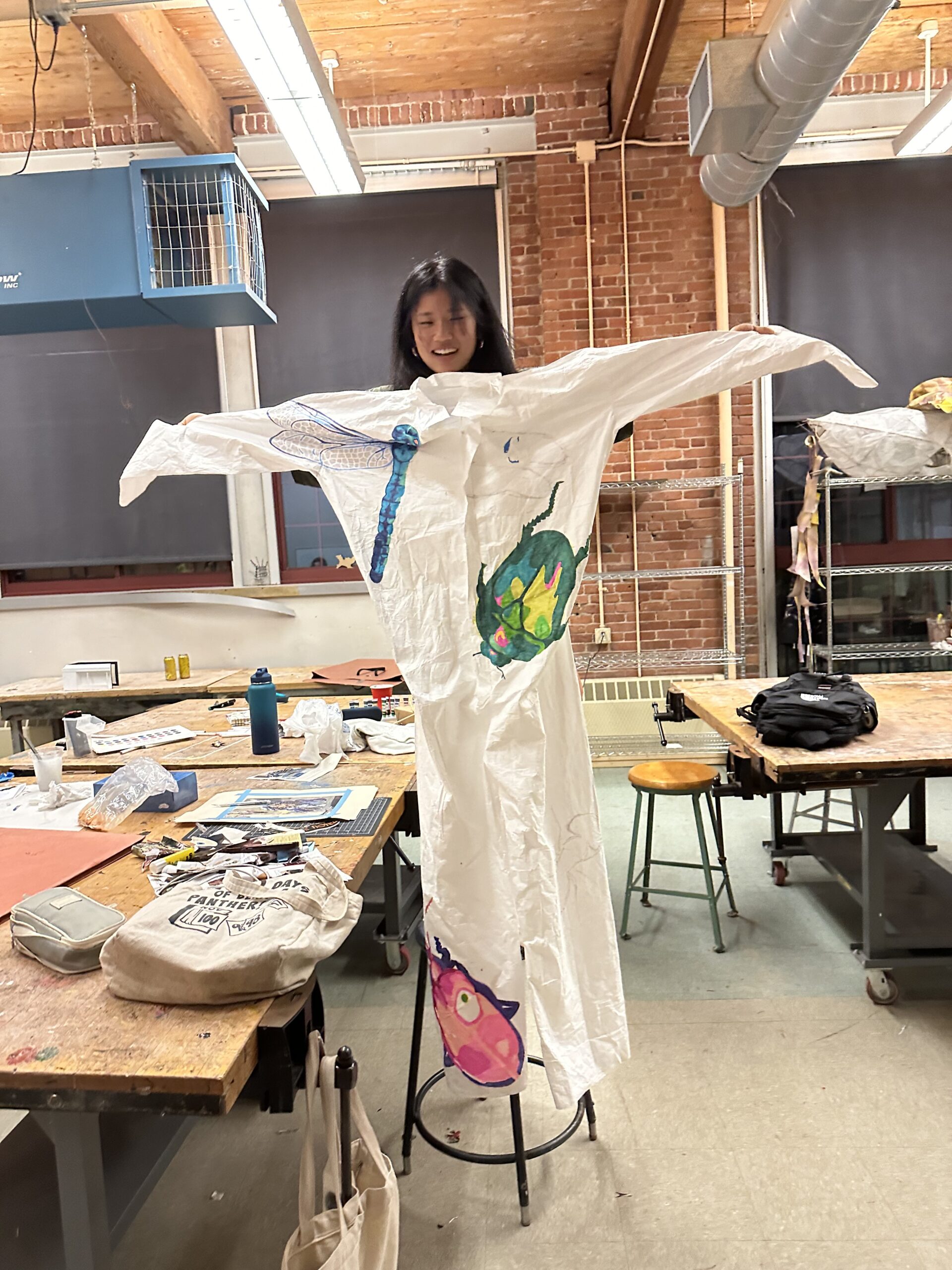
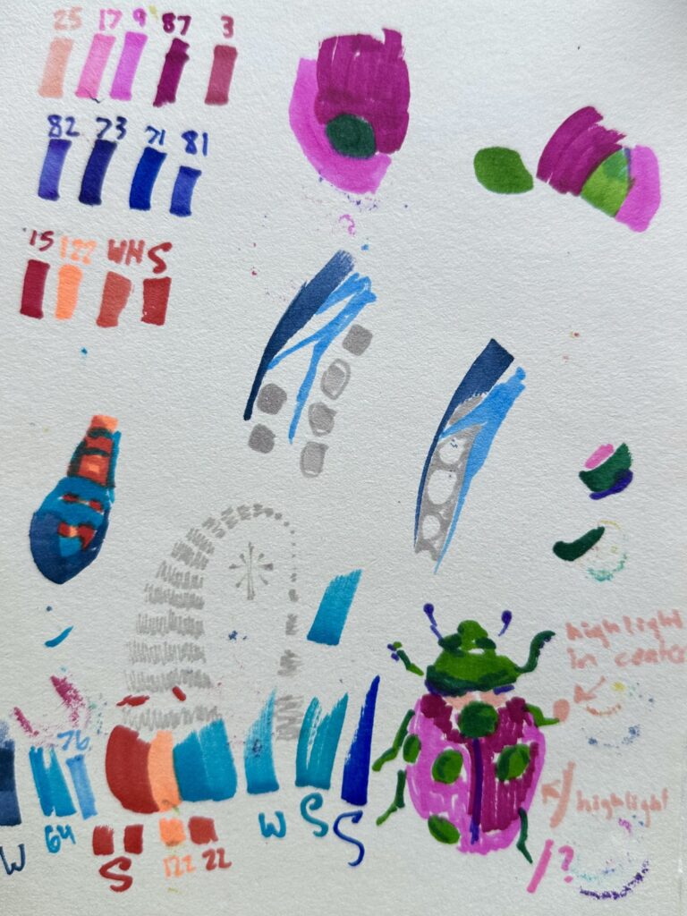
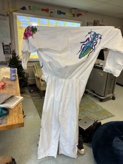
As I mapped out my piece, I used the lightest color out of that bugs pallet to create the outline. Once the gestural drawings were done, that when I would go in blocking out colors following the color pallet values I tested before (as seen on the “Sketch: Bug (color swatches+)” picture).
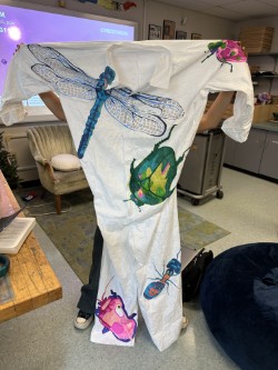
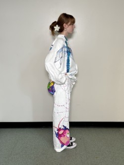
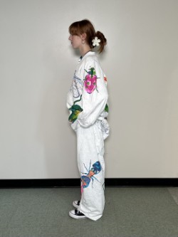
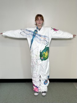
For each bug I used contrasting colors for the highlight to give more interest to each bug. So for the blue bugs I used a light neon color, for the pink I used green, for the green I used pink, and so on. Another thing I think was successful was changing the facing directions of each bug, you don’t see a single bug facing the same direction as its neighbors.
One thing I struggled with was trying to make each bug enlarged and different sizes, but as I sized up each bug that would normally be much smaller than it’s neighboring bug, I ended up making all the bug generally the same size on accident. I think was successful with the dragonfly and lady bug though as they were two contrasting sizes right next to each other, I wish I could have implemented that technique consistently throughout the piece. I also wish I had made minuscule bugs and placed them around the piece. Something simply and fast as to not take up much time but to add more interest to the piece in that way.
A challenge I faced was defiantly the dragonfly. I think over all it turned out well and but I had a lot of bumps in the road and obstacles I had to get past for it to be successful, one of them being my canvas. I was working on fabric that moved around, pinched in some areas, and was distressed in others. So as I. was working on it the fabric would move, this made it challenging to map out the dragonfly, I had to constantly keep going back and correcting my mistakes so I could make the wings symmetrical. If you look closely at the wings they aren’t symmetrical, some lines in the right wing are badly messed up or completely missing. However I think I did a good job going with my mistakes and improvising to make them not noticeable.
Another thing that was hard to work around was a patch two the right of the wing where there was a tag or label of some sort that had been ripped off leaving the fabric tearing and fuzzy. This texture made the ink bleed so I tried to avoid that spot as much as possible. I eventually had to draw a couple lines in that area so I worked with a light hand as to not have so much bleeding.
One challenge that I didn’t expect was having the markers die on me so quick. You might notice with the dragonfly for example, the right wing has a patch of different color geometric shapes than the rest of it because my marker had completely run out of ink. I went to use a similar colored marker, but it looked a bit funky, so I chose to change route and try using the light neon orange that I had been using for the form’s highlighter instead. This turned out well and I was able to play it off as a patch where the sun hits the wing just right.
Overall I think the dragon fly was a success. it created a linear element. to the front to make the piece eye catching. I wish I implanted something similar towards the bottom on the back.
Final Product
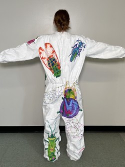
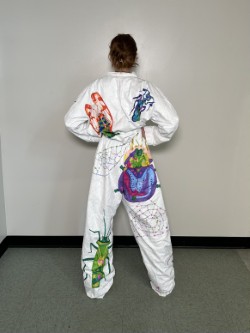
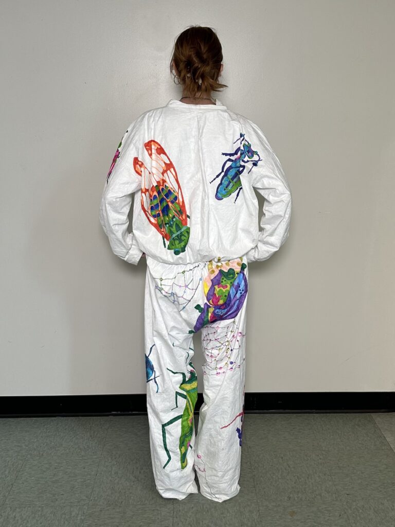
At the critique I was told to add more stuff to fill up any empty space I had left. I was of course going to add more bugs to back, which I did. My only regret there was that wish I hadn’t done such complex color pallets, I wish I had stuck to something more like the front. Other things people suggested I add instead of bugs (since they’re so time consuming) were natural elements like sticks. I ended up doing colorful spiderwebs that reflected any nearby colors. I wish I had been able to keep the web in neutral grey tones to keep the attention on the bugs and not have the suit be so busy, but I doubt I would have had enough ink to do that anyway as I found myself running low on the few saturated colors I was using.
If I had all the time I wanted to work on the project, then of course I would try to fill up more space on the suit. I would want to add much more bugs on the sleeve, smaller repeated bugs everywhere, and less dense attention-grabbing webs dispersed evenly around the suit.
At the end of the day, I’m satisfied with my work. I covered the majority of the suite and made it dynamic. I got to play with bright colors in an abstract way which I’ve never done before. I definitely learned about color schemes and composition along the way, so I’d say it was a success.
Leave a Reply