Blog

  • The Popularity Of  Sexist Theories In Prehistory

    The Popularity Of  Sexist Theories In Prehistory


    Man The Hunter
    is a symposium published in 1968 by Richard B. Lee and Irven DeVore. It’s notorious for its sexist evolutionary views that essentially claims that men were the hunters and women were nearly supporting roles. This theory became popular and was promoted through editorial cartoons, tv shows, and other media, for the public to digest and accept as truth. However, this narrative of men being the hunters is simply false. Despite this, the lens of which Man The Hunter was created from, is commonly shared, and is used just to discredit women.

    There’s evidence proving that women had the physical capacity to hunt alongside men and did. If you look at the biological differences between the two sex’s, you can see there are advantages with both that could help with hunting. Men typically have larger hearts, lungs, and more muscle mass, whereas females have better endurance.

    Endurance is essential to persistent hunting which is hypothesized to be how humans hunted prey in the past. There is also evidence of equal roles between sexes by the skeletons of our ancestors.

    Meaning that since there are similar damages to between the skeletons, then they were doing the same activities. Despite the clear evidence of Man The Hunter being incorrect, it was still the catapult of a set of beliefs that men drove evaluation by their hunting.

    Venus of Willendorf is a prime example of how people can use bias lenses to generate theories on prehistoric ancestors and their values. It’s a common belief that Venus of Willendorf (whose modern name from the 20th century derives from the goddess of love and beauty), was created by men for aphrodisiacal purposes. Another popular explanation of the purpose of Venus of Willendorf, is that she was a fertility figure, whether it was a good-luck totem in hopes of women becoming fertile, or fertility being monumented because it was so valued at the time. This reasoning was supported by the exaggerated reproductive physical features of the woman, “The most conspicuous elements of her anatomy are those that deal with the process of reproduction and child rearing. The artist took particular care to emphasize her breasts, which some scholars suggest indicates that she is able to nurse a child.”, (Dr. Zygmont, para. 17). These reasons are as well as the next but why it’s the most commonly known explanation is something we have to evaluate.

    A different explanation suggests a woman created the piece as a self portrait. You can see from the contrasting images that the sculpture looks very similar to how a six month pregnant woman would look down at herself (since mirrors weren’t invented yet). n contrast to what Dr. Zygmont stated,
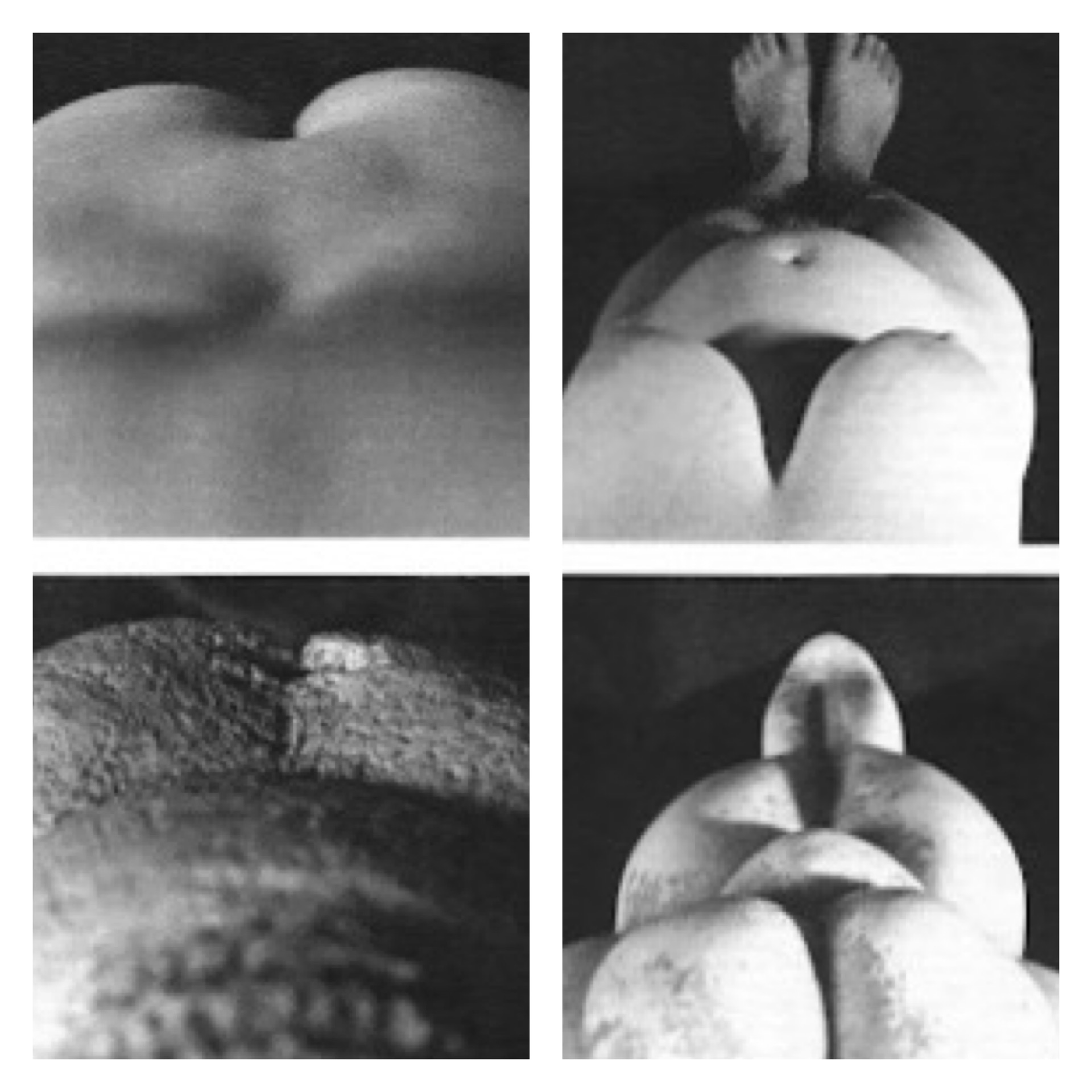
    “If the face was purposefully obscured, the Paleolithic sculptor may have created, not a portrait of a particular person, but rather a representation of the reproductive and child rearing aspects of a woman.”, (para. 19). A woman looking down at herself would not be able to see her own face or hands while she was sculpting.

    There are multiple reasons why a woman would want to create a self portrait while pregnant. You can imagine that like any child who draws in the sand with their finger, art comes naturally to us and we simply have an urge to recreate what we see. This woman could have also created this sculpture in an educational lens to demonstrate to other young women what changes their bodies would go through. This is such a large aspect of womanhood, and to leave it out of the narrative because of one’s own sexist biases is fallacious.

    What these anti-feminist theories all have in common, is that they stem from a harsh set of beliefs of gender binary roles. They hardly consider women being valued for anything more than their bodies or their contribution to domestic chores. These sexist assumptions are not just harmless ideas, they have an effect on society. Look at the time at which Man the Hunter was published; it was right after a large rise in working wives during the 1950s. It’s hard to believe that “man the hunter”, “man the provider”, “man the breadwinner”, wasn’t a biased opinion based off of this event.

    One can imagine the movement would have taken off quicker if not for this claim that women’s domestic role comes natural to them because “that’s the way it’s always been”. 

    When presented with a feminist idea like Venus of Willendorf being a self portrait, it’s branded as “extreme liberalism” and “unlikely”, discrediting women and their ability. It’s important to ask what prehistoric art could have meant to our ancestors so we have a better understanding of where we came from, but it’s just as important to look at our ideas of what it meant to reflect on our generation’s biases.

    Citations

    • Oocbock, C., & Lacy, S. (2023, November 1). The theory that men evolved to hunt 

         and women evolved to gather is wrong. Scientific American. Retrieved 

         February 21, 2024, from https://www.scientificamerican.com/article/ 

         the-theory-that-men-evolved-to-hunt-and-women-evolved-to-gather-is-wrong1/

    • Zygmont, B., Dr. (n.d.). Nude woman (Venus of Willendorf). Khan Academy. 

         Retrieved February 21, 2024, from https://www.khanacademy.org/humanities/ 

         prehistoric-art/paleolithic/paleolithic-objects/a/venus-of-willendorf
  • Classical Influence of Intergenerational Cultural Transmission in Disney
    Classical Influence of Intergenerational Cultural Transmission in Disney
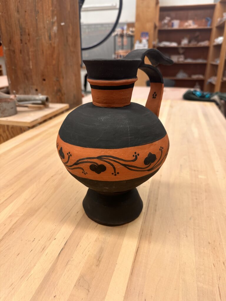
    Photo by My Favorite Planet.com

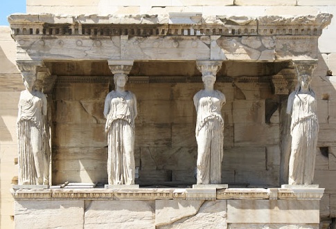
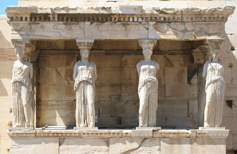
    The classical era has made its stamp on today’s modern world of art, but not just by the influence of fancy pillars on esteemed buildings. Its influence branches further than the physical appearance of architecture and sculptures, it reaches the virtues and values we uphold today. One example is their caryatids, these sculptures serve multiple purposes: beauty, support, and a symbol of harmony. If you look at the Erechtheion, you’ll see that they’re unified by appearance and stance that creates a sense of order and peace. The way the women have their weight shifted on their outer legs provides the assurance of support and therefore adds to the sense of united peace. “This is a sort of sensitivity to harmony, balance…” Zucker, S., & Harris, B express. This technique used to represent these ideals is so effective that we imitate it in our art today. We have more tools than ever to pass down groups’ cultural morals and values to new generations such as animation. The Disney movie Brave used it to tell a story of what happens when you don’t have that unity. 

    that they should be the pillars on which the peace of the land rested.

    In Brave, the mother Elinor is trying to teach her daughter Merida what happens if you don’t fulfill your duties as a political figure. She tells a story of an ancient kingdom, “… ruled by a wise and fair king who was much beloved. And when he grew old he divided the kingdom among his four sons. That they should be the pillars on which their piece of land rested.” Andrews, M & Chapman, B. (Directors). [13:10:00]. As Elinor tells the story she physically builds this kingdom with a chess board supported by four chess pieces under each corner. The chessmen she picks are white and are well detailed coincidentally alike how we view classical caryatids today. However one chessman is black and is clashing with the other three white pieces, it is this piece that represents the antagonist of the story at hand, “… But the oldest prince wanted to rule the land for himself, he followed his own path and the kingdom fell, from war and chaos and ruin.” As she recounts the kingdom’s demise, she snatches the black chessman from underneath the chess board and it tumbles to the ground along with all the other chess pieces who once relied on the foundationally chessmen to stay atop the board. Physically showing how imbalance, lack of order, or lack of symmetria, causes chaos. 

    He followed his own path and the kingdom fell

    These beliefs were once displayed on the architecture of buildings in Athens for all to see. All the youth of Athens had to do to see the virtues of their community was to walk outside. We don’t have as detailed architecture today to create rich storytelling for children, so we rely on other means. As a form of education and storytelling, animation has made a powerful impact on children’s lives. It’s no wonder they’ve looked back at the classical era for symbolism for intergenerational cultural transmission.

    Citations

    Andrews, M. & Chapman, B. (Directors). (2012). Brave [Film]. Walt Disney Pictures, Walt Disney Studios Motion Pictures.

    Zucker, S., & Harris, B. (n.d.). The Athenian Agora and the experiment in 
    democracy. Khan Academy. Retrieved April 30, 2024, from 
         https://www.khanacademy.org/humanities/ap-art-history/ancient-mediterranean-ap/ 
         greece-etruria-rome/v/athenian-agora 

    Zucker, S., & Harris, B. (n.d.). The Erechtheion. Khan Academy. Retrieved April 
         30, 2024, from https://www.khanacademy.org/humanities/ 
         ancient-art-civilizations/greek-art/classical/v/erechtheion?modal=1

  • Substance Over Shock

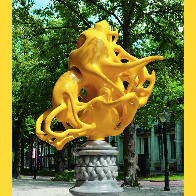
    In the art world, provocation often gets more attention than creativity and dynamic quality. Artists like Jeff Koons gain overwhelming attention for the principle and controversy of its avant garde qualities. Koons’ fans have an easier time justifying his work when they look at it in a vacuum, not acknowledging other artists’ work. This attention really could be distributed to many other artists or works that are more dynamic like Nick Ervinck for example.

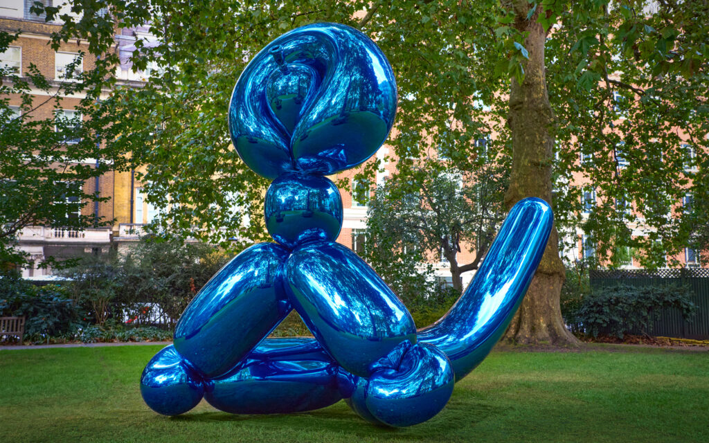
    Koons’ work is admired for its technical flawlessness. When discussing his strive for perfection in an interview with NOWNESS, he said, “When I would work with an object, I would want every detail, every perfection or imperfection of the object. So when somebody would view it, that they could maintain this kind of suspension of disbelief and go along with this abstraction for as long as possible.” When this mindset is applied to generally symmetrical subjects like his balloons in Celebration, the works look too even, making it visually boring. For instance, in Balloon Monkey (Blue), he could make various sized versions of the piece, rotate them, and stick them together at different points of his original piece. This could still be naturalistic and would help create interest in the form. He could also create interest in the surface by having contrasting textures. Like most of his other sculptures, the Balloon Monkey (Blue) is covered in one solid metallic color. Having an area or two that go against this “perfection” would strengthen the pieces visually. Koons’ pursuit of perfection limits his works and can make them stagnant.

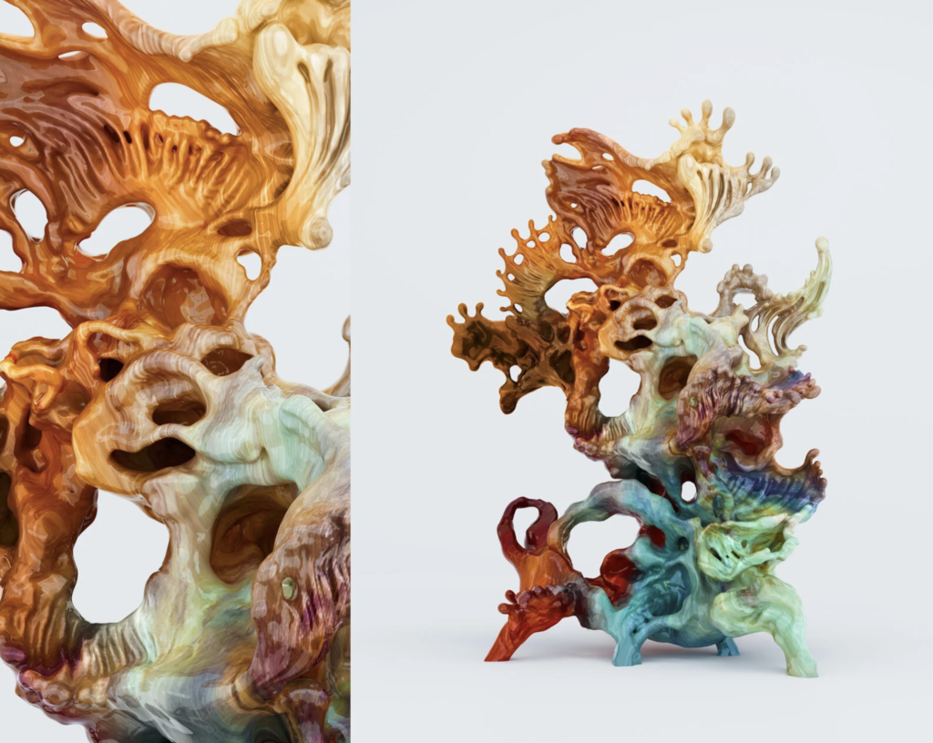
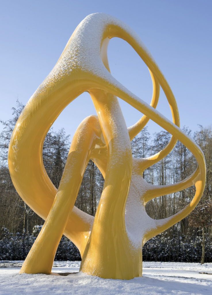
    Works like Nick Ervinck NOITERIS are inarguably visually dynamic. NOITERIS has repetition in form and color. It has an interesting glossy woodgrain-like texture that adds depth to the piece. It also contrasts in its use of negative and positive space while staying balanced. The viewer’s eyes travel across the entire sculpture and are not fixed at one point. This may not be “perfection” but the technical work is still strong enough for the immersion to be believable to the audience.

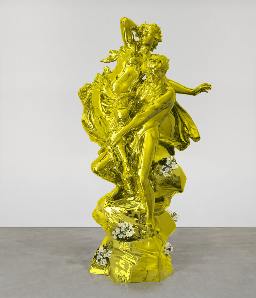
    Jeff Koons’ A Retrospective and Nick Ervinck’s LUIZAERC are two very similar pieces in terms of colors and gestural form. Looking at the two of these pieces side by side allows you to see how they compare with their dynamic aspects. The biggest difference that stands out is Koon’s rooted priority in naturalism and Ervinck’s priority in incorporating negative space into the sculpture.

    Ervinck commented on a similar sculpture of his, “After all, PRAHIARD looks like a sculpture which embraces the empty space in between. As a result of this embrace, that empty space has become a sculptural instrument.” Since Koons is focusing on making this piece believable to the audience, he doesn’t give himself the opportunity to use negative space in the piece like Ervinck can. A Retrospective, also lacks contrast in proportion making the sculpture look highly busy. LUIZAERC is chaotic like A Retrospective but isn’t as hard to look at due to business, it has contrast in proportion between the abstract blobs and doesn’t rely on naturalistic details to make it dynamic. 

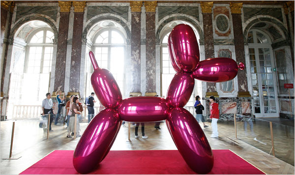
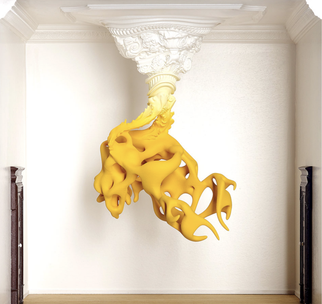
    When the sculptures are placed in older buildings that are more classical or french baroque they can be controversial for being nontraditional art in traditional places. However Ervinck has a skill to incorporate the environment into his piece like he did in the ceiling medallion of KOMANIL. Whereas Koons’ Balloon Dog in the Palace of Versailles stuck out like a sore thumb, asking to have debate on its right to be there. Whether the art actually belongs there is subjective. However, having the skill to analyze a space and adapt your work accordingly to fit the aesthetics of its surroundings, immerse viewers, or otherwise, is one I’ve yet to see from Koons’.

    Popularity of art solely based on controversy and shock value instead of their artistic skill should be avoided at all costs. Let the debate take place and then let it spark conversation to praise other artists who you think are deserving. As viewers we do not need to continue to over praise the successful who don’t align with our artistic values. We can give attention to those who do it all.

    Work Cited

    “8 Questions with Nick Ervinck – ORIGINAL Issue.” Al-Tiba9, Al-Tiba9 Contemporary Art, 1 June 2020, www.altiba9.com/artist-interviews/nick-ervinck-3d-sculpture. 

    The Editors of Art Market. “Nick Ervinck | An Exclusive Interview.” Art Market, 8 Oct. 2020, artmarketmag.com/nick-ervinck-an-exclusive-interview/. 

    Lancelin, Hervé. “Jeff Koons: The Triumph of Shimmering Emptiness.” ArtCritic, 17 Dec. 2024, www.artcritic.com/en/jeff-koons-the-triumph-of-shimmering-emptiness/. 

    McGivern, Hannah. “Jeff Koons Goes Head-to-Head with Michelangelo in Florence.” The Art Newspaper – International Art News and Events, The Art Newspaper – International art news and events, 1 Sept. 2015, www.theartnewspaper.com/2015/09/01/jeff-koons-goes-head-to-head-with-michelangelo-in-florence. 

    “Prahiard.” Nick Ervinck, nickervinck.com/en/work/advanced-search/detail-2/prahiard. Accessed 7 May 2026. 

    “Reflections: Jeff Koons’ Philosophy of Perfection.” NOWNESS, 16 June 2014, www.nowness.com/series/reflections/jeff-koons-philosophy-of-perfection. 

  • Hybridized Food Item

    Assignment

    Formaltexture, balance, color, repetition, contrast
    Technicalcreate a substructure using foilwork at hand sized scale (5-10″)additive and subtractive surface methodswork with a soft material that it made permanent through low temperature heating 
    Conceptualcreate a hybridized form that has not been seen before using know textures and color 

    Guidelines:

    • Using white Sculpy polymer clay your will combine together 2 food items into a hybridized food item. The  material will be heated to 275 degrees farenheit per 1/4 inch of thickness for 1/2 hour. 
    • This closed form should have volume and shape.
    • The interior will be created with foil and then the Sculpy will be formed over that structure.   
    • You should have a visual reference for the forms being used.
    •  The final hardened work will be painted for final effect.
    • Images will be posted to your website with explanation.

    Process

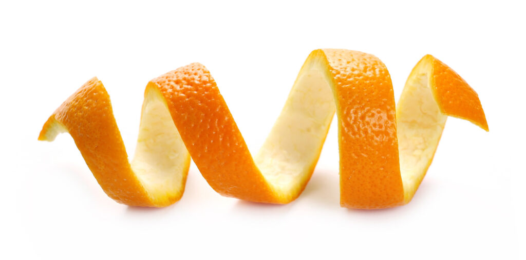
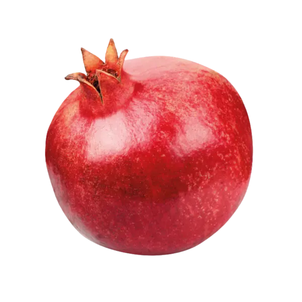
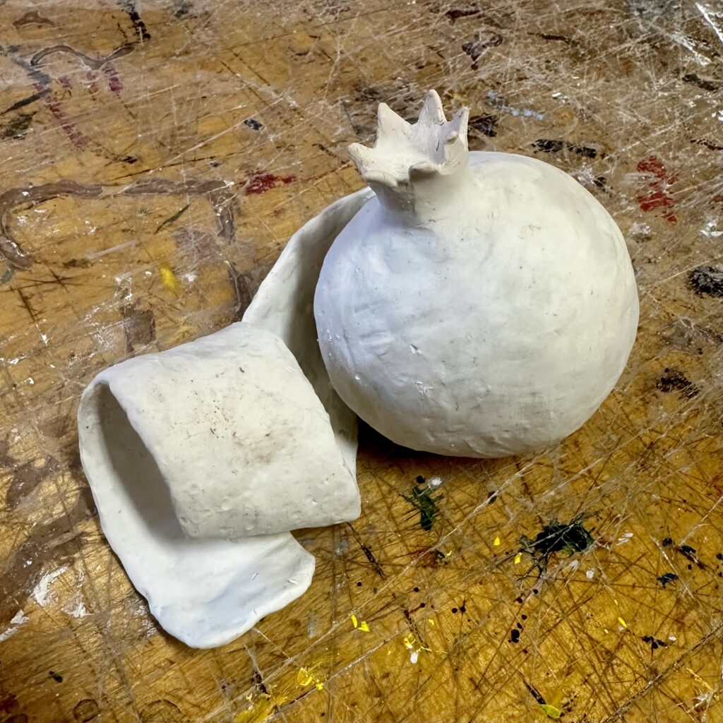
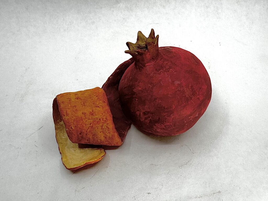
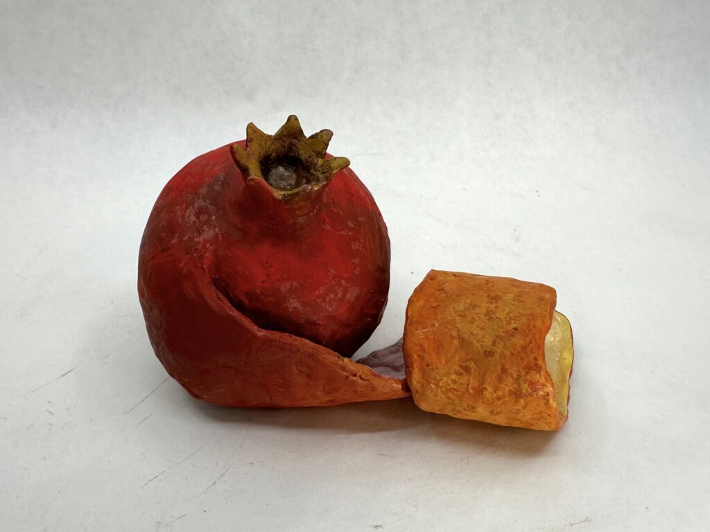
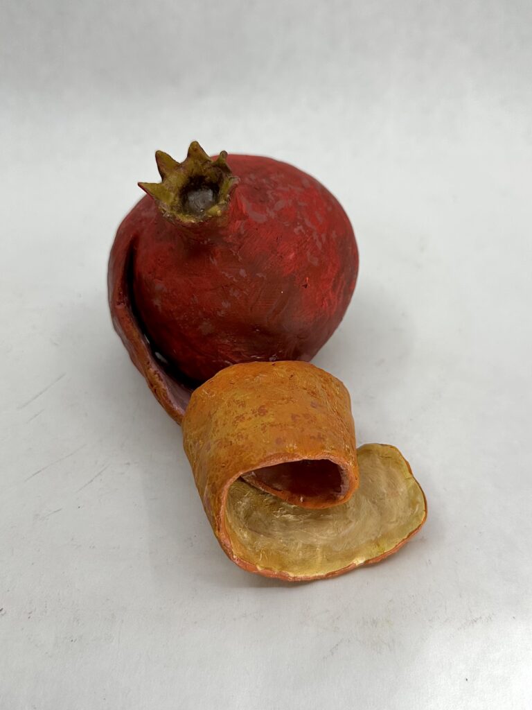
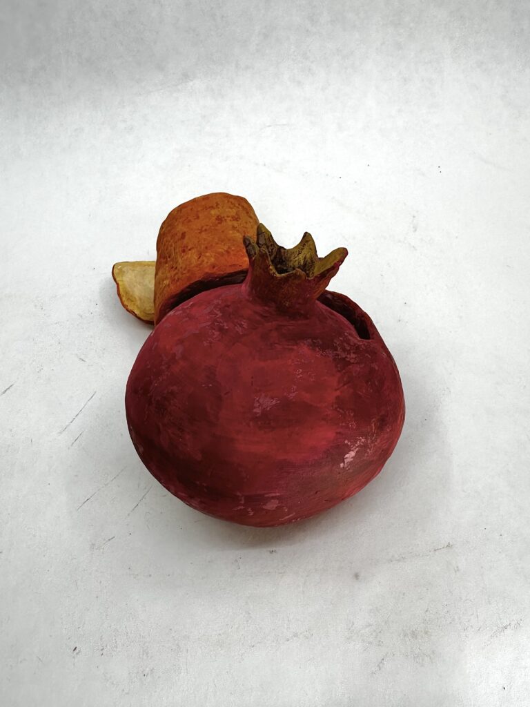
    I didn’t know how to pick my hybridized food. So I just thought of colors I’d like to paint instead, seeing as I neglect the painting process until after I build the forms. I landed on a pomegranate and orange because I thought the analogous colors would blend nice together. I decided to have an orange peel off from the pomegranate and use it as a ribbon to create interest. Then I could create a nice ombre effect as I transition from a magenta into orange color.

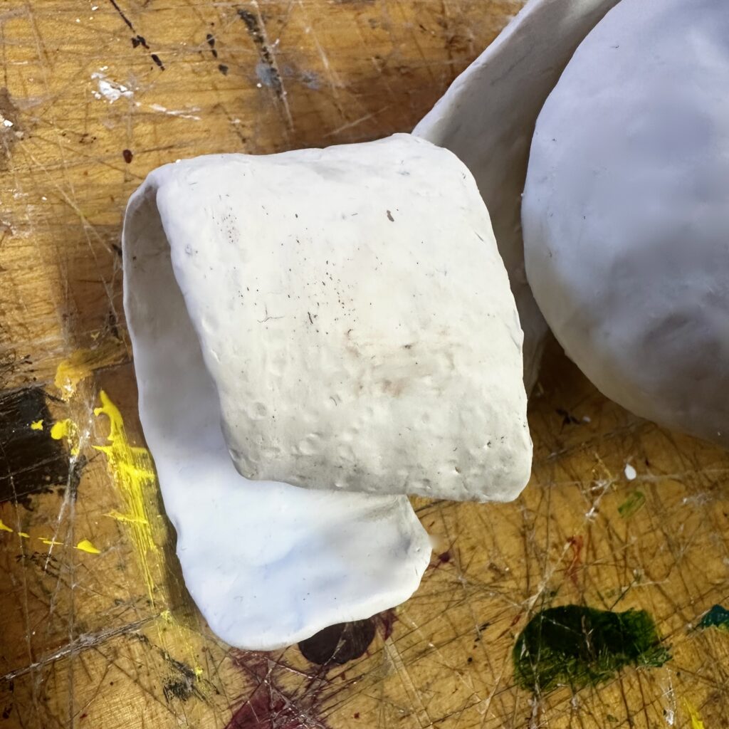
    I started by rolling tin foil into a ball. Luckily, I didn’t need to make it perfectly sphere since I would be going over it with the oven-bake clay later. Then I folded some more tin foil into a strip and weaved one end of it into the ball then curled it. After, I put a layer of clay onto the form, removed any excess clay that made lumps, and used a small dowel-like tool to help smooth out the surface. To make the stem, I repeated 7 relatively flat triangles on top of the pomegranate creating a fanned out ring. Pomegranates come in different sizes, but I noted most have 6-7 triangles and have the width of the stem roughly a third of the width of the whole fruit. Observing references helped make the fruit look a lot more naturalistic. Before firing the piece, I made sure to add little circular indents to the orange peel to give it the pore-like texture they have. This would also help me dry brush later on to make the pores darker than the rest of the peel.

    Final Product

    This piece turned out to be the most dynamic piece I’ve made in this course. Brainstorming the painting process first proved effective, I’m much better at planning the actual shape of the form so prioritizing the aspect I’m worse at made it seem like it was less of an after thought and more well balanced. I enjoyed using the warm colors especially because of the curling peel. The shadows of the form and the colors chosen, make the peel have high color contrast. Form wise, I think the asymmetrical, chaotic gestural movement of the peel contrasts well against the very stagnate symmetrical pomegranate. The concept of a more chaotic form merging with a more stagnate form is interesting to me.

  • Video

    Assignment

    Project #4 Video

    CategoryDescription
    FormalReview artists who work in the media and framing, sequencing, and shooting principles
    TechnicalWork in video planning, shooting, and editing your work
    Conceptual Project a narrative as clearly as possible (with room for viewer interpretation) for your idea  

    Process

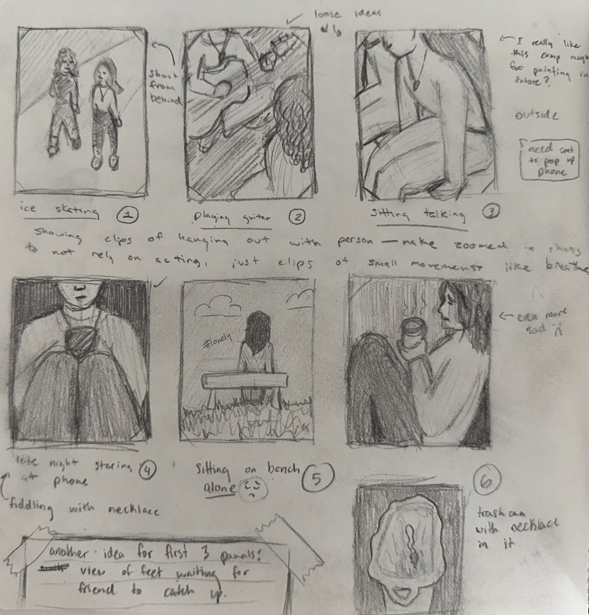
    I originally had a much more complex idea but it required a specific location, my roommates to not be around, good lighting, and time. All of which was not accessible to me when I had spare time. So as the due date approached, I needed to shift directions. As I was thinking of bad ideas for videos I thought well hey this is a video concept in itself. So I just started recording me being frustrated at not being able to come up with a video idea. I feel like most videos I watched for research prior was just people doing something, except something was “off”. So that’s what I tried to accomplish with the last scene in the video.

    Final Product

    What I think makes this video interesting is that it literally takes you through the motions of a snippet of my life, you’re me the entire time, at work with my coworkers around. Then it’s revealed that I look really silly with a phone held between my chin and chest the entire time. I was too locked in on not moving my head the whole time that I don’t even know if people were looking at me wondering what the hell I was doing.

    This video was dynamic because although it had 1st person point-of-view the whole time, it had cuts, sped up and zoomed in parts, and a pivotal clip at the end that changed the perception of the video.

    Conceptually the viewer can wonder was her showing herself at the end an intentional detail, or was it to show that she doesn’t care. You be the judge.

  • Abstract Form

    Assignment

    Project #3: Abstract Form

    Formalabstract, closed and hollow form, texture, pattern, proximity, color 
    TechnicalMaquette/sketch creation interior structure creation additive method   
    ConceptualCreate a form that can be placed in any position (don’t think of the object having a top or bottom) and incorporates contrast in surface/concept      

    Description:

    • You will create a hollow form that can be placed in any position using plaster, wire mesh, and plaster gauze to create a surface skin over the mesh structure  
    • Create a maquette of this form using oil clay, sketches, digital representations, etc.
    • 14-18″ in size for a final form
    • can incorporate color, decoupage, screenprint, or other surface treatments in addition to texture

    Process

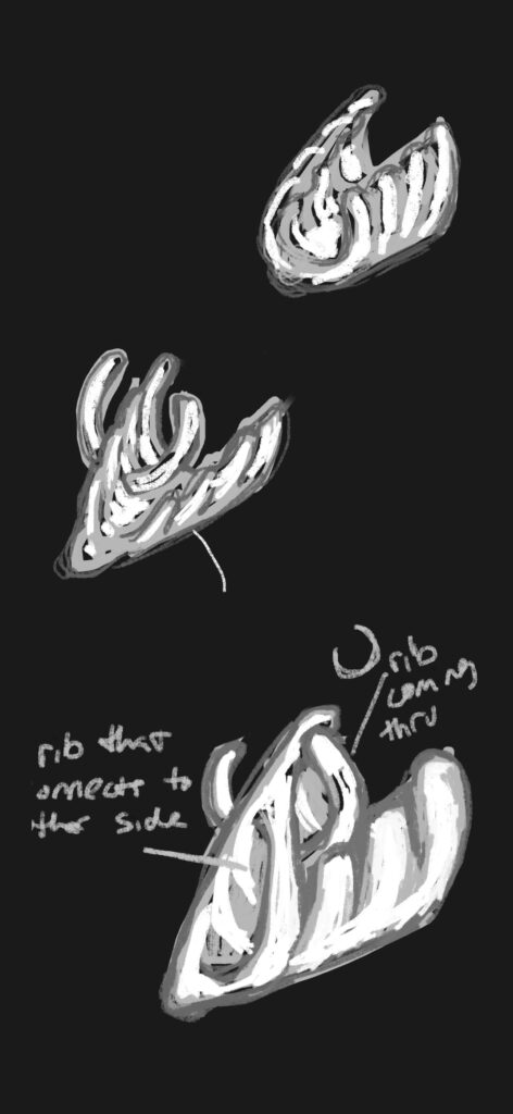
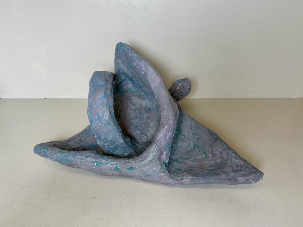
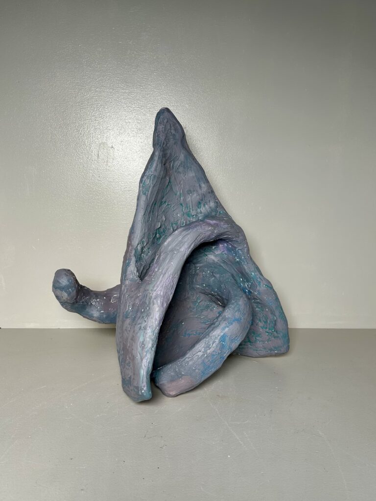
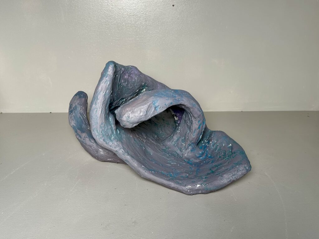
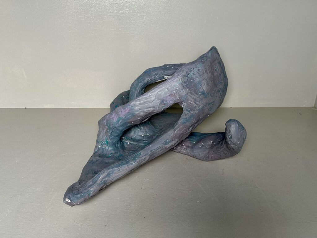
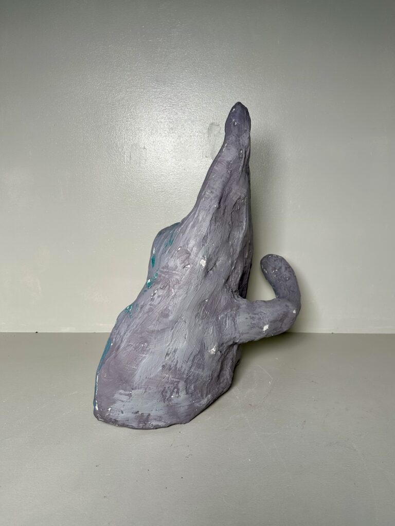
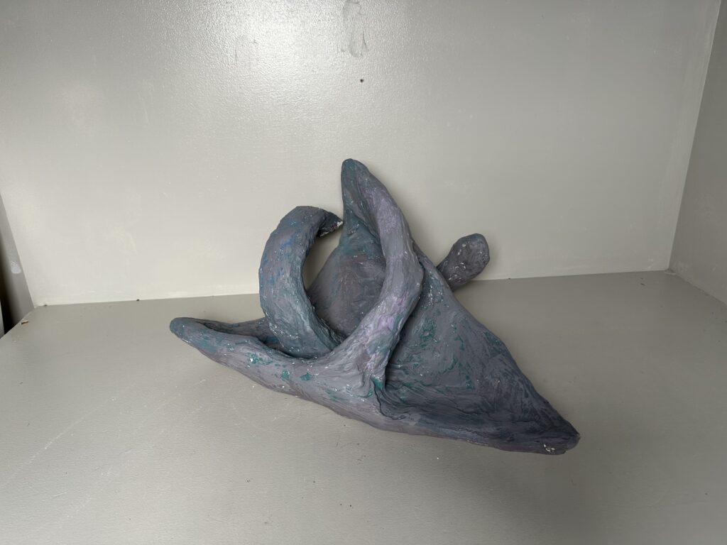
    The only inspiration I took into this piece was the idea of ribs. I originally wanted to paint the ribs on its general abstracted form. Which would include a pair of rips jutting out of place. As I started forming the object with chicken wire, I slowly forgot about my sketch and just started cutting, removing, adding and bending wire into whatever looked more interesting. I think this worked out well since the objective was not to make it look naturalist but something abstract.

    When adding the plaster, I tried to smooth it out as much as possible when wet to save my self from extra work later. As I was sanding it, I tried not to focus on getting a perfectly smooth texture, but to just focus on removing big bumps. After all, this was based on the idea of ribs sitting out decaying. I didn’t think it needed to be “perfect”.

    When it came to painting it, I simply didn’t feel the urge to paint individual ribs anymore. I wanted to paint it all one solid bone-white/cream color. However, there was no yellow paint available for me to mix into a cream. So I threw all plans out the window and just used whatever paint came out of the bottle too fast. I used dry-brushing in hopes of giving it an interesting texture/color as a last-ditch effort to make it look more dynamic.

    digital sketches

    Final Product

    At the end, I actually really enjoyed the color of the piece. Someone had said the color almost looked metallic which I really liked. It was also compared to a cornucopia, Dorito, shark, and more. Hearing what everyone’s interpretation of it was, was the best part of the project for me. In my eyes it’s still ribs though, and I think the metallic color contrasts interestingly with that. What I pictured as decaying and broken down is now armored and strong.

    The most dynamic aspect of the form is the shape. There are a lot of gestural lines that give the piece movement. Not only that, but it truly can be placed and rotated any way and still have things going that makes it dynamic from every perspective.

  • Guerilla Installation

    Assignment

    Project #3: Guerilla Installation

    Formal Scale, form, proximity, proportion, structure
    Technical·      Work using modular forms in a non traditional space·      Create a work for a specific location considering space
    ConceptualChoose a site where you will be constructing a modular composition that will be built off site and reconstructed onsite.  

    Description:

    Using cardboard and other needed construction materials you are to work to create a 3D form. This form should:

    • Be worked on in a sketch format incorporating the site
    • an image of the intended site posted here
    • be a minimum of 2’ in dimension.
    • Be well crafted:
      • only brown cardboard with no text.
      • Tape, glue, and other materials are for structure.
    • Be modular
      • this means the piece can be assembled on site and installed
    • Incorporate volume and mass (no layered planar structures)

    The piece should:

    • Not restrict access on the site
    • Be fastened securely or freestanding

    Process

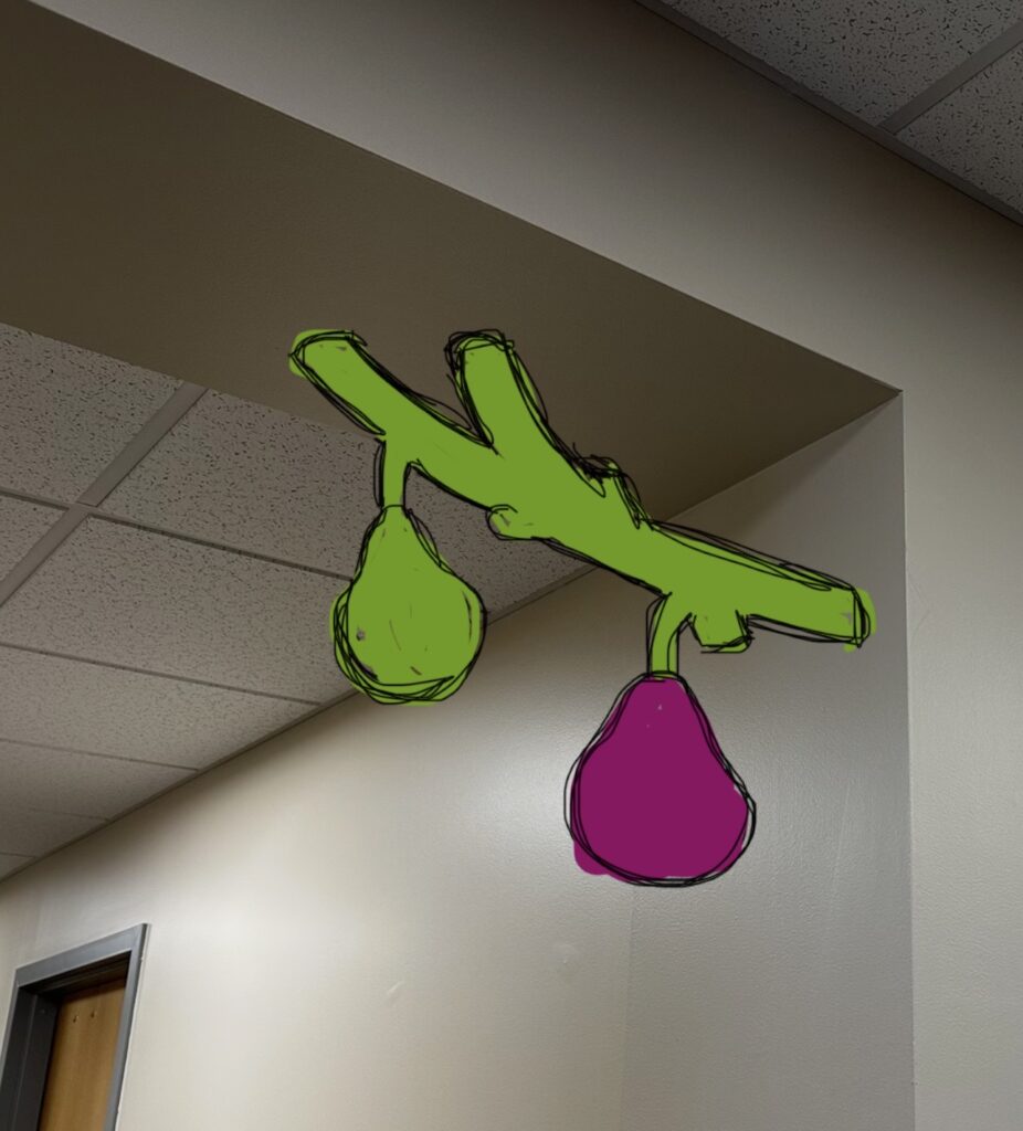
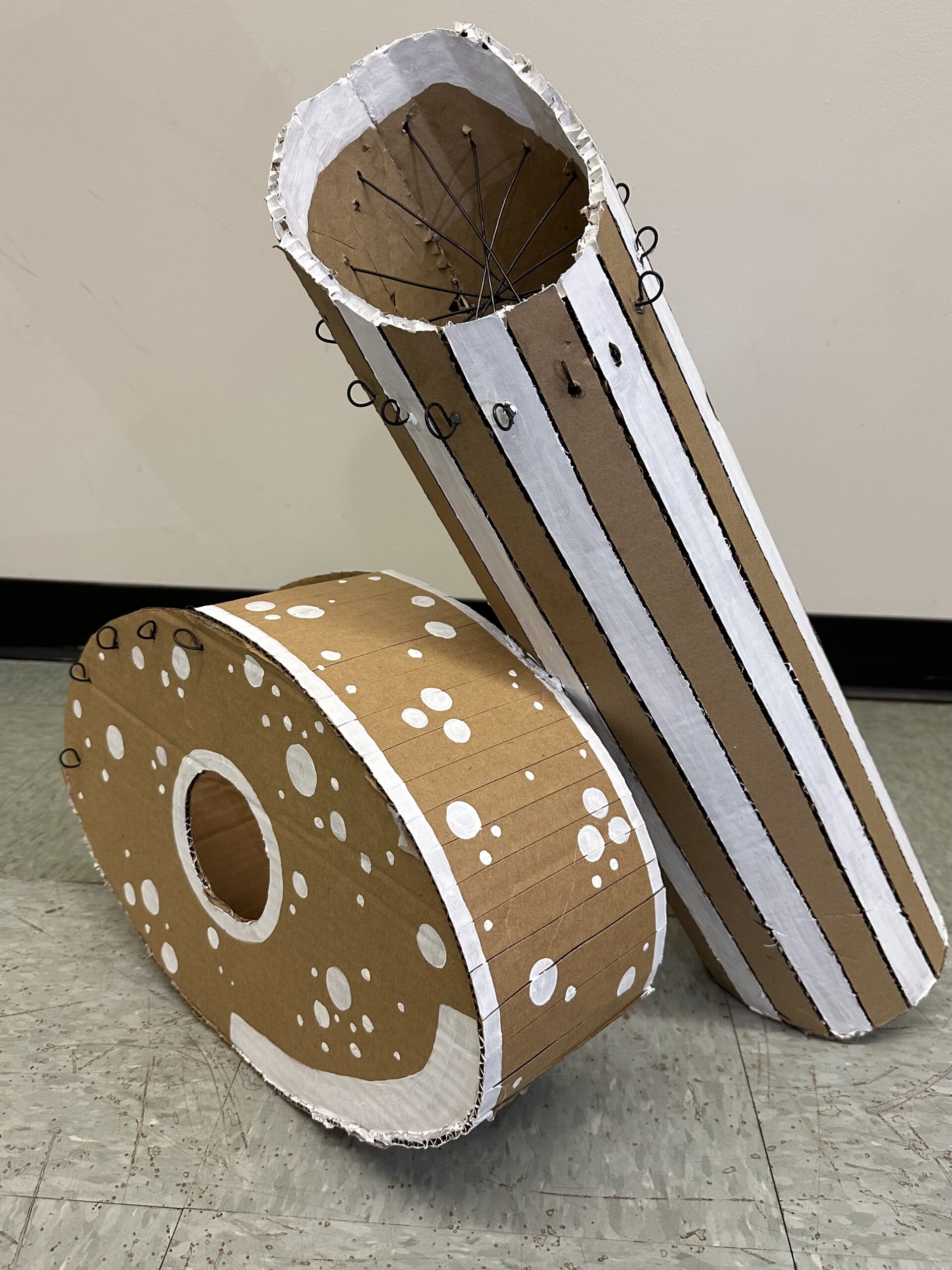
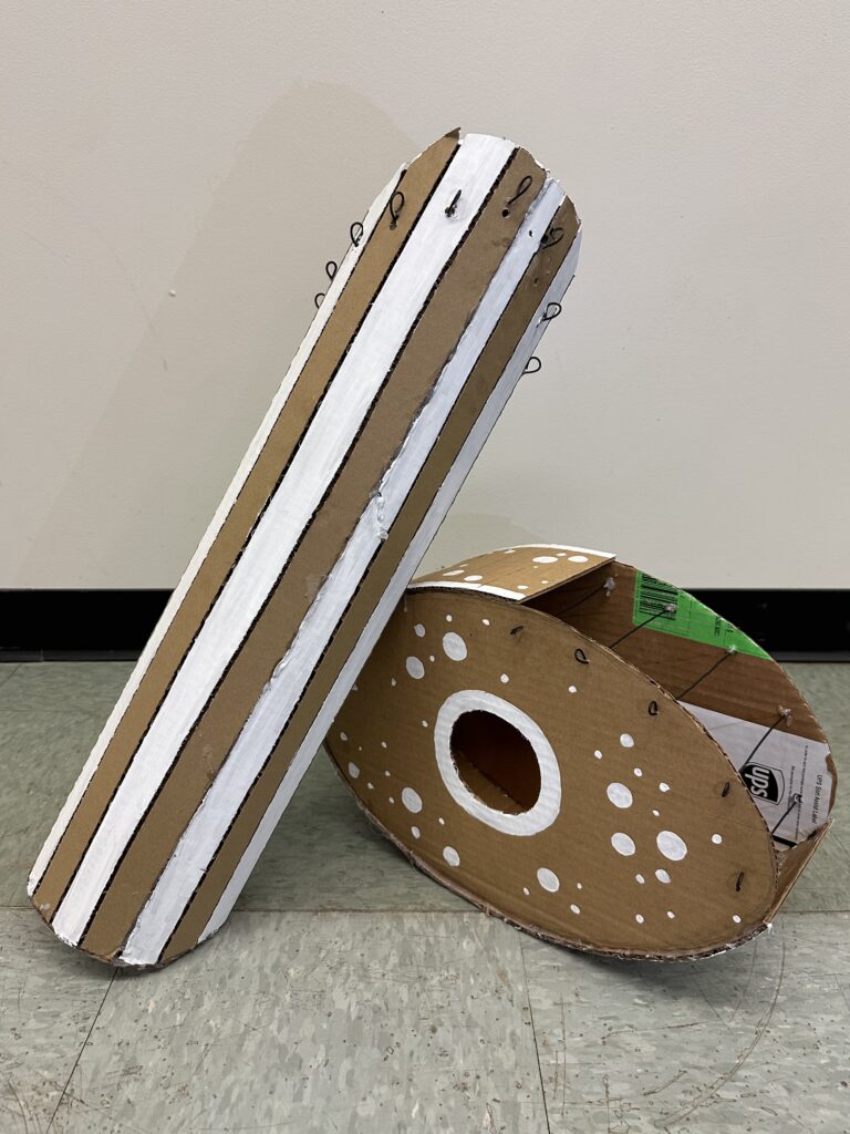
    The thing I struggled with most with this project was figuring out where to put the sculpture. I didn’t want the placement to be an afterthought since a big aspect of the assignment was how the sculpture interacts with its environment. I thought that the Pass Office would be the easiest place for me to get permission to install the piece since I work there and know the people in the space. So I tried to figure out spots within that space where I could install a sculpture. Initially, I thought a corner of an archway would work best. The piece would have to interact with two planes, what’s more interactive than that? I didn’t get permission to put the piece in the hallway, however I did get permission to put it directly in the Pass Office. The only good spot for it was a wide pillar connecting to the ceiling (shown in the final product picture).

    I picked the subject and meaning behind the piece specifically for this office in mind. As explained in my artist statement, the fig tree analogy really stuck with me and is something I associate the TRIO community with. If you can have a conceptually dynamic piece, then I think I achieved that.

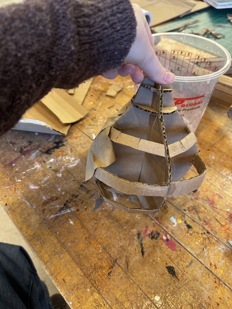
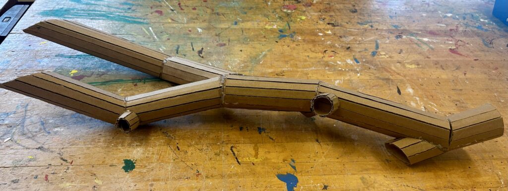
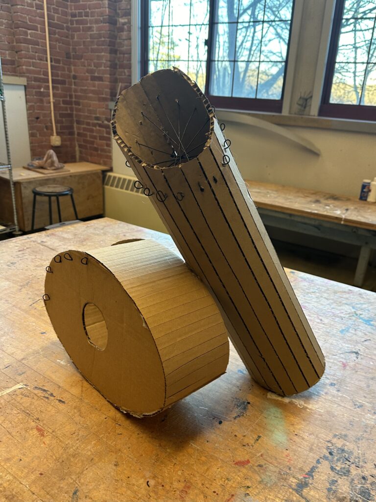
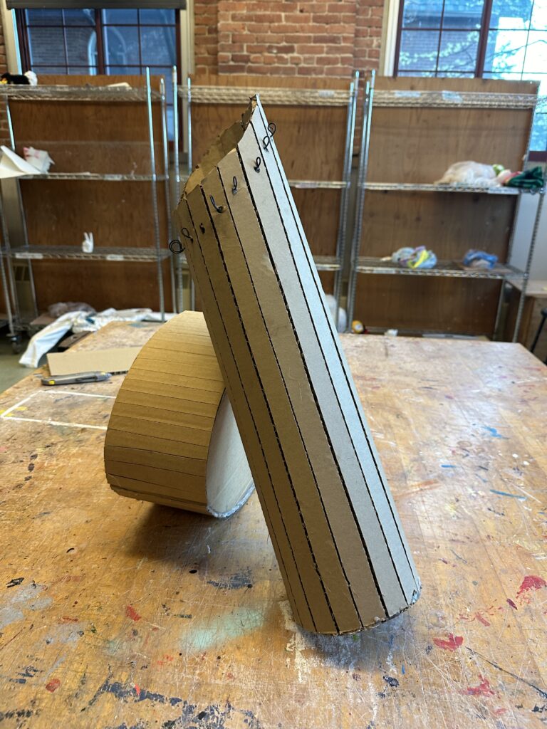
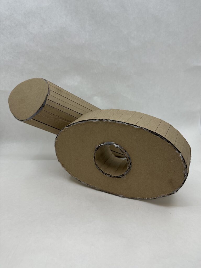
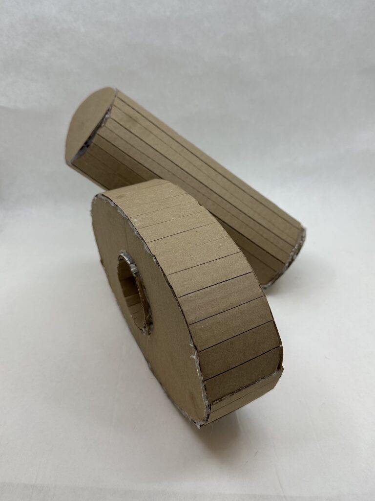
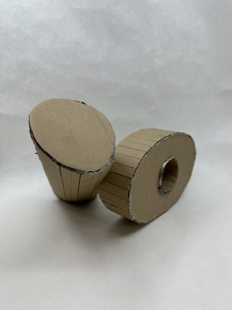
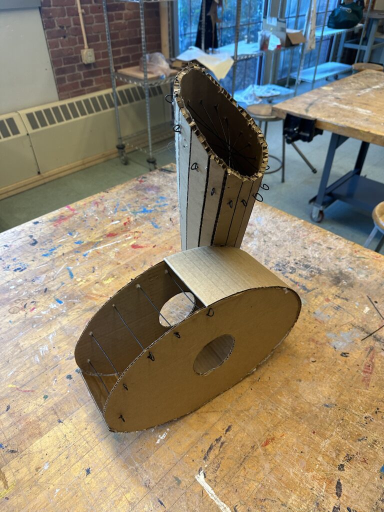
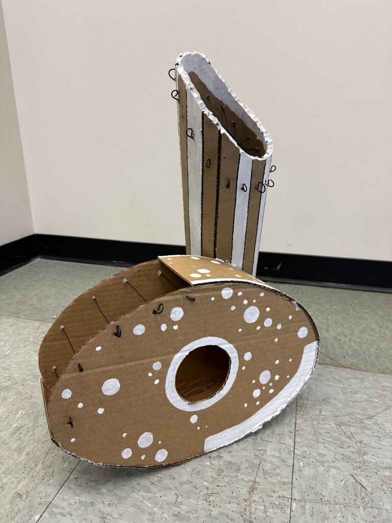
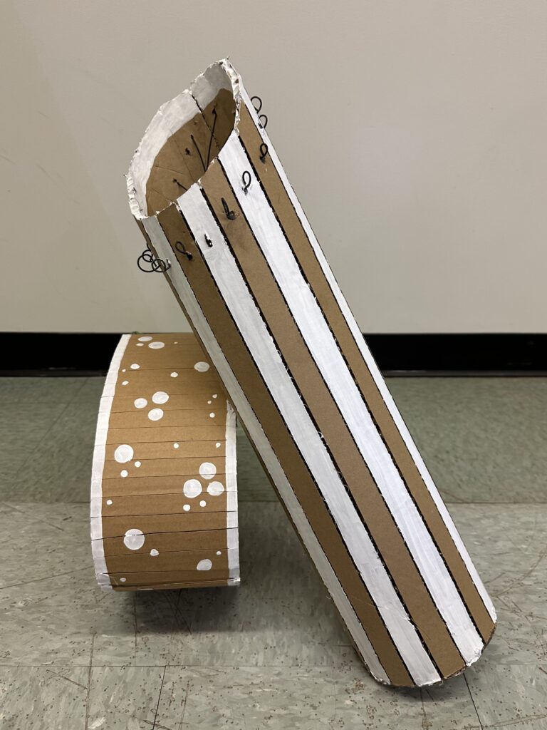
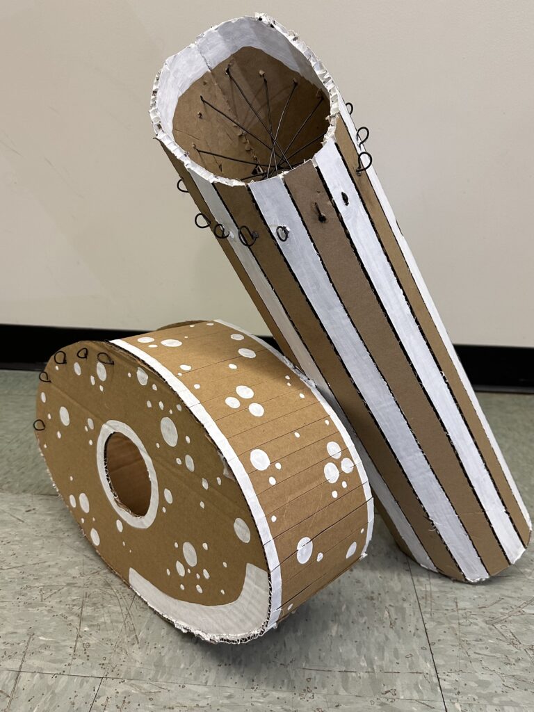
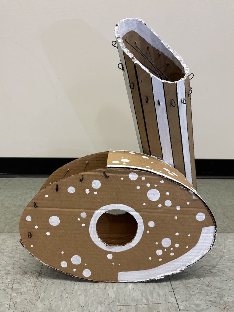
    I wanted to make an unnaturally large branch of figs so I wouldn’t have to make tiny cuts that would end falling apart later. So I decided to make a branch with just two figs, making them to scale to the branch as much as possible. Usually organic shapes are easiest to build/draw because they’re hard to make look “wrong”, but I did not realize that working with cardboard would make that so much more time consuming then I thought. I had to round out a flat stiff material but making precise cuts and gluing them back together. In order to make the branch I slit the cardboard vertically (the long way) so it bends into a cylinder. Then I cut darts into it so it could change direction. I added on a branch coming off from the main one and knots with the leftover pieces to make it look more dynamic.

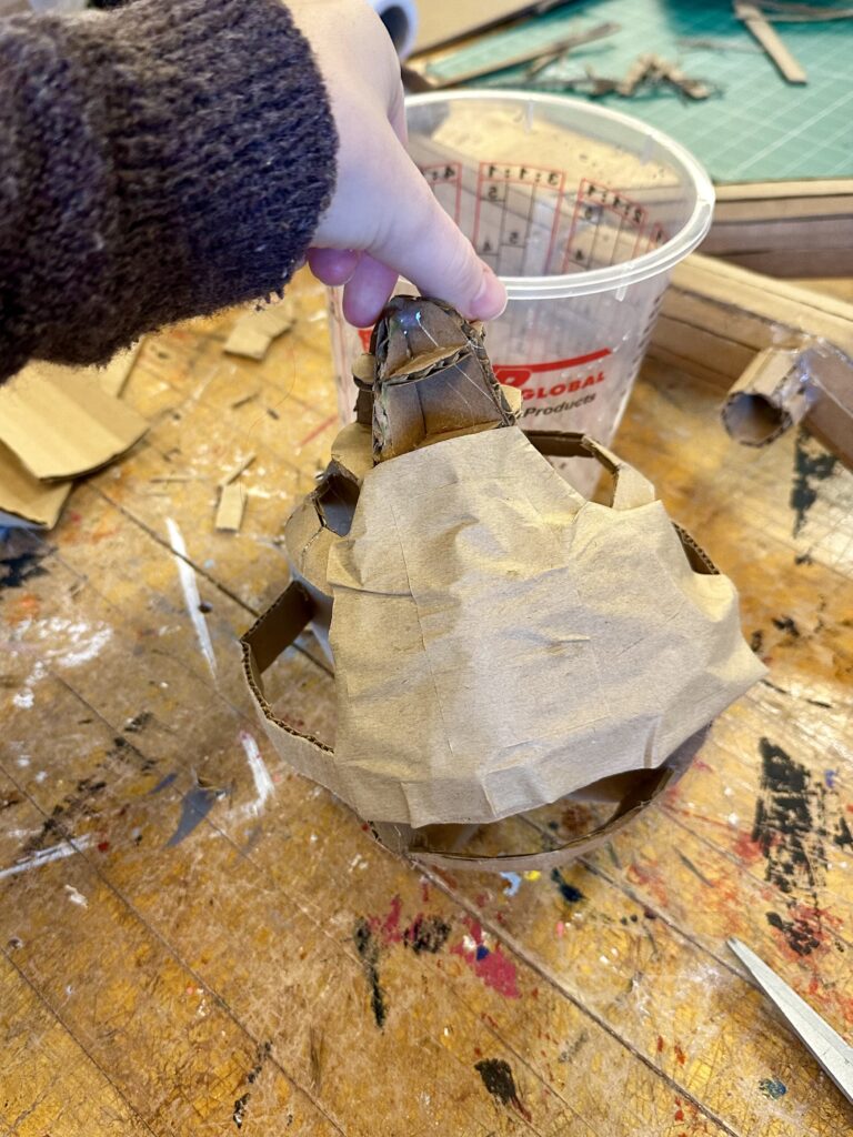
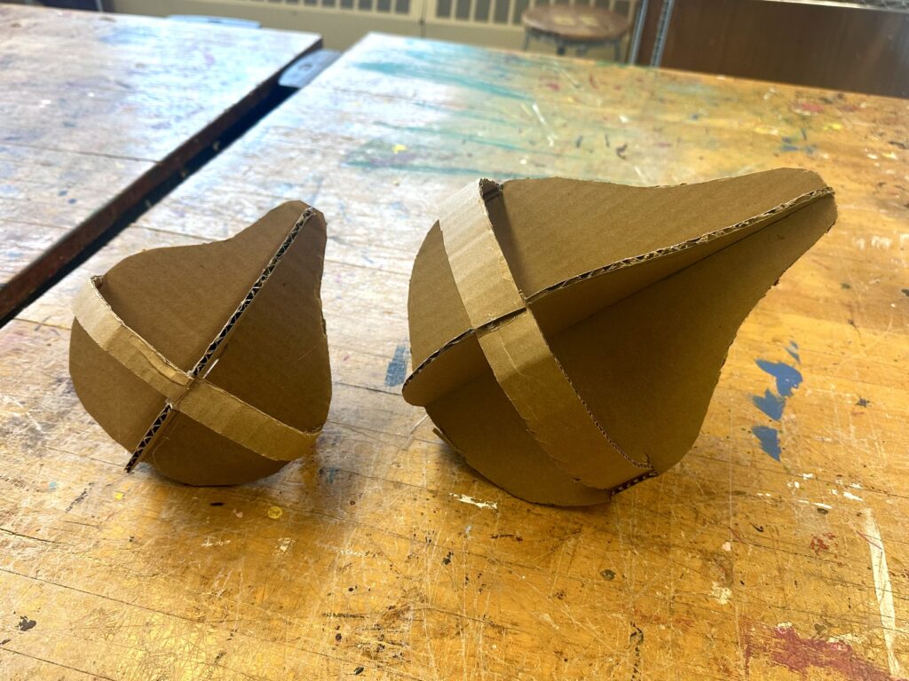
    To make the figs, I cut out two 2D profile-view figs and joined them together by opposing center slits. From there, I added bands of cardboard with dart cutouts to give the negative space spherical volume. Then I used cardboard tape in a paper mache fashion to create the surface that I then painted. I repeated this process to make the other fig and glued them on to the branch.

    I wasn’t sure what angle I would need to make the top of the branch so it would be flush with the ceiling. To work around that, I left a lot of excess branch at the top so I could later bring it to the sight and cut it off accordingly. Then I added on disks so I could use tacks, nails, tape, or whatever else I would may need to hang it up. I painted the disks white to blend in with the wall and ceiling to make it as naturalistic as possible.

    Final Product

    After a brutal process of hanging up the piece with its artist statement, I could finally see the main components as to why this piece is so dynamic. The figs actually live in the environment. The branch grows out of the pillar and connects to the ceiling at two different points. I believe the piece has two different focal points at each fig, making the eye travel along the branch better. The use of an ombre effect and dry brushing technique also made the sculpture look more naturalistic and dynamic. By painting the piece naturalistic colors instead of painting them two solid colors like I originally planned, it supported the viewers to better perceive that they’re figs and not pears, and to feel more emerged in the art .

    Artist Statement

    Allison Surprenant

    The Ripe Fig 

    Since I’m a TRIO student, I wanted to make a sculpture for the Pass Office, so I wanted to create something relating to a challenge I’ve faced that the people in the PASS Office have helped me with. I recently learned about the fig tree analogy which in summary, each fig represents different options for your future. One fig could be a life as a doctor, another as a florist. There are so many options to choose from that the person becomes paralyzed with indecision and all the figs rot away before they’ve picked one. I’m a very indecisive person myself and since being at college feel that I’ve changed my mind about my career path once per semester. I would come to my TRIO advisor looking for some direction and they would always assure me that I don’t need to have every step of my future planned out fully, that I will still gain skills that’ll be applicable to many different careers. I’ve learned to take one step at a time and not to worry so much about the unknown of the future. What I wanted to convey with my sculpture is that you don’t always need to look at the whole fig tree and try to decide the best best one, that’s it ok to just look at the branch in front of you and pick the ripe fig. Then if you’re  not full, you can still eat other figs when they’re ripe. 

    To craft the organic shaped branch, I needed to slit the cardboard vertically so it bends into a cylinder and cut darts into it so it changes direction. To make the figs themselves, I took two identical fig-shaped pieces of cardboard and joined them together by opposing center slits. From there, I added bands of cardboard with dart cutouts to give the negative space spherical volume. Then I used cardboard tape in a paper mache fashion to create the surface that I then painted. 

  • Expressive Hand

    Assignment

    Project #1: Expressive Hand

    Formal Scale, proportion, size, gesture, color
    Technical·      Maquette creation·      Direct observational rendering using sighting tools·      Balance a larger than life scale object·      Subtractive method   
    ConceptualCreate a hand that gesturally conveys a message to the viewer  

    Description:

    After defining what expressive means you will construct:

    • a 3-5” wire and plasticene hand using sighting tools
      • this will be a type of quick maquette that should be flexible and bendable for practice
      • due start of class Tuesday January 26
    • a 12-16” clay hand to be fired and completed
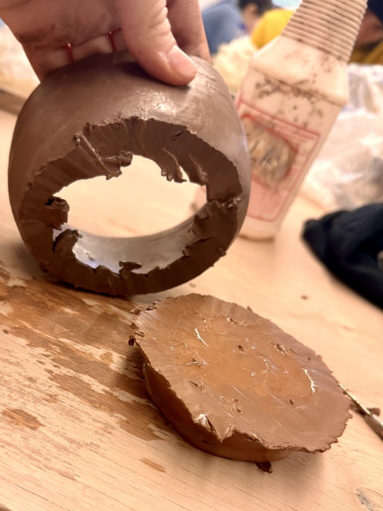
      • this hand will start out as a solid form and then need to be CAREFULLY hollowed out to avoid exploding in the kiln firing.
      • There will be an option for using 2-3 colors of acrylic paint including the orange brick color of the fired clay surface.
      • greenware hand due Thursday February 5
        • final painted hand due TBA pending firing in kiln

    This hand should be expressive in gesture instead of expressive in an object it is holding.

    Process

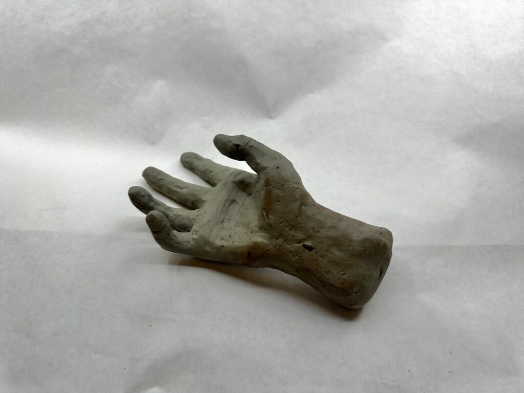
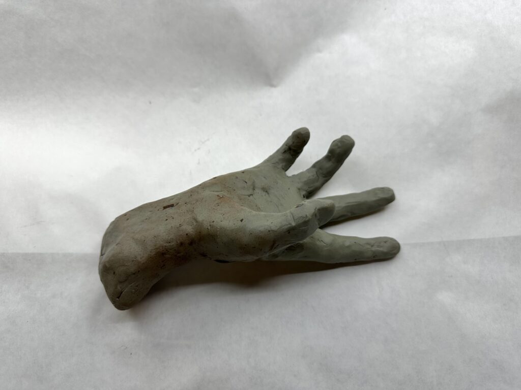
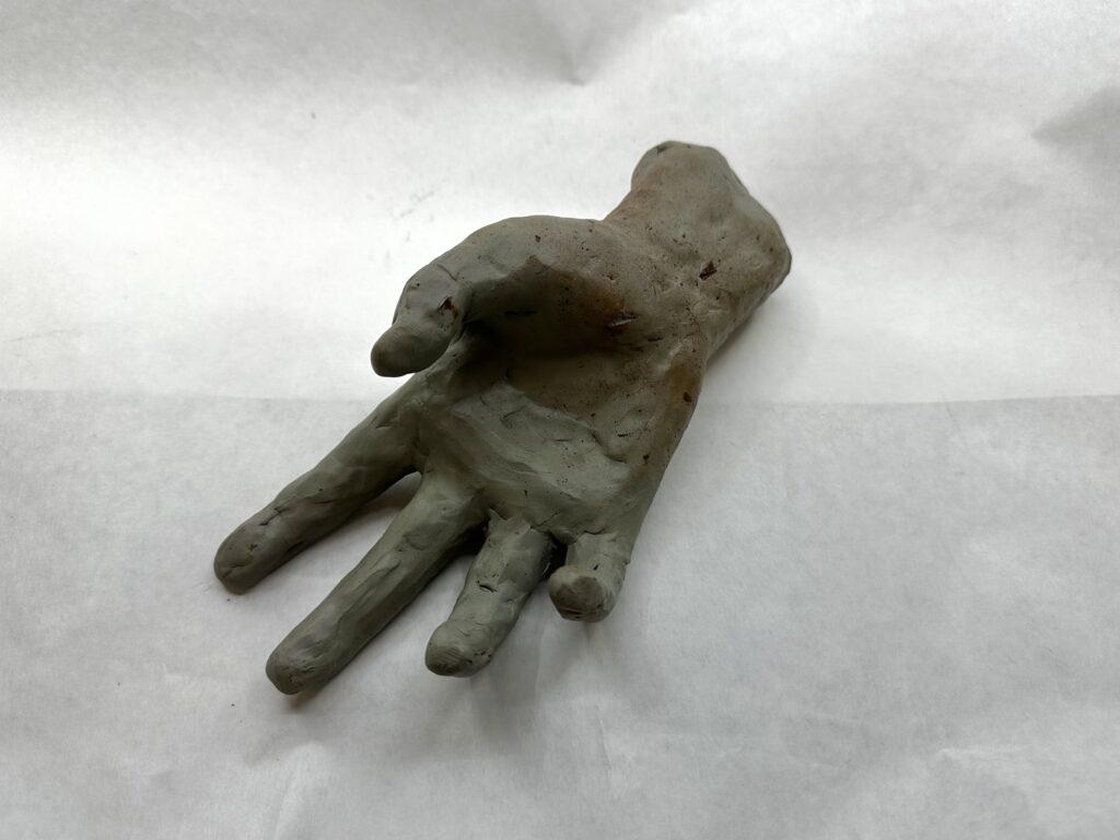
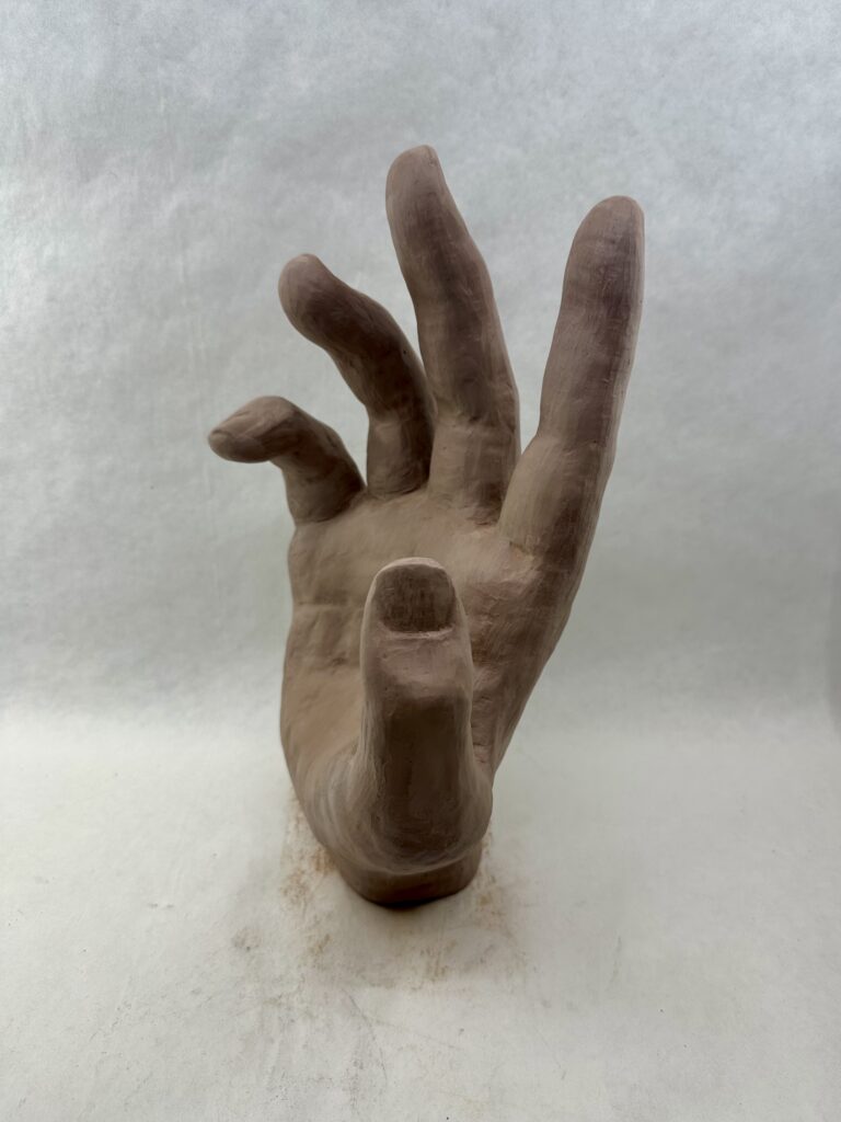
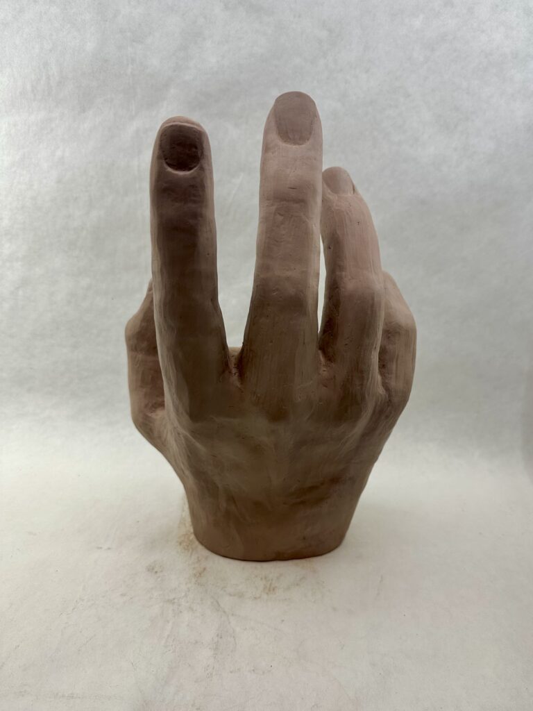
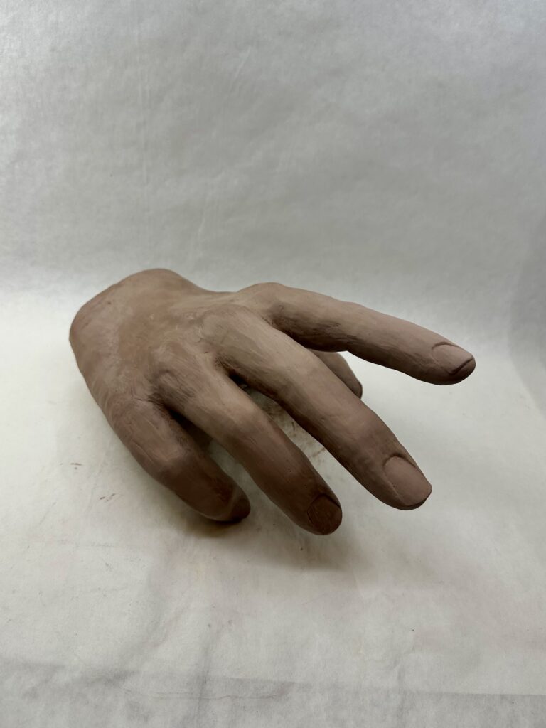
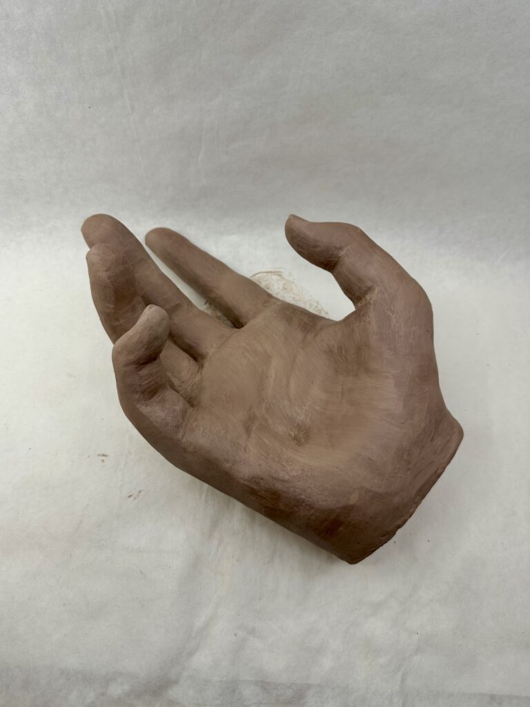
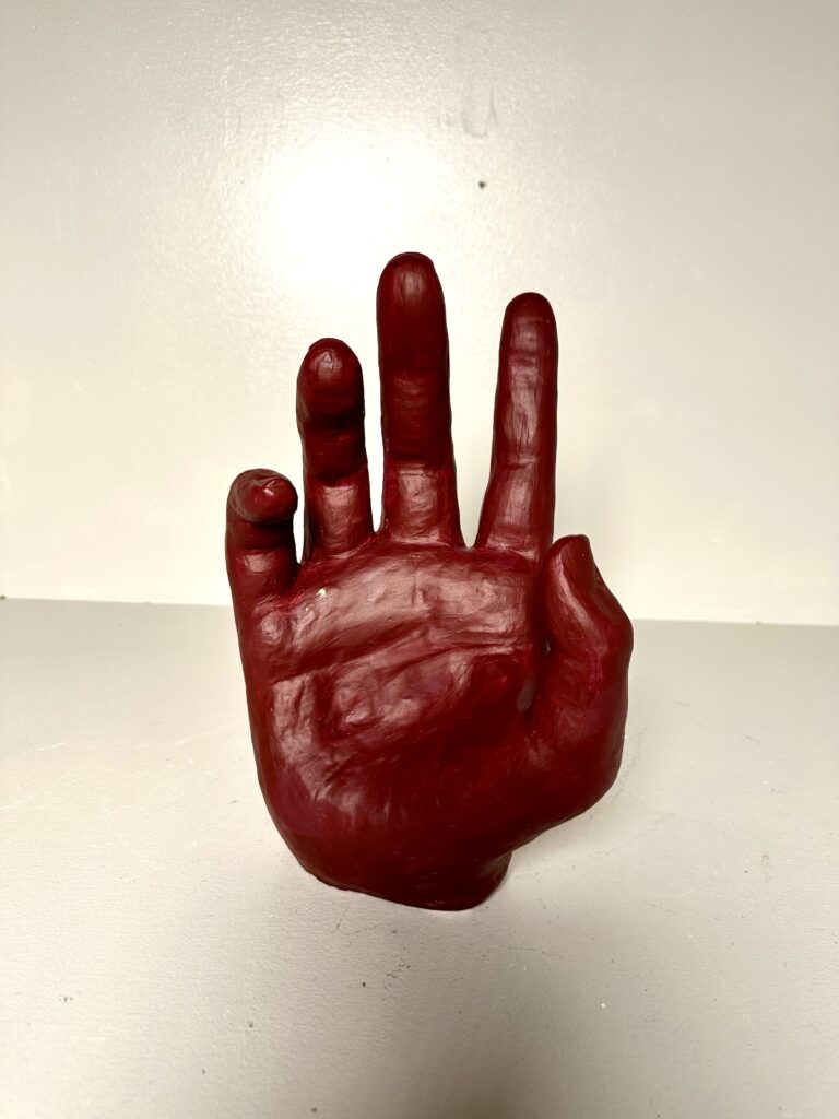
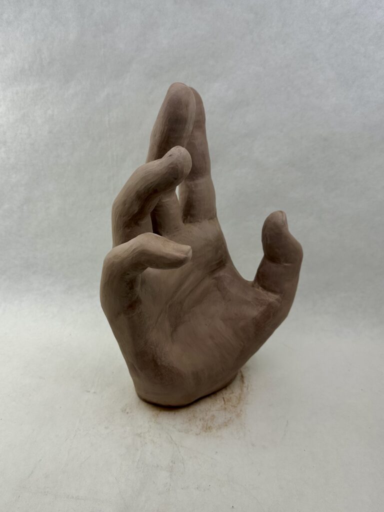
    To create my maquette, I bent wire in a shape of a skeleton hand using my actual hand as reference. The maquette would serve me as a tool later on, so getting the proportions of everything now would be helpful later. By layering the wire on top of my hand I was able to ensure that the proportions would be relatively close. When I added the modeling clay, I made sure to add the more clay in between my wire finger to have accurate line of where I would need to “start” and “end” the finger from the palm. The only big thing I noticed that I would have to change in my real sculpture was the thinness of the hand. Like scientists with dinosaurs, I shrink wrapped the clay to the wire more notably in the palm where I was less worried about messing up proportions.

    At first, when I started working on the larger hand, I couldn’t even allow myself to think of details like the nails or creases. I had to tackle trying to get the sausage like forms to bend in the same spots as my real fingers, cutting them into relatively equal thirds on the “front” side. I would have to constantly alternate using subtractive and additive methods as I realized things like that the middle of the palm has less padding than the bottom that has a lot more because the thumb sticking out, or that the skin between the fingers is raised much higher on the “front” side than where the knuckles start on the “back” side.

    Once I finished getting basic proportions and shapes down, I was able to focus on the more detailed areas. The nails were especially difficult for me. I had to redo them because at first I made them flat but realized they bend around the finger giving them more surface area. On multiple occasions, I would have to rewet the ends of the fingers since they were the spots that dried quickest, to add the nails that would jut out past the finger tip. I only wished I filed my nails before using them as a reference.

    Final Product

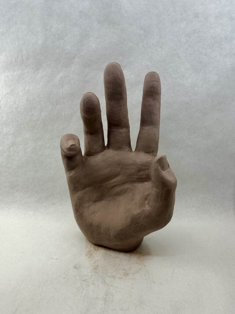
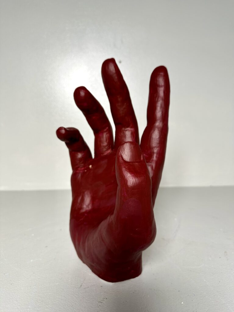
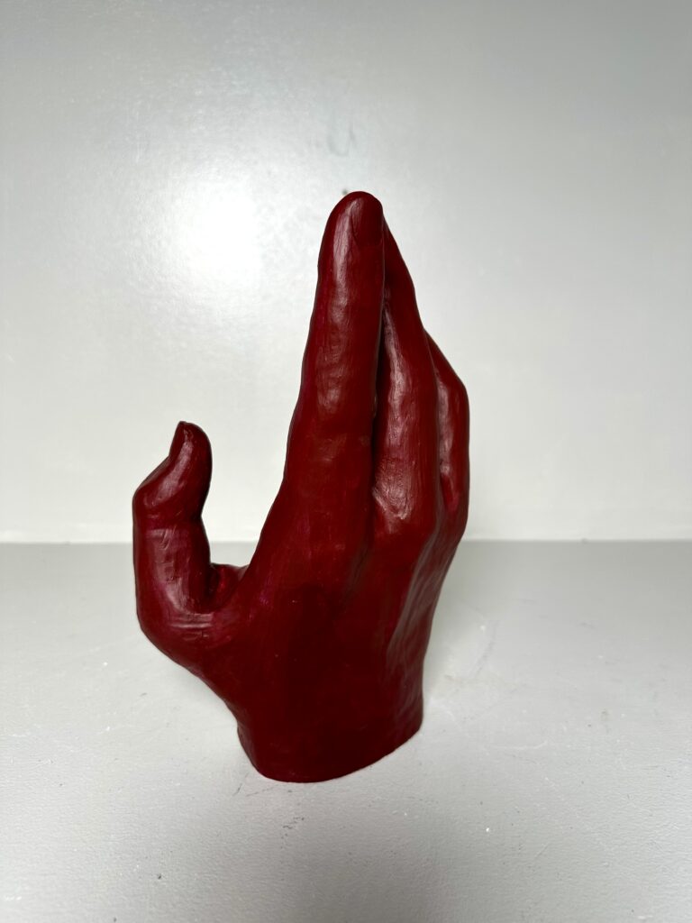
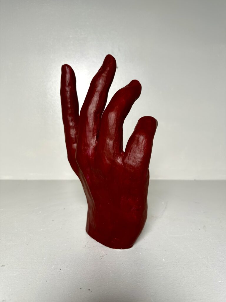
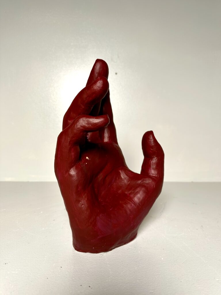
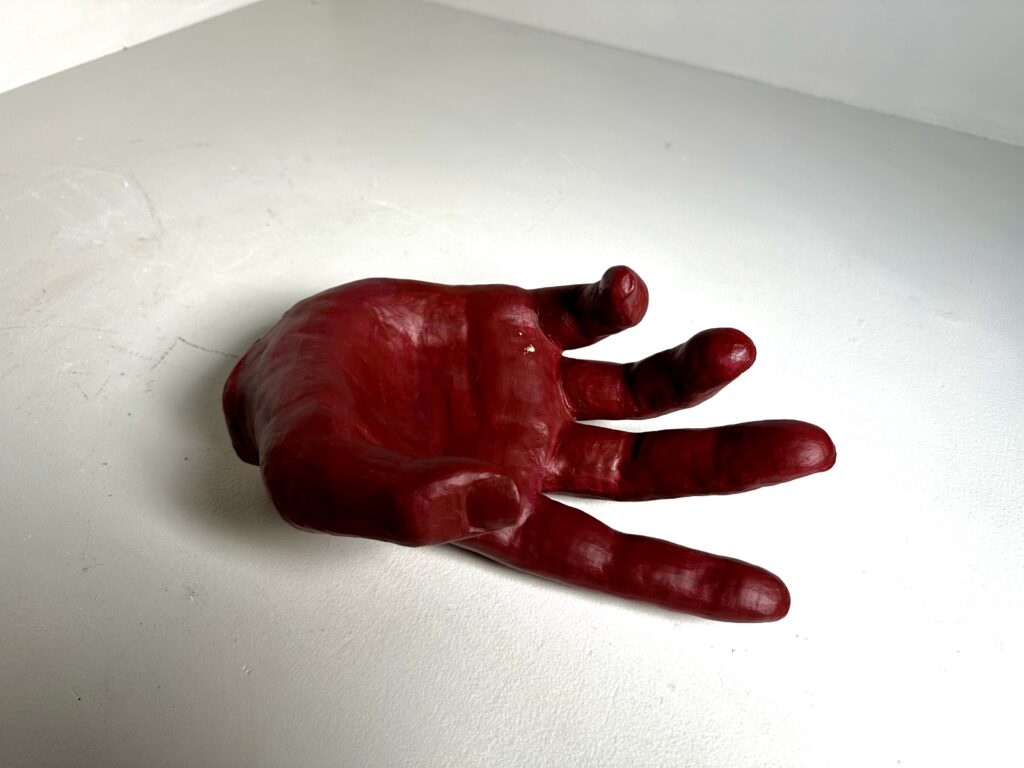
    After carving out the center of the hand to make it dry faster and putting it in the kiln, I had to paint it. I painted this multiple times because the first time it was periwinkle which looked more like a doctor’s latex glove. I went into a different direction making it a deep red. The color contrasts to the gesture making the viewer think about the meaning more. While the color is an intense red that makes people think of anger and rage, the gesture is soft, hesitant, or desperate. This could represent someone presenting well-tempered but is really furious inside. Personally I think that gives the piece more meaning than the original periwinkle idea.

    Overall, this piece is dynamic with not one side being the “front”. If it stands up, you can walk fully around the piece and see the fingers bending in interesting ways from every angle. Unlike the fingers that mimic each other’s positions, the thumb is pulling away from them creating a focal point that stick out from the visually dominant area.

  • Adornments

    Adornments

    Assignment

    CategoryDescription
    FormalCreate a 3D customer based product
    TechnicalWork at a smaller scale on an iterative product series·       use high fire clay and glaze·      
    Consider efficient methods for creating forms 
    ConceptualUnderstand what material, time, and customer driven work needs to consider to be profitable

    Working with high fire cone 10 clay you will research products of adornment for the body. The goal is not to appropriate/reproduce an existing product but to create something of your own design. 

    Guidelines: 

    • products should be between 1-5″ in size
    • be a decorative function of adornment to be worn on the body
    • involve color, design, and iteration

    Process

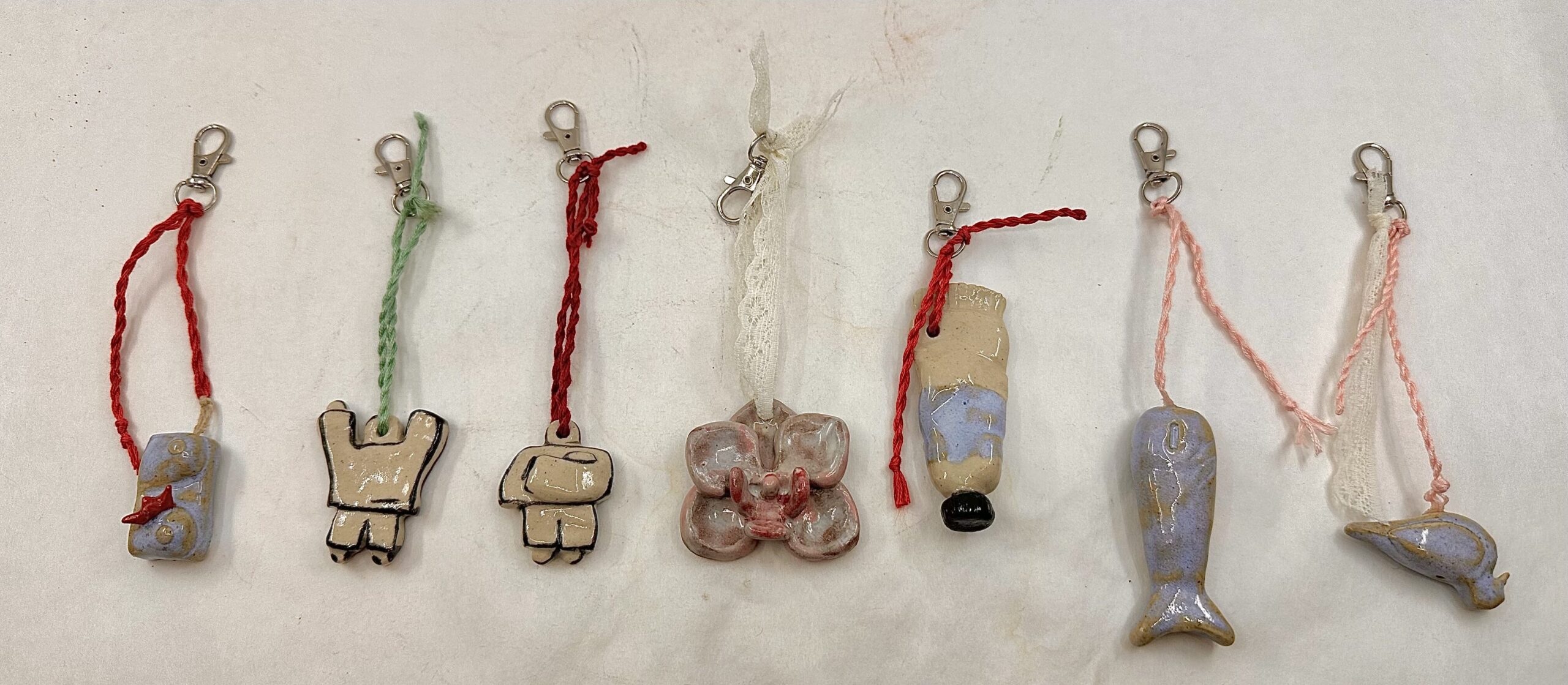
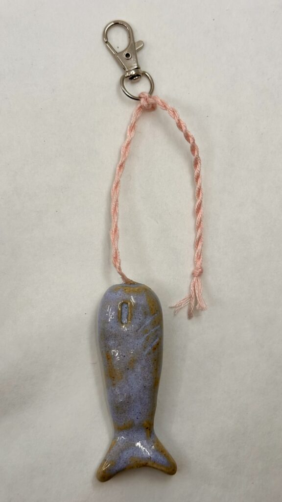
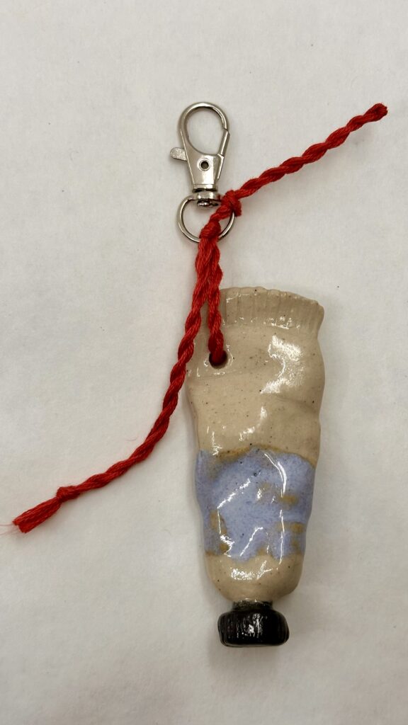
    I firstly needed to think about my audience and what type of product I was going to sell. I thought about how events like Earth Jam, Autumn Fest, and Winter Market, all had very similar items: crocheted items, prints, clothes, and jewelry. I wanted to avoid going into an oversaturated market, so I didn’t want to make jewelry if possible. I thought about the current fashion trend of wearing a carabiners and thought that those people must need something more than just keys to put on them. That’s how I arrived at the keychain idea.

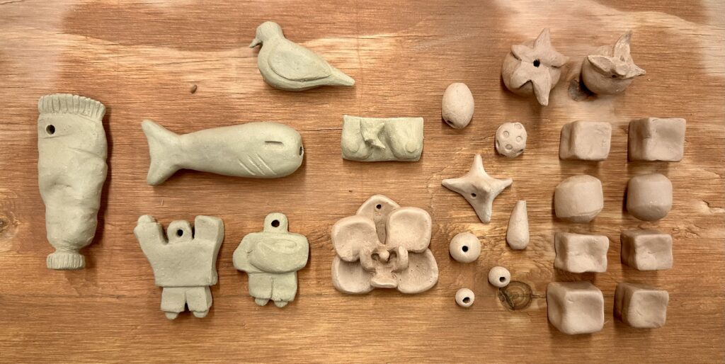
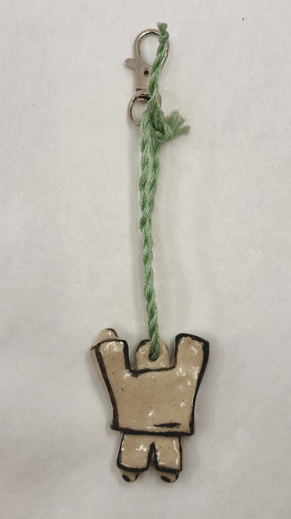
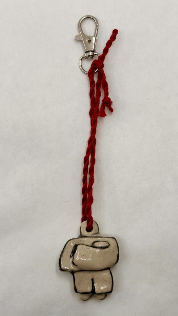
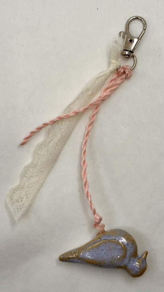
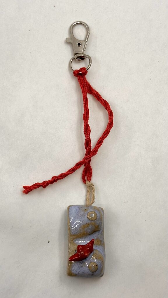
    When I considered what charms to add to the keychains, I thought to myself well I’m a college student, what would I want to buy?, and that’s basically how I went about this. I made a paint tube for art kids, tomatoes and a fish for the nature type folk, and matching people charms that could be used as BFF keychains. Most of the adornments are unique to one another so the customer will feel more special and feel as they are getting something more personalized. I also threw in a couple quick-to-make abstract charm adornments for time constraints I might face. These keychains would also be occasionally paired with other strings of fabric to make the piece less simple and more dynamic.

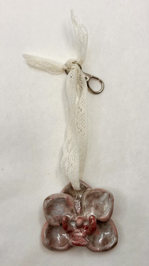
    I first started off by using the low-fire clay just because I missed the announcement where we were told we could use high-fire. I soon discovered that the low-fire clay was extremely hard to sculpt on a small scale. That’s why you see all of the basic bead looking charms done with low-fire. The most complicated thing I made with the low-fire clay was the orchid, which might have even been easier to create than the sharp leaves of the tomatoes. The high-fire clay was much more cooperatable and forgiving, I was able to smooth edges much better too. After a leaf broke off one of the tomatoes, I gave myself some room to be able to ditch a charm or two by making a couple more than needed.

    For glazes, I kept my color pallet simple, Taking advantage of the already made opal blue high-fire glaze to expedite the process. Unfortunately, I could not come up with up with a good enough pink in time which was truly devastating. I used blues, greens, and black and white instead which I guess work just as good.

    Most of the low-fire charms weren’t loaded into the kiln despite having put them on a shelf so I didn’t end up having

    ten pieces in the end. This was disappointing since I couldn’t possibly make up for that since it was the last fire of the semester. However, I worked with what I got. I think I could have been more carful checking if there was glaze in the holes before I had loaded them into the kiln because a few of the pieces’ holes were glazed shut so I had to super glue the string instead of simply threading it through and tying it. I thought I had checked the pieces pretty well beforehand but I suppose I might have forgotten to do a double check which could have saved me a lot of time (and money since I had to buy the super glue). Making the strings/chains of the keychains was actually pretty fun too. I used some old lace I had lying around and some embroidery thread that I thrifted for a different project in the past. I just took the thread, folded it in half, twirled them together, and they naturally twist themselves in the middle to create that sturdy string. This added to the piece a lot because it gave me a chance to introduce or repeat colors into the charms.

    Cost

    If I were to continue making these pieces and sell them for profit, I would need to price these adornments at $37.60 each to make livable wage. This doesn’t include one time purchases like superglue for a quick fix or things like studio equipment/studio subscription. If I would to do this over a long period of time, presumably my speed at which I could make these products would increase, so I could use less time to make them, sell more for a cheaper price, and therefore sell more, and make more. This would be ideal anyway since my target audience at the moment are college students.

    Products in bulk:Per adornment:
    Estimated average cost of high-fire clay:$2.60 (1 lb)$0.26 (given estimated weight is 1.6 ounces)
    Keychain hooks:$5.00 (70 pc) $0.07
    Thread:$2.00$0.01
    Labor time:—$37.17 (1.5 hrs, livable wage in NH)
    Total costs:$9.60 + livable wage $37.60

    Final Products

    What I think makes these pieces dynamic is the contrast in color I used. I used the grey scale against bright colors in pieces like the people and paint tube. The people are completely black and white which look nice against the bright string used as the chain. The chest also is a good example of this. Although it doesn’t have black and white, the good contrast comes from the soft pale blue against the harsh bright red in the thread and spikes. Another reason this charm contrast well is because of the geometric spikes jutting out from the organic dominant shape of the chest. This also creates a good focal point for the viewer. The orchid also creates an interesting focal point using the same technique of something smaller like the saturated petals coming out from the dominate area. I believe an interesting form in itself can make an adornment dynamic; the chest, flower, and dove, are good examples of that.

  • Kathy Butterly Presentation

    Kathy Butterly Presentation

    Audio

    Transcript

    SLIDE 1-2

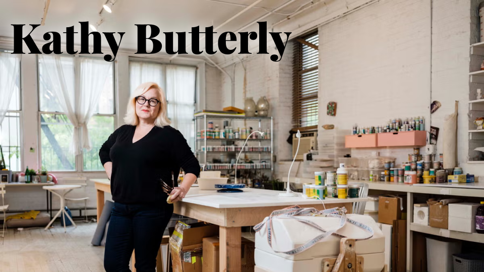
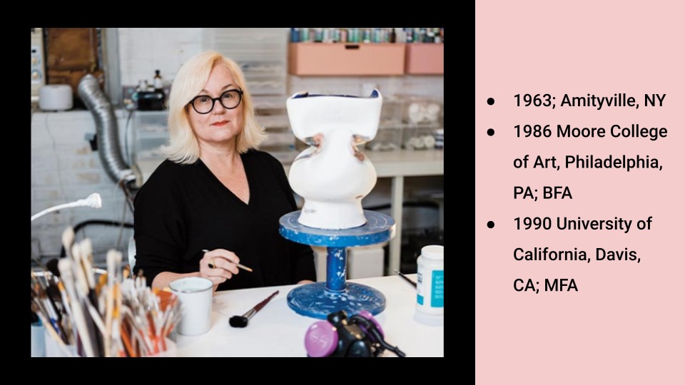
    Kathy Butterly was born in 1963 in Amityville NY. She graduated from Moore College of Art – located in PA in 1986 with her Bachelor of Fine Arts. She then received her Master of Fine Arts at University of California in 1990. 

    SLIDE 3

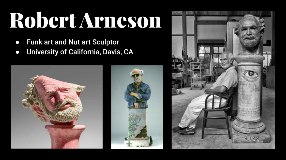
    Butterly studied with Robert Arneson who was a funk art and nut art sculptor. Arneson, like Butterly, had also studied at University of California. He later became a ceramics professor there for nearly three decades.

    SLIDE 4

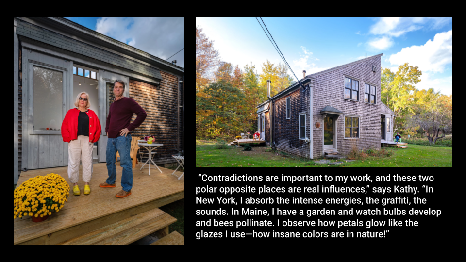
    Another artist Kathy Butterly is associated with, is her husband Tom Burckhardt, who does abstraction and figuration paintings. They both have a studio in Maine where they split their time between NYC and the rural environment.

    “‘The light in Maine is just so beautiful,’ says artist Kathy Butterly…‘You see more of the sky here than in New York. You’re very acutely aware of the elements.’” adds Tom Burckhardt.

    SLIDE 5

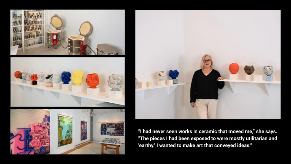
    Here are just some more photos of their studio in Maine, on the bottom left you will see some paintings by Tom Burckhardt.

     “Contradictions are important to my work, and these two polar opposite places are real influences,” says Kathy. “In New York, I absorb the intense energies, the graffiti, the sounds. In Maine, I have a garden and watch bulbs develop and bees pollinate. I observe how petals glow like the glazes I use—how insane colors are in nature!”

    SLIDE 6

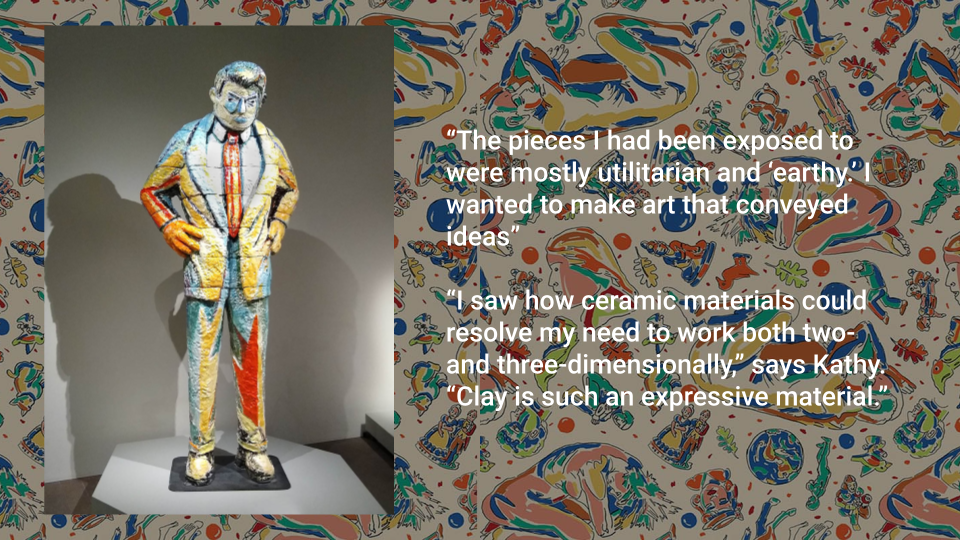
    As an undergrad at Moore College Art and Design, Butterly thought that she would be an oil painter. 

    “The pieces I had been exposed to were mostly utilitarian and ‘earthy.’ I wanted to make art that conveyed ideas”

    That was until she saw a sculpture exhibition in 1984 by Viola Frey. Who was a painter and drawing in addition to sculptor. Renowned for her large and colorful glazed clay sculptures of people. This nontraditional, boundary pushing style is what sparked Butterly’s work.

    “I saw how ceramic materials could resolve my need to work both two- and three-dimensionally,” says Kathy. “Clay is such an expressive material.”

    SLIDE 7-10

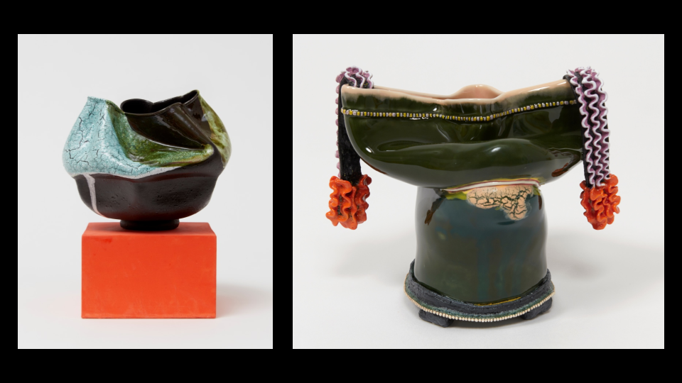
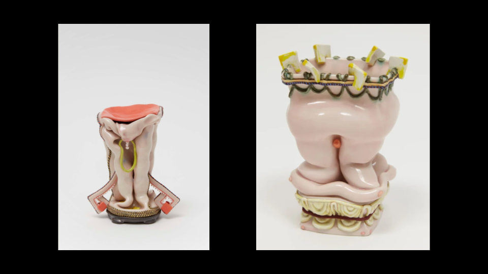
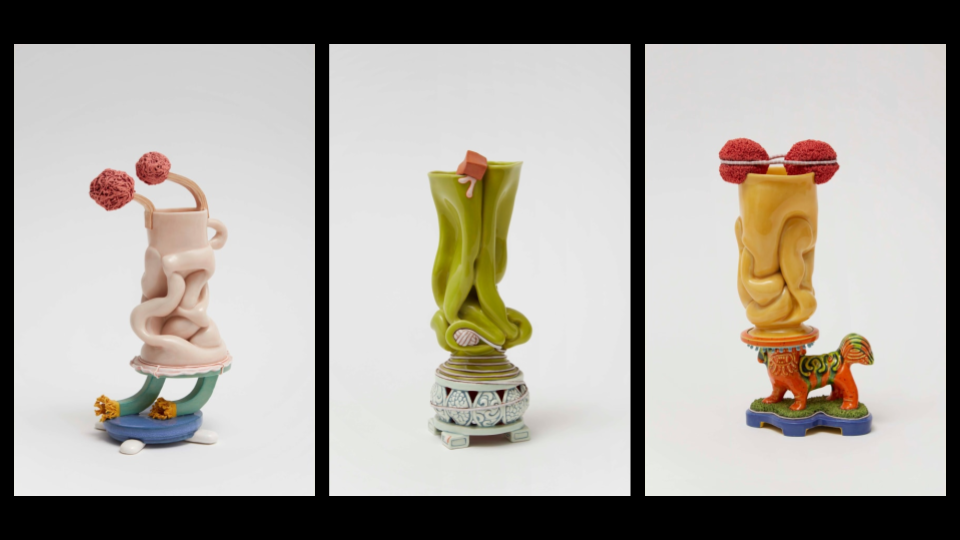
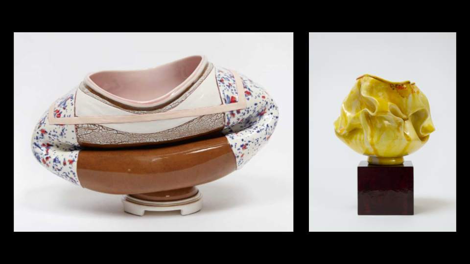
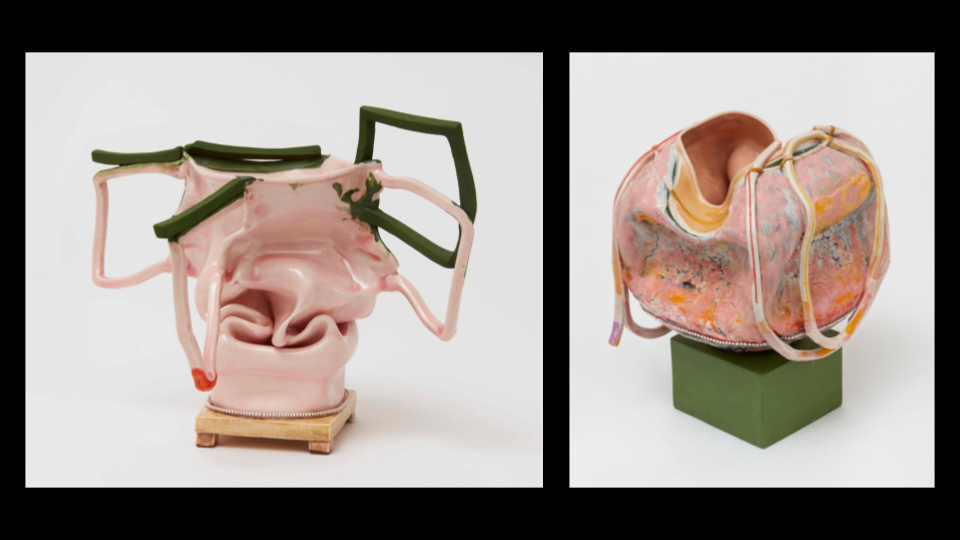
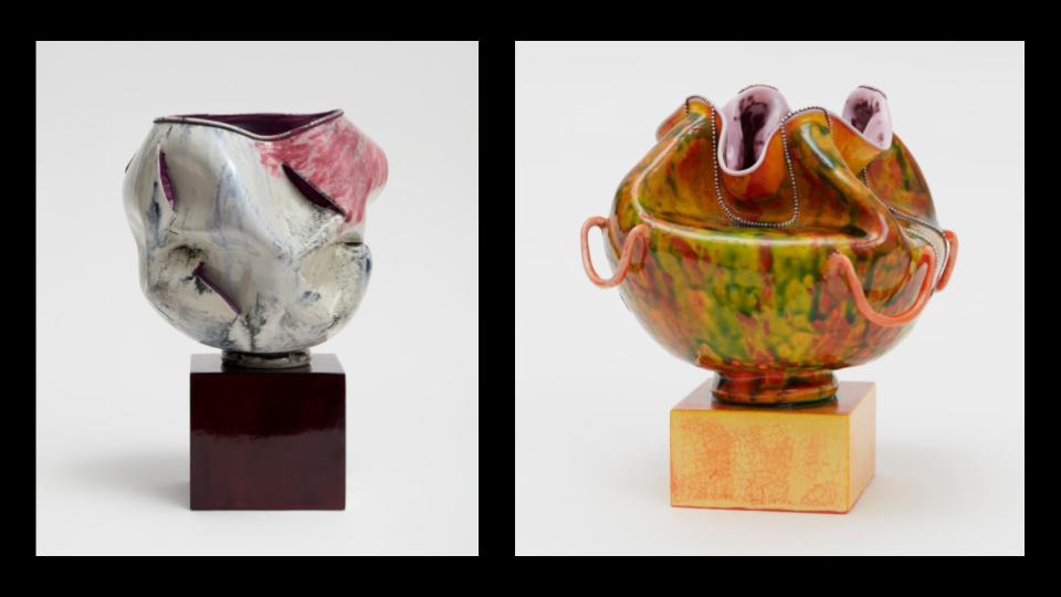
    Butterly uses a variety of muses today including but not limited to children’s toys, pop culture, dolls, asian culture, and the body. Butterly’s work often explores the female figure and the stereotypes and expectations that come with it. The vessel’s contortions, bulges, and lumpy midrifts make it impossible to use as a functional mug or cup. They resist the expected purpose of the vessel. Demonstrating Butterly’s strength in conceptual and abstract ideas. 

    Kathy Butterly creates vases and vessels that stand no taller than 12 inches. She tends to create sculptures closer to 6 inches though to be able to create intimate, complex pieces. She starts with a simple porcelain slip cast form, then pokes holes and folds in the walls of the form. She then will often decorate the exterior with ropes of porcelain or carefully crafted beads.

    These sculptures are presented on colorful pedestals or plinths to support the even more vibrant forms. Butterly’s color usage is something she is known for. Using vibrant colors resembling those from mid-century modern. A style which highlights clean lines, and organic shapes. The reason for her remarked use of color becomes clear when you realize the tedious work she puts into the layers. To achieve the iconic painterly effect on the surface of the piece, Butterly will fire and layer glazes on her works up to 40 times.  

    As Butterly works on each piece, she allows the materials and her creative flow drive her the process so each vessel is unique. 

    SLIDE 11-12

    I admire how Butterly leans into the concept of imperfection. She uses the flaws of her art like errant firing to her advantage. Going with the flow and being flexible with “happy accidents” in art is something I try to improve on. Of course not just in craft but conceptually too; she extinguishes any expectations a viewer might have of her ceramics.

    Her work being as conflicting and complex as it is, truly inspires me to do the same in my art work. It made me realize that my ideas don’t need to be fully flushed out to express myself. They merely need to create a spark or opportunity for the audience to feel conflicted or seen through the contradictory.

    I’m inspired by Butterly’s artwork mostly from her use of pallet. She uses a wide range of colors that are bright and playful. Lately I’ve really liked the concept of embracing femininity in my artwork; Butterfly does a beautiful job at this, with the usage of pink alongside the lace-like elements that resemble small strings of pearls. 

    SLIDE 13

    I’ll leave you with a quote from Kathy Butterly that might resonate, “Currently, I’m thinking a lot about the environment and politics and society—how messed up it all is, yet also how beautiful it is, too,” she says. “There are always dualities.”

    SLIDE 14

    Thank you.


    Works Cited

    Frankel, David. “Kathy Butterly.” Artforum, May 2014, www.artforum.com/events/kathy-butterly-205136/. Accessed 17 Sept. 2025.

    “KATHY BUTTERLY.” Kathybutterly.com, 2019, kathybutterly.com. Accessed 16 Sept. 2025.

    “KATHY BUTTERLY.” KATHY BUTTERLY, 2020, www.kathybutterly.com/cv. Accessed 16 Sept. 2025.

    “Kathy Butterly: Out of One, Many / Headscapes.” Portland Museum of Art, www.portlandmuseum.org/kathybutterly. Accessed 16 Sept. 2025.

    Mcavoy, Suzette. “Studio Visit with Kathy Butterly and Tom Burckhardt.” Decor Maine, 2025, www.google.com/url?q=www.decormaine.com/art/studio-visit-with-kathy-butterly-and-tom-burckhardt/&sa=D&source=docs&ust=1765066373656961&usg=AOvVaw0pyHY4IY-GfVpymo6DRJwh. Accessed 16 Sept. 2025.

    Stern, Melissa. “KATHY BUTTERLY at JAMES COHAN GALLERY – COLOR in FORMING – Art Spiel.” Artspiel.org, 9 Mar. 2022, artspiel.org/kathy-butterly-at-james-cohan-gallery-color-in-forming/. Accessed 16 Sept. 2025.

  • Wheel Thrown Elements

    Wheel Thrown Elements

    Assignment

    FormalCreate a visually dynamic object using color, open forms, texture and rhythm.
    TechnicalLearn to use the pottery wheel. 
    Create a functional object.
    Use mixed building methods to create a form.
    ConceptualLearn to use bowls/open form to create a closed form.

    This is a multiple part project that should have results on specific dates.  Wheel thrown elements you make will act as components for a pair of larger objects and functional objects in themselves. You should incorporate mixed methods of building objects in Part C and try not to think of the forms as bowls but elements for Part C of the project.

    Part A:

    Throw 10 high walled open form bowls. Guidelines:

    • use 1.5 to 2lbs of clay
    • have an opening diameter of 5-7 inches.
    • Be wheel trimmed before removal from the wheel head

    Part B: Four of these bowls need to:

    • relate in surface design and volume.
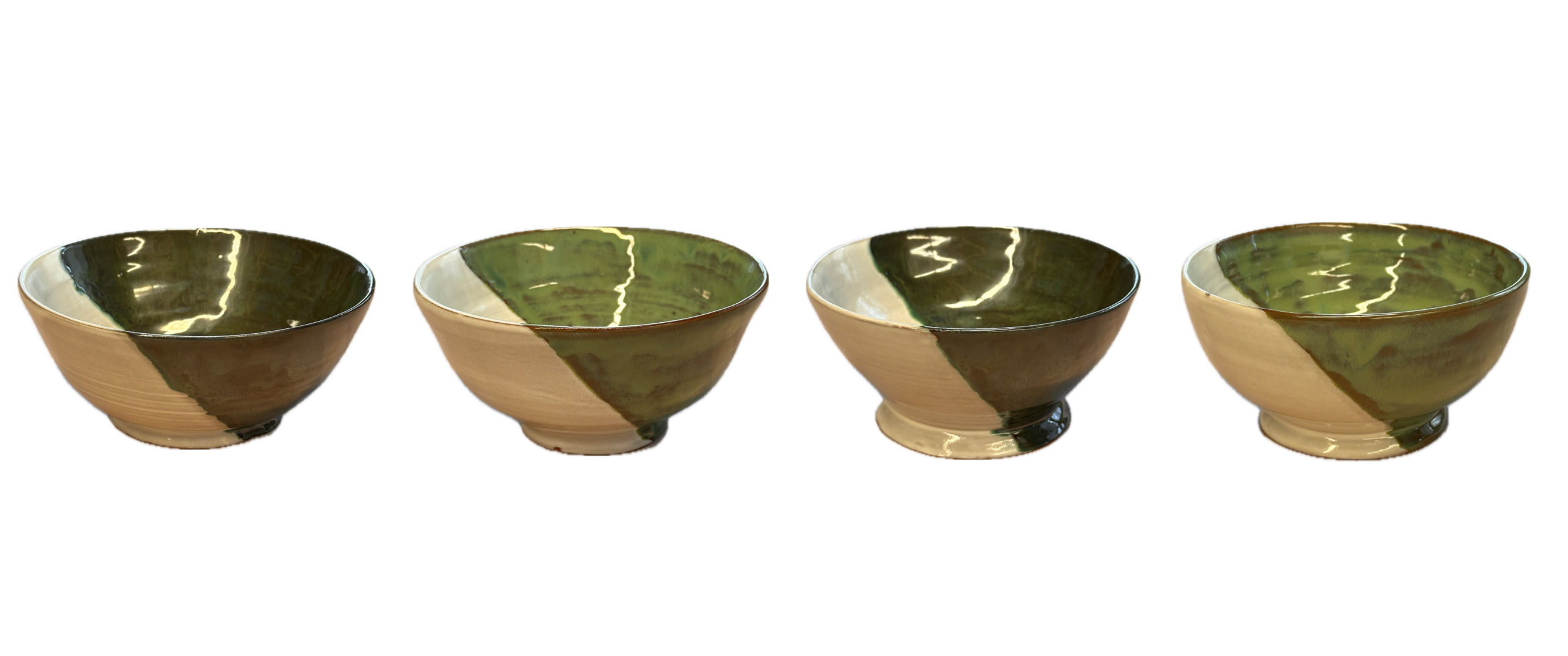
    • be wheel trimmed.

    Part C:  Using the remaining forms you are to create two closed vessel forms with handles. The final pieces should inform the viewer of your intent in defining “vessel”. You will be asked at the final critique to explain your intention. 

    Process

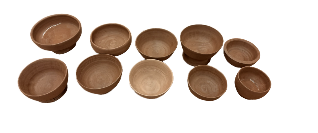
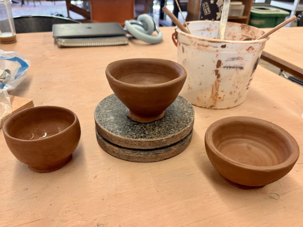
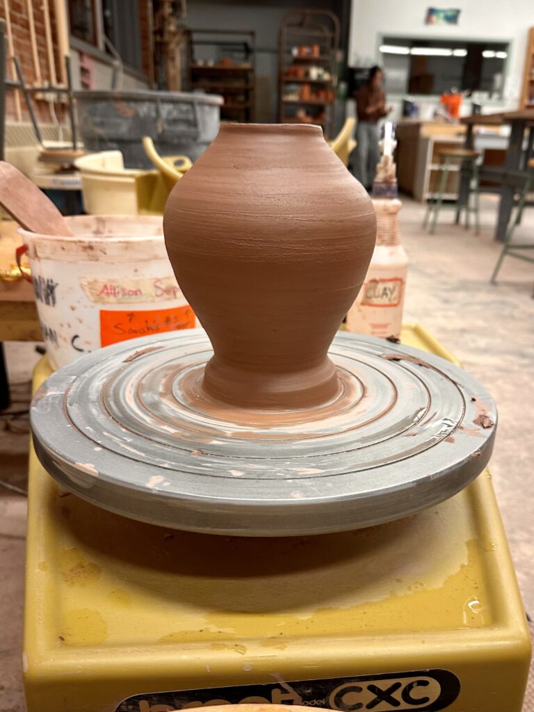
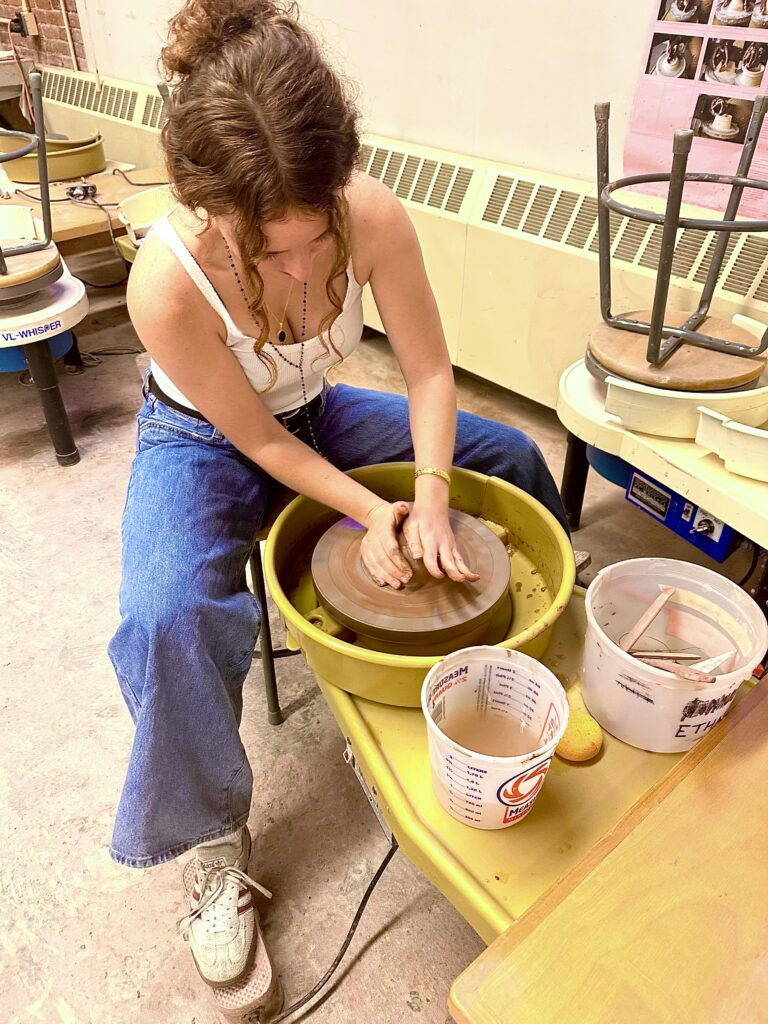
    Of course I started off the project by throwing ten bowls. It was my second or third time using the wheel and I had noticed some pain in my right wrist. I had broken a part of my wrist when I was a kid and realized that may be the cause of my pain. I had to spend some time figuring out a way to cone and shape the clay in a way that didn’t strain my wrist which was definitely a challenge during the whole process.

    I noticed some people’s approach to the project was to make six of the bowls with the intention of making the vessels out of them. I thought that may be helpful except I have never thrown bowls before and I had half expected a lot of fails during the process, so I decided to make all ten bowls first so I could use the worse ones as parts of my vessels.

    To the right are the ten best bowls I

    produced. In the picture only one of them is trimmed, but I made sure to trim all of them even if I was using them for the vessels as I thought that would help me align the centers better.

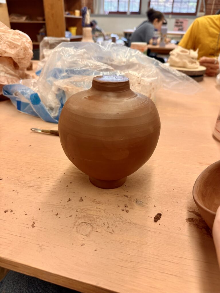
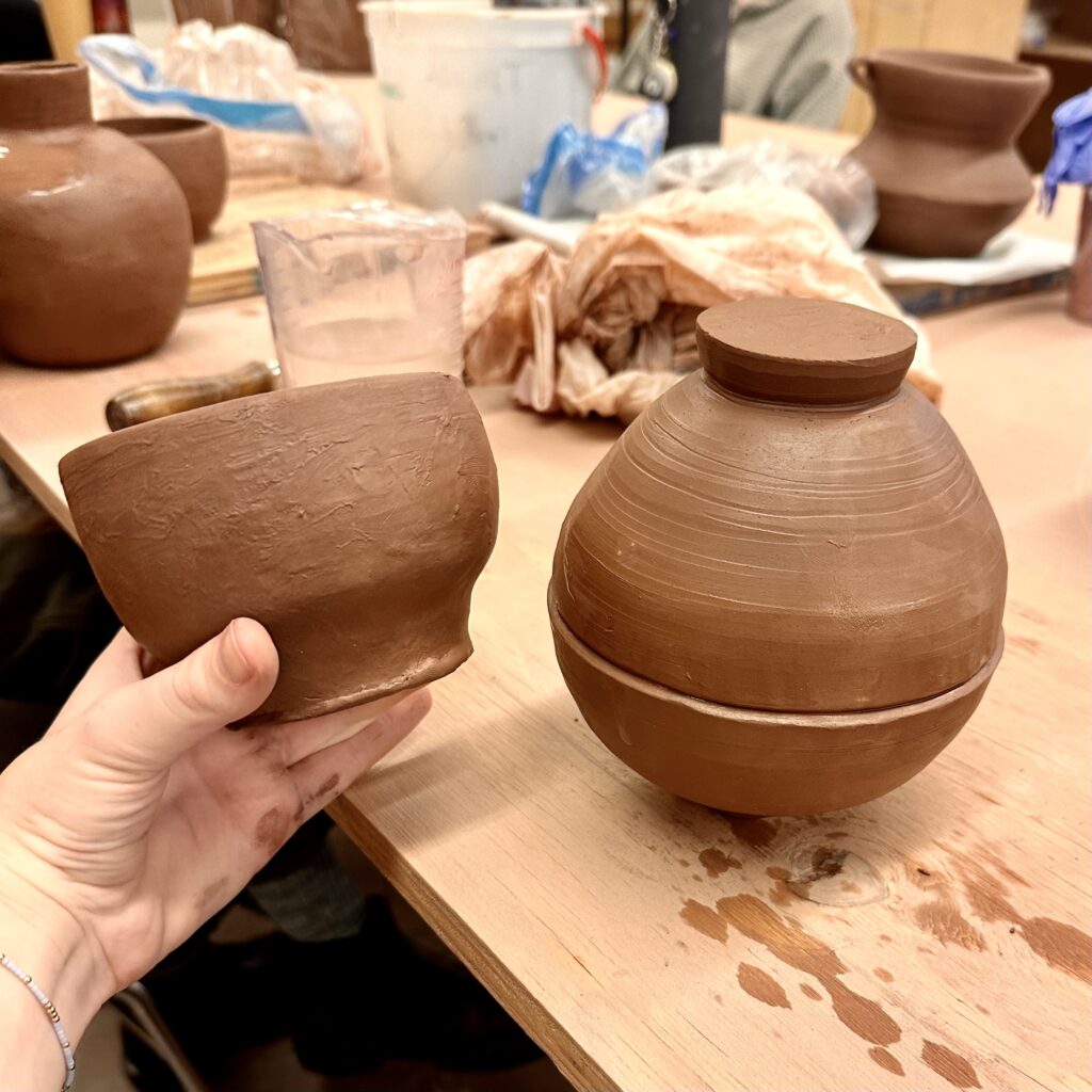
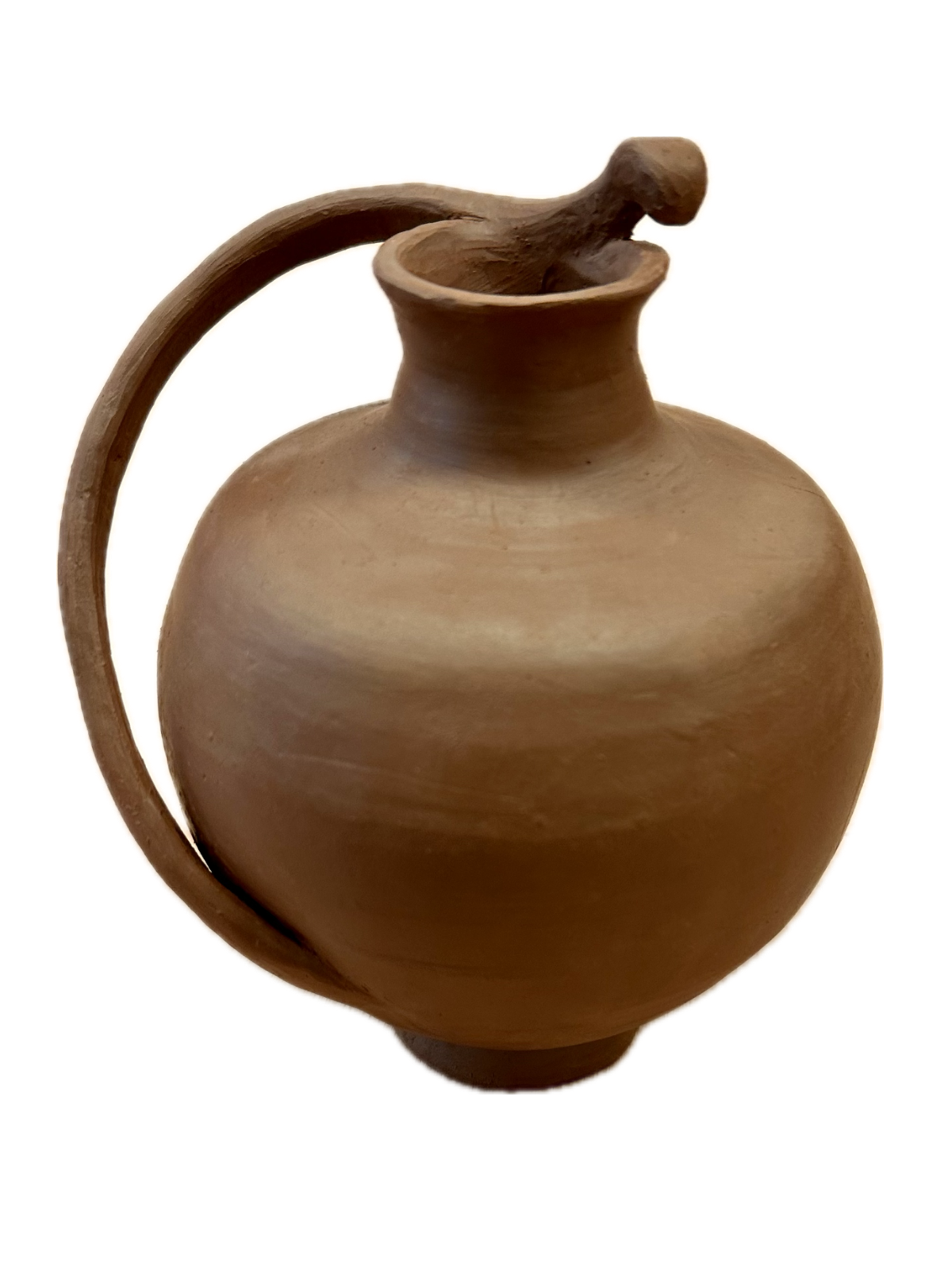
    To get started on the next step, I picked four bowls that related most to each other in size and form to be my four final bowls. Once I had those picked out I used the rest to make the vessels. I took the three smallest bowls and decided to make a vessel with those first. Out of the three, I picked two bowls with about the same circumference and stuck them together by the rims to make a closed form. There was some wrestling I had to do with the clay to get the rims to stick together just right as they weren’t perfectly the same size as each other. They fit relatively well however, and I was able to polish it up well by trimming it again on the wheel.

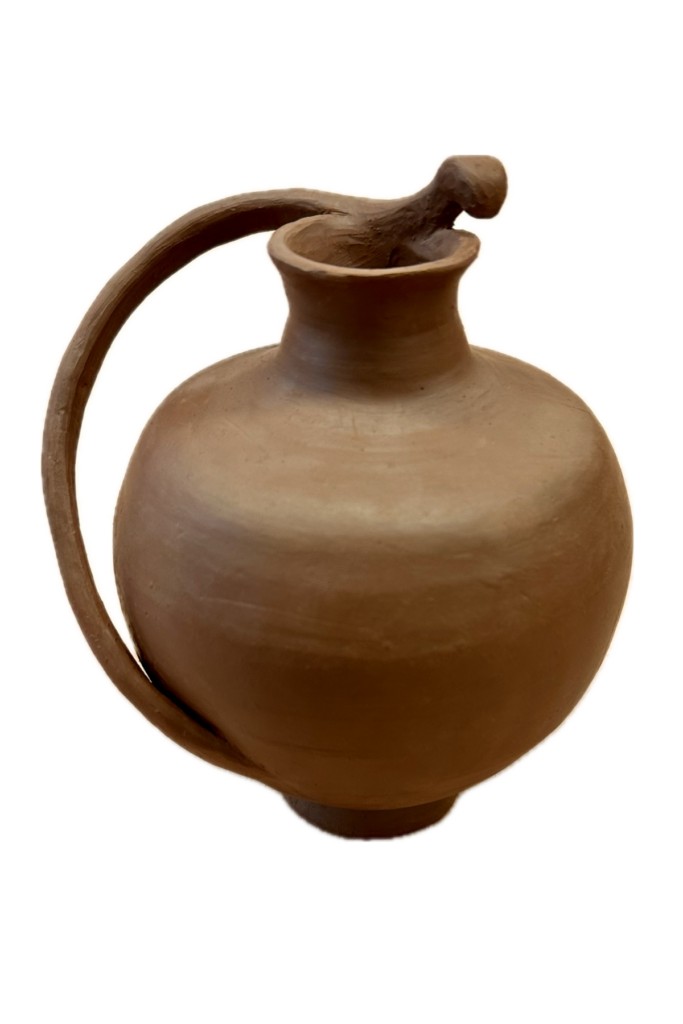
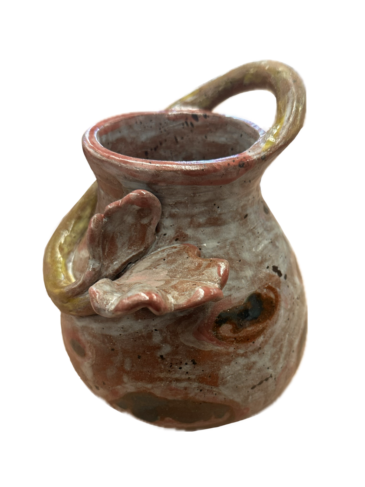
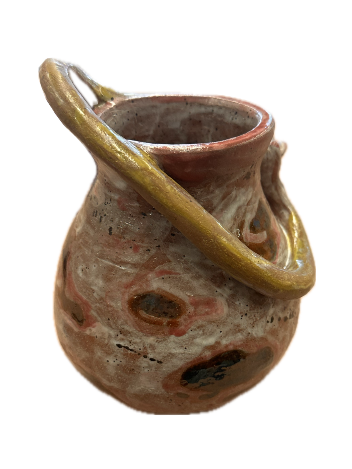
    Then I got started on the handle of the vessel. I deconstructed the remaining bowl and was inspired by the wheel-like shape it created. I thought it would be a shame to not take advantage of the already circular slab I accidentally created. So, I trimmed this slab into a thin curved coil, then I diagonally wrapped it around the vessel. While I did this I used newspaper in between the handle and walls of the form to keep the handle suspended in the air while I shaved away and shaped it. Then I just added a flare on top to decorate it.

    The last thing I did was create the whole into the neck of the vessel. I wanted to do this last so that the

    form wouldn’t dent or fold into itself while I worked on it. I basically was working with a balloon that allowed the air inside to keep equal pressure to the walls of the form. I learned this trick on my first ceramic piece and it’s definitely come in handy in handy since. I used the wheel again for subtractive methods to carve out the neck so that the rim was equal in volume all around.

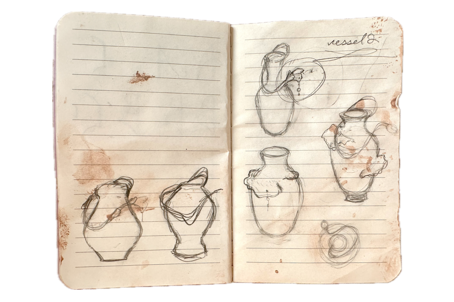
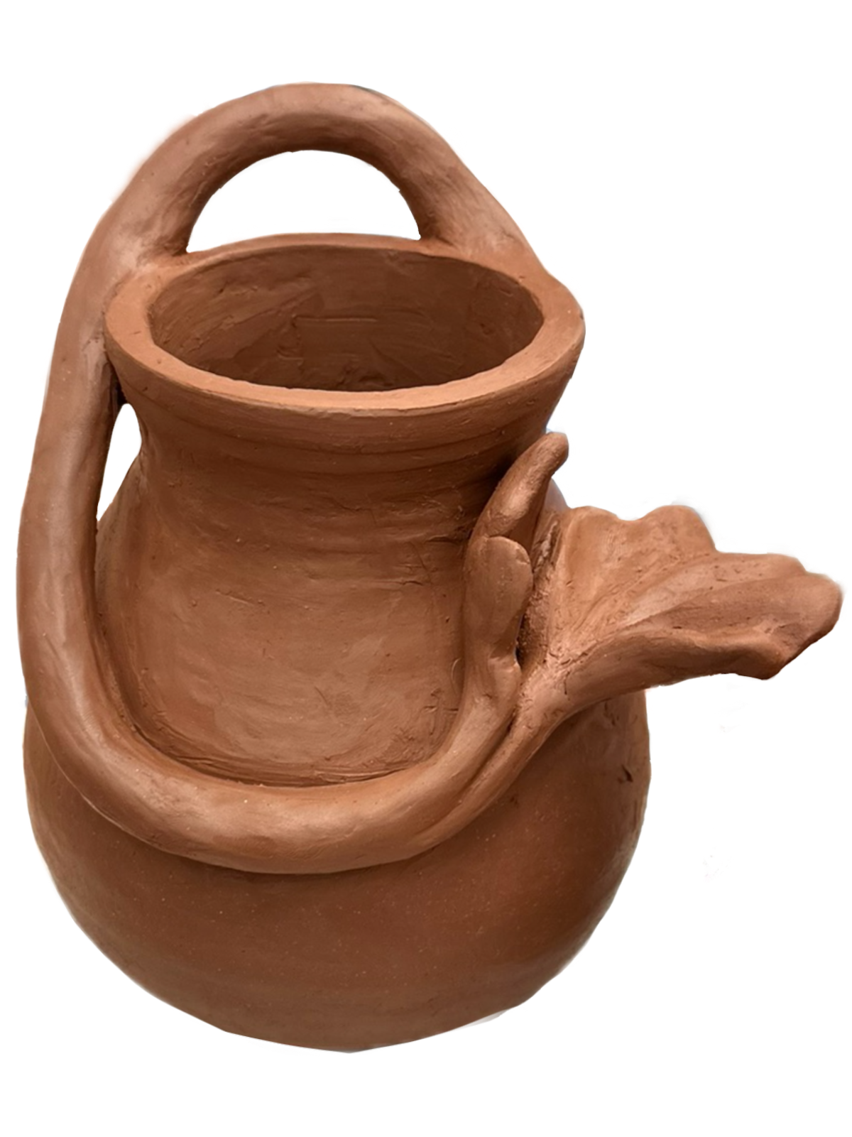
    Once I finished sculpting the first vessel I started on the second. The remaining three bowls I had to work with didn’t cooperate well together, they were too different in size to make anything out of them. So I decided to scrap using those bowls and make new ones. Now that I was going to create bowls with the specific intention of making a vessel out of them, I put a lot more thought into the shapes of them. I create a few sketches of what type of vessel I wanted that guided my throwing process (see right page of notebook). I knew I wanted something botanical and have a place to attach string of non ceramics charms to it that mimicked water or dew dripping.

    After I had made the two bowls I had to then conjoin them together. I was working on a time crunch and the air vent wasn’t working at this time, so the most I could do was wait for the clay to partly dry and work on the flower part of the handle in the meantime. However, I still had to add the bowls together while they were still very wet. Luckily, the form didn’t cave in on itself too much. I also decided to trim the closed form on the wheel while it was still wet. I think this expedited process worked well in this case but if the form was any bigger or thinner, there could have been backlash in my attempt to speed up the process.

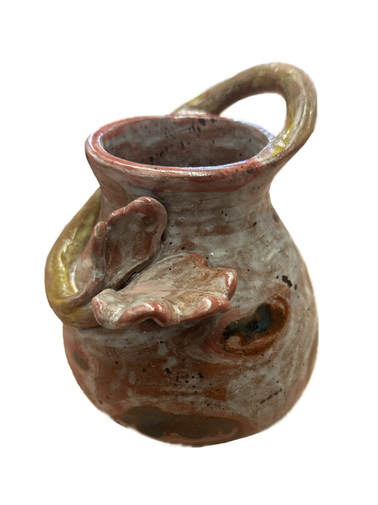
    Since the vessel wasn’t as tall as my sketches, I redrew it, this time accurate to width and height as the vessel I made (see left page of notebook). I made an option if I were to flip it either way to see which I liked better. Once I decided on which way I wanted it to go, I added a coil for the handle that wrapped all the way around the vessel. I used the newspaper technique once again to hold it in place. Adding in the floral decorative piece I worked on while the bowls were drying, was one of the more difficult parts of the process. The flower was crumbling and falling apart as I was trying to adhere it to the slip and scored area. I had to use a column

    of wet clay to hold up the flower while it dried. Then once it was leather hard, I realized I forgot to add a hole in the flower for the string of beads to hang from, so in the process of adding that, it broke again. I must have reconstructed it about four times before it stayed. I was sure it was going to break in the kiln.

    I think what contributes to what makes these pieces dynamic are the handles that can be seen from all angles of the piece. They both create interesting focal points at the end of the handles. The first vessel’s hovers

    above the visually dominated element of the round bottom. This gives it great contrast since the focal point is much smaller in scale to the rest of it. However, the base of the vessel is also quite small, so it creates a high contested, yet balanced visual for the viewer. The second vessel, although the focal point is close to the visually dominated area of the piece, has gestural lines created by the handle that act as an arrow that lead your eye out from the rim of the vessel down and up away from the established element of dominance.

    Overall, I think these pieces work really well as a series. They both are closed forms that have organic handles that wrap around the vessel. If I were to continue this series I would definitely keep trying to add height and more elaborate botanical handles.

    Glazing them was what I was most nervous about. Not being able to exactly predict how glazes will turn out once they’re fired is intimidating. Honestly, I think I was intimidated for good reason because the second vessel turned out muddy. I realized I should have put more layers on the next day, but when I went back to glaze again, it had already gone in the kiln. A part of me wishes I dipped both pieces fully in white to save me from ruining the pieces but I’m glad I experimented. I’m happy with how the dark colors contrast against the light though. I think once I reglaze and fire it, that aspect will potentially be a strength.

    Final Glazed Products (pics coming soon)

    Bowls
    – 2 foliage green
    – 2 bottle green

    2 Vessels
    – 1 final with glaze
    – one pre second glaze

  • Historical Vessel Adaptation

    Historical Vessel Adaptation

    FormalElements of design: color, texture, material, scale, 
    TechnicalCorrect use of underglaze and clear glaze
    Use mixed methods of hand building to create a hollow form
    Additive and subtractive methods 
    ConceptualCreate a contemporary object using forms and iconography from the tradition of historic vessels

    For this project you are to choose 3 different vessel forms dated pre 1500. Choose these vessels in regards to shape, composition, and surface design. Have representations (tracings, photocopies, printouts, etc…) of these vessels that you can reference and know:

    • the period of history in which they were created/ date
    • what country they are from
    • a cultural reference of tribe or geographic area

    If you cannot find this information then you can’t use the vessel. You will be explaining your results at the final critique and in written form.

    Sketches

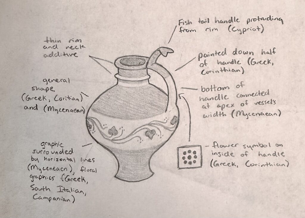
    In a sketch take the three images you have chosen and combine them together into one vessel. Example: use the form of a Korean vessel, the handles from a Minoan vessel, and the surface design from a Mayan vessel. Mix cultures to create the final.

    Final Vessel Guidelines

    1. 12 inches in height.
    2. Use of colored underglazes
    3. Additive and subtractive methods of surface design.
    4. Should be an “enclosed” form that involves an S curve. The volume should be curvilinear and not a vertical tube.
    5. Incorporate handles on the form

    Process

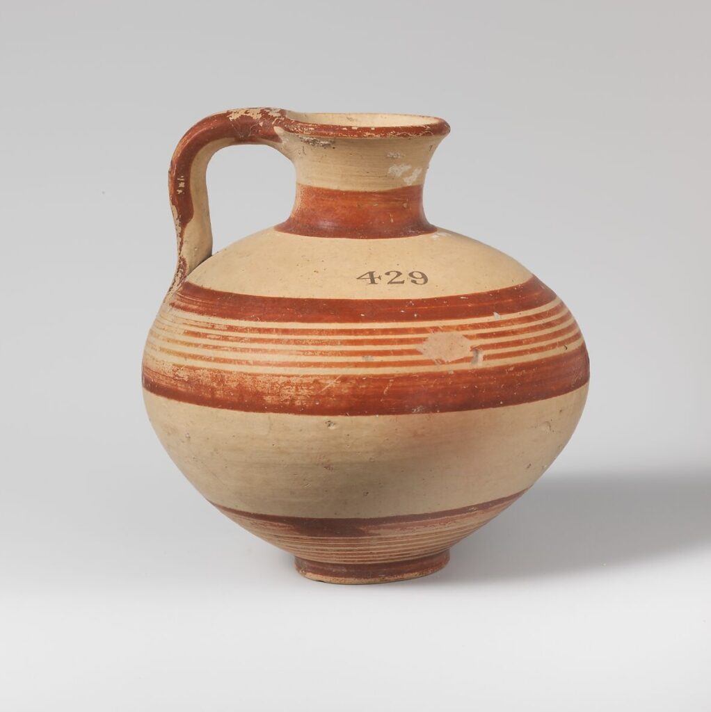
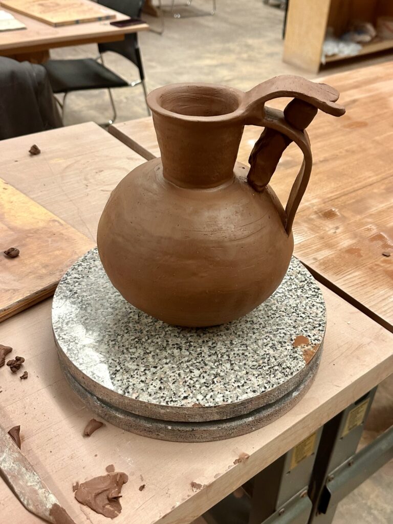
    Vessel A – Terracotta jug, ca. 1600-1050 BCE, Mycenaean culture, H. 4 in.

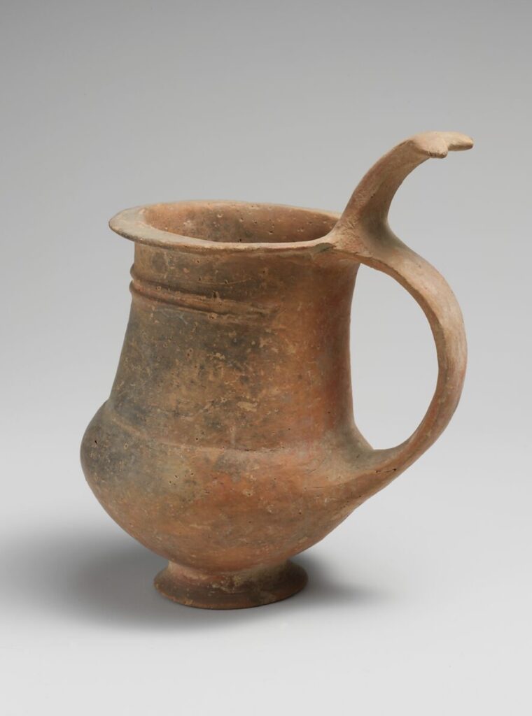
    Vessel B – Terracotta tankard – ca. 1600-1200 BCE, Cypriot culture, H. 4 9/16 in.

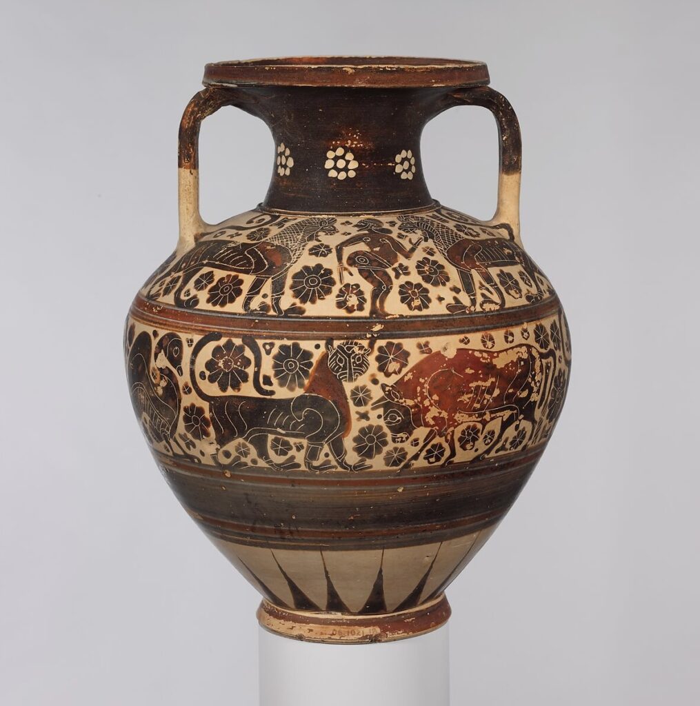
    Vessel C – Terracotta neck-amphora, ca. 620-590 BCE, Greek, Corinthian culture, H. 11 1/2 in.

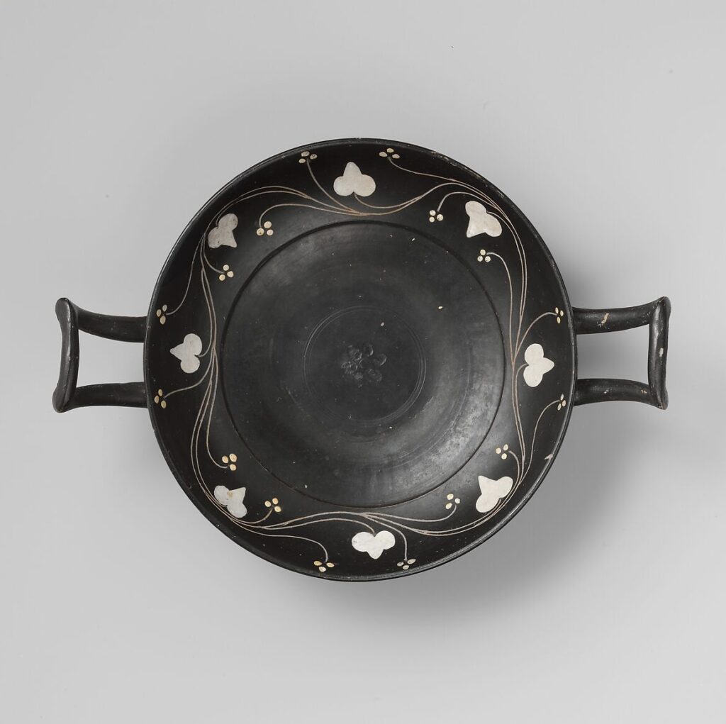
    Additional Ceramic Piece – Terracotta kylix, ca. 400-350 BCE, Greek, South Italian, Campanian culture

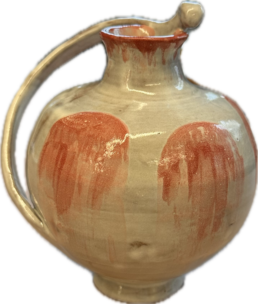
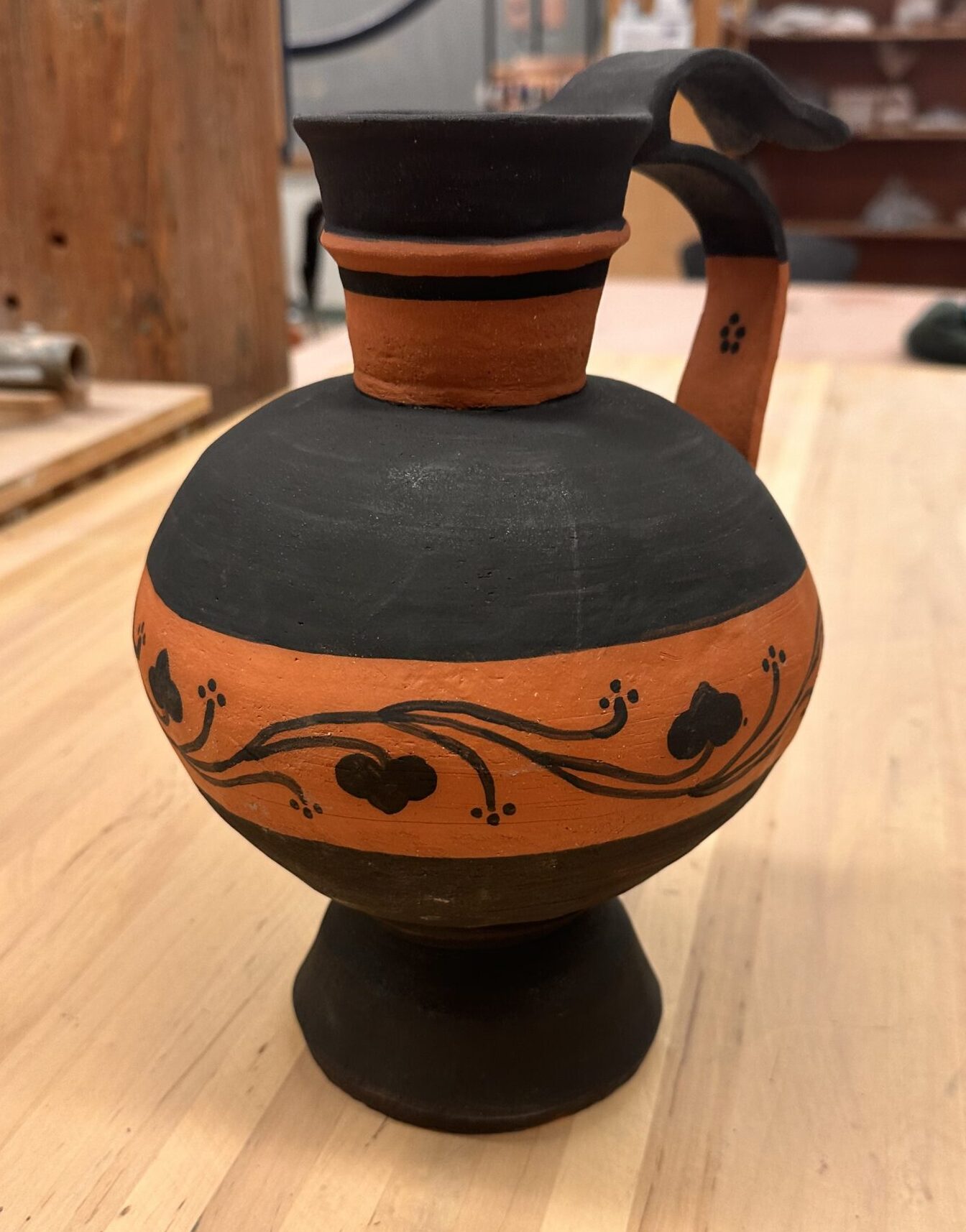
    Vessel A & C is where I got most my inspiration of the general design of my Frankenstein vessel. I took another element of Vessel A from the handle. I wanted a handle to come from the rim of the vessel down into the greatest circumference measurement of the vessel like it does in Vessel A. I wanted another handle to come from the top of that handle and bow out like it does in Vessel B. The top handle also share the same shape at the tip of the handle as the reference. Vessel C was the only reference I felt unsure about recreating. I wanted to incorporate a graphic design that wrapped around the entire vessel and was enclosed by horizontal lines, but didn’t wasn’t to create an elaborate illustration of people, animals, and florals. That’s why I added another reference to add to my vessel that’s illustration was much more simple and my style. To make sure I had enough elements of Vessel C in my adaptation, I included the handle being painted halfway and added one of the geometric floral symbols on the inside of the bottom handle.

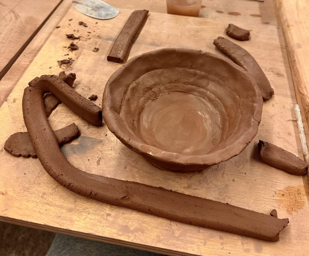
    My first step was to make two large bowls to later attach later to create the circular part of the vessel. This was my second experience ever trying to create a vase-like sculpture out of clay. So this step was an experimental process of figuring out what working for me.

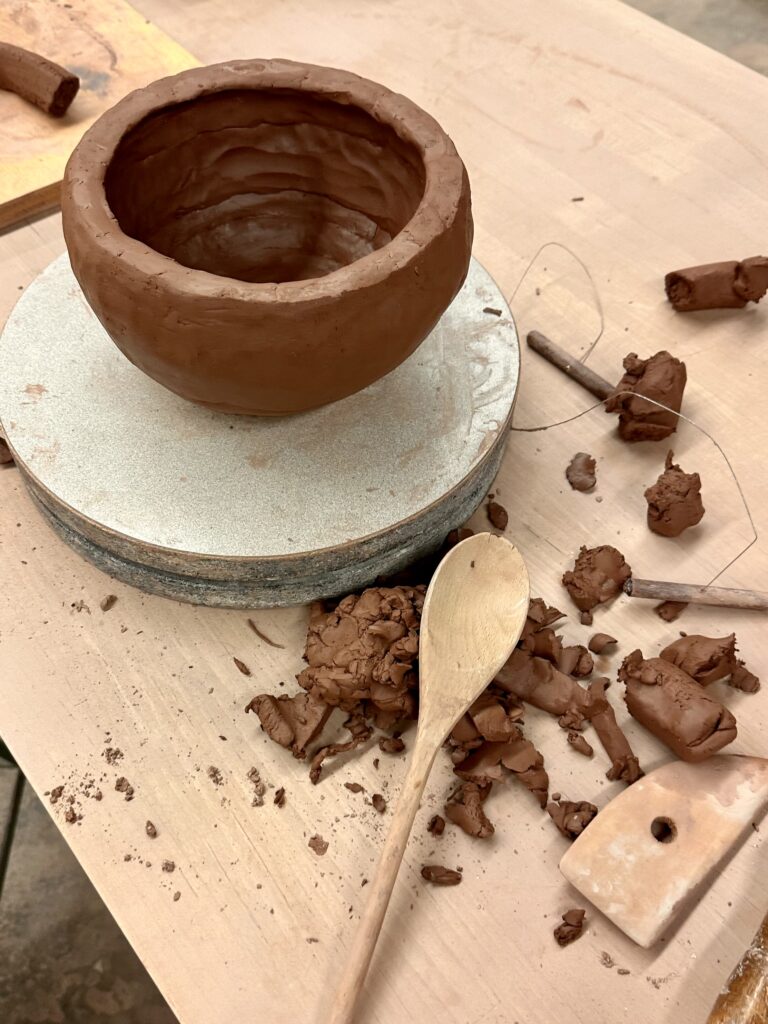
    My first strategy was to make flattened coils that I would tediously attach in layers. However, this seem to become futile as I would thin out the walls too much in the areas I had attached the coils. So during my second go around of making the bowl I used much larger coils I didn’t bother flattening. After I would attach the coils to each other I would flatten them out myself in a pinch pit fashion. This proved to be a dramatically quicker process that gave me similar enough results.

    Although, I tried to get a round shape that was closer to my sketch, it ended up being my circular than I anticipated. I tried to recover the original shape as much as possible by patting the walls in with a wooden spoon.

    I had never used the wheel before so I decided to only do the smaller parts of the vessel, like the base and neck, on the wheel.

    Using the wheel for the first time was an interesting experience. I surprised at how difficult it was to control the clay. Luckily, I found it to not be too frustrating because when I failed, it just felt like I was making mud pie. It reminded me of using a sewing machine where you use a pedal to control the speed, at the higher speeds you could more easily loose control and risk the precision of your work, which in this case would result in a mud pie.

    I started with the neck of the vessel which I hard a hard time forming because I can’t breaking the neck when I tried to extend the length of the rim. I settled for a less dramatic rim and then attached the neck to the hollow sphere I’d already made. I took a break from the wheel to craft the handles of the vessel. I used a flat strip of clay to make the handles, one

    for the big bottom strip, and one for the smaller top piece. The most difficult part of making the handle was trying to get the clay to stand up right. The clay had to be wet enough to attach and bend, but dry enough to stand up right. I had difficulty with the latter and relied on other clay to keep the form up right. As you can see in the picture above, the clay acted as a pillar to keep the handles from drooping. It might seem that there is one handle with a decorative flourish on top, but I would argue that there are two since you could carry the vessel from either part.

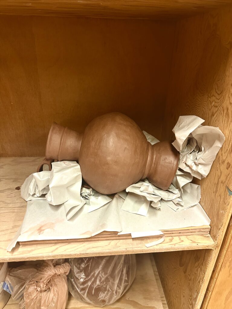
    Now that the handle was attached I would be able to accurately measure the height of what I had for the vessel so far, so I could calculate how tall to make the base. Although a tall base wasn’t in any historical vessel references, it was my way of adding height to the vessel to meet the assignment requirements. Once I attached the base I realized it was too short by a 1/2 inch, so I made another base to attach to the bottom which made the whole base over 13 inches. I created essentially a kiln bomb so I carved out the bottom of it. Something I didn’t foresee was that because I took away the support the solid base was providing, it began to collapse. I tried to rectify this but no matter what I did, it just kept sinking into itself. I decided to take pressure off the bottom by laying it down, the only problem with that is the handles or the walls of the vessel would warp from the pressure on them. To prevent contorting it, I crumpled up newspaper to try to support the sides and handles. This worked surprising very well. If course I couldn’t prevent all the caving but I tried to fix the damages when it was less wet.

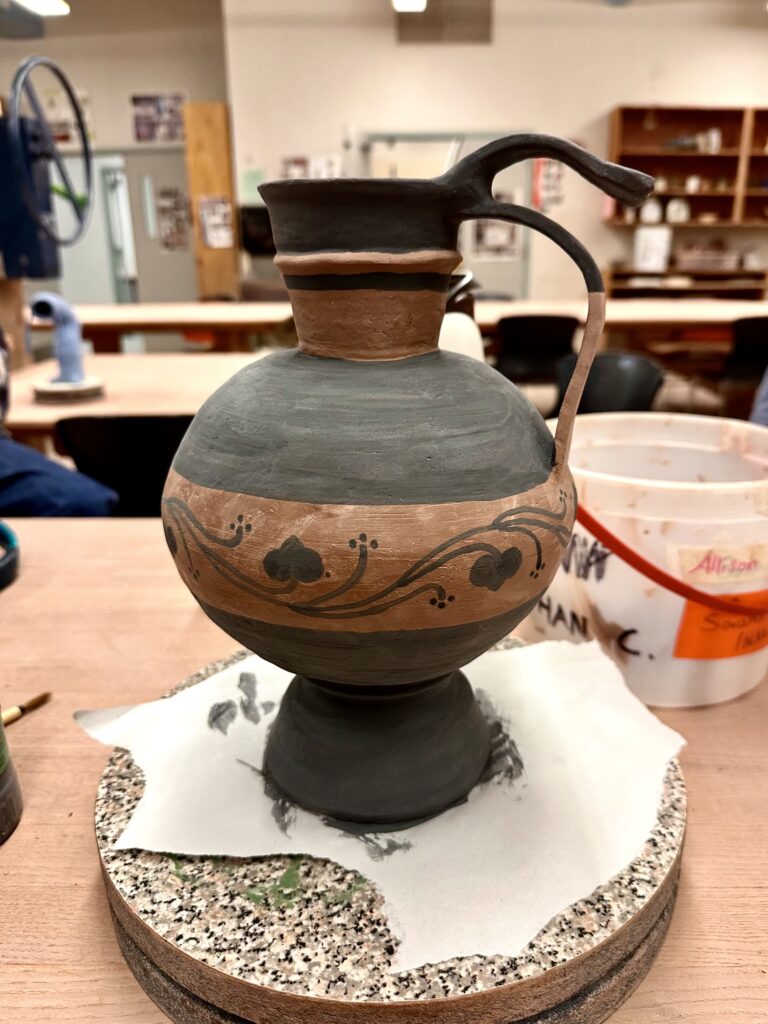
    After it was bone dry I was able to begin painting with black underglaze similar to Vessel C and the additional ceramic piece, leaving the rest of the vessel a natural warm terracotta color similar to the warm tones in the rest of the references. To line up the horizontal lines smoothly, I put the vessel on the wheel and held the paintbrush to it, so all I had to do was push a pedal. After creating my lines I blocked in the glaze and drew on my design.

    Then my vase got bisque fired! I checked to see if y handle was secured to the vessel as that was what I was most worried about since they were so thin. Luckily, they were fine. As I was taking pictures of the vessel it popped off the base! At least you can see my score marks on the vessel for proof I did my best.

    At this stage all I have to is reattached the base. I was originally thinking to put a clear coat of glaze on top of the entire vessel but now I’m reconsidering this after seeing how clumping it can look. If I had the tools available, I would use an airbrush to apply the glaze to get a thin even coat to avoid getting a goopy texture on it.

    Final glazing aside, I think the this form works really well. The contrast of the circular middle part of the vessel next to the planar slabs creates an interesting visual especially with how it’s painted. The geometric black stripes also contrast well with the organic pattern that enevlops the vessel. The whole piece has pleasing contrasts as I choose black against the bright orange of the bare low fire clay. I also think the handle that hovers above the lower longer one adds an interesting flair that brings the piece personality.

  • Two Slumbers

    Through the 17th and 19th century, Europe and the United States were in a time of revolution and unrest. The Rococo, Neoclassicism, Romanticism, and Realism were movements all responding to the instability of their environment at the time. Neoclassicism and Romanticism in particular had a polar difference in reaction to their climate. 

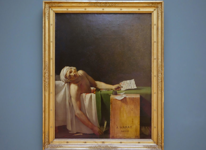
    Jacques-Louis David, Death of Marat, 1793, oil on canvas

    Neoclassicism was more action focused. The art primarily was propaganda and was trying to sway you to take a firm stand either with or against the monarchy. Jacques-Louis David, a revolutionary and close to the Jacobins, used art to glorify the revolutionists in their sacrifice for freedom. In The Death of Marat, David portrays his friend as an intellect, dying with pen in hand, aligning itself with enlightenment ideals. Writing of course what we assume are texts speaking out and slandering the monarchy. The audience hence obtains the impression that while working selflessly for a heroic cause, the monarchy exemplifies its overreach and ruthless power to suppress radicalists. Which is the goal for radicals like David who want there to be an uproar and sway public opinion in favor of the revolution.

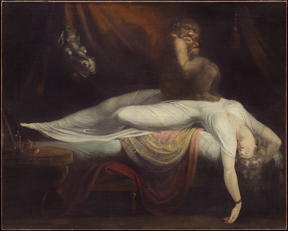
    Romantics, on the other hand, were less concerned with Neoclassicism’s rational clarity and instead embraced ambiguity, emotion, and raw reactions to the lack of stability during that period. Henry Fuseli’s The Nightmare shows these values well. The symbolism of the horse, representing sleep, and the demonic creature on the lady’s chest, representing nightmares, is the clearer part of the painting. Whether this sleep is eternal or temporary is more subjective, however. This is exactly the type of reflection Fuseli wants us to have; he wants us to reflect on the weight of the chaos of their society.

    The contrast in these two movements is stark when you compare what type of sleep each character is in. One is clear depiction of a real murder; the other is a fantasy-like subjective sleep. The difference between these two portrayals of sleep reveals how Neoclassicism focuses on concrete events and collective ideals, whereas Romanticism explores personal uncertainties and emotions.

    Henry Fuseli, The Nightmare, 1781, oil on canvas

    Citations

    Dr. Noelle Paulson, Noelle, Dr. “Henry Fuseli, The Nightmare.” Smart History,
         smarthistory.org/henry-fuseli-the-nightmare/. Accessed 15 May 2025.

    Gersh-Nesic, Beth, Dr. “Neoclassicism, an introduction.” Kahan Academy,
         www.khanacademy.org/humanities/renaissance-reformation/rococo-neoclassicism/
         neo-classicism/a/neoclassicism-an-introduction. Accessed 14 May 2025.

    “The Nightmare.” Wikipedia, Wikimedia Foundation, 28 Apr. 2025, en.wikipedia.org/
         wiki/The_Nightmare. Accessed 14 May 2025.

    Zucker, Steven, Dr, and Beth Harris, Dr. “A beginner’s guide to the Age of
         Enlightenment.” Kahan Academy, www.khanacademy.org/humanities/
         renaissance-reformation/rococo-neoclassicism/rococo/a/
         a-beginners-guide-to-the-age-of-enlightenment. Accessed 14 May 2025.

  • The Art of The Game

    The High Renaissance is known for its prioritized values in harmony, balance, and ideal beauty, but later movements broke from these ideals. Mannerism and Baroque responded to changing times with very different values, intellect and ambiguity, and emotion and accessibility. These differences are clear when comparing how each depicts a tabletop game.

    Mannerism held strong themes of intellect, poise, ambiguity, and elegance, attributes typically associated with elite, high-ranking social groups. The movement’s elegance can be attributed to the economic, social, and political shifts of the 16th century. These themes likely reflect the rising social status of artists and the changing tastes of powerful patrons. While Mannerism was very similar to the High Renaissance in its emphasis on elegance, it differed in its lack of balance. This imbalance stemmed partly from the tension of the time, especially the growing religious conflict between Catholics and Protestants. That uneasiness is often thought to have inspired the elongated and stylized forms seen in many Mannerist artworks.

    Tension between Catholics and Protestants later escalated, resulting in two distinct artistic responses during the Baroque period. The Catholics, aiming to reconnect people to the Church, commissioned grand, awe-inspiring artworks that resembled High Renaissance ideals. In contrast, the Protestants, who sought to reform both Church and religion to make them more accessible to the common man, favored theatrical, dramatic, emotional genre scenes. Both sides of the Baroque period used naturalistic figures, diagonal compositions, high-contrast lighting, and theatrical scenes to evoke emotion as a way to persuade people to adopt their faith.

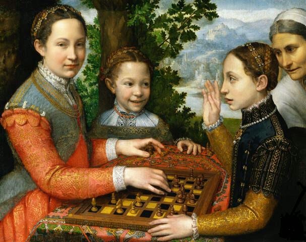
    The Chess Game by Sofonisba Anguissola is a great example of the Mannerist values of elegance and sophistication in the elite. The people themselves represent this high-class group, from the garments they wear to their rigid poses. The choice of game they play is associated with great intellect, education, and discipline. We also don’t know what the outcome of the game will be unless you actually study the pieces on the board. This shows the prioritized values of ambiguity and insider knowledge.

    Sofonisba Anguissola, The Chess Game, 1555, oil on canvas

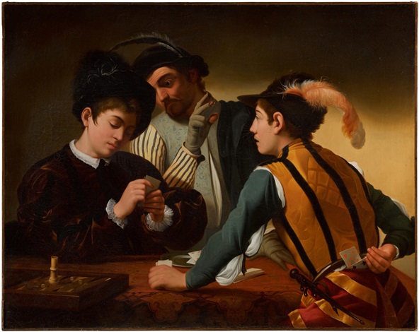
    The piece is expressive, dynamic, and emotional. Its naturalistic faces and dramatic poses make the figures feel relatable, echoing some traits of the High Renaissance. But unlike the ambiguity of Mannerism, this work presents a clear unjust narrative of cheating at a tabletop game. It invites the viewer to take sides. Its accessibility lies in how easily anyone can engage with it, without needing insider knowledge of symbolism. This clarity made it effective propaganda for drawing in a wide audience and persuading them toward Protestantism.

    Both Mannerism and Baroque show how art evolved beyond High Renaissance ideals, responding to its time while still retaining elements like elegance or naturalism. Comparing a depiction of a specific genre, like tabletop games, offers a controlled way to see how each movement redefined its values in accordance to their unique cultural and religious climates. 

    Michelangelo Merisi da Caravaggio, The Cardsharps, c. 1594, oil on canvas, 37 x 52 in.

    Citations

    The Art Story. “High Renaissance.” The Art Story, www.theartstory.org/movement/
         high-renaissance/. Accessed 12 May 2025.

    Camara, Esperança, Dr. “Baroque Art, an Introduction.” Kahan Academy,
         www.khanacademy.org/humanities/renaissance-reformation/baroque-art1/
         beginners-guide-baroque1/a/baroque-art-in-europe-an-introduction?modal=1.
         Accessed 12 May 2025.

    Kilroy-Ewbank, Lauren, Dr, and Heather Graham, Dr. “Mannerism, an Introduction.”
         Khan Academy, www.khanacademy.org/humanities/renaissance-reformation/
         high-ren-florence-rome/pontormo/a/mannerism-an-introduction. Accessed 12
         May 2025.

  • Powerful and Divine Foundations

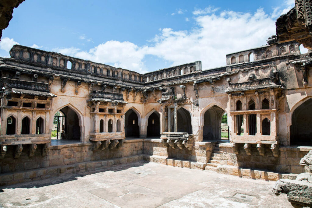
    Vijayanagara architecture blends Hindu and Islamic styles, as seen in the Queen’s Bathhouse. It reflects how the Sangama brothers, Harihara I and Bukka, shaped a distinct identity for their newly founded kingdom in response to outside Islamic influence.
    There’s some debate about whether the brothers came from the Kakatiya Kingdom or the Hoysala Empire (which eventually merged into the Vijayanagara Empire). Regardless, both these civilizations were Hindu-based and eventually overtaken by Muslim rule. In response to the Muslim invasion, the two brothers founded Vijayanagara. The rulers promoted the Hindu religion with festivals held in the capital and by building religious structures. The empire’s deep roots in Hinduism help explain architectural details such as the repeated lotus brackets on buildings, a Hindu symbol representing purity and divine beauty.

    (photo: Shivajidesai29, CC BY-SA 4.0)

    However, a question arises from the appearance of Islamic architecture, such as the pointed arches. Why would the Vijayanagara adopt these Islamic visual traits if they were resisting Muslim reign?

    One of the most likely reasons is that the empire wasn’t cut off from the rest of the world. In fact, “…kings encouraged overseas trade from coastal ports that transported local goods for the international market…” (Pai). Not only did people visit for business, but also for tourism. The kingdom was lively, and as visitors described, it was “…a prosperous and well-planned city with irrigation technology, bustling bazaars, a large standing army, and sumptuous palaces,” (Pai) even comparing it to Rome. So of course, this was a hotspot for cultural exchange, including Islamic culture. Although they were resisting Islamic rule, it would be difficult not to subconsciously pick up on some of their familiar visual traditions. Elements like pointed arches and symmetrical architecture symbolize elegance, sophistication, and divinity. It’s logical that the kings would display these values in the Queen’s Bath, a place of royal leisure.

    Alternatively, the choice to adopt a mixed Islamic and Hindu visual identity could very well have been intentional. On one hand, they were establishing Hinduism and resisting Islamic rule culturally. At the same time, they embedded Islamic architectural elements in the literal stone foundations of Vijayanagara’s most prestigious buildings, perhaps as a strategy to assert power. If they mimic the Islamic identity whose reign encompassed much of South India, then they could imply they had just as much power. Vijayanagara was trying to meet neighboring Islamic empires as an equal, so conveying that same strength through architectural language made sense for the City of Victory. This architectural blending of the two cultures reveals how imagery was used to define the “Self” in contrast to a perceived Islamic “Other,” reflecting the broader concept of imperialism as a cultural and political contest.

    Citations

    New World Encyclopedia contributors. (2023, May 3). Vijayanagara Empire. New
         World Encyclopedia. Retrieved April 24, 2025, from
         https://www.newworldencyclopedia.org/entry/Vijayanagara_Empire

    Pai, G. V., Dr. (n.d.). Art and architecture of the Vijayanagara empire. Smart
         History. Retrieved April 24, 2025, from https://smarthistory.org/
         art-and-architecture-of-vijayanagara-empire/

    Vijayanagara architecture. (n.d.). Wikipedia. Retrieved April 24, 2025, from
         https://en.wikipedia.org/wiki/Vijayanagara_architecture?utm_source=chatgpt.com

  • Defining Women Should Not Be to Define Modernism

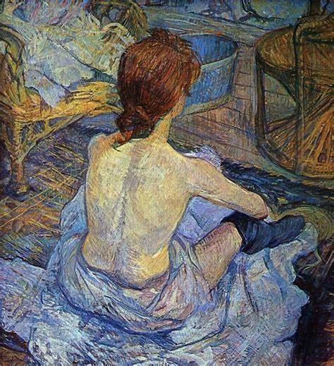
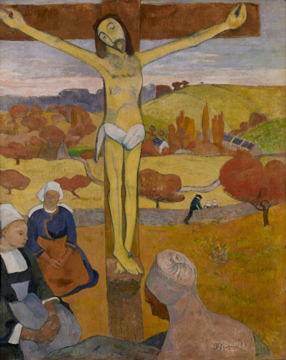
    To be modern is to challenge the present. Post-Impressionist artists did just that; they rejected tradition, embraced emotion, and redefined what art could express. As you can see to the right, this movement’s style exhibited imperfect lines and unnaturalistic colors. They were reacting to the Impressionists, who were beginning to embrace brushstrokes and color. They focused on their individual experience, opinions, and feelings about the fleeting moments in front of them, rather than focusing on the precision of what lay before them and capturing photo-identical pictures.

    What made them modern is similar to what made the Impressionists modern: “The [Impressionist] group was unified only by its independence from the official annual Salon.” These artists represented a rejected, bohemian, alternative lifestyle that the official Paris Salon could not condone. Post-Impressionists weren’t just modern for their use of brushstrokes, perspective, and color; they were also modern for their contrasting subjects or muses.

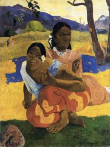
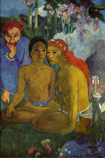
    Paul Gauguin, Contes Barbares (Primitive Tales)

    They would often paint naked women in the presence of men without a chaperone. Having a different subject from past movements set them apart—it’s what made them bohemian. It was supposed to reflect an alternative lifestyle, one that rejected societal norms. This can be seen as strides in the feminist movement because women were finally represented outside the constraints of modesty. However, having men be the dictators of how women are depicted isn’t anything new. They’re just using women to display their skill and talent, much like painting a vase. They did not care to reflect the women’s perspectives at all; instead, they depicted their own interpretation of them through their art.

    The content of Post-Impressionism bohemian art was also extremely shocking to viewers. Revolting against the Salon’s ideals consequently gained a lot of traction (good or bad) due to the shock value it had. This was an attractive reason for artists to (ironically) jump on the bandwagon and partake in the Impressionist art style. It ended up enabling the objectification of women. It reminds us of the importance to keep an eye out for artists who are simply looking for attention from that shock value—if not, they could be harming a marginalized community, as Carol Duncan said, “His freedom is her unfreedom.”

    We can relate this to one of the most popular movie production companies, Disney. Disney is currently straying away from the traditional cliché of the (white) damsel in distress, replacing her with diverse, capable women who are fearless and decisive, often with no focus on romantic entanglements with anyone. Many would agree this is a nice switch-up. Disney would be reacting to their own times by doing so. However, they are continuing a new trend of rewriting classics that don’t align with their present values, like Snow White. This begs the question: Are they doing this to correct their history of normalizing harmful stereotypes, or as a strategic move to profit off the shock value of surface-level change?

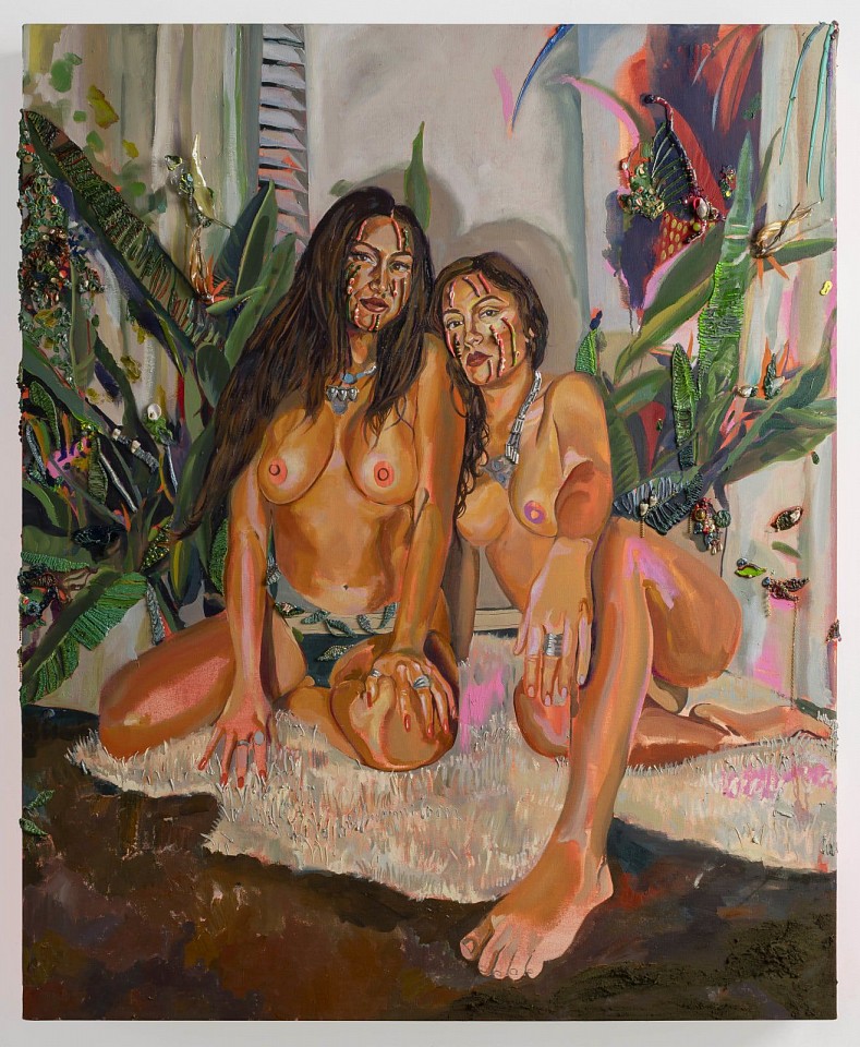
    We saw Gisela McDaniel rewrite Paul Gauguin’s Primitive Tales in her piece Chelon Tiha, doing a similar empowering revision of a misogynistic piece. So, is it not the same thing? Well, no, it’s not, for a couple of reasons. Disney could be creating new movies that excite and inspire youth; instead, they’re lazily taking older movies they have copyrights to and putting a different set of expectations on women. This implies once again that there is only one way to be a woman. Young women are getting the impression that they can’t be quiet, soft-spoken, and take on traditional feminine roles; now they can only be leaders, heroes, and take on more masculine roles. We haven’t really allowed room for women to be respected as somewhere in between. The other reason is that Gisela McDaniel is a woman who is taking back the narrative herself.

    We need to let women take the reins of their own representation. We need to create a space to allow them to show modernism through their art, instead of letting women’s expectations define modernism for that time period. That way, we don’t get a repeat of a whole movement objectifying naked women like we see in Post-Impressionism.

    Gisela McDaniel, Chelon Tiha

    Citations

    “La Toilette (Toulouse-Lautrec).” Wikipedia, Wikimedia Foundation, 17 Nov. 2024,
         en.wikipedia.org/wiki/La_Toilette_(Toulouse-Lautrec). Accessed 15 Apr.
         2025.

    “Paul Gauguin.” Buffalo AKG Art Museum, buffaloakg.org/artworks/
         19464-le-christ-jaune-yellow-christ. Accessed 15 Apr. 2025.

    “Paul Gauguin – Contes Barbares Also Known as Primitive Tales.” Paul Gauguin
         Art, www.paulgauguinart.org/
         paul-gauguin-paintings-contes-barbares-also-known-as-primitive-tales.
         Accessed 15 Apr. 2025.

    Pilar Corrias. www.pilarcorrias.com/artists/53-gisela-mcdaniel/. Accessed 15
         Apr. 2025.

    Samu, Margaret. “Impressionism: Art and Modernity.” The Met, 1 Oct. 2004,
         www.metmuseum.org/essays/impressionism-art-and-modernity. Accessed 15 Apr. 2025.

  • From Rebirth to Revenue

    The Renaissance literally translates to “rebirth,” a rebirth from a period marked by famine, war, and the Black Death. The medieval period was not a habitable era for the pursuit of art, and the art that was made had a slightly different focus in content. However, during the Renaissance, there was an upsurge in quantity and a shift in content and technique. 

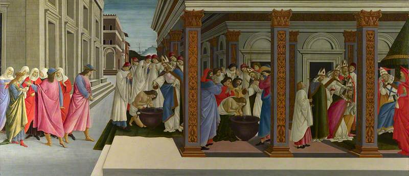
    In a time when people are less concerned with their survival, they are allowed to pursue the quality of life in leisure and entertainment. They look back to the last time when civilization was consistently thriving. This meant they were looking at the philosophers and scholars of the classical period for guidance through writing and other art. This inspired the Renaissance’s focus on religious figures, such as deities, along with historical figures. Since these are historical or spiritual figures, they didn’t just make portraits of them as we see with current rich hierarchical figures’ commissions. Instead, these artists commonly used these figures as symbols for their (or their buyer’s) political commentary, a retelling of their story, or both. With this lens, as you may predict, the paintings produce more dynamic action to give the audience more to digest than just a still face that holds no meaning. These artists also exuded a strong emphasis on antiquity-inspired values such as humanism and individual agency. This focus greatly influenced their artistic expression, often resulting in storytelling through continuous narratives. Similar to modern comics, these artworks depicted multiple moments of a story within a single composition, with characters appearing in various stages of the narrative.

    The National Gallery, London
    Sandro Botticelli, Four Scenes from the Early Life of Saint Zenobius (1444/1445-1510)

    The Four Scenes from the Early Life of Saint Zenobius uses grouping of people as gestural splits in scenes along with architecture that creates more of a literal line of separation more akin to comics.

    Renaissance and classical art is highly regarded today in architecture, philosophy, our values of harmony and balance, and the need for storytelling. Our form of storytelling is different now only due to advancements in technology where we can simply record and alter video. Our normalization and reliance on video have forced continuous narratives to die out; because why would you need continuous narrative paintings when you have a museum for moving pictures in your pocket? However, we still see ghosts of continuous narratives within our capitalist society today.

    Rick Riordan, Percy Jackson series (side by side)

    Consider your favorite novel series, do they have matching covers and/or spines? Most do, and some even go as far as to create a depiction of the story on the cover in the continuous narrative format like how Percy Jackson does. If you have one or two of the books, there’s more of an incentive to collect the rest to complete the piece of artwork. The artist could have innocently been inspired by the classical period seeing as the story is about Greek gods and demigods, or the artist realized the appeal and variable of fear of missing out (FOMO), that matching sets have. Especially when you’re considering the audience for these books: children, specifically children with learning disabilities like ADHD or Dyslexia in mind. This audience’s first impression of the product is the picture on the cover, not the blurb on the inside of the sleeve or the title of the book, it’s the scene unfolding visually in front of them.

    We’ve known that we look back to Ancient Greece and Rome and the Renaissance to improve our society today, but it seems we also use it for consumerism culture. Especially when you consider short video clips like Instagram reels or tiktoks – which could be argued is an extension or distant relative of continuous narrative – that are being exploited to sell us products. How far will we take the privilege of being able to look to our past to feed into our corrupt capitalist culture and how long have we been doing it?

    Citations

    Continuous narrative. (n.d.). Italian Renaissance Resources. Retrieved March 1,

         2025, from https://www.italianrenaissanceresources.com/units/unit-6/

         sub-page-05/continuous-narrative/

    Wattam, A. (2023, August 15). Double take: Continuous narrative in Renaissance

         art. Art UK. Retrieved March 1, 2025, from https://artuk.org/discover/

  • Video: Pregnant Pause

    Video: Pregnant Pause

    Assignment

    Concentrating on common everyday activities, create a video (120-300 seconds in duration) that primarily uses sequencing, pacing, editing and shot rather than dialogue, action, or music to construct a narrative that gives the activities poetic, visual and/or metaphoric impact to communicate something that is not directly expressed. Consider the idea of a pregnant pause which is a a meaningful lull in a conversation, or a delay in speech used to give time to consider the consequences of a statement. In this project focus on the kinds of common, generally unnoticed activities that exist between the “big” memorable events of our lives. Also, I am asking you to primarily rely on editing your video to create meaning (as opposed to dialogue or plot). Editing creates a “third meaning” that exists in the spaces between shots. You may choose to have audio or not but NO MUSIC OR DIALOG so you can use ambient (actual sound).

    Process

    sketch: final concept

    My first idea had the same plot concept of losing a friend, instead it was told with a mug that was gifted from said friend. I decided against the idea because there were some scenes that were just unrealistic for me to accomplish. So, I pivoted to the final concept that put emphasis on the friendship necklace seen throughout the film and highlighted at the end.

    I wish I was able to get more clips for the best friend montage in the beginning but I couldn’t I didn’t have the resources. I didn’t have a person to film so I had to prop up my phone every time, but it was incredibly hard to set up the camera for each clip. Then there comes a point where you can’t get a variety of clips like you want because there’s only so many things you can set your phone up on. So that’s why I use different clips from the same scene and mix it in with the others. If I had a tripod I believe I could have accomplished all the scenes like I had drawn out.

    Something I struggled with was with having no music. At the end I did have slight ambient music in the background but tried to have it very quiet and not have it be the main focus. I only did this because I had scene that didn’t have any sound and there was no way around it. So, I had a choice between having awkward silence or elevator music. The scene that really presented this problem was the scene where we’re both on the floor talking. We. had actually be talking about something because our acting was horrendously awkward. Obviously, no one wants to hear the family drama we were discussing so that’s why I chose to have music and keep it in other scenes for consistency’s sake.

    Final Product

    One thing I would alter in my short film would be the amount of scenes where people are the main subject. There’s only a couple senes where the person is not the main subject of that frame. I did keep this is mind while brainstorming and filming but just couldn’t come up with any scenes. Even now, I’m not sure what scenes I would add where objects and space alone could tell a story. This is something I think I need to work on because even in my 2D art which I’m more experienced in, I usually use people to tell the story for me, whether that be from action or body language. Although, I think if I tried using the space and objects around the people more to my advantage I can better articulate a story or feeling while making the piece more dynamic. So this strategy is going to be something I try to improve moving forward.

    Something I think worked well in this short film was the black out fade. I used this technique to show that something had happened behind the scenes. Especially with the different type of clip that follows it, delivers the point I was trying to convey well. I also think my use of angles and playing around with different sized scales worked to my advantage and provided diversity in my scenes.

    Overall I think I did fine with assignment but would have done better with the materials I needed.

  • Dynamic Double Diorama

    Dynamic Double Diorama

    Assignment

    In this assignment you will complete a two sided diorama incorporating contrasting concepts on each side. The composition can be arranged vertically or horizontally, and should be at least 8” x 6” when complete.  

    Requirements:

    • a minimum of five layers. The middle layer/center counts and should be involved in the composition. A “frame” layer does not count as a layer.
    • Patterns in a material should compliment the work and contribute to the composition.
    • Images can be taken from any scale to represent depth and distance.
    • Think of 3 contrasting concepts for each side of the diorama. Simple solutions (you will create better ones!)
      • Day & night
      • Arctic & desert
      • Curvilinear & angular

    Part One: From your contrasting ideas select objects that relate and think of them in layers.

    • What do you want to represent in this contrast for the viewer?   
    • Take the images and break them into five or more layers, by distance (foreground, midground, background). The composition should be visually dynamic. How light interacts through the final piece should be considered. Layers in the foreground will cast shadows on those toward the mid/background. Can the backgrounds of each side have the same imagery? 
    • The materials used for your piece should compliment the role they play in the composition. Be mindful that the materials will need to survive the laser cutting process and being on display for the viewer.

    Part Two: Production and assembly.

    • Create 2D files from your sketches, working in black and white. One file per layer, saved as PNG files. We will take PNG files, import them in to Lightburn,Links to an external site. and trace the bitmaps to produce the work.

    Process

    When brainstorming concepts for the design, the first thing I thought of was good and evil. I knew the concept was too broad for me to depict without more guidance, so I thought about sub-categories within good and evil. I settled on technology vs. nature, specifically through the lens of a person on a day to day level. A person has a choice (much like with morally good and bad choices) to choose to be either sucked into doom scrolling or go outside and take a moment to be mindful.

    At this stage I wasn’t entirely sure what I wanted to do for the tech side. As you can see in my sketchbook I have many different ideas of what the background could look like, but I didn’t end up coming up with the final idea until the very end of the process.

    As for the nature side, I was pretty sure on what I wanted to do from the very beginning, something tranquil and interactive. I was picturing the thing I would most likely do on a hike which is pick up the biggest, most red leaf I could find. You might note that the leaf isn’t red and that the whole project is in greyscale. I chose to do this one because I wanted to try shading with the laser cutter, otherwise I would have definitely had made the leaf red.

    Sketches of concept

    I’ve worked with a laser cutter briefly once before in high school so I was somewhat familiar with how my designs were going to translate into the program. I knew I had to make very clean looking lines so it would be less work later in Lightburn. This meant I couldn’t use any brushes that had any blending end properties. My strategy ended up working well and I was able to swiftly get perfect lines in the program.

    Something I hadn’t thought of in the beginning was adding inner frames around all the layers. I had to go back and do that at the end which was a little confusing at first because I’m used to drawing with something like that in mind. I didn’t add butter layers because that would mean shrinking each layer individually and I wasn’t willing to risk not getting each layer disproportional to each other. But this proved not to be a castle in the program and was honestly one of the more easier things to do.

    Overall, I enjoyed my experience working in Lightburn because it was interesting to see how my knowledge of Adobe programs translated. It ended up being more similar than I anticipated. It was also fun to learn how to do new things on the program and then to see the product come to life, it was very rewarding.

    Unfortunately, I had to use cardboard instead of wood like I had hoped because, with the many layers I had, it would have been too time-consuming otherwise. For. those who don’t know, cardboard takes less energy to cut and shade, therefore less time. An additional thing that needed to be adapted to save time was the layers that were complexity filled in. These layers are the silhouetted people on the tech side, and on one of the nature background layers.  

    There were a couple hiccups during the cutting process. The picture on the right shows a couple of layers where I put shading layers on the wrong cut layer. I had to go back and redo. correctly. Besides that, there were not any major problems I had with the laser cut.

    Final Product

    I’m pleased with the results of diorama, the only thing I would change is the foreground. The two sets of plant clusters is broken up by the background. This breaks the illusion of depth. I didn’t realize this was a problem until was all put together, I thought the front plants would be enough to create the illusion. Another thing I would add just for an extra layer of interest is a boarder at the very front that has clean rounded edges and slightly over hangs over the rest of the layers’ boarders. I think part of what worked so well with the tech side of the diorama is the foggy boarder (especially with the extra ons as you go further into) that brings the viewer into the space.

    I also believe I did a good job depicting the busy, noisy, constant buzz of social media that tech brings by the smoke layers. The business is what clouds your vision from the present moment which I think translate well in the design; this is highlighted in the layer of silhouetted people. I was originally going to add line work on top, but instead I chose to shade the whole layer. I found that this gave it more meaning because the people blend in with the environment and don’t stand out as people. Another aspect of the smoke I find successful is how it has areas of sharp edges that represent how scrolling on social media can be so harmful.

    It’s Its ironic how the side I was most successful in is the side I should admittedly not engage with as much.

  • Open Form

    Open Form

    Assingment

    Clay and Multiples

    Project Description:  In this project you will communicate the idea of Kitsch. Create at least 3 multiple size hollow 2-3 ” shapes out of clay. You will be using these multiples and a slab built clay cylinder/vessel (2.5″ high x 6″ wide) to create your final object as long as the overall composition is Dynamic! Be sensitive to the repetition and gesture of the pieces to direct the viewer’s eye movement through out the composition. 

    Using a minimum of 3 multiple forms create a dynamic composition built on a 2.5″high X 6 inch diameter slab built cylinder and incorporate your Kitsch object in the composition.

    Process

    I first I had to find my kitchen objects to inspire what I’d build for the pedestal. I went to my local thrift store Ladders and found these ceramic blue horses. I thought the most obvious way to stay on theme with the idea of a kitsch object was to make kitsch looking pedestal to go along with it. To me, this meant to make a habitat for the horses. I knew I wanted to somehow implement the same blue from the horses onto my pedestol. So I created a pond where I would later paint blue. to match.

    I made an organic looking hollow form for the terrain. To make the main from more interesting, I added a strip of clay running up along the side of the mountain terrain along with a barn for the horses to rest in. Another thing I did to make the piece more interesting was that I created repetition with the hose shoes. Another thing I did to make the piece more interesting was add texture on all surfaces. I used a fork to create the texture of the grass, a needle tool to create the wood texture on the barn and rock crevices on the cliffside.

    A hurdle I faced was that when I was completely done sculpting the piece, I dropped it on the corner of the barn. So I had to completely redo the barn and terrain in that area. This was super time consuming but luckily I learned some strategies of what worked and what didn’t when I worked on the barn the first time, so it didn’t take as long the second time.

    One regret I have is making the piece so grounded. I knew I should have added a form under on side of the piece to make it more dynamic but I wasn’t sure how to do that and make it seem cohesive with the rest of the piece. I wish I spent more time thinking about it because it seems so obvious as to what I could have done now. I would add a few tall “rocks” under the back side of the piece where there isn’t much going on. Not only would this give the other cliffside more interest, but it would elevate the flat top the sculpture and make it into a hill instead of a field.

    Final Result

    Something I was successful in though was painting the object. I knew I was lacking in terms of the form being dynamic so I wanted to put more effort in painting it. For the cliffside, I had horizontal strips of “stone” to add texture, but it served well when I was painting on the lighter layer. After I had put a layer of dark grey paint on all of the “rock”s surface, I took a lighter grey and brushed it on vertically so I only hit the apex areas of the rock.

    After the critique, I learned I could spray the piece with ___ to make it a shiny texture. I did this in hopes of partially redeeming myself for not being able to color-match the blue and keep that same vibrancy of the horses as I’d hoped to. I sprayed the entire piece with the __, minus the horse shoes. I kept them matte similarly to the white shown in the kitsch objects to keep things consistent. I also thought that leaving them matte brought more attention to them.

    Overall, I believe I did a good job with matching the vibe of the kitsch objects with the podium and painting it. I think I could have improved on adding more forms to the piece to make it more dynamic.

  • Combined Forms

    Combined Forms

    Assignment

    Using the definitions of Linear Form (wire) and Planar Form (cardboard) we will create 1.5-2 ft individual linear, planar, and solid asymmetrical geometric forms in class. The project will need one shape for each form which can be anything created in the period of time designated, for each definition. Investigate potential textures to create contrasts in the individual forms and each form should have volume (height X width x depth). Then combine the 2 forms into a dynamic formal composition! Your forms should be abstract.  

    My Process

    I first started off by drawing up various planar forms to brainstorm more ideas than the expected 3D shapes such as pyramids, hearts, cubes, etc. I landed on a combined shape of an oval shape and a cylinder. To make both shapes more interesting, I put a whole through the oval shape, and tilted the cylinder and put a curved top on it.

    From here, I still needed a linear form made from wire. I chose to implement the linear form into the planar form to act almost as its own plane to the planar form. I put straight wires across each cardboard panel of the cylinder. This created a spiderweb net effect looking down on the top of the cylindar. I did a similar technique for the oval half of the planar form to create a ladder looking “panel” by using repeated bars of wire running across the edge of the top of each oval shape. Additionally, the wires had curled ends that made the exterior of the form more dynamic.

    I chose to make the linear forms more discreet to not take away from the planar form I liked so much. In hindsight, I wished I hadn’t because I can so clearly picture more interesting linear forms coming out from the planar form that would have made the piece so much more interesting.

    Final Product

    If I could alter any part of my project, I would put energy into my linear form. I understand the instructions so I neglected the linear forms until the end. I wish I had put as much energy into them as my planar forms. One thing I could have done, that didn’t even dawn at me at the time, was to paint the wires. This would especially been helpful for the wires on the oval shape that blend into the planar form.

    The planar form is where I think I strived because I tried to use techniques I learned from past projects. For instance, the Objects in Space project, I learned how movement with gestural lines across a composition, like a diagonal slash across a piece, can make a piece more dynamic. I implemented a diagonal gestural line like this with the cardboard cylinder shape. I think this makes the piece much more dynamic from all angles.

    As for the texture, I think I achieved that well with the repetition of pattern with the white paint as well as the wire stringing around the top of the cylinder. I was also able to create strong contrast with the white stripes running down the cylinder, and with the polkadot clusters.