Category: Art Foundations 3D: Design and Meaning

  • Video

    Assignment

    Project #4 Video

    CategoryDescription
    FormalReview artists who work in the media and framing, sequencing, and shooting principles
    TechnicalWork in video planning, shooting, and editing your work
    Conceptual Project a narrative as clearly as possible (with room for viewer interpretation) for your idea  

    Process

    I originally had a much more complex idea but it required a specific location, my roommates to not be around, good lighting, and time. All of which was not accessible to me when I had spare time. So as the due date approached, I needed to shift directions. As I was thinking of bad ideas for videos I thought well hey this is a video concept in itself. So I just started recording me being frustrated at not being able to come up with a video idea. I feel like most videos I watched for research prior was just people doing something, except something was “off”. So that’s what I tried to accomplish with the last scene in the video.

    Final Product

    What I think makes this video interesting is that it literally takes you through the motions of a snippet of my life, you’re me the entire time, at work with my coworkers around. Then it’s revealed that I look really silly with a phone held between my chin and chest the entire time. I was too locked in on not moving my head the whole time that I don’t even know if people were looking at me wondering what the hell I was doing.

    This video was dynamic because although it had 1st person point-of-view the whole time, it had cuts, sped up and zoomed in parts, and a pivotal clip at the end that changed the perception of the video.

    Conceptually the viewer can wonder was her showing herself at the end an intentional detail, or was it to show that she doesn’t care. You be the judge.
  • Guerilla Installation

    Assignment

    Project #3: Guerilla Installation

    Formal Scale, form, proximity, proportion, structure
    Technical·      Work using modular forms in a non traditional space·      Create a work for a specific location considering space
    ConceptualChoose a site where you will be constructing a modular composition that will be built off site and reconstructed onsite.  

    Description:

    Using cardboard and other needed construction materials you are to work to create a 3D form. This form should:

    • Be worked on in a sketch format incorporating the site
    • an image of the intended site posted here
    • be a minimum of 2’ in dimension.
    • Be well crafted:
      • only brown cardboard with no text.
      • Tape, glue, and other materials are for structure.
    • Be modular
      • this means the piece can be assembled on site and installed
    • Incorporate volume and mass (no layered planar structures)

    The piece should:

    • Not restrict access on the site
    • Be fastened securely or freestanding

    Process

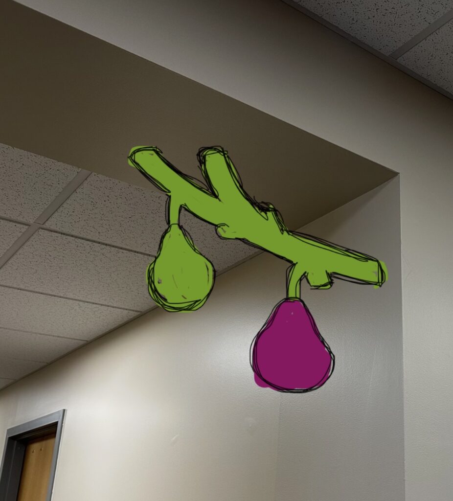
    The thing I struggled with most with this project was figuring out where to put the sculpture. I didn’t want the placement to be an afterthought since a big aspect of the assignment was how the sculpture interacts with its environment. I thought that the Pass Office would be the easiest place for me to get permission to install the piece since I work there and know the people in the space. So I tried to figure out spots within that space where I could install a sculpture. Initially, I thought a corner of an archway would work best. The piece would have to interact with two planes, what’s more interactive than that? I didn’t get permission to put the piece in the hallway, however I did get permission to put it directly in the Pass Office. The only good spot for it was a wide pillar connecting to the ceiling (shown in the final product picture).

    I picked the subject and meaning behind the piece specifically for this office in mind. As explained in my artist statement, the fig tree analogy really stuck with me and is something I associate the TRIO community with. If you can have a conceptually dynamic piece, then I think I achieved that.

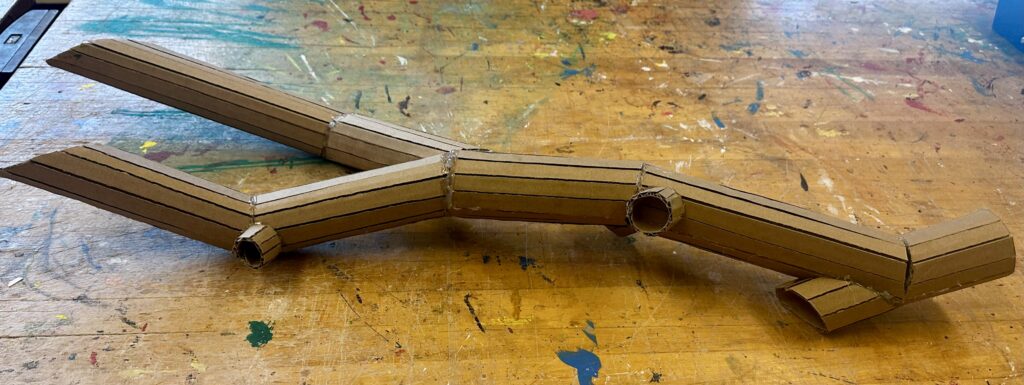
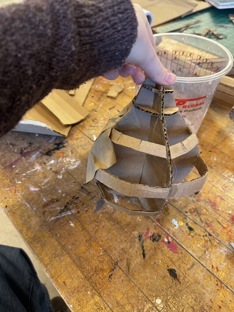
    I wanted to make an unnaturally large branch of figs so I wouldn’t have to make tiny cuts that would end falling apart later. So I decided to make a branch with just two figs, making them to scale to the branch as much as possible. Usually organic shapes are easiest to build/draw because they’re hard to make look “wrong”, but I did not realize that working with cardboard would make that so much more time consuming then I thought. I had to round out a flat stiff material but making precise cuts and gluing them back together. In order to make the branch I slit the cardboard vertically (the long way) so it bends into a cylinder. Then I cut darts into it so it could change direction. I added on a branch coming off from the main one and knots with the leftover pieces to make it look more dynamic.

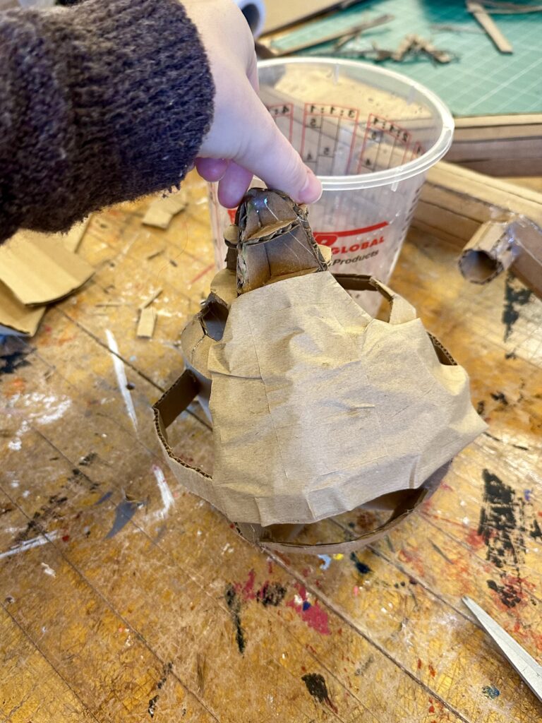
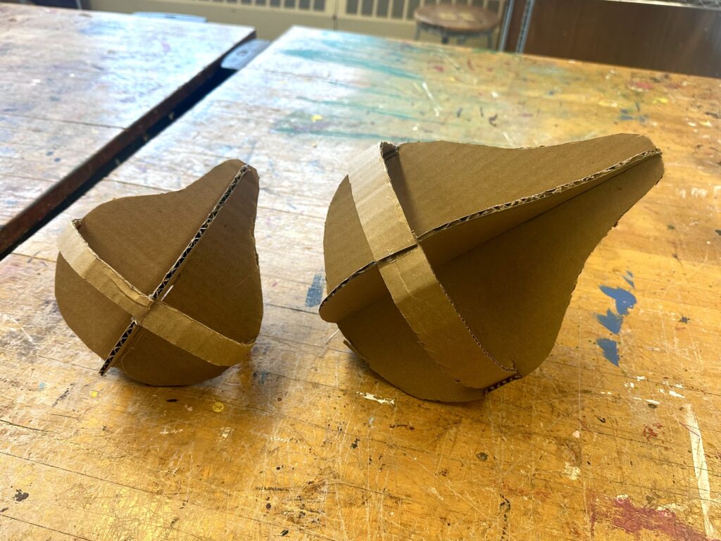
    To make the figs, I cut out two 2D profile-view figs and joined them together by opposing center slits. From there, I added bands of cardboard with dart cutouts to give the negative space spherical volume. Then I used cardboard tape in a paper mache fashion to create the surface that I then painted. I repeated this process to make the other fig and glued them on to the branch.

    I wasn’t sure what angle I would need to make the top of the branch so it would be flush with the ceiling. To work around that, I left a lot of excess branch at the top so I could later bring it to the sight and cut it off accordingly. Then I added on disks so I could use tacks, nails, tape, or whatever else I would may need to hang it up. I painted the disks white to blend in with the wall and ceiling to make it as naturalistic as possible.

    Final Product

    After a brutal process of hanging up the piece with its artist statement, I could finally see the main components as to why this piece is so dynamic. The figs actually live in the environment. The branch grows out of the pillar and connects to the ceiling at two different points. I believe the piece has two different focal points at each fig, making the eye travel along the branch better. The use of an ombre effect and dry brushing technique also made the sculpture look more naturalistic and dynamic. By painting the piece naturalistic colors instead of painting them two solid colors like I originally planned, it supported the viewers to better perceive that they’re figs and not pears, and to feel more emerged in the art .

    Artist Statement

    Allison Surprenant

    The Ripe Fig 

    Since I’m a TRIO student, I wanted to make a sculpture for the Pass Office, so I wanted to create something relating to a challenge I’ve faced that the people in the PASS Office have helped me with. I recently learned about the fig tree analogy which in summary, each fig represents different options for your future. One fig could be a life as a doctor, another as a florist. There are so many options to choose from that the person becomes paralyzed with indecision and all the figs rot away before they’ve picked one. I’m a very indecisive person myself and since being at college feel that I’ve changed my mind about my career path once per semester. I would come to my TRIO advisor looking for some direction and they would always assure me that I don’t need to have every step of my future planned out fully, that I will still gain skills that’ll be applicable to many different careers. I’ve learned to take one step at a time and not to worry so much about the unknown of the future. What I wanted to convey with my sculpture is that you don’t always need to look at the whole fig tree and try to decide the best best one, that’s it ok to just look at the branch in front of you and pick the ripe fig. Then if you’re  not full, you can still eat other figs when they’re ripe. 

    To craft the organic shaped branch, I needed to slit the cardboard vertically so it bends into a cylinder and cut darts into it so it changes direction. To make the figs themselves, I took two identical fig-shaped pieces of cardboard and joined them together by opposing center slits. From there, I added bands of cardboard with dart cutouts to give the negative space spherical volume. Then I used cardboard tape in a paper mache fashion to create the surface that I then painted. 

  • Expressive Hand

    Assignment

    Project #1: Expressive Hand

    Formal Scale, proportion, size, gesture, color
    Technical·      Maquette creation·      Direct observational rendering using sighting tools·      Balance a larger than life scale object·      Subtractive method   
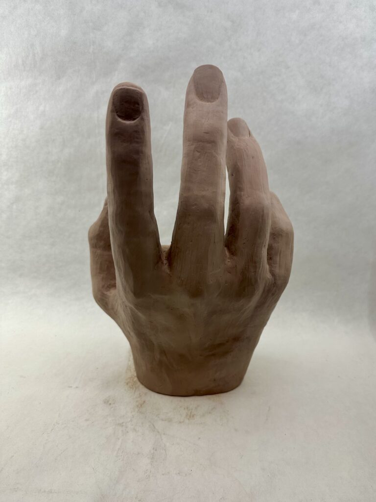
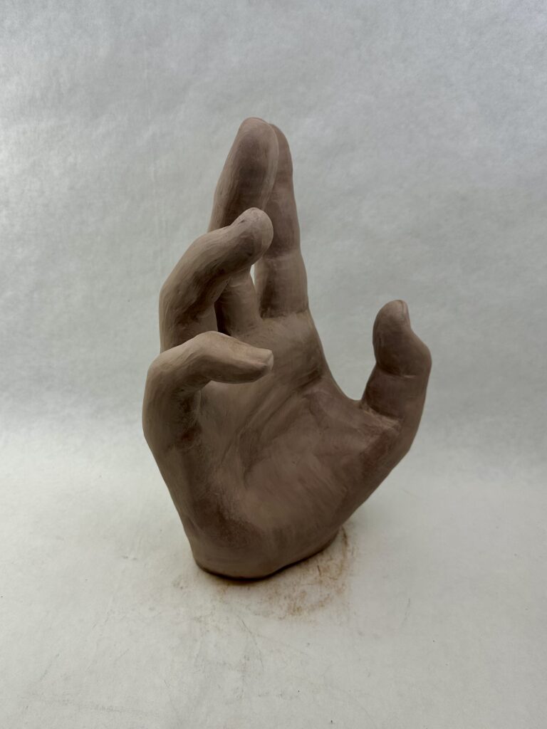
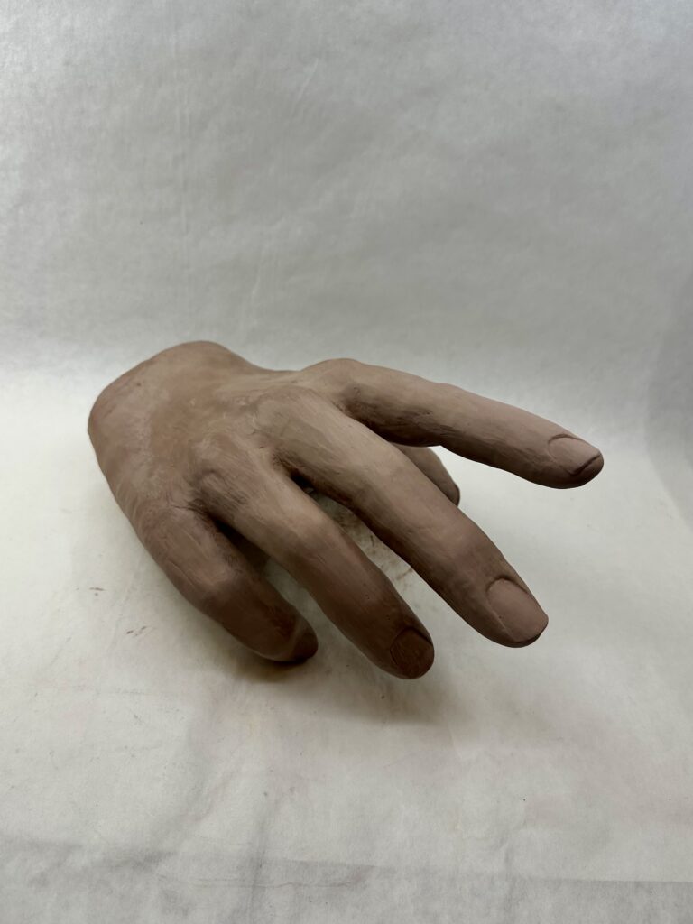
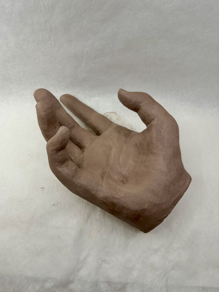
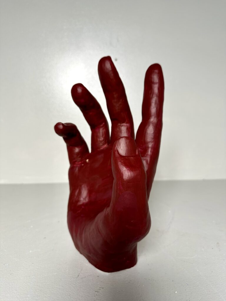
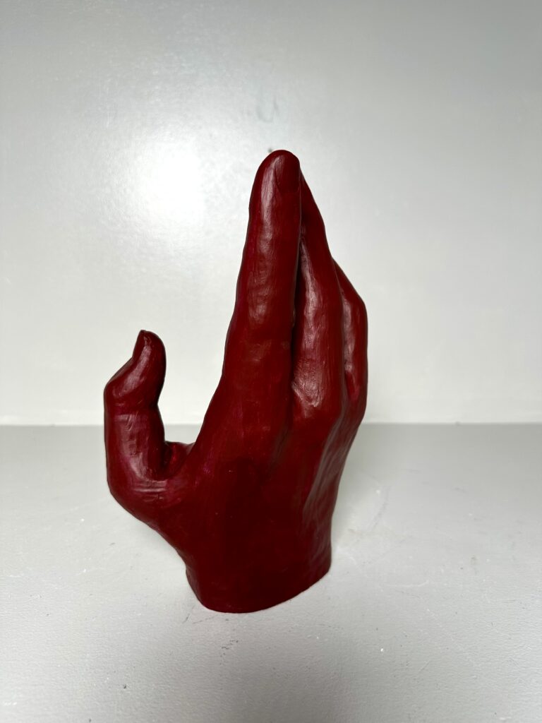
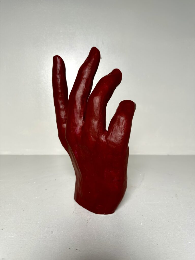
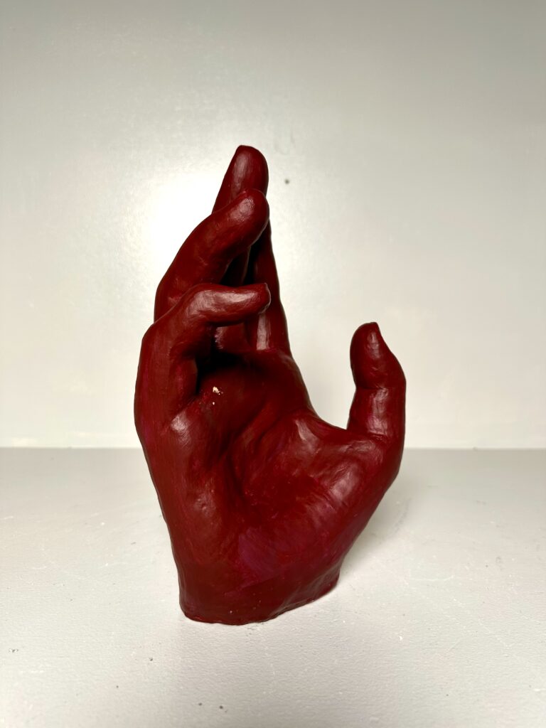
    ConceptualCreate a hand that gesturally conveys a message to the viewer  

    Description:

    After defining what expressive means you will construct:

    • a 3-5” wire and plasticene hand using sighting tools
      • this will be a type of quick maquette that should be flexible and bendable for practice
      • due start of class Tuesday January 26
    • a 12-16” clay hand to be fired and completed
      • this hand will start out as a solid form and then need to be CAREFULLY hollowed out to avoid exploding in the kiln firing.
      • There will be an option for using 2-3 colors of acrylic paint including the orange brick color of the fired clay surface.
      • greenware hand due Thursday February 5
        • final painted hand due TBA pending firing in kiln

    This hand should be expressive in gesture instead of expressive in an object it is holding.

    Process

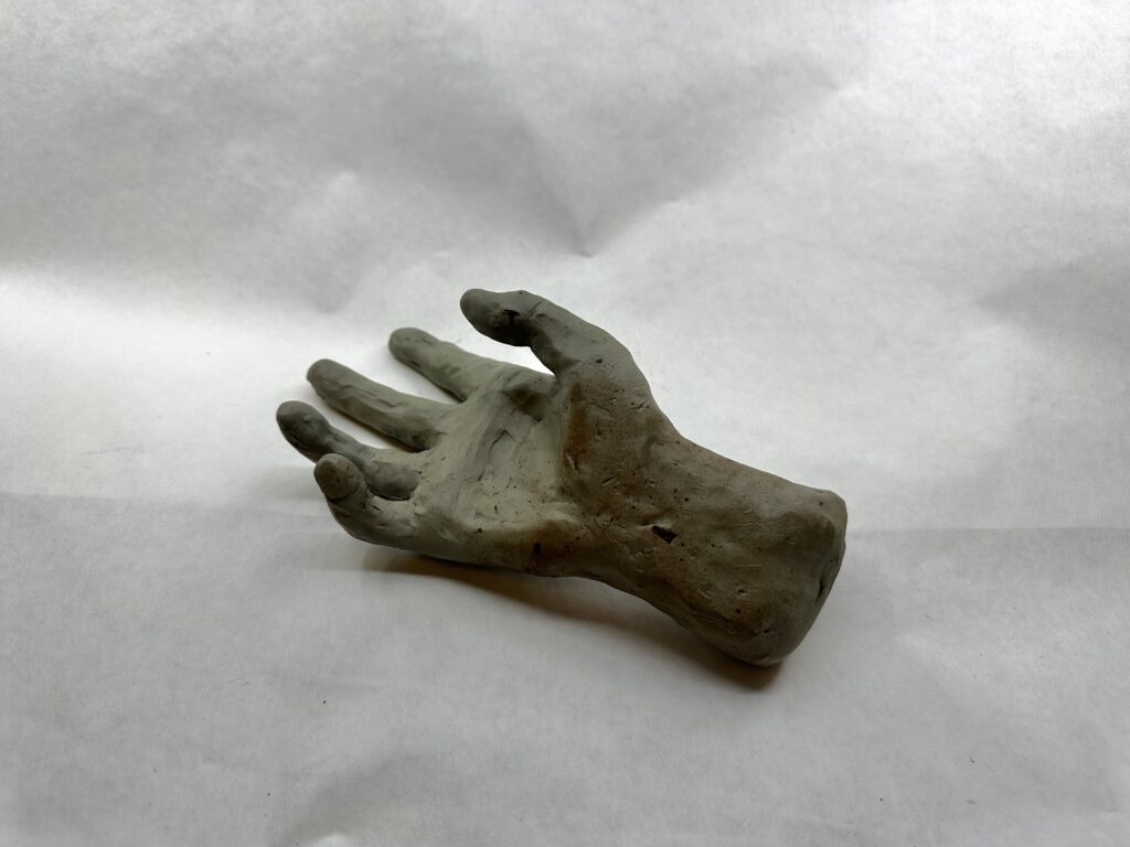
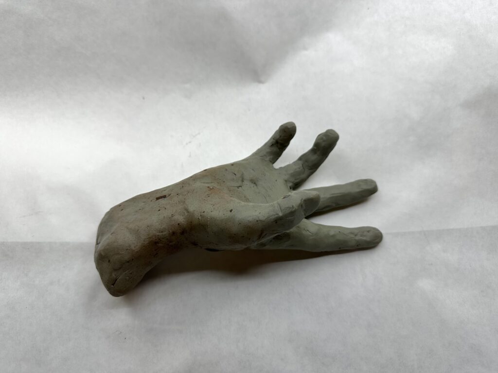
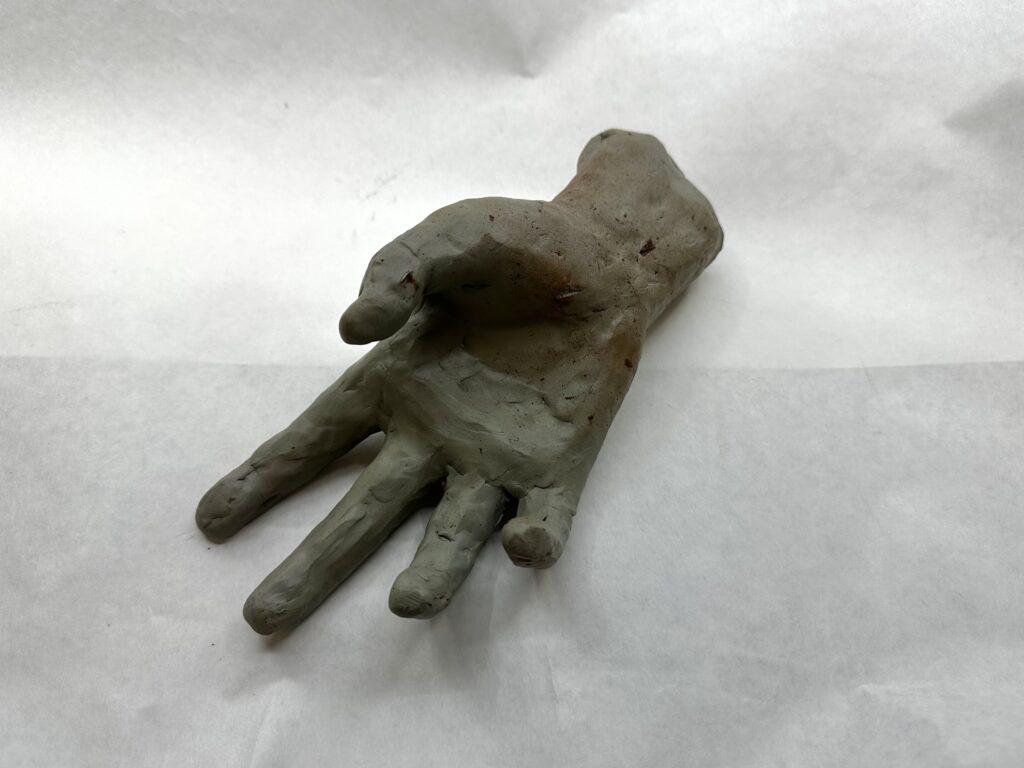
    To create my maquette, I bent wire in a shape of a skeleton hand using my actual hand as reference. The maquette would serve me as a tool later on, so getting the proportions of everything now would be helpful later. By layering the wire on top of my hand I was able to ensure that the proportions would be relatively close. When I added the modeling clay, I made sure to add the more clay in between my wire finger to have accurate line of where I would need to “start” and “end” the finger from the palm. The only big thing I noticed that I would have to change in my real sculpture was the thinness of the hand. Like scientists with dinosaurs, I shrink wrapped the clay to the wire more notably in the palm where I was less worried about messing up proportions.

    At first, when I started working on the larger hand, I couldn’t even allow myself to think of details like the nails or creases. I had to tackle trying to get the sausage like forms to bend in the same spots as my real fingers, cutting them into relatively equal thirds on the “front” side. I would have to constantly alternate using subtractive and additive methods as I realized things like that the middle of the palm has less padding than the bottom that has a lot more because the thumb sticking out, or that the skin between the fingers is raised much higher on the “front” side than where the knuckles start on the “back” side.

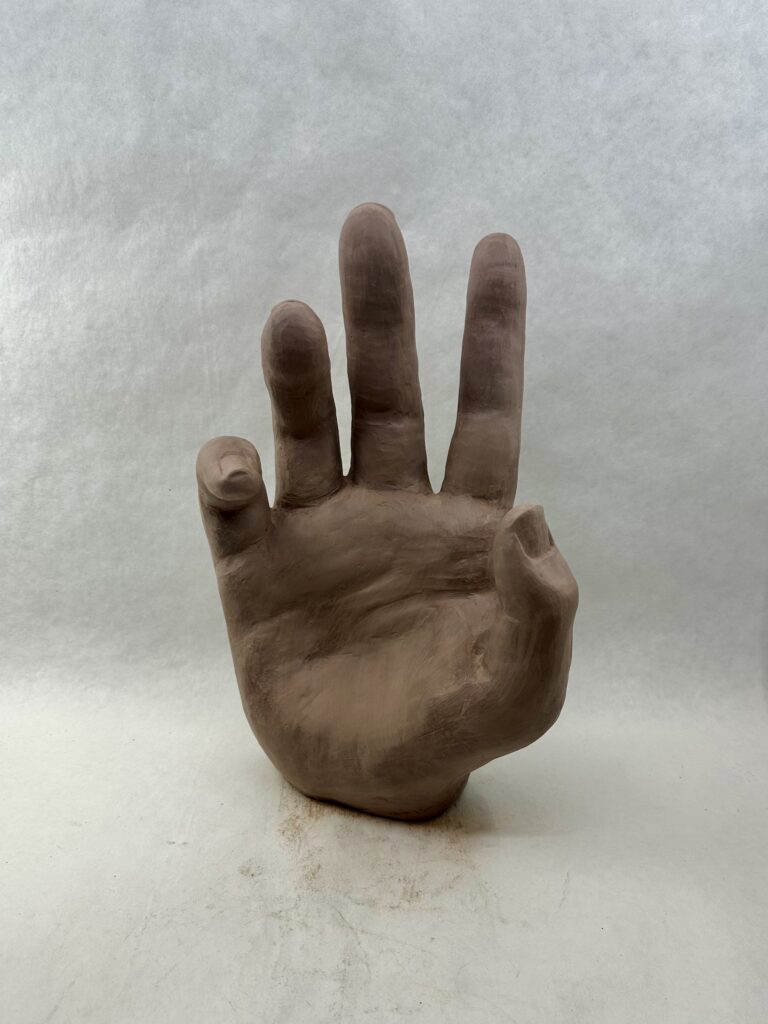
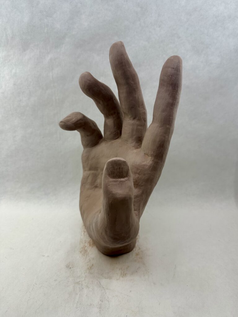
    Once I finished getting basic proportions and shapes down, I was able to focus on the more detailed areas. The nails were especially difficult for me. I had to redo them because at first I made them flat but realized they bend around the finger giving them more surface area. On multiple occasions, I would have to rewet the ends of the fingers since they were the spots that dried quickest, to add the nails that would jut out past the finger tip. I only wished I filed my nails before using them as a reference.

    Final Product

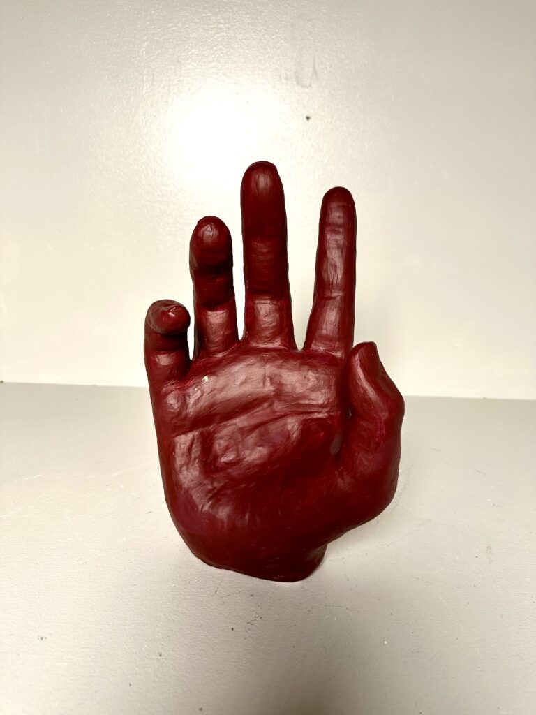
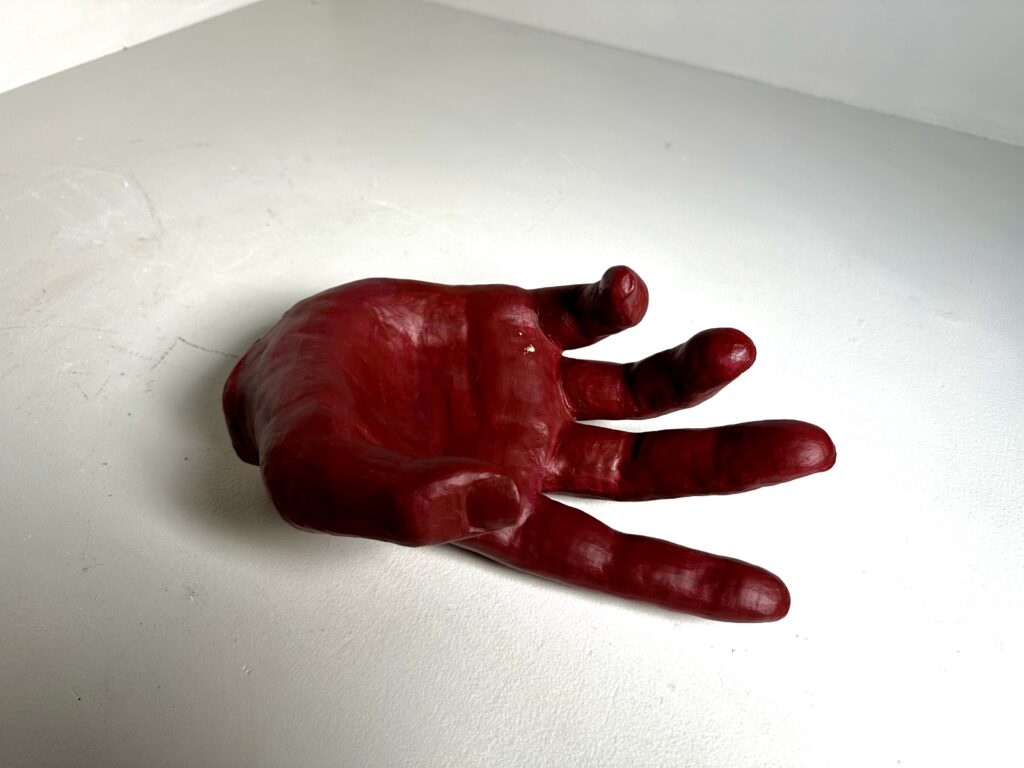
    After carving out the center of the hand to make it dry faster and putting it in the kiln, I had to paint it. I painted this multiple times because the first time it was periwinkle which looked more like a doctor’s latex glove. I went into a different direction making it a deep red. The color contrasts to the gesture making the viewer think about the meaning more. While the color is an intense red that makes people think of anger and rage, the gesture is soft, hesitant, or desperate. This could represent someone presenting well-tempered but is really furious inside. Personally I think that gives the piece more meaning than the original periwinkle idea.

    Overall, this piece is dynamic with not one side being the “front”. If it stands up, you can walk fully around the piece and see the fingers bending in interesting ways from every angle. Unlike the fingers that mimic each other’s positions, the thumb is pulling away from them creating a focal point that stick out from the visually dominant area.

  • Video: Pregnant Pause

    Video: Pregnant Pause

    Assignment

    Concentrating on common everyday activities, create a video (120-300 seconds in duration) that primarily uses sequencing, pacing, editing and shot rather than dialogue, action, or music to construct a narrative that gives the activities poetic, visual and/or metaphoric impact to communicate something that is not directly expressed. Consider the idea of a pregnant pause which is a a meaningful lull in a conversation, or a delay in speech used to give time to consider the consequences of a statement. In this project focus on the kinds of common, generally unnoticed activities that exist between the “big” memorable events of our lives. Also, I am asking you to primarily rely on editing your video to create meaning (as opposed to dialogue or plot). Editing creates a “third meaning” that exists in the spaces between shots. You may choose to have audio or not but NO MUSIC OR DIALOG so you can use ambient (actual sound).

    Process

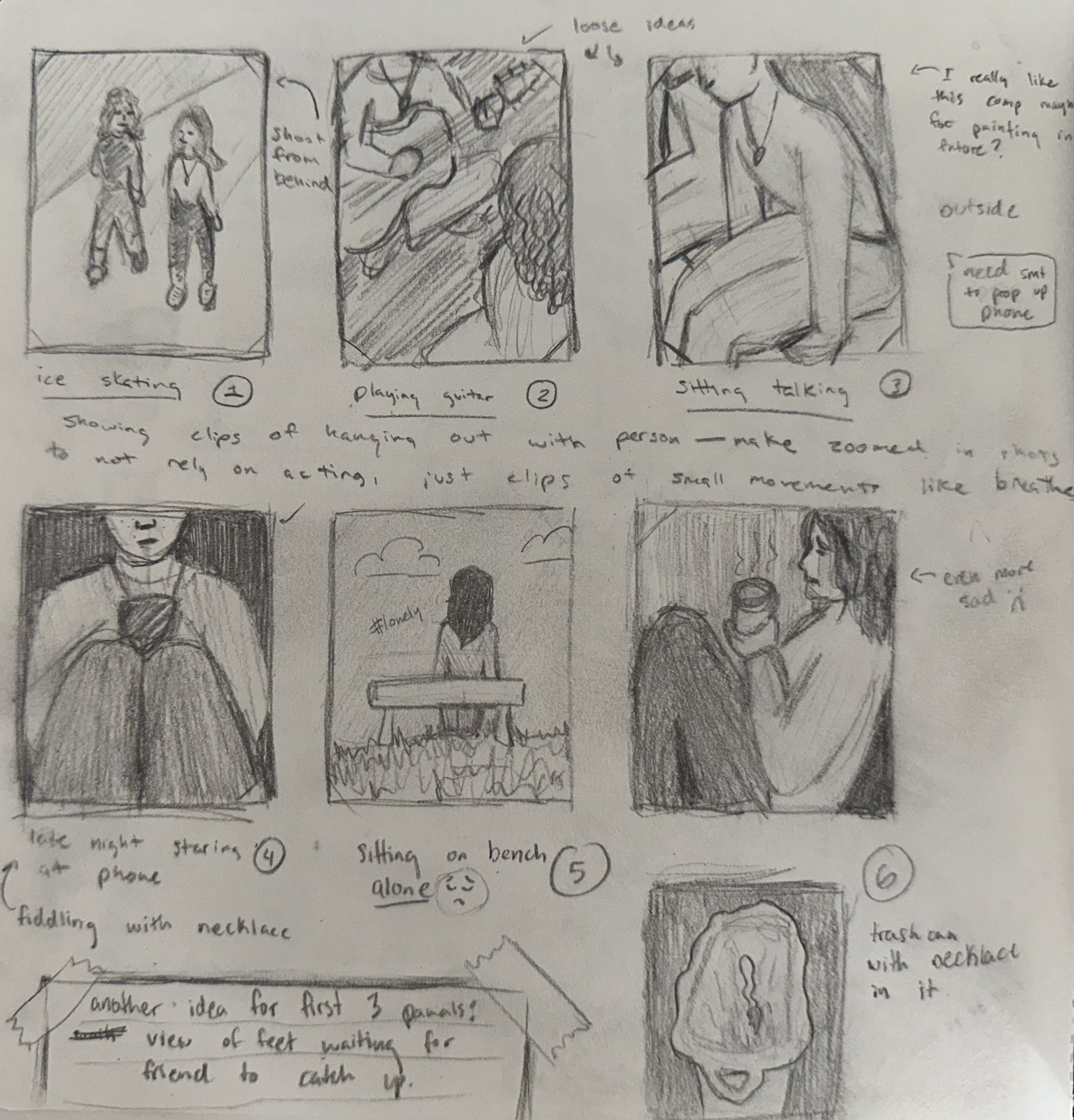
    sketch: final concept

    My first idea had the same plot concept of losing a friend, instead it was told with a mug that was gifted from said friend. I decided against the idea because there were some scenes that were just unrealistic for me to accomplish. So, I pivoted to the final concept that put emphasis on the friendship necklace seen throughout the film and highlighted at the end.

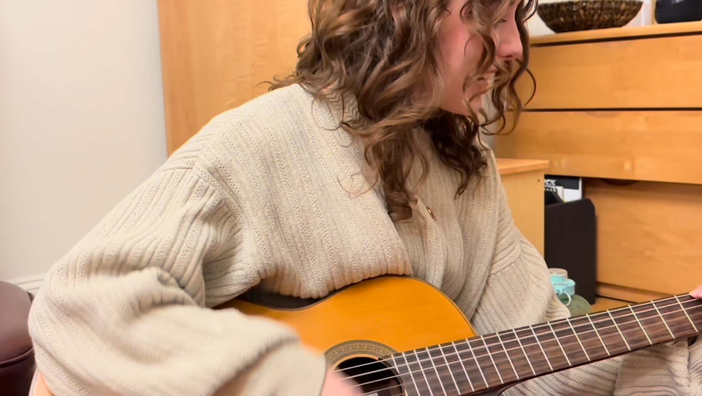
    I wish I was able to get more clips for the best friend montage in the beginning but I couldn’t I didn’t have the resources. I didn’t have a person to film so I had to prop up my phone every time, but it was incredibly hard to set up the camera for each clip. Then there comes a point where you can’t get a variety of clips like you want because there’s only so many things you can set your phone up on. So that’s why I use different clips from the same scene and mix it in with the others. If I had a tripod I believe I could have accomplished all the scenes like I had drawn out.

    Something I struggled with was with having no music. At the end I did have slight ambient music in the background but tried to have it very quiet and not have it be the main focus. I only did this because I had scene that didn’t have any sound and there was no way around it. So, I had a choice between having awkward silence or elevator music. The scene that really presented this problem was the scene where we’re both on the floor talking. We. had actually be talking about something because our acting was horrendously awkward. Obviously, no one wants to hear the family drama we were discussing so that’s why I chose to have music and keep it in other scenes for consistency’s sake.

    Final Product

    One thing I would alter in my short film would be the amount of scenes where people are the main subject. There’s only a couple senes where the person is not the main subject of that frame. I did keep this is mind while brainstorming and filming but just couldn’t come up with any scenes. Even now, I’m not sure what scenes I would add where objects and space alone could tell a story. This is something I think I need to work on because even in my 2D art which I’m more experienced in, I usually use people to tell the story for me, whether that be from action or body language. Although, I think if I tried using the space and objects around the people more to my advantage I can better articulate a story or feeling while making the piece more dynamic. So this strategy is going to be something I try to improve moving forward.
    Something I think worked well in this short film was the black out fade. I used this technique to show that something had happened behind the scenes. Especially with the different type of clip that follows it, delivers the point I was trying to convey well. I also think my use of angles and playing around with different sized scales worked to my advantage and provided diversity in my scenes.
    Overall I think I did fine with assignment but would have done better with the materials I needed.

  • Dynamic Double Diorama

    Dynamic Double Diorama

    Assignment

    In this assignment you will complete a two sided diorama incorporating contrasting concepts on each side. The composition can be arranged vertically or horizontally, and should be at least 8” x 6” when complete.  

    Requirements:

    • a minimum of five layers. The middle layer/center counts and should be involved in the composition. A “frame” layer does not count as a layer.
    • Patterns in a material should compliment the work and contribute to the composition.
    • Images can be taken from any scale to represent depth and distance.
    • Think of 3 contrasting concepts for each side of the diorama. Simple solutions (you will create better ones!)
      • Day & night
      • Arctic & desert
      • Curvilinear & angular

    Part One: From your contrasting ideas select objects that relate and think of them in layers.

    • What do you want to represent in this contrast for the viewer?   
    • Take the images and break them into five or more layers, by distance (foreground, midground, background). The composition should be visually dynamic. How light interacts through the final piece should be considered. Layers in the foreground will cast shadows on those toward the mid/background. Can the backgrounds of each side have the same imagery? 
    • The materials used for your piece should compliment the role they play in the composition. Be mindful that the materials will need to survive the laser cutting process and being on display for the viewer.

    Part Two: Production and assembly.

    • Create 2D files from your sketches, working in black and white. One file per layer, saved as PNG files. We will take PNG files, import them in to Lightburn,Links to an external site. and trace the bitmaps to produce the work.

    Process

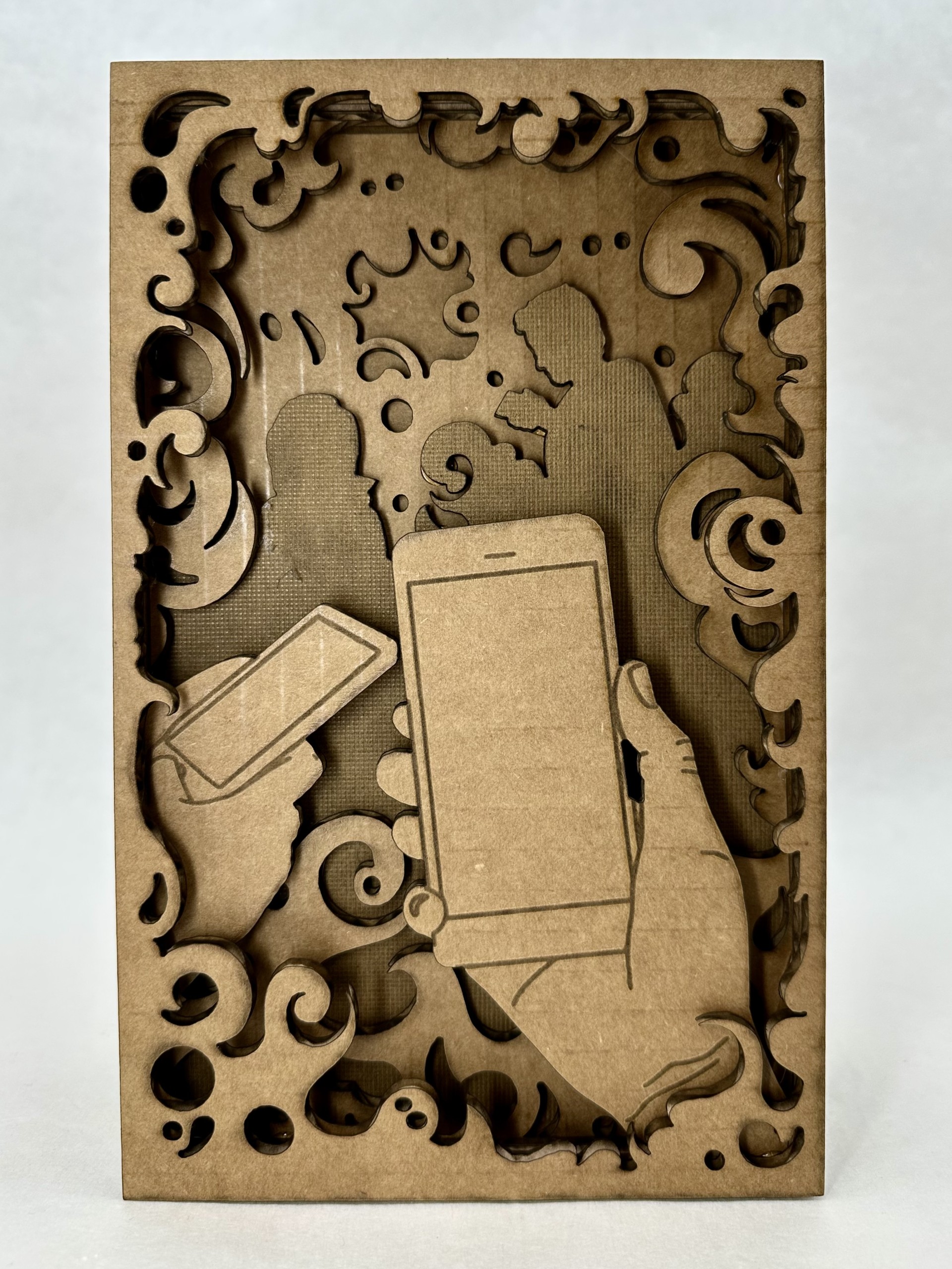
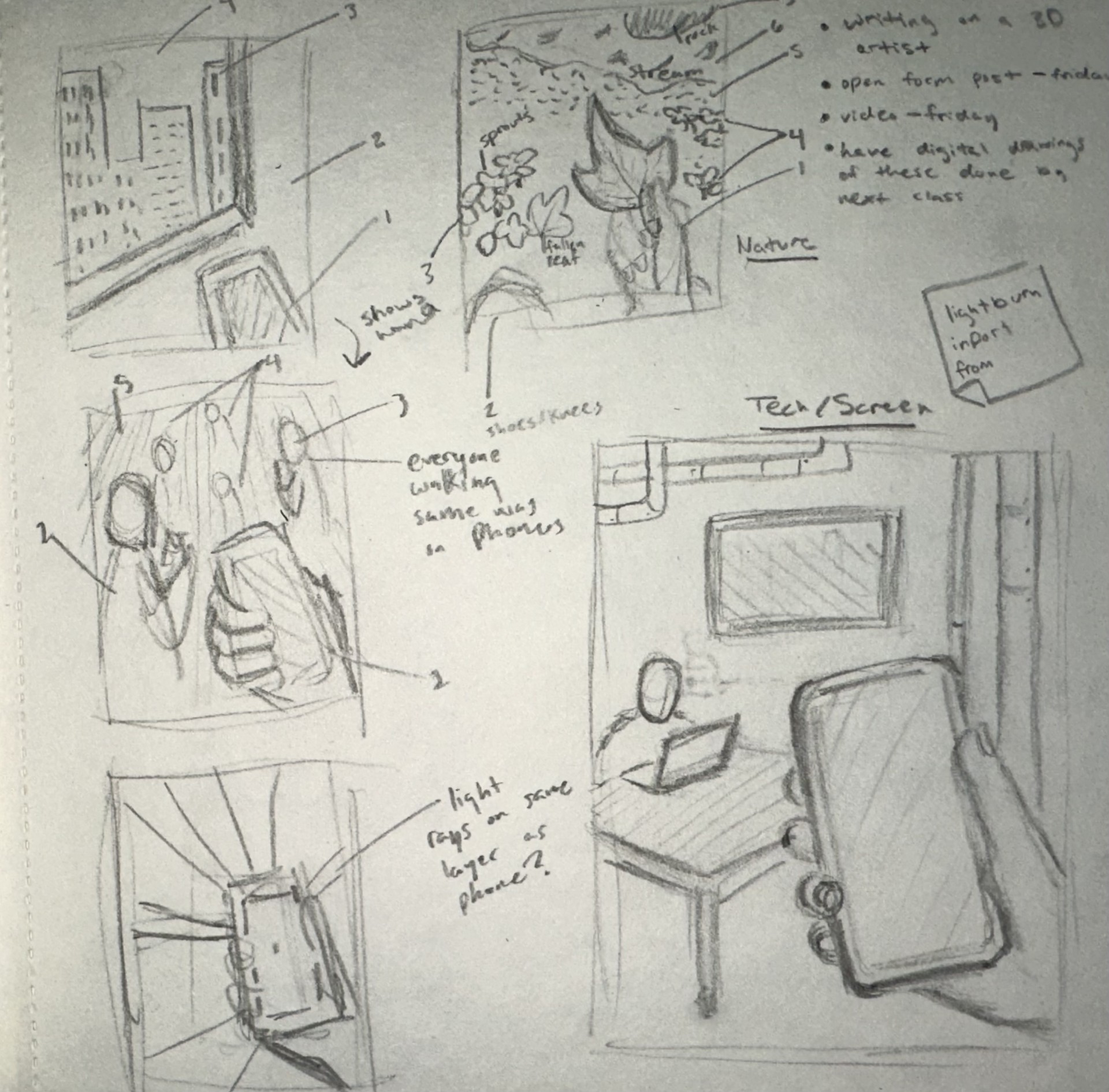
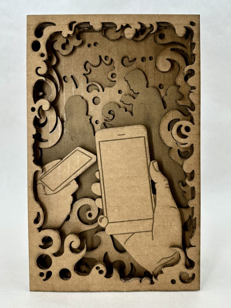
    When brainstorming concepts for the design, the first thing I thought of was good and evil. I knew the concept was too broad for me to depict without more guidance, so I thought about sub-categories within good and evil. I settled on technology vs. nature, specifically through the lens of a person on a day to day level. A person has a choice (much like with morally good and bad choices) to choose to be either sucked into doom scrolling or go outside and take a moment to be mindful.

    At this stage I wasn’t entirely sure what I wanted to do for the tech side. As you can see in my sketchbook I have many different ideas of what the background could look like, but I didn’t end up coming up with the final idea until the very end of the process.

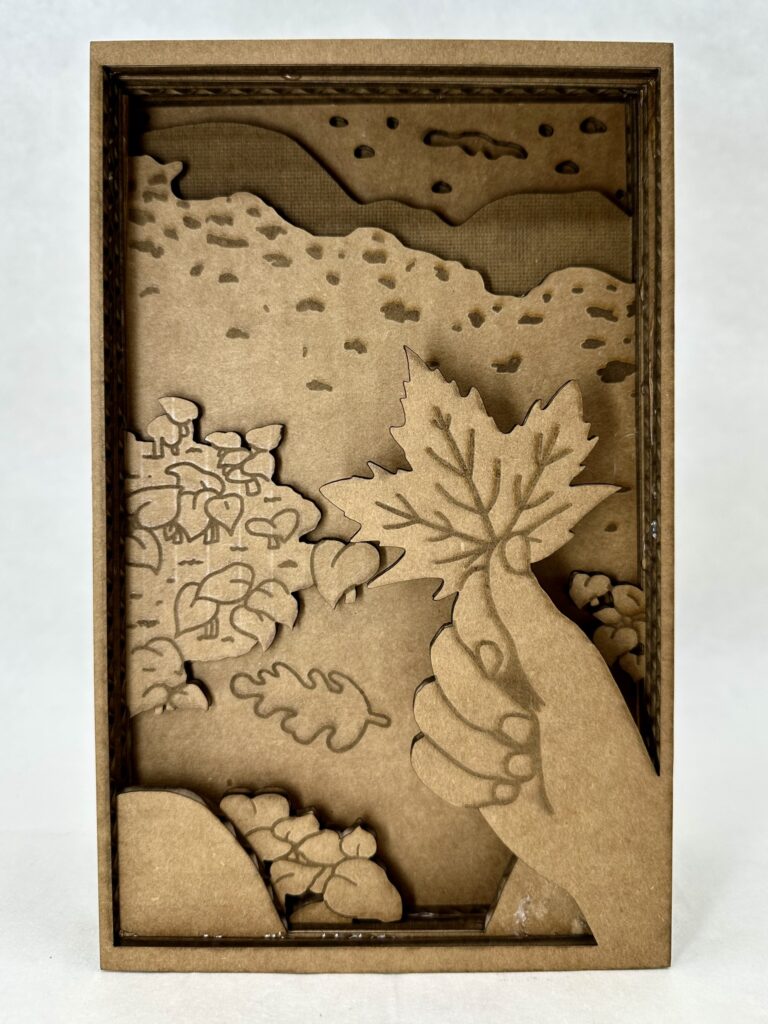
    As for the nature side, I was pretty sure on what I wanted to do from the very beginning, something tranquil and interactive. I was picturing the thing I would most likely do on a hike which is pick up the biggest, most red leaf I could find. You might note that the leaf isn’t red and that the whole project is in greyscale. I chose to do this one because I wanted to try shading with the laser cutter, otherwise I would have definitely had made the leaf red.

    Sketches of concept

    I’ve worked with a laser cutter briefly once before in high school so I was somewhat familiar with how my designs were going to translate into the program. I knew I had to make very clean looking lines so it would be less work later in Lightburn. This meant I couldn’t use any brushes that had any blending end properties. My strategy ended up working well and I was able to swiftly get perfect lines in the program.

    Something I hadn’t thought of in the beginning was adding inner frames around all the layers. I had to go back and do that at the end which was a little confusing at first because I’m used to drawing with something like that in mind. I didn’t add butter layers because that would mean shrinking each layer individually and I wasn’t willing to risk not getting each layer disproportional to each other. But this proved not to be a castle in the program and was honestly one of the more easier things to do.

    Overall, I enjoyed my experience working in Lightburn because it was interesting to see how my knowledge of Adobe programs translated. It ended up being more similar than I anticipated. It was also fun to learn how to do new things on the program and then to see the product come to life, it was very rewarding.

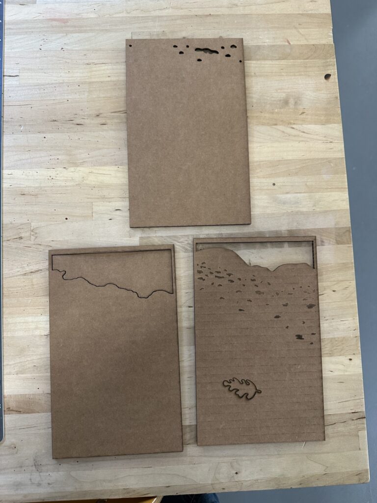
    Unfortunately, I had to use cardboard instead of wood like I had hoped because, with the many layers I had, it would have been too time-consuming otherwise. For. those who don’t know, cardboard takes less energy to cut and shade, therefore less time. An additional thing that needed to be adapted to save time was the layers that were complexity filled in. These layers are the silhouetted people on the tech side, and on one of the nature background layers.  

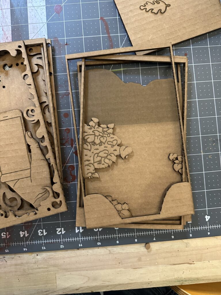
    There were a couple hiccups during the cutting process. The picture on the right shows a couple of layers where I put shading layers on the wrong cut layer. I had to go back and redo. correctly. Besides that, there were not any major problems I had with the laser cut.

    Final Product

    I’m pleased with the results of diorama, the only thing I would change is the foreground. The two sets of plant clusters is broken up by the background. This breaks the illusion of depth. I didn’t realize this was a problem until was all put together, I thought the front plants would be enough to create the illusion. Another thing I would add just for an extra layer of interest is a boarder at the very front that has clean rounded edges and slightly over hangs over the rest of the layers’ boarders. I think part of what worked so well with the tech side of the diorama is the foggy boarder (especially with the extra ons as you go further into) that brings the viewer into the space.

    I also believe I did a good job depicting the busy, noisy, constant buzz of social media that tech brings by the smoke layers. The business is what clouds your vision from the present moment which I think translate well in the design; this is highlighted in the layer of silhouetted people. I was originally going to add line work on top, but instead I chose to shade the whole layer. I found that this gave it more meaning because the people blend in with the environment and don’t stand out as people. Another aspect of the smoke I find successful is how it has areas of sharp edges that represent how scrolling on social media can be so harmful.

    It’s Its ironic how the side I was most successful in is the side I should admittedly not engage with as much.

  • Open Form

    Open Form

    Assingment

    Clay and Multiples

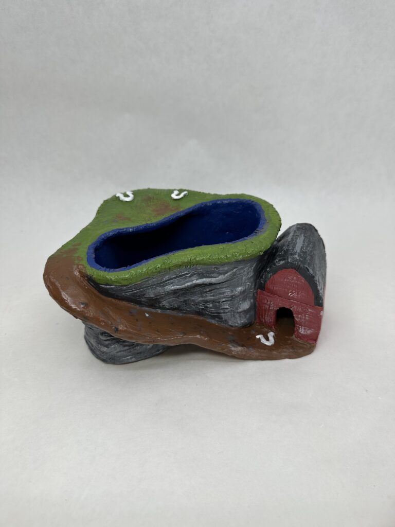
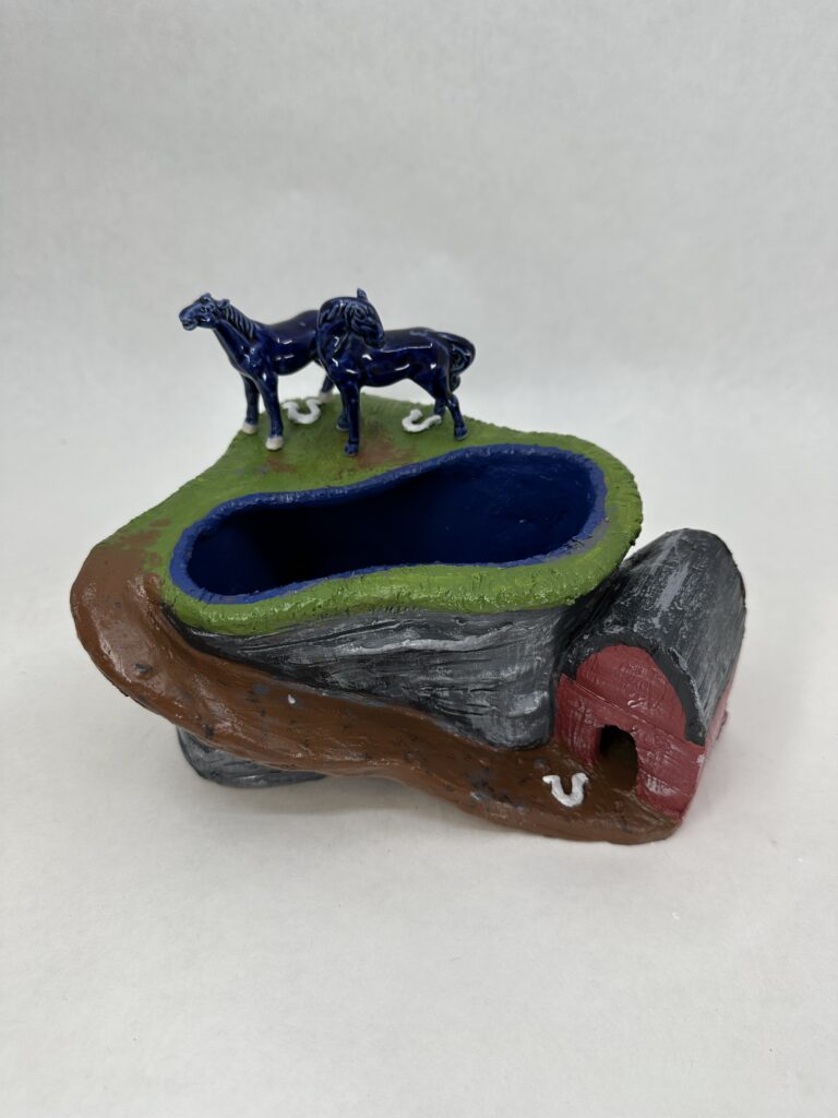
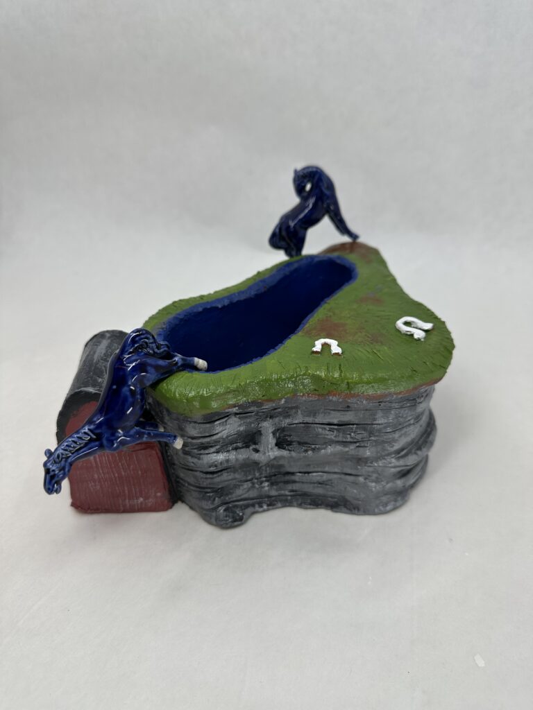
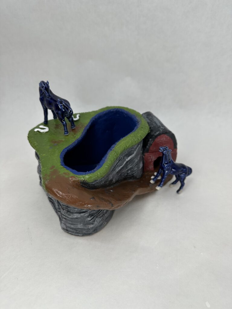
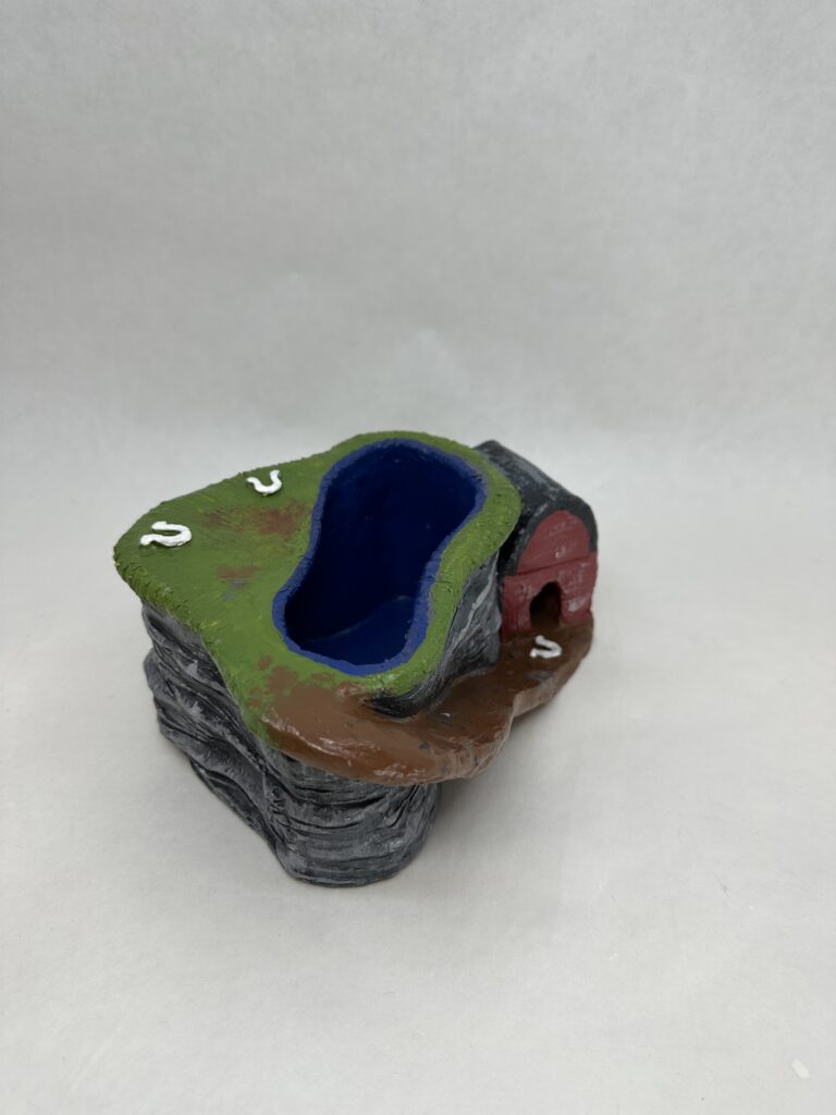
    Project Description:  In this project you will communicate the idea of Kitsch. Create at least 3 multiple size hollow 2-3 ” shapes out of clay. You will be using these multiples and a slab built clay cylinder/vessel (2.5″ high x 6″ wide) to create your final object as long as the overall composition is Dynamic! Be sensitive to the repetition and gesture of the pieces to direct the viewer’s eye movement through out the composition. 

    Using a minimum of 3 multiple forms create a dynamic composition built on a 2.5″high X 6 inch diameter slab built cylinder and incorporate your Kitsch object in the composition.

    Process

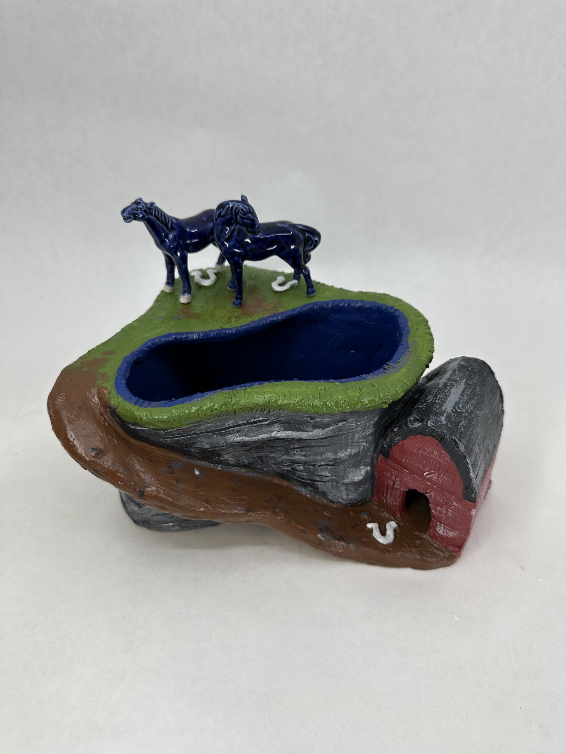
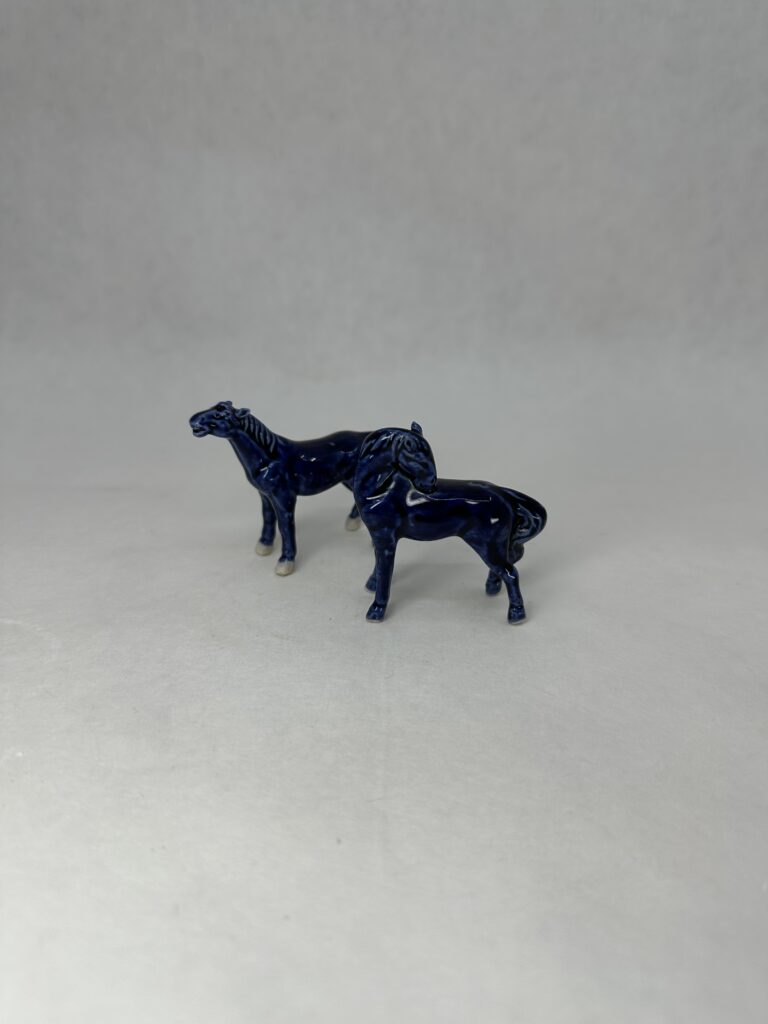
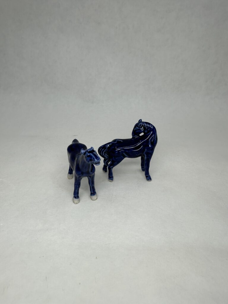
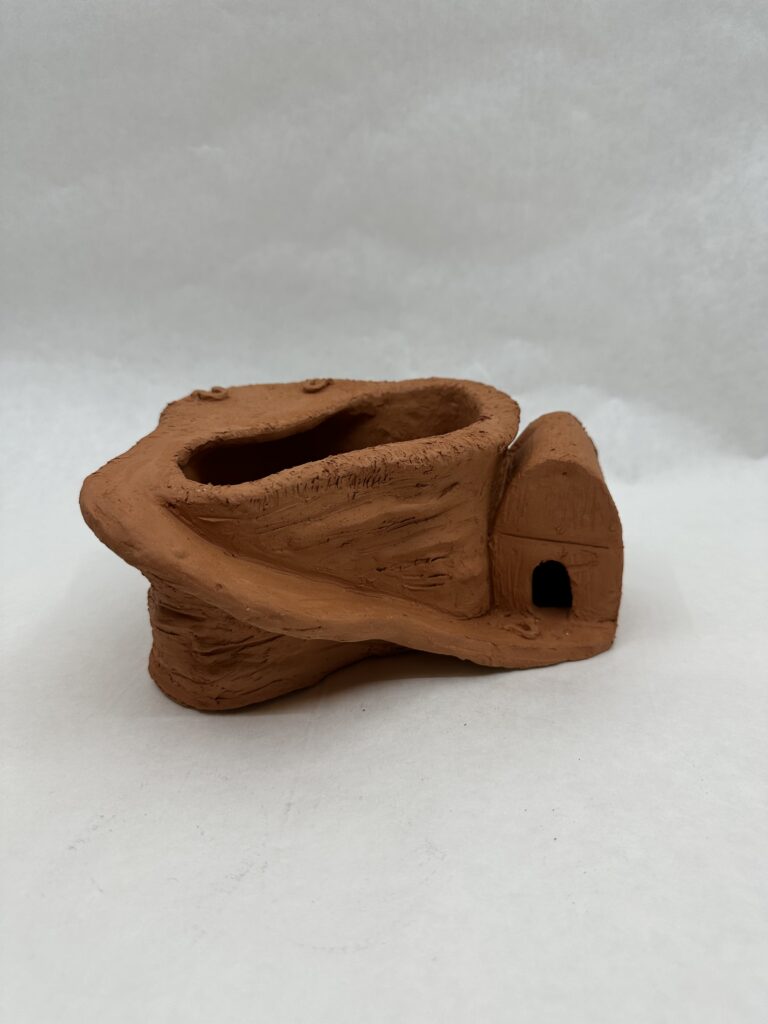
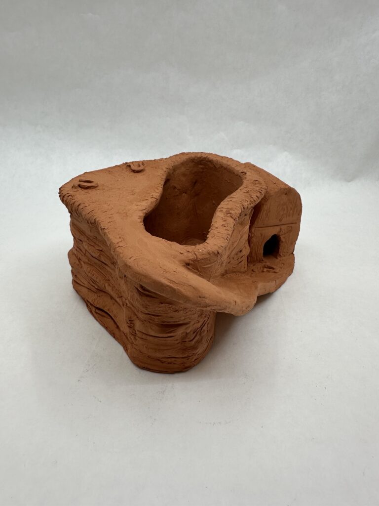
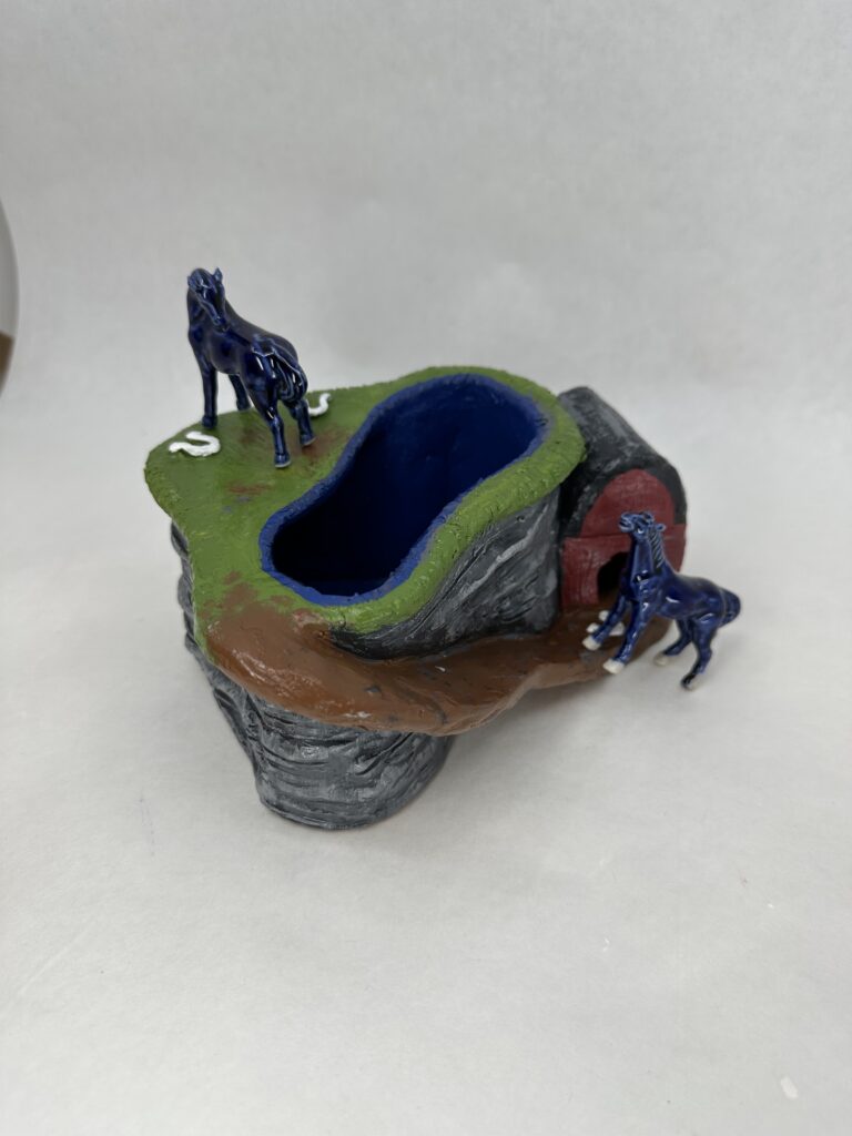
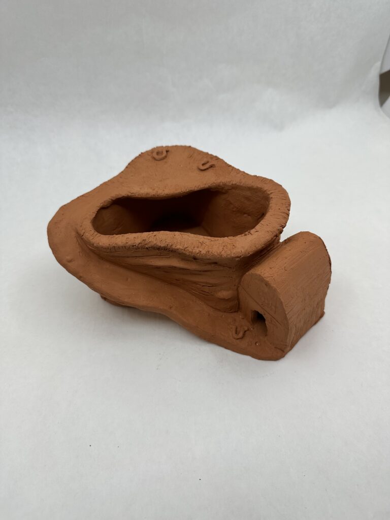
    I first I had to find my kitchen objects to inspire what I’d build for the pedestal. I went to my local thrift store Ladders and found these ceramic blue horses. I thought the most obvious way to stay on theme with the idea of a kitsch object was to make kitsch looking pedestal to go along with it. To me, this meant to make a habitat for the horses. I knew I wanted to somehow implement the same blue from the horses onto my pedestol. So I created a pond where I would later paint blue. to match.

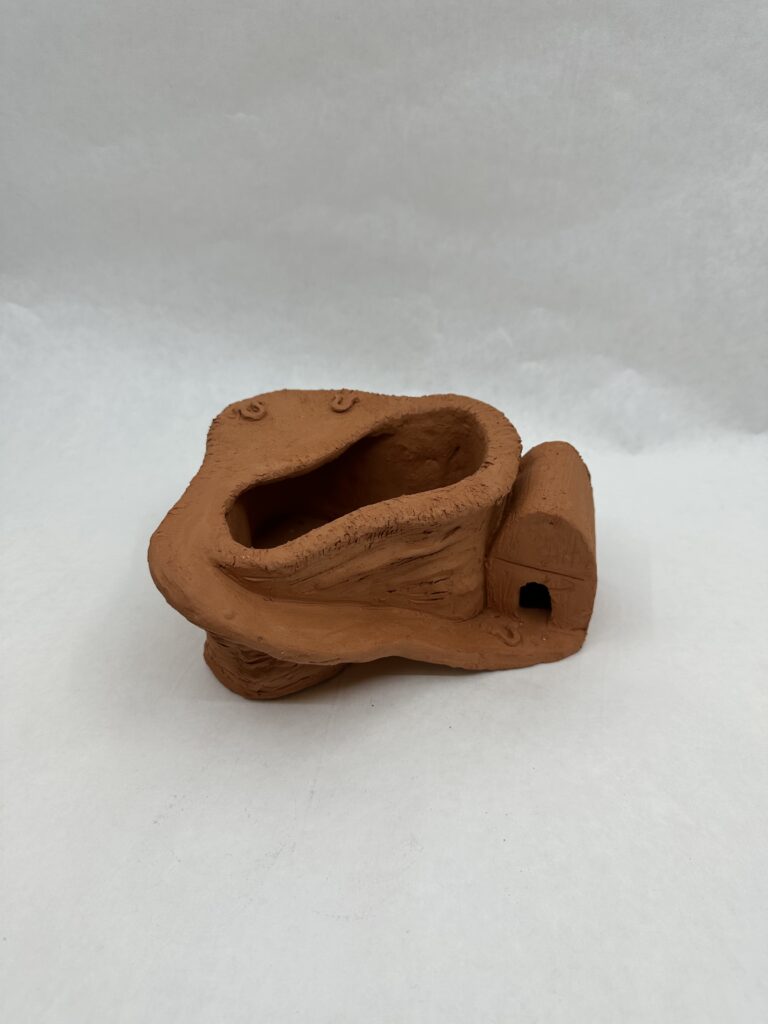
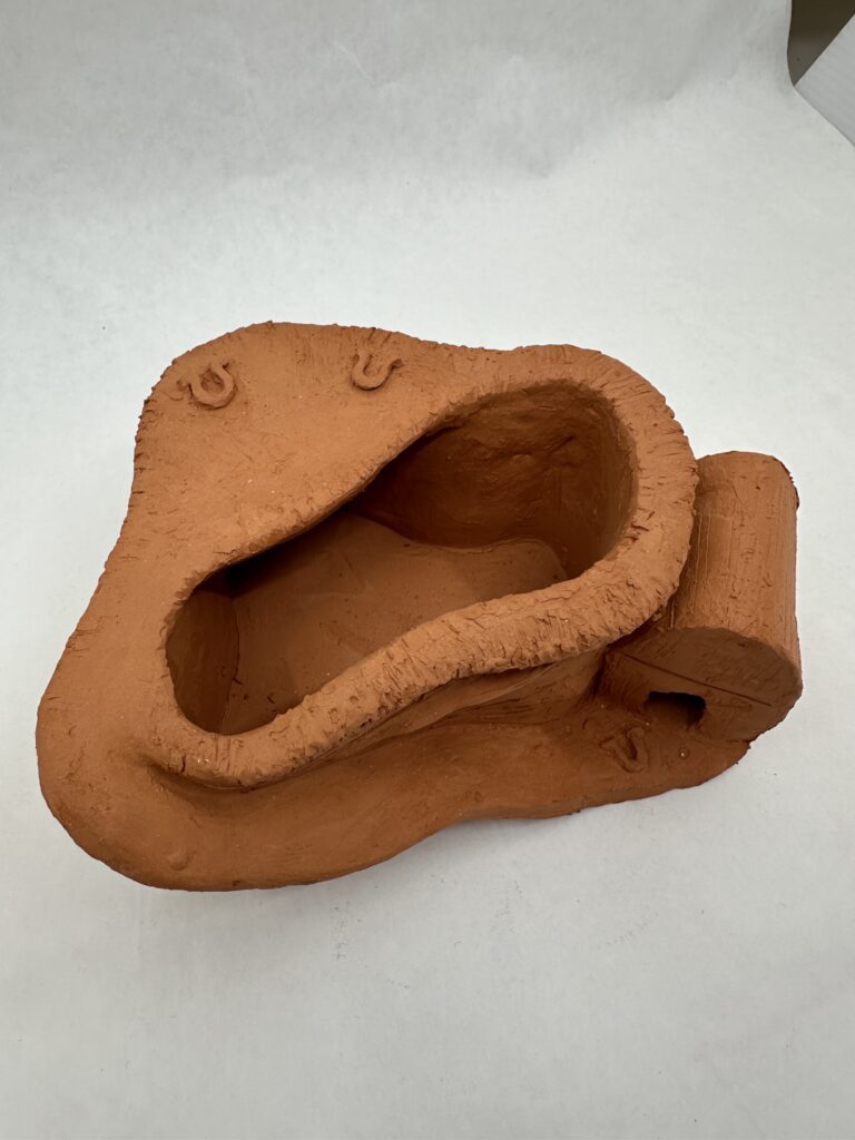
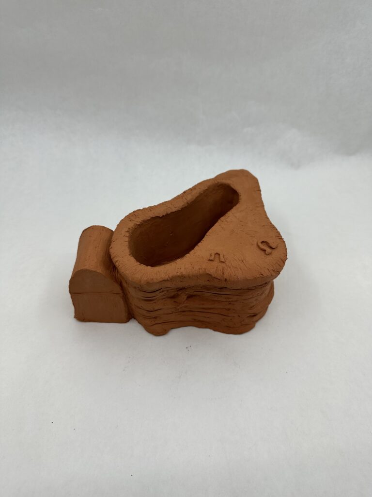
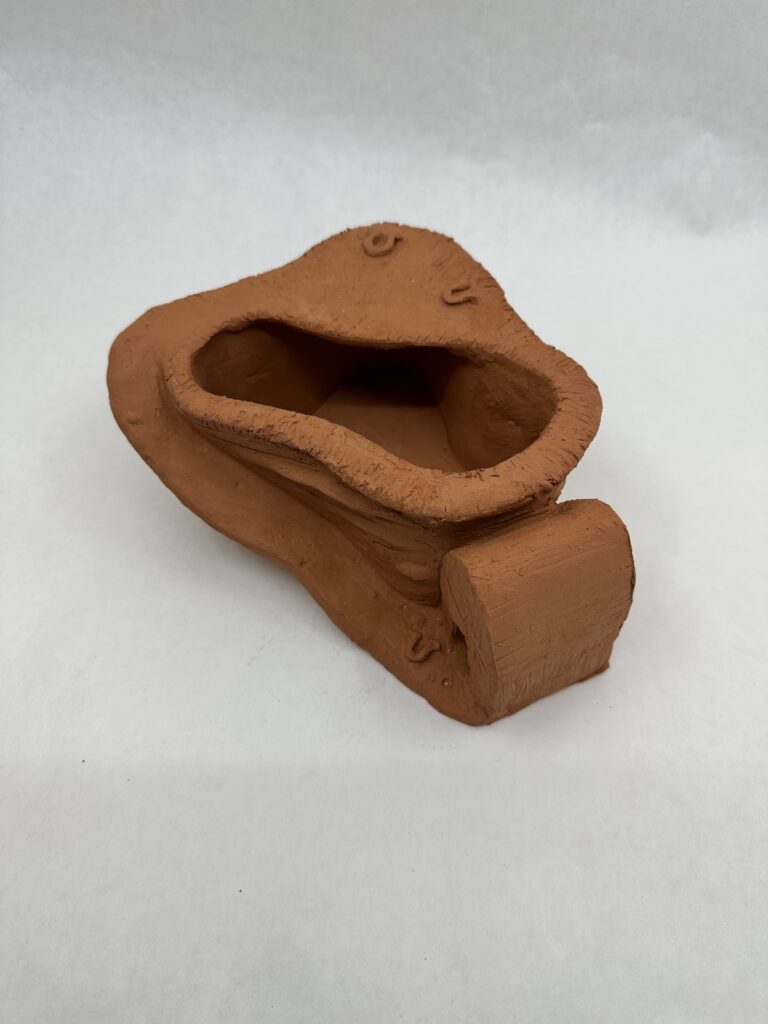
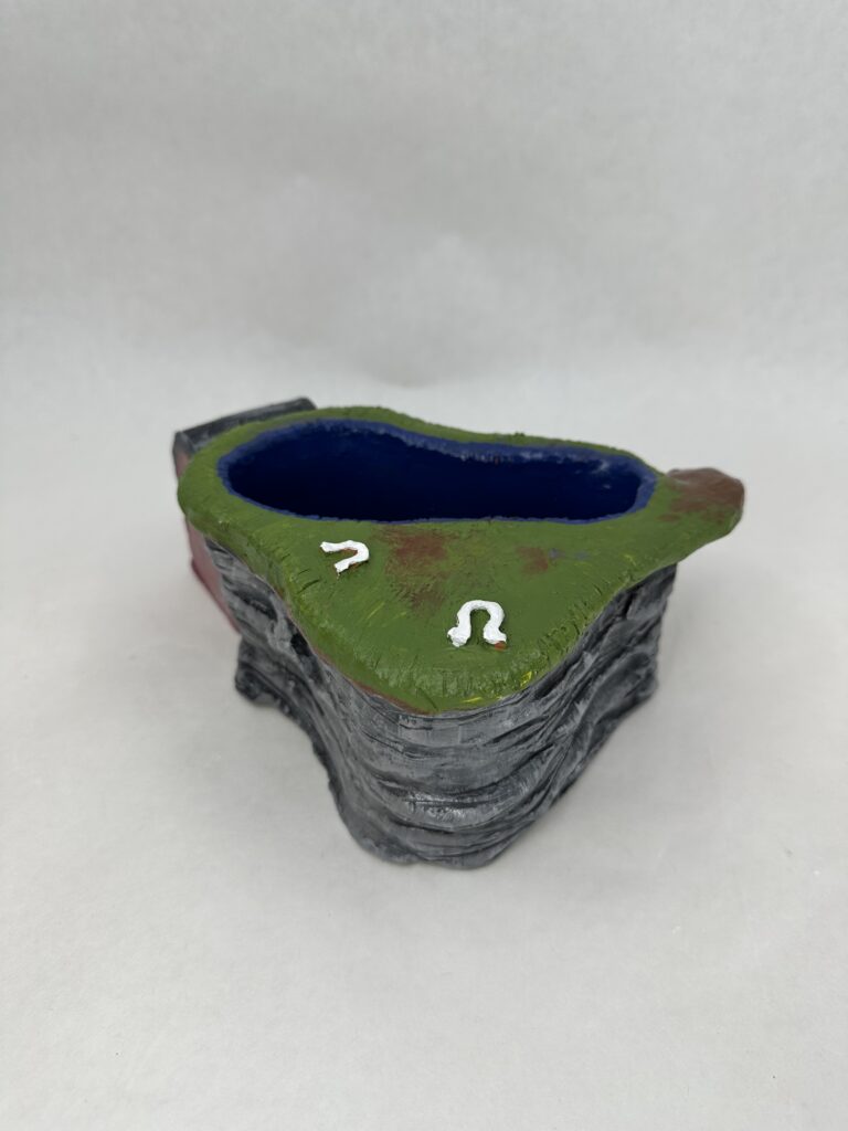
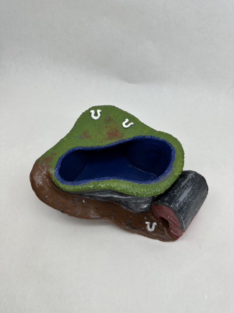
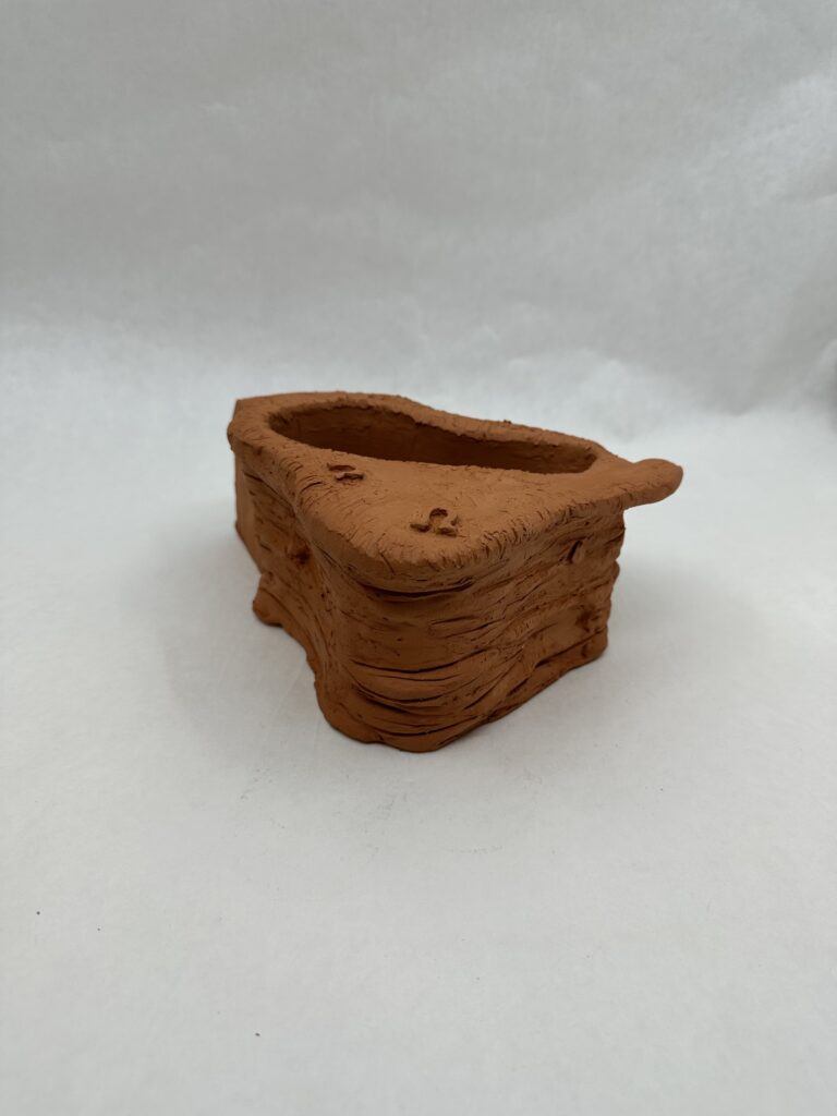
    I made an organic looking hollow form for the terrain. To make the main from more interesting, I added a strip of clay running up along the side of the mountain terrain along with a barn for the horses to rest in. Another thing I did to make the piece more interesting was that I created repetition with the hose shoes. Another thing I did to make the piece more interesting was add texture on all surfaces. I used a fork to create the texture of the grass, a needle tool to create the wood texture on the barn and rock crevices on the cliffside.

    A hurdle I faced was that when I was completely done sculpting the piece, I dropped it on the corner of the barn. So I had to completely redo the barn and terrain in that area. This was super time consuming but luckily I learned some strategies of what worked and what didn’t when I worked on the barn the first time, so it didn’t take as long the second time.

    One regret I have is making the piece so grounded. I knew I should have added a form under on side of the piece to make it more dynamic but I wasn’t sure how to do that and make it seem cohesive with the rest of the piece. I wish I spent more time thinking about it because it seems so obvious as to what I could have done now. I would add a few tall “rocks” under the back side of the piece where there isn’t much going on. Not only would this give the other cliffside more interest, but it would elevate the flat top the sculpture and make it into a hill instead of a field.

    Final Result

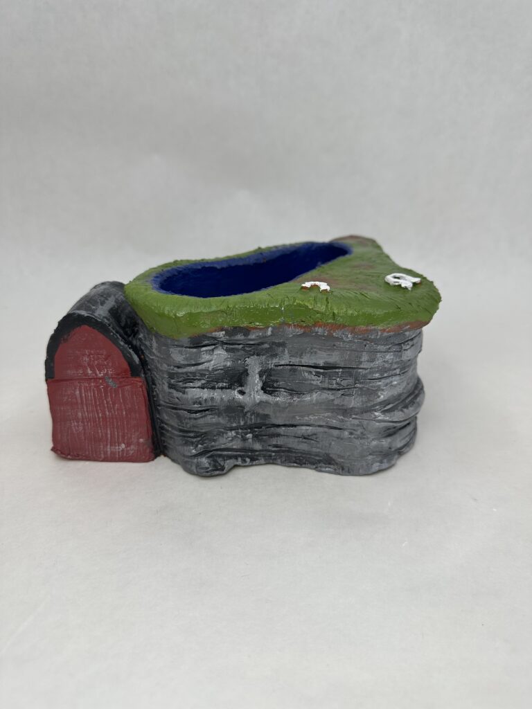
    Something I was successful in though was painting the object. I knew I was lacking in terms of the form being dynamic so I wanted to put more effort in painting it. For the cliffside, I had horizontal strips of “stone” to add texture, but it served well when I was painting on the lighter layer. After I had put a layer of dark grey paint on all of the “rock”s surface, I took a lighter grey and brushed it on vertically so I only hit the apex areas of the rock.

    After the critique, I learned I could spray the piece with ___ to make it a shiny texture. I did this in hopes of partially redeeming myself for not being able to color-match the blue and keep that same vibrancy of the horses as I’d hoped to. I sprayed the entire piece with the __, minus the horse shoes. I kept them matte similarly to the white shown in the kitsch objects to keep things consistent. I also thought that leaving them matte brought more attention to them.

    Overall, I believe I did a good job with matching the vibe of the kitsch objects with the podium and painting it. I think I could have improved on adding more forms to the piece to make it more dynamic.

  • Combined Forms

    Combined Forms

    Assignment

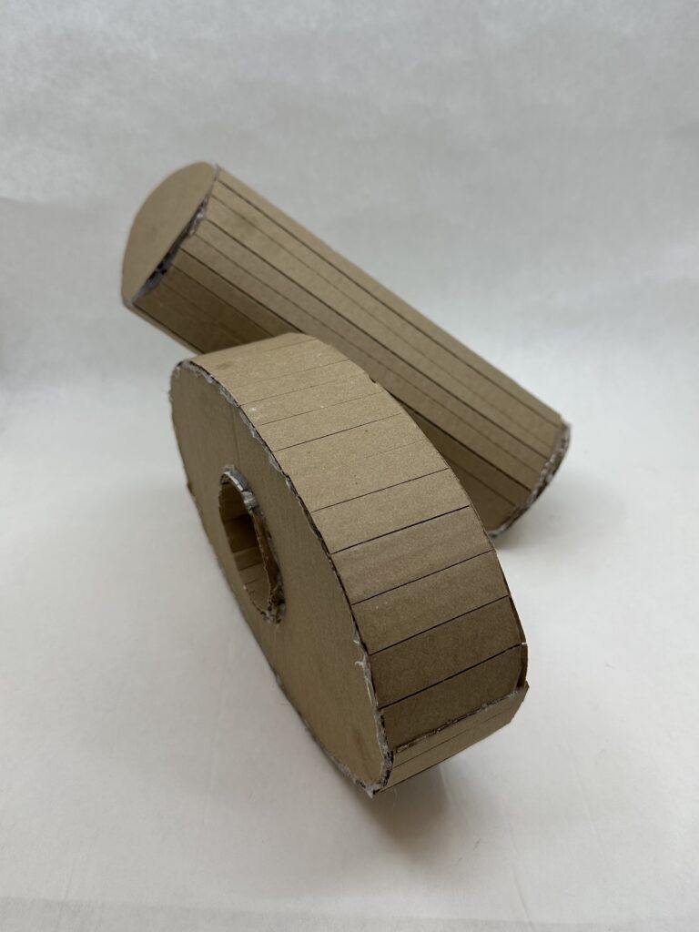
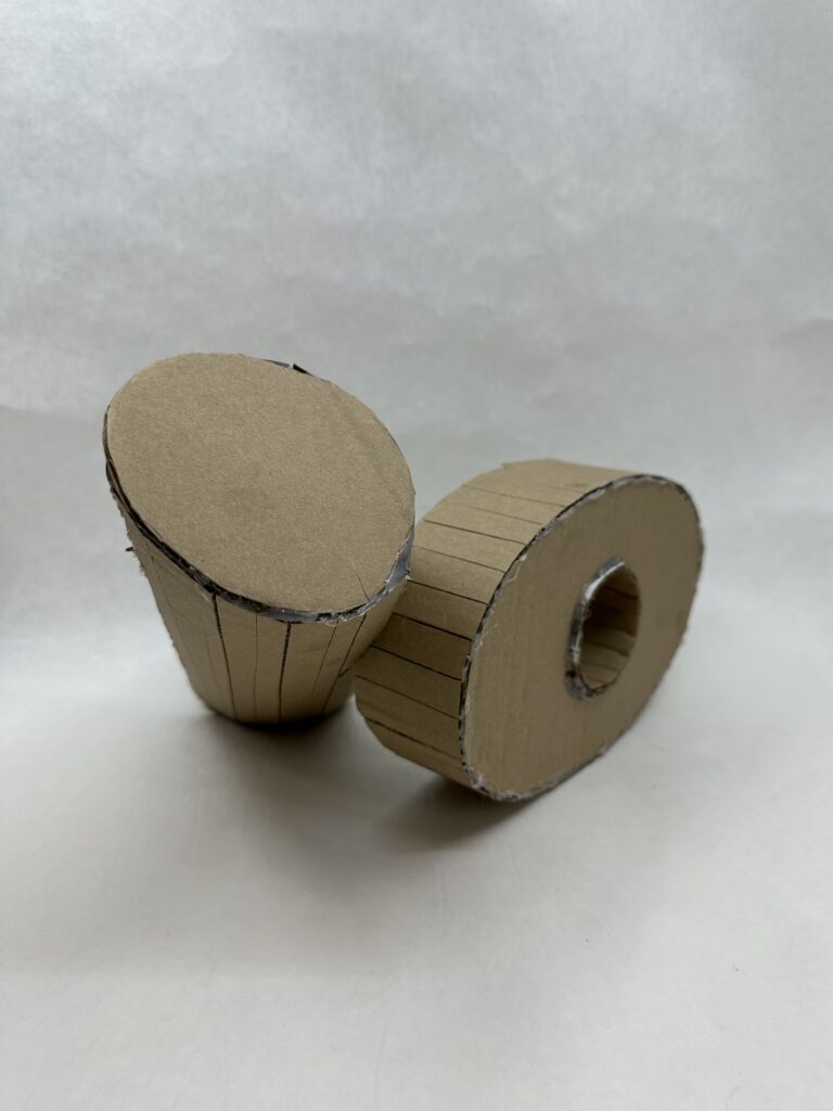
    Using the definitions of Linear Form (wire) and Planar Form (cardboard) we will create 1.5-2 ft individual linear, planar, and solid asymmetrical geometric forms in class. The project will need one shape for each form which can be anything created in the period of time designated, for each definition. Investigate potential textures to create contrasts in the individual forms and each form should have volume (height X width x depth). Then combine the 2 forms into a dynamic formal composition! Your forms should be abstract.  

    My Process

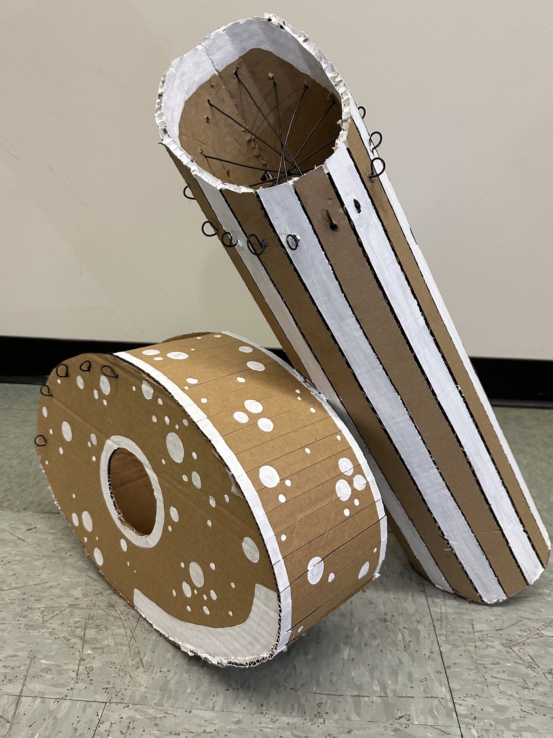
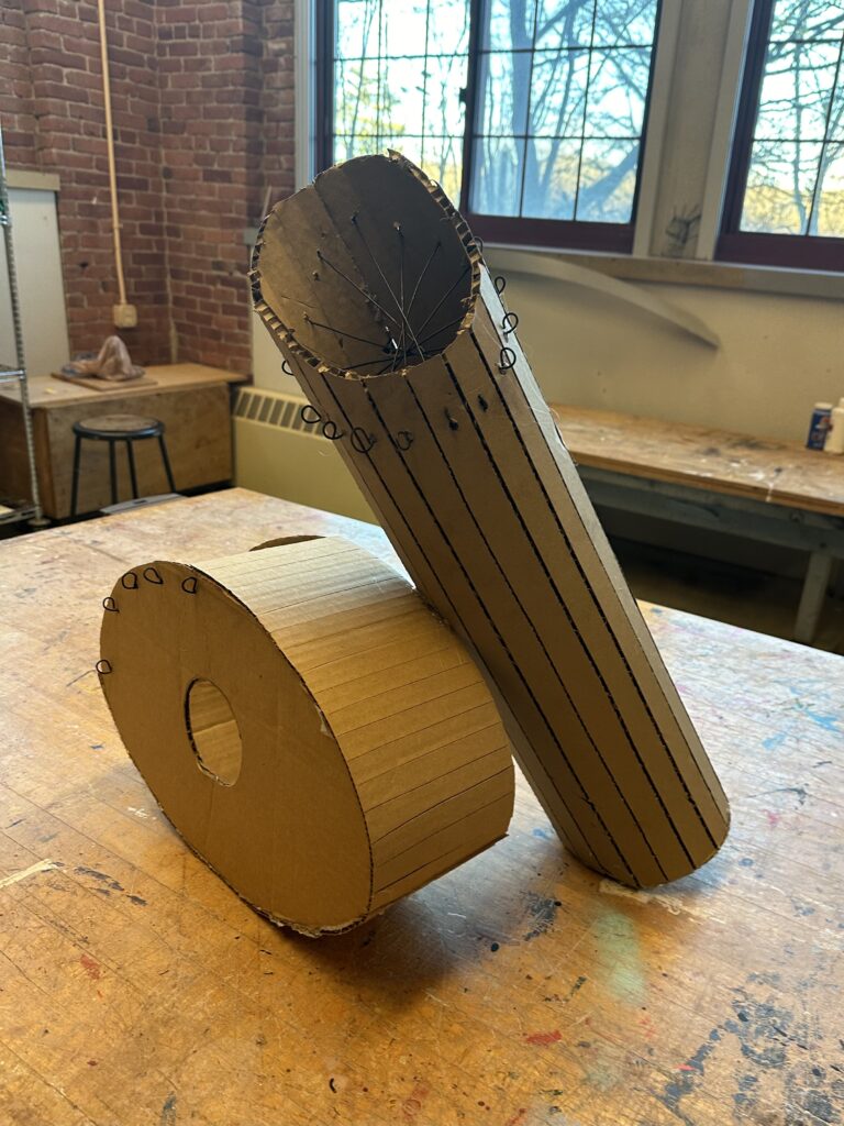
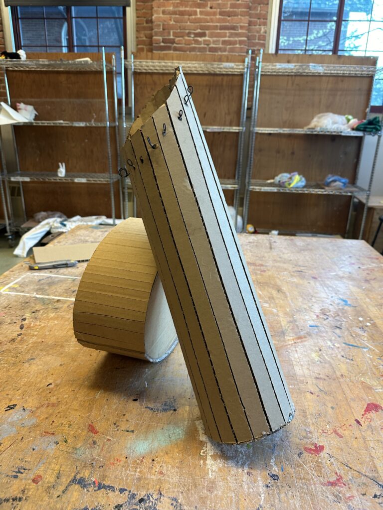
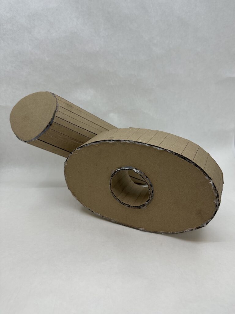
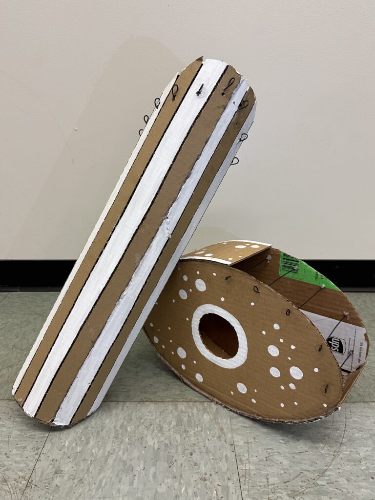
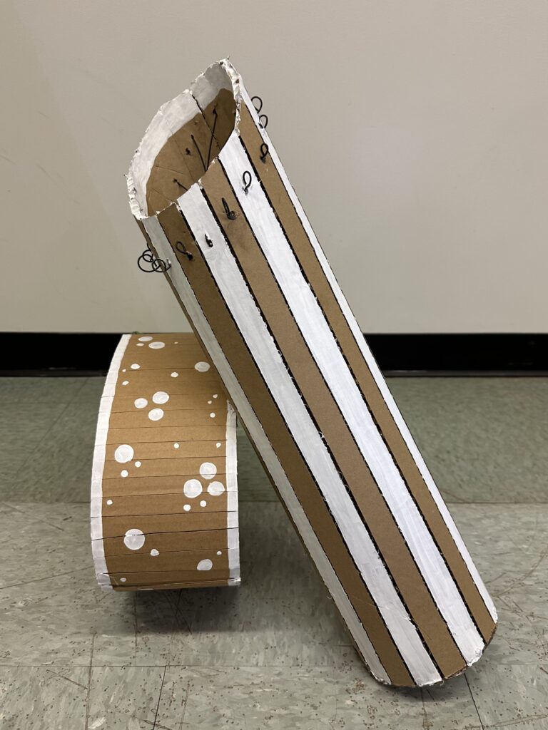
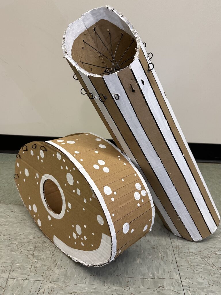
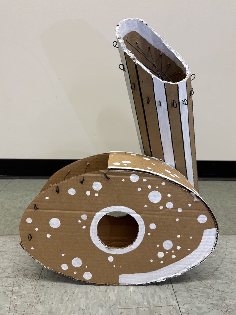
    I first started off by drawing up various planar forms to brainstorm more ideas than the expected 3D shapes such as pyramids, hearts, cubes, etc. I landed on a combined shape of an oval shape and a cylinder. To make both shapes more interesting, I put a whole through the oval shape, and tilted the cylinder and put a curved top on it.

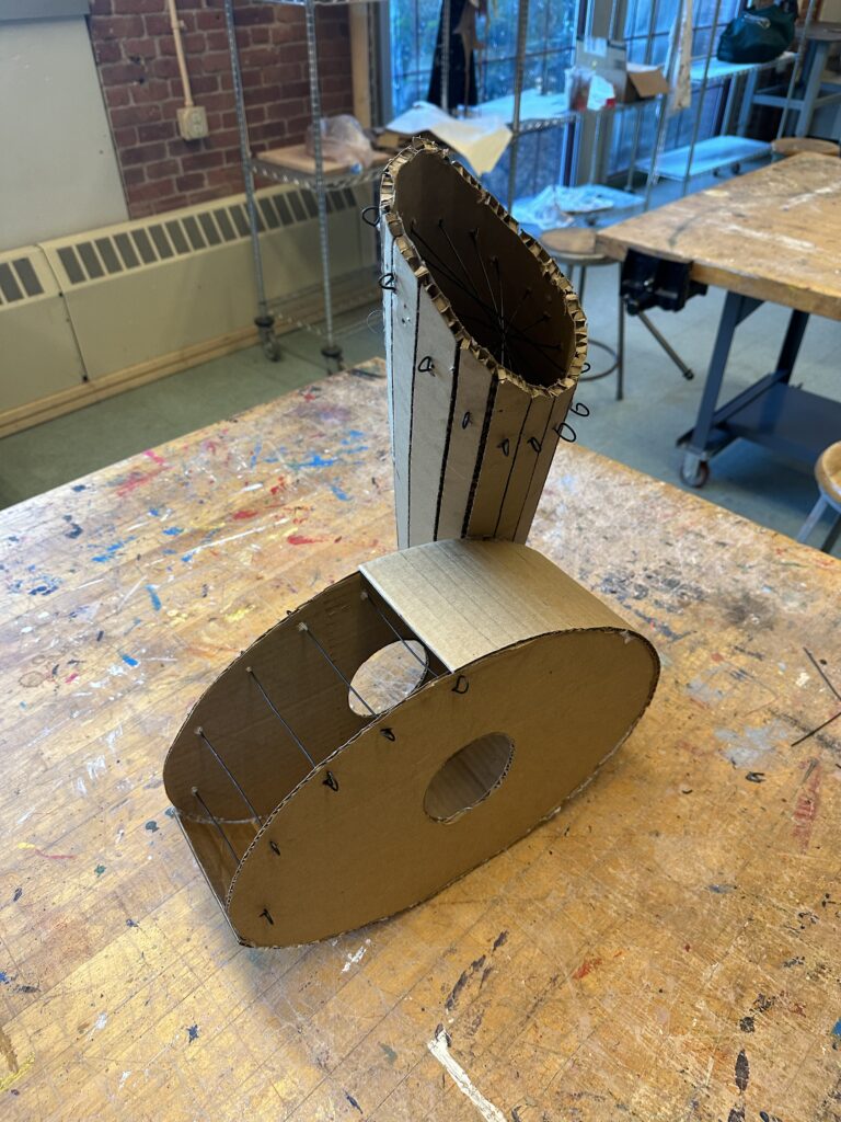
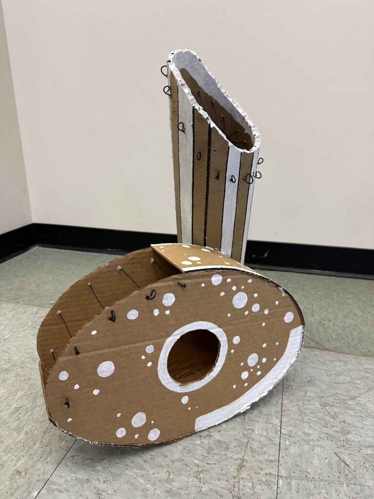
    From here, I still needed a linear form made from wire. I chose to implement the linear form into the planar form to act almost as its own plane to the planar form. I put straight wires across each cardboard panel of the cylinder. This created a spiderweb net effect looking down on the top of the cylindar. I did a similar technique for the oval half of the planar form to create a ladder looking “panel” by using repeated bars of wire running across the edge of the top of each oval shape. Additionally, the wires had curled ends that made the exterior of the form more dynamic.

    I chose to make the linear forms more discreet to not take away from the planar form I liked so much. In hindsight, I wished I hadn’t because I can so clearly picture more interesting linear forms coming out from the planar form that would have made the piece so much more interesting.

    Final Product

    If I could alter any part of my project, I would put energy into my linear form. I understand the instructions so I neglected the linear forms until the end. I wish I had put as much energy into them as my planar forms. One thing I could have done, that didn’t even dawn at me at the time, was to paint the wires. This would especially been helpful for the wires on the oval shape that blend into the planar form.

    The planar form is where I think I strived because I tried to use techniques I learned from past projects. For instance, the Objects in Space project, I learned how movement with gestural lines across a composition, like a diagonal slash across a piece, can make a piece more dynamic. I implemented a diagonal gestural line like this with the cardboard cylinder shape. I think this makes the piece much more dynamic from all angles.

    As for the texture, I think I achieved that well with the repetition of pattern with the white paint as well as the wire stringing around the top of the cylinder. I was also able to create strong contrast with the white stripes running down the cylinder, and with the polkadot clusters.

  • Tyvek Suit

    Tyvek Suit

    Assignment

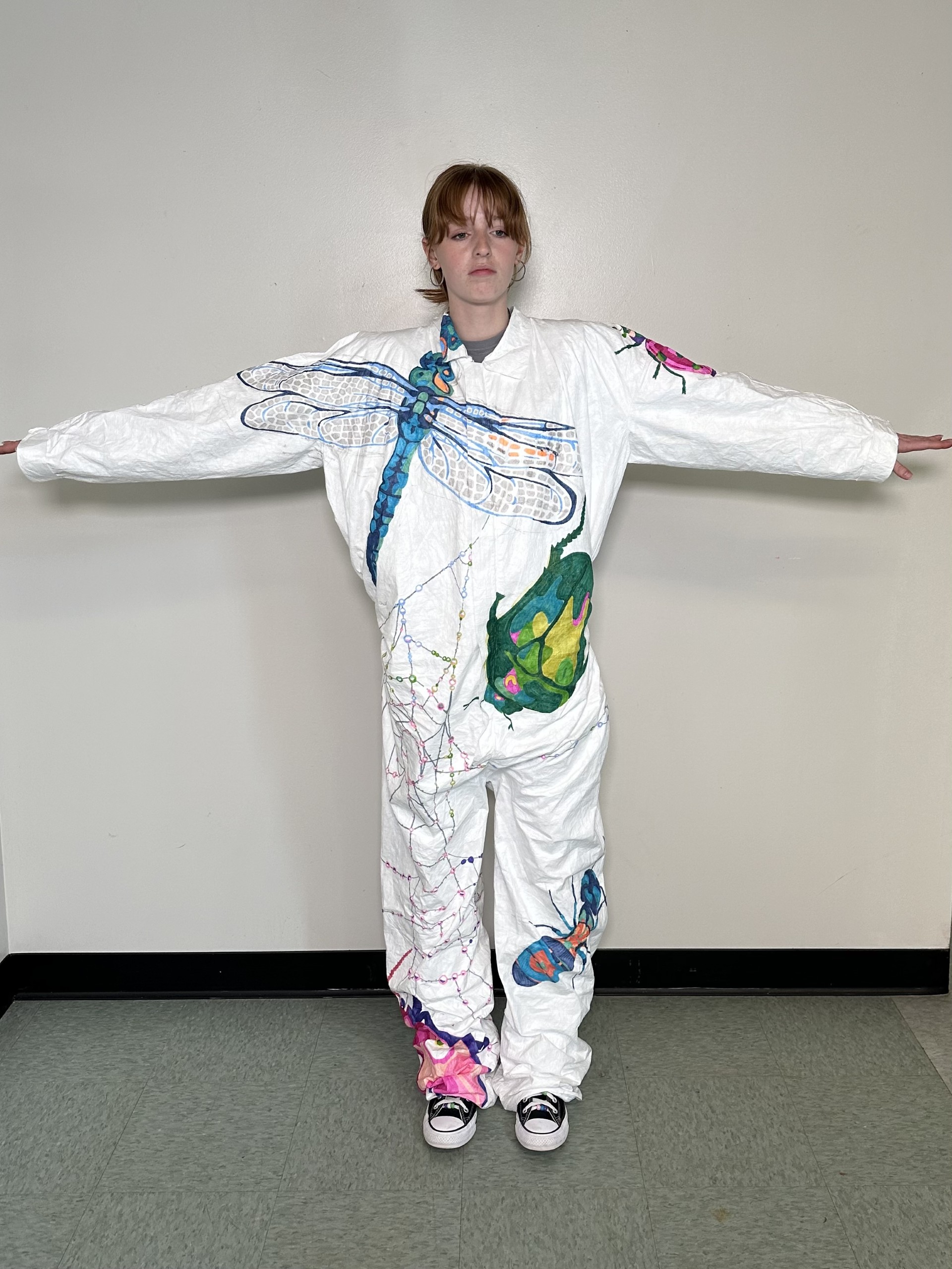
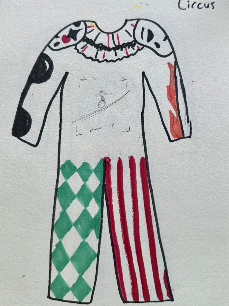
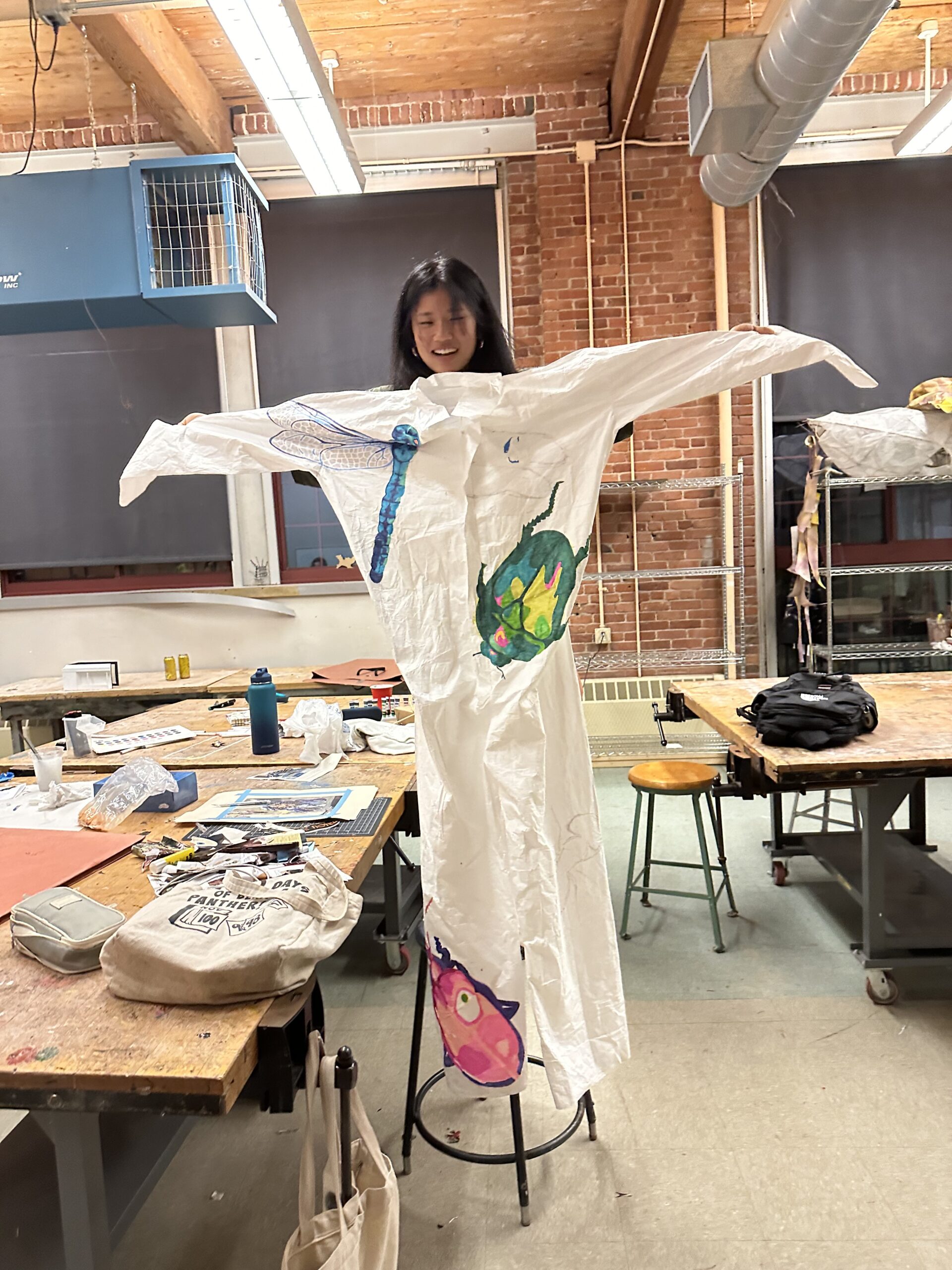
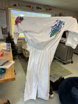
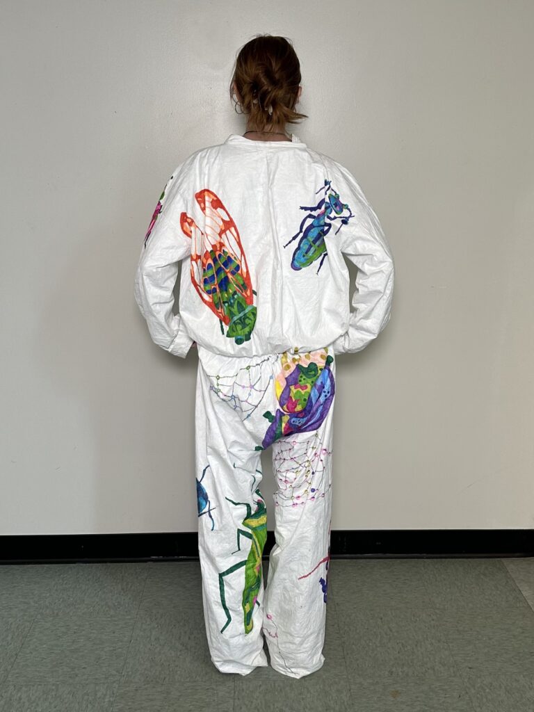
    Using what you know about the 3D elements of design, a Tyvek suit, Sharpie markers and a Theme of your choice, design a suit that will draw the viewers eye around from one side of the suit to the other.  Remember this suit will be worn and is Three-dimensional (even though when you work on it, it is flat).

    LATERAL THINKING: Brainstorm lists of the elements in a theme. For example if your theme was “Sea Life” you could make a list of the different things that live in the sea. Fish, whales, sharks, Plant life etc. Then…you could make a list of all the kinds of Fish (web search might help with this), list of different kinds of sharks…you get the idea. Now you have lots of visually material for the next step!

    • You must cover the whole suit (Draw big!)
    • Use repetition and contrast
    • Use pattern

    SKETCH: use your sketch book to explore different possibilities,

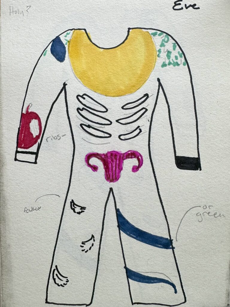
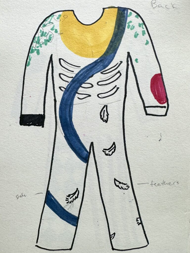
    Maquettes: then using a large sheet of paper cut out 3 paper doll type shapes that will be maquettes of your suit See below image). Draw on these to play with composition that is not only 2D but wraps around to the other side.  They should be different from each other, with the goal being to explore different possible paths for you to take with this assignment.

    WRITE: Free write a list of what is most interesting about each of the 3 cut outs, and what might be rewarding or compelling about making each one.

    Process

    Lists

    Eve

    • Golden Halo
    • Snake
    • Apple
    • Wings
      • Feather
    • Branches
      • Leaves
    • Ribs
    • Good & Evil/Black & White

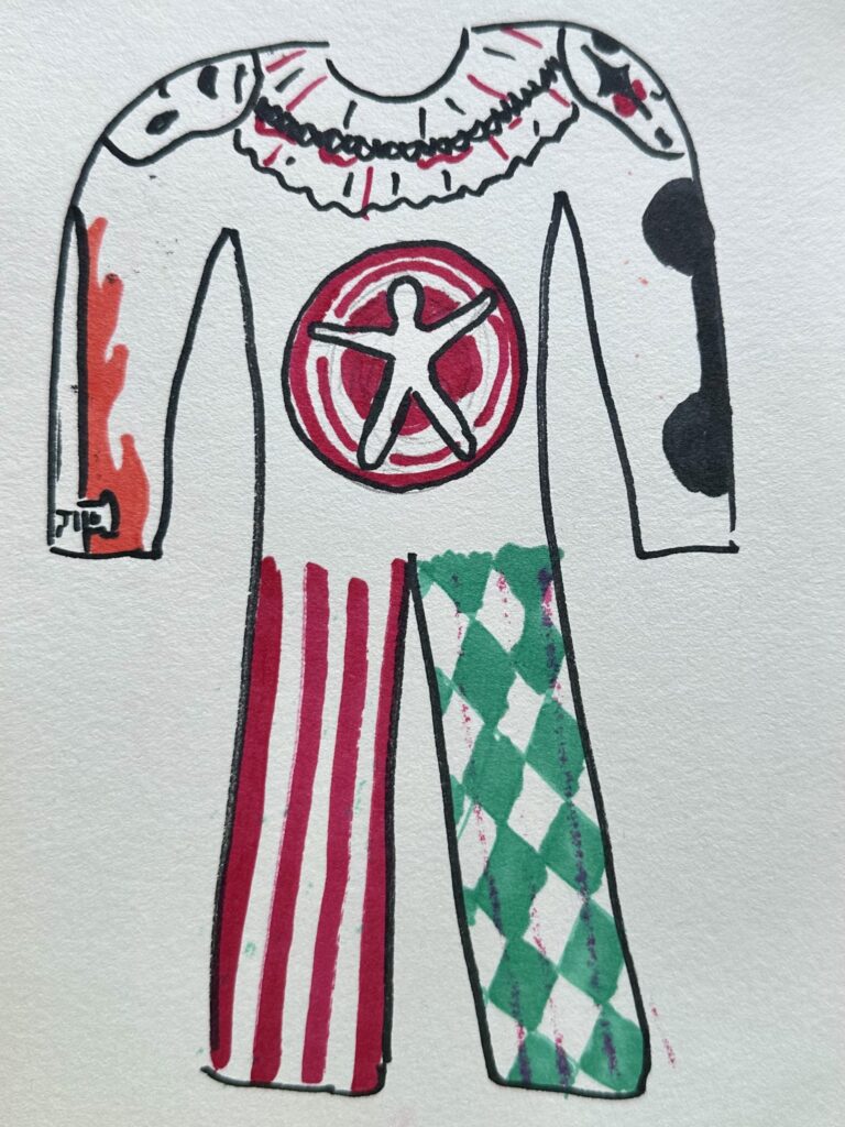
    Circus

    • Spinning Dart Board
    • Flaming Swords
    • Dumbells
    • Horses
    • Elephants
    • Red & White vertical stripes
    • Clown makeup/masks
    • Type-rope

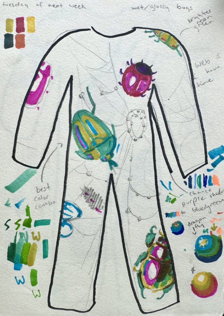
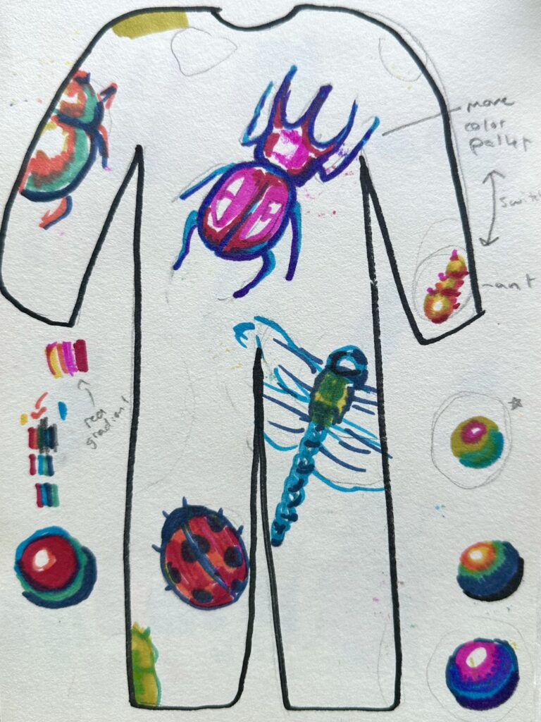
    Bugs

    • Beatle
    • Dragonfly
    • Ladybug
    • Ant
    • Caterpillar
    • Worm
    • Spider
      • Spiderweb
    • Dew drops
    • Leaves/other outdoor elements

    Sketches & Maquettes

    Shown to the right are my first two maquettes. I liked how the snake wrapped around the entire suit and how it had repetition/something sitting on the shoulders. However I didn’t like the first Eve theme because I didn’t think I could bring in commentary I wanted to do successfully with the timeframe and canvas I had.

    Again, I really enjoyed how I had something sitting on the shoulders with the Circus design, I also really liked the patterns on the leg. On the other hand, I didn’t feel like I was bringing the right vibe to the piece like I wanted. So, I decided against going any further with the idea.

    The last design was interesting to me and I thought it brought verity and repetition in a unique way. Each bug had its own color, shape, It also allowed me to do something on the shoulder (like how I did with the ladybug). It also allowed me to do something on the shoulder (like how I did with the ladybug).

    Something I kept in mind while drawing the maquettes was that I’m a very meticulous slow drawers, so seeing this big of a canvas to work with made this assignment pretty daunting. I knew I would have to work more abstractly than I usually do. I tend to create things that are more realistic but it’s really time consuming as I get wrapped up in trying to make everything “perfect”. With such a large canvas to work on, I didn’t have the option to spend that much time on every small detail. So I chose to block out colors and create hard contrasting lines instead of mixing colors to create soft transitions within the shadows to get that realism effect.

    Drawing On the Suit

    First Progress Check (front)

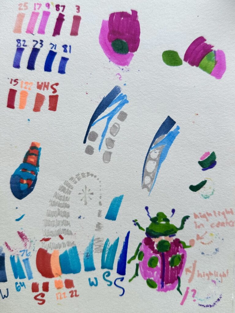
    As I mapped out my piece, I used the lightest color out of that bugs pallet to create the outline. Once the gestural drawings were done, that when I would go in blocking out colors following the color pallet values I tested before (as seen on the “Sketch: Bug (color swatches+)” picture).

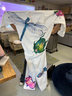
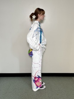
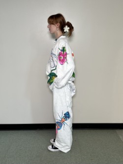
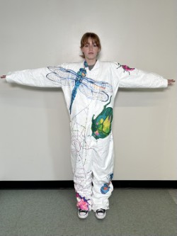
    For each bug I used contrasting colors for the highlight to give more interest to each bug. So for the blue bugs I used a light neon color, for the pink I used green, for the green I used pink, and so on. Another thing I think was successful was changing the facing directions of each bug, you don’t see a single bug facing the same direction as its neighbors.

    One thing I struggled with was trying to make each bug enlarged and different sizes, but as I sized up each bug that would normally be much smaller than it’s neighboring bug, I ended up making all the bug generally the same size on accident. I think was successful with the dragonfly and lady bug though as they were two contrasting sizes right next to each other, I wish I could have implemented that technique consistently throughout the piece. I also wish I had made minuscule bugs and placed them around the piece. Something simply and fast as to not take up much time but to add more interest to the piece in that way.

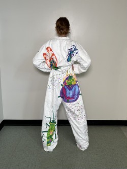
    A challenge I faced was defiantly the dragonfly. I think over all it turned out well and but I had a lot of bumps in the road and obstacles I had to get past for it to be successful, one of them being my canvas. I was working on fabric that moved around, pinched in some areas, and was distressed in others. So as I. was working on it the fabric would move, this made it challenging to map out the dragonfly, I had to constantly keep going back and correcting my mistakes so I could make the wings symmetrical. If you look closely at the wings they aren’t symmetrical, some lines in the right wing are badly messed up or completely missing. However I think I did a good job going with my mistakes and improvising to make them not noticeable.

    Another thing that was hard to work around was a patch two the right of the wing where there was a tag or label of some sort that had been ripped off leaving the fabric tearing and fuzzy. This texture made the ink bleed so I tried to avoid that spot as much as possible. I eventually had to draw a couple lines in that area so I worked with a light hand as to not have so much bleeding.

    One challenge that I didn’t expect was having the markers die on me so quick. You might notice with the dragonfly for example, the right wing has a patch of different color geometric shapes than the rest of it because my marker had completely run out of ink. I went to use a similar colored marker, but it looked a bit funky, so I chose to change route and try using the light neon orange that I had been using for the form’s highlighter instead. This turned out well and I was able to play it off as a patch where the sun hits the wing just right.

    Overall I think the dragon fly was a success. it created a linear element. to the front to make the piece eye catching. I wish I implanted something similar towards the bottom on the back.

    Final Product

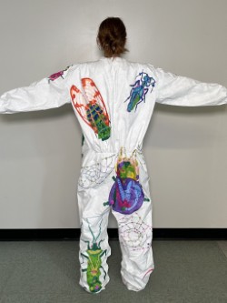
    At the critique I was told to add more stuff to fill up any empty space I had left. I was of course going to add more bugs to back, which I did. My only regret there was that wish I hadn’t done such complex color pallets, I wish I had stuck to something more like the front. Other things people suggested I add instead of bugs (since they’re so time consuming) were natural elements like sticks. I ended up doing colorful spiderwebs that reflected any nearby colors. I wish I had been able to keep the web in neutral grey tones to keep the attention on the bugs and not have the suit be so busy, but I doubt I would have had enough ink to do that anyway as I found myself running low on the few saturated colors I was using.

    If I had all the time I wanted to work on the project, then of course I would try to fill up more space on the suit. I would want to add much more bugs on the sleeve, smaller repeated bugs everywhere, and less dense attention-grabbing webs dispersed evenly around the suit.

    At the end of the day, I’m satisfied with my work. I covered the majority of the suite and made it dynamic. I got to play with bright colors in an abstract way which I’ve never done before. I definitely learned about color schemes and composition along the way, so I’d say it was a success.

  • Objects in Space

    Objects in Space

    Assignment Description

    The assignment was to create five lists of five dynamic closed shaped objects. So not i.e. rainbows, rivers, fields, etc. From that we were to pick five objects from each list that might look interesting together, so not too many skinny objects, or too many spherical objects. Then we needed to create four sketches of the objects we picked floating around in space. The sketch needed to be dynamic, which meant playing around with perspective, overlapping, and repetition. Once we had done sketches, we were to use what we liked from them and implement it in our final drawing.

    My Process

    I created five lists of five objects (with categories to help me come up with ideas for objects) as shown. I tried to pick things physically around me so I could use them as reference.

    Things That Remind Me Of Vermont

    1. Cabot Cheese
    2. Maple Helicopter Seeds
    3. Apple Cider Donuts
    4. Creemies
    5. Cows

    Objects In My Room

    1. Potted Plant
    2. Salt Lamp
    3. Purse
    4. Stuffed Animal
    5. Picture Frame

    Food I Like

    1. Ben & Jerry’s
    2. Strawberries
    3. Salmon
    4. Bananas
    5. Fruity Pebbles

    Bathroom Objects

    1. Toilet Paper
    2. Candle
    3. Hair Curler
    4. Soap
    5. Razor

    Things I Wear

    1. Shoes
    2. Necklace
    3. Sunglasses
    4. Mascara
    5. Belt

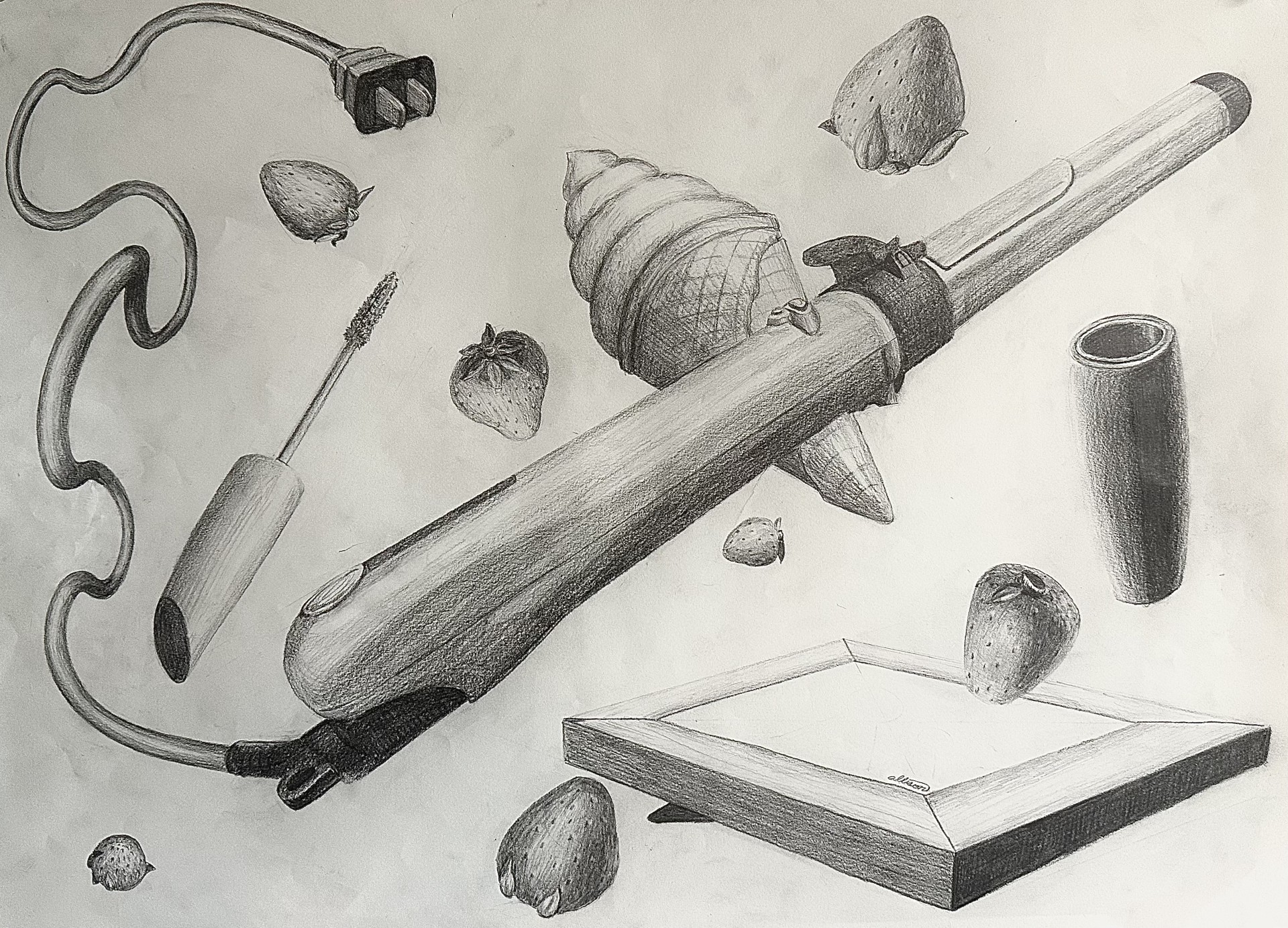
    After creating my lists of objects, I made five more lists playing around with combinations. I ended up choosing to draw a curling iron, tube of mascara, an ice cream cone, a picture frame, and strawberries. I thought these were objects that, out of all my combinations, were least connected with each other while also being very diverse shape-wise. These randomized combo lists are shown below:

    1. Potted Plant
    2. Razor
    3. Salmon
    4. Bananas
    5. Fruity Pebbles
    1. Stuffed Animal
    2. Candle
    3. Bananas
    4. Creeemies
    5. Shoes
    1. Salt Lamp
    2. Razor
    3. Strawberries
    4. Helicopter Seeds
    5. Belt
    1. Potted Plant
    2. Razor
    3. Strawberries
    4. Donuts
    5. Sunglasses
    1. Picture Frame
    2. Hair Curler
    3. Strawberries
    4. Creemie
    5. Mascara

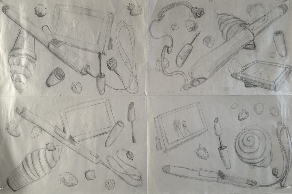
    These are the sketches I did to the left. You can probably tell which were my first ones and which was my last one. I worked from the top left, counterclockwise to the top right. As you can tell the top right one is much more dynamic than the other three. After getting feedback I gave the hair curler more of an interesting perspective and made its cord travel back through space by using size and value.

    I also gave the frame a less typically viewed at perspective, making sure to add in detail of the stand in the back. However the frame turned out a bit grounded so if I had to redo it I would tilt it more. If I had more time to redo it I would draw an actual photograph into the frame.

    The mascara use was one of the more easier things to draw but I wish I had added a label on it tome it more interesting.

    The strawberries were the most tedious part. The shape was the easiest part of it but creating the seed texture was difficult, especially having to repeat. it so many times.

    The ice cream cone was the part I struggled with the most. I didn’t have an actual ice cream cone to reference so it was a bit challenging to conceptualize it in my head. Eventually I stripped back the layers and thought of it as two cones attacked to one another floating in space. This helped my process out a lot and once I got those shapes down it was a matter of adding texture. There’s a lot of growth from the top right sketch to the final drawing which I’m really proud of.

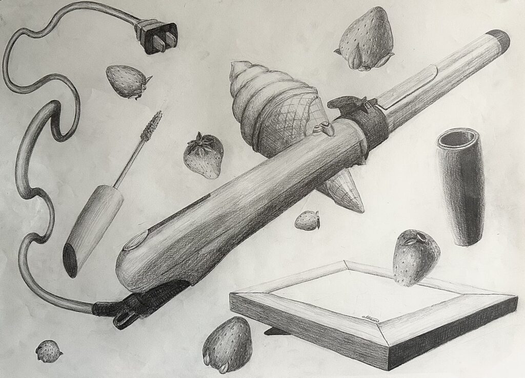
    One thing I had to change from my critique (one shown above was pre critiques and the one to the right is post critique) was distributing the value across the composition. I had a couple areas in the bottom right corner that was not as dark as the darkest shade in the center or upper left corner were; it made it look incomplete. After making the bottom half of the mascara tube’s shadow darker, and making the darkest shade of the picture frame darker, the drawing looked more complete.

    All in all I think ai made a very dynamic piece. The action happening a slash across the composition created by the hair curler, things over lapping each other, multiple unique perspectives being used, repletion from the strawberries, and (besides arguably the frame) I didn’t ground any objects and all objects. I also didn’t crop any objects off the edge of the paper. So I followed the assignment guidelines and made a very dynamic composition.